User Interface

Labels
AJAX(112) App Studio(9) Apple(1) Application Builder(245) Application Factory(207) ASP.NET(95) ASP.NET 3.5(45) ASP.NET Code Generator(72) ASP.NET Membership(28) Azure(18) Barcode(2) Barcodes(3) BLOB(18) Business Rules(1) Business Rules/Logic(140) BYOD(13) Caching(2) Calendar(5) Charts(29) Cloud(14) Cloud On Time(2) Cloud On Time for Windows 7(2) Code Generator(54) Collaboration(11) command line(1) Conflict Detection(1) Content Management System(12) COT Tools for Excel(26) CRUD(1) Custom Actions(1) Data Aquarium Framework(122) Data Sheet(9) Data Sources(22) Database Lookups(50) Deployment(22) Designer(178) Device(1) DotNetNuke(12) EASE(20) Email(6) Features(101) Firebird(1) Form Builder(14) Globalization and Localization(6) How To(1) Hypermedia(2) Inline Editing(1) Installation(5) JavaScript(20) Kiosk(1) Low Code(3) Mac(1) Many-To-Many(4) Maps(6) Master/Detail(36) Microservices(4) Mobile(63) Mode Builder(3) Model Builder(3) MySQL(10) Native Apps(5) News(18) OAuth(9) OAuth Scopes(1) OAuth2(13) Offline(20) Offline Apps(4) Offline Sync(5) Oracle(11) PKCE(2) Postgre SQL(1) PostgreSQL(2) PWA(2) QR codes(2) Rapid Application Development(5) Reading Pane(2) Release Notes(184) Reports(48) REST(29) RESTful(29) RESTful Workshop(15) RFID tags(1) SaaS(7) Security(81) SharePoint(12) SPA(6) SQL Anywhere(3) SQL Server(26) SSO(1) Stored Procedure(4) Teamwork(15) Tips and Tricks(87) Tools for Excel(3) Touch UI(93) Transactions(5) Tutorials(183) Universal Windows Platform(3) User Interface(338) Video Tutorial(37) Web 2.0(100) Web App Generator(101) Web Application Generator(607) Web Form Builder(40) Web.Config(9) Workflow(28)
Archive
Blog
User Interface
Wednesday, November 7, 2012PrintSubscribe
Using “Navigation Button” Menu

Web applications may have a large number of pages. Traditional approach is to list the top level pages as menu options on every page.

Here is an example of Adventure Works web app based on the sample database with 91 tables and views. The menu presentation is “Standard Multi-Level”.  The menu option Products / Product / Product Review is selected in the screenshot.

Adventure Works sample with 'Standard Multi-Level' navigation menu created with Code On Time web application generator

The page user interface can be simplified by changing the menu presentation style to “Navigation Button”.

Select the project name on the start page of the application generator, choose Settings, and proceed to Layout.

Select “Navigation Button” as menu presentation style, click Finish, and generate the application.

Notice that the menu bar with top-level options has disappeared from the user interface of the page. There is also and “drop” arrow next to the application name in the page header.

Adventure Works sample with 'Navigation Button' menu created with Code On Time web application generator. The button in the page header is not active.

Move a mouse pointer over the application name and hover over menu options to select another page.

Adventure Works sample with 'Navigation Button' menu created with Code On Time web application generator. The button has been activated to select another page.

The site menu with “Navigation Button” style offers a minimalistic presentation even for the most complex navigation systems.

Wednesday, November 7, 2012PrintSubscribe
Comparing Fly-Over Login and Dedicated Login Page

If custom membership and role providers are enabled for a project then the application is configured to expose the page with the name Home to anonymous users. A link on a membership bar allows activating the fly-over Login window.

A fly-over login window in web app with custom membership and role providers created with Code OnTime application generator

Developers can re-design the page Home by removing the standard user controls and adding the custom ones. Standard user controls display a site map and login instructions.

Additional pages can be exposed to end users if their Roles property is set to “?”.

For example, create a new page MySiteMap, set its Roles property to “?” (do not copy the double quotes). Activate User Controls tab in Project Explorer, right-click the user control node TableOfContents and choose “Copy”. “Paste” the user control on the new page. Right-click the page and choose “View in Browser”.

The new page will be visible to anonymous users along with Home page.

A page of a web app is exposed to anonymous users if its 'Roles' property is set to '?'

A dedicated login page can “greet” users when they access the web app.

Select the project on the start page of application generator, choose Settings, and proceed to Authentication and Membership. Choose Login Window section and enable a dedicated login page instead of a fly-over login window. Click Finish button.

Select Refresh action to ensure that the dedicated login page is included in the application design. Do not choose any data controllers in Refresh Dialog and simply proceed to refresh the project by clicking on Refresh button.

Generate the project. A dedicated page will be displayed asking users to sign in.

A standard dedicated login page created by application generator

If you need to change the layout of the login page, then activate Project Designer. Select User Controls tab in Project Explorer. Right-click Login user control node and select “Edit in Visual Studio” option in context menu.

Activating Visual Studio to modify the 'Login' user control

Visual Studio will start and display the definition of the user control. The user control is configured to be generated “First Time Only”. Any changes done in Visual Studio will persist between sessions of code generation.

Notice that the pages available to anonymous users are still accessible if the URL of the page is known.

For example,  an anonymous user can access MySiteMap page created above by entering the URL directly in the address bar of a web browser without being required to sign in.

A page can be accessed directly in web app with a dedicated login page if its 'Roles' property is set to '?'

An attempt to access a protected page will redirect an anonymous user to the dedicated login page.

Saturday, November 3, 2012PrintSubscribe
Order Form Sample–Part 28

Let’s create a custom HTML table layout that will use the field placeholders to position the data fields.

Below is the new, longer version of the template. The style element defines CSS rules .FieldLabel and .RightAlignedInputs. Several div and table elements organize the field references surrounded by curly brackets into a complex layout.

Template for ~/Controls/OrderFormTemplate.ascx:

<%@ Control AutoEventWireup="true" %>
<style type="text/css">
    .FieldLabel
    {
        font-weight: bold;
        padding: 4px;
        width: 90px;
    }
    .RightAlignedInputs input
    {
        text-align: right;
    }
</style>
<div style="display:none">
    <div id="Orders_editForm1">
        <table style="width: 100%">
            <tr>
                <td valign="top">
                    <table>
                        <tr>
                            <td class="FieldLabel">
                                Customer:
                            </td>
                            <td>
                                <div class="FieldPlaceholder DataOnly">
                                    {CustomerID}</div>
                            </td>
                        </tr>
                        <tr>
                            <td class="FieldLabel">
                                Employee:
                            </td>
                            <td>
                                <div class="FieldPlaceholder DataOnly">
                                    {EmployeeID}</div>
                            </td>
                        </tr>
                        <tr>
                            <td class="FieldLabel">
                                Order Date:
                            </td>
                            <td>
                                <div class="FieldPlaceholder DataOnly">
                                    {OrderDate}</div>
                            </td>
                        </tr>
                        <tr>
                            <td class="FieldLabel">
                                Required Date:
                            </td>
                            <td>
                                <div class="FieldPlaceholder DataOnly">
                                    {RequiredDate}</div>
                            </td>
                        </tr>
                        <tr>
                            <td class="FieldLabel">
                                Shipped Date:
                            </td>
                            <td>
                                <div class="FieldPlaceholder DataOnly">
                                    {ShippedDate}</div>
                            </td>
                        </tr>
                    </table>
                </td>
                <td valign="top">
                    <table style="float: right" 
                        class="RightAlignedInputs">
                        <tr>
                            <td class="FieldLabel">
                                Address:
                            </td>
                            <td>
                                <div class="FieldPlaceholder DataOnly" 
                                    style="float: right">
                                    {ShipAddress}</div>
                            </td>
                        </tr>
                        <tr>
                            <td class="FieldLabel">
                                City:
                            </td>
                            <td>
                                <div class="FieldPlaceholder DataOnly" 
                                    style="float: right">
                                    {ShipCity}</div>
                            </td>
                        </tr>
                        <tr>
                            <td class="FieldLabel">
                                Region:
                            </td>
                            <td>
                                <div class="FieldPlaceholder DataOnly" 
                                    style="float: right">
                                    {ShipRegion}</div>
                            </td>
                        </tr>
                        <tr>
                            <td class="FieldLabel">
                                Postal Code:
                            </td>
                            <td>
                                <div class="FieldPlaceholder DataOnly" 
                                    style="float: right">
                                    {ShipPostalCode}</div>
                            </td>
                        </tr>
                        <tr>
                            <td class="FieldLabel">
                                Ship Country:
                            </td>
                            <td>
                                <div class="FieldPlaceholder DataOnly" 
                                    style="float: right">
                                    {ShipCountry}</div>
                            </td>
                        </tr>
                    </table>
                </td>
            </tr>
            <tr>
                <td colspan="2">
                    {view2Extender}
                </td>
            </tr>
            <tr>
                <td valign="bottom">
                    <table>
                        <tr>
                            <td class="FieldLabel">
                                Ship Name:
                            </td>
                            <td>
                                <div class="FieldPlaceholder DataOnly">
                                    {ShipName}</div>
                            </td>
                        </tr>
                        <tr>
                            <td class="FieldLabel">
                                Ship Via:
                            </td>
                            <td>
                                <div class="FieldPlaceholder DataOnly">
                                    {ShipVia}</div>
                            </td>
                        </tr>
                    </table>
                </td>
                <td align="right">
                    <table style="margin-right: 4px;" 
                        class="RightAlignedInputs">
                        <tr>
                            <td class="FieldLabel">
                                Subtotal:
                            </td>
                            <td align="right">
                                <div class="FieldPlaceholder DataOnly" 
                                    style="float: right">
                                    {Subtotal}</div>
                            </td>
                        </tr>
                        <tr>
                            <td class="FieldLabel">
                                Freight:
                            </td>
                            <td align="right">
                                <div class="FieldPlaceholder DataOnly " 
                                    style="float: right">
                                    {Freight}</div>
                            </td>
                        </tr>
                        <tr>
                            <td class="FieldLabel">
                                Total:
                            </td>
                            <td>
                                <div class="FieldPlaceholder DataOnly" 
                                    style="float: right">
                                    {Total}</div>
                            </td>
                        </tr>
                    </table>
                </td>
            </tr>
        </table>
    </div>
</div>

If you remove the display:none attribute from the main div and click on the Design button in the lower left corner of Visual Studio, you will see a visual representation of the template. You can see that there is a text label next to each field placeholder. Visual tools can be used to rearrange the fields in the order of your preference.
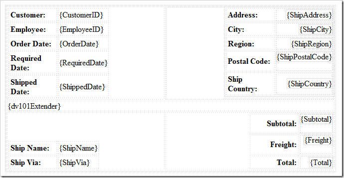
Design view of the Custom HTML Table layout

One key element is {view2Extender}, located in the center of the layout. This placeholder refers to the data view with ID of “view2”, which shows Order Details.

Save the template file, and refresh the web application. Select an order, and you will see the new layout.
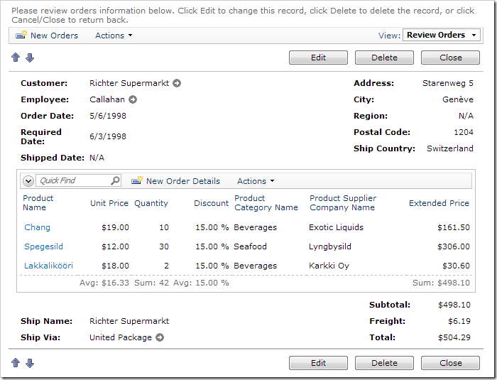
The new layout of Order Form using a Custom HTML Table Layout

The Customer, Employee, and Date fields are presented on the left side. Shipping Information is displayed on the right side.

The grid of order details is automatically inserted in the next row of the template.

Ship Name and Ship Via are displayed in the bottom left.

Subtotal, Freight, and Total are in the bottom right, underneath the Extended Price row of Order Details.

If you edit the record, you can see that the fields are using the lengths specified previously. If you use the up and down arrows to move through Orders, you can see the order record and order details change.
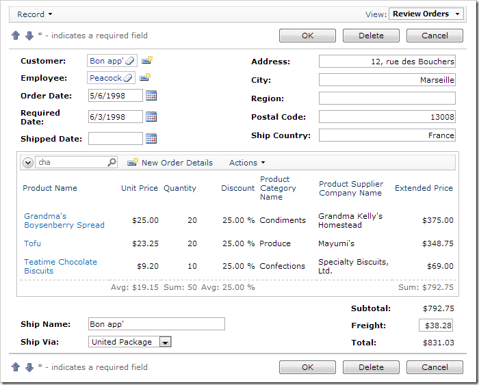
New Custom HTML Table layout of Order Form in edit mode

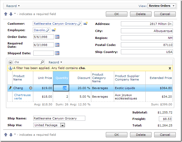
If you have a lot of Order Detail records, you can sort and filter using the columns. You can also search for specific products with Quick Find. For more complex searches, you can use the advanced search bar. The Sum aggregate in the bottom Extended Price column shows a sum of the filtered rows, while Subtotal will be calculated for all rows that belong to the Order regardless of the filter.
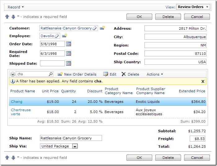
New Custom HTML Table layout of Order Form with a filter applied to the Order Details

Users can activate the Data Sheet view mode to quickly enter line items using the keyboard.
Order Form with Order Details in Data Sheet View