Tutorials

Labels
AJAX(112) App Studio(7) Apple(1) Application Builder(245) Application Factory(207) ASP.NET(95) ASP.NET 3.5(45) ASP.NET Code Generator(72) ASP.NET Membership(28) Azure(18) Barcode(2) Barcodes(3) BLOB(18) Business Rules(1) Business Rules/Logic(140) BYOD(13) Caching(2) Calendar(5) Charts(29) Cloud(14) Cloud On Time(2) Cloud On Time for Windows 7(2) Code Generator(54) Collaboration(11) command line(1) Conflict Detection(1) Content Management System(12) COT Tools for Excel(26) CRUD(1) Custom Actions(1) Data Aquarium Framework(122) Data Sheet(9) Data Sources(22) Database Lookups(50) Deployment(22) Designer(177) Device(1) DotNetNuke(12) EASE(20) Email(6) Features(101) Firebird(1) Form Builder(14) Globalization and Localization(6) How To(1) Hypermedia(2) Inline Editing(1) Installation(5) JavaScript(20) Kiosk(1) Low Code(3) Mac(1) Many-To-Many(4) Maps(6) Master/Detail(36) Microservices(4) Mobile(63) Mode Builder(3) Model Builder(3) MySQL(10) Native Apps(5) News(18) OAuth(9) OAuth Scopes(1) OAuth2(13) Offline(20) Offline Apps(4) Offline Sync(5) Oracle(11) PKCE(2) Postgre SQL(1) PostgreSQL(2) PWA(2) QR codes(2) Rapid Application Development(5) Reading Pane(2) Release Notes(183) Reports(48) REST(29) RESTful(29) RESTful Workshop(15) RFID tags(1) SaaS(7) Security(81) SharePoint(12) SPA(6) SQL Anywhere(3) SQL Server(26) SSO(1) Stored Procedure(4) Teamwork(15) Tips and Tricks(87) Tools for Excel(2) Touch UI(93) Transactions(5) Tutorials(183) Universal Windows Platform(3) User Interface(338) Video Tutorial(37) Web 2.0(100) Web App Generator(101) Web Application Generator(607) Web Form Builder(40) Web.Config(9) Workflow(28)
Archive
Blog
Tutorials
Sunday, March 8, 2015PrintSubscribe
Grouping Date Values in Charts

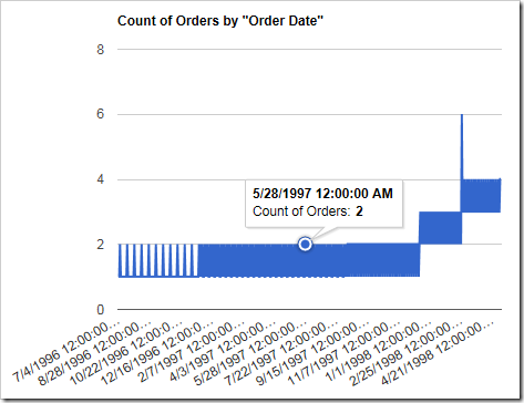
When using a date as a row in a chart, it is necessary to form groups for each date value. Otherwise, a row will be created for each date. This excess of rows will render the chart useless:

Data Field Tag
OrderDate pivot1-row1-line

A line chart with too many date values as rows.

The data behind the chart looks like the following:
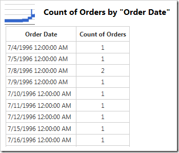
The data for a chart with too many date rows.

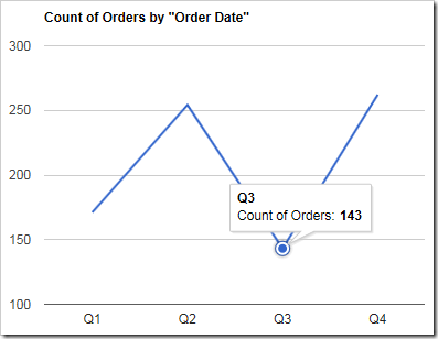
Instead of listing each date as a unique value, the dates should be placed into buckets in order to provide a clearer view of the data. For example, let’s group the dates by quarter. Add the “quarter” keyword to calculate the quarter of each date.

Data Field Tag
OrderDate pivot1-row1-line-quarter

The chart is now easier to read.

A line chart showing count of orders by quarter.

The data for the chart looks as follows:
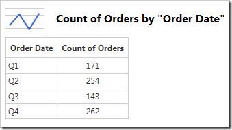
Line chart showing orders by quarter.

However, notice that we have lost information about the year. To solve this problem, we need to group the dates by year first, and then by quarter.

Data Field Tag
OrderDate pivot1-row1-line-year pivot1-row2-quarter

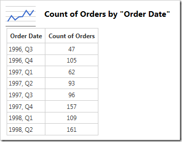
The chart now displays quarters per year.
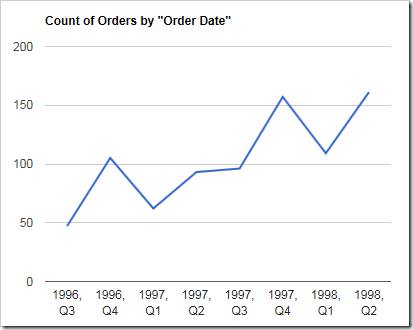
Line chart showing orders over quarters by year.

The data is shown here:

Data for chart showing orders grouped by year and quarter.

However, what happens when the data is filtered to produce a different subset of data? The chart may become useless again.
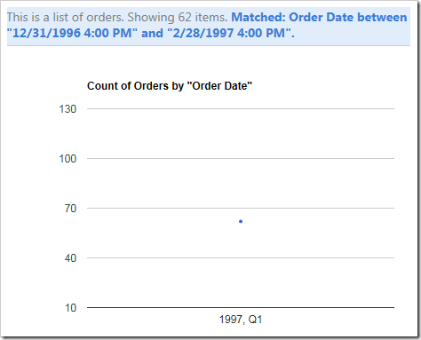
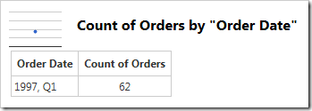
The filter has caused the chart to display only a single point.

The single row is displayed below.

Only a single row is displayed in the data.

In order to solve this problem, an automatic grouping function can be used. By specifying a group of “date”, the server will make several attempts with various groups. The chart with a number of rows closest to 25 will be selected and displayed to the user.

Data Field Tag
OrderDate pivot1-row1-line-date

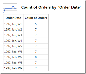
The function has decided to use year/month/week as the most optimal solution for the currently applied filter.
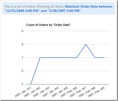
The auto date grouping decided to use year/month/week.

The data can be seen below.

The data for the chart.

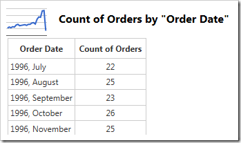
When the filter is cleared and all data from the Orders table is displayed, the group mode will try to maintain the number of rows. The function has elected on using year/month.
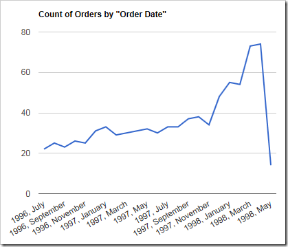
All data is visible in the chart.

The new data can be seen here:

All data is visible in the table.

A full list of available groups is displayed below.

Keyword Description Example Value
date An automatic function that will attempt several combinations of groups and select the result that has a number of rows closest to 25.  
timeofday Takes the hours, minutes, and second of the date. 12:30:45
minute Takes the minute from the date. 30
halfhour All dates with minutes less than 30 will be grouped into the hour group. All dates above 30 will be grouped into the half-hour group. 1:30
hour The hour will be used as the value. 1:00
day Uses the day of the month. 31
dayofweek Uses the day of the week. The value will be formatted according to the current culture. Saturday
dayofyear The day of the year. 156
weekofmonth The week of the month. The value is derived from the first letter of the word “Week” in the current culture’s language, plus the number. W3
week The week of the year. W16
month The month of the year. The values will be formatted according to the current culture. January
quarter The quarter in the year. The value is derived from the first letter of the word “Quarter” in the current culture’s language, plus the number. Q1
year The year. 2015
Sunday, March 8, 2015PrintSubscribe
Line Chart Type

The “line” chart type shows a line that plots a value as it changes over the horizontal axis. A typical use case might be plotting a value over time.

To use “line” chart type, add the keyword “line” to any “pivot-” tag, and make sure that it is separated with hyphens (-).

Data Field Tag
OrderDate pivot1-row1-date-line

The chart is using the “date” keyword, which directs the server to attempt several combinations of date groupings. The best fit group is selected and displayed to the user. An equivalent tag combination on OrderDate data field would be “pivot1-row1-year-line pivot1-row2-month”.

Simple line chart using count of orders by order date.

The data for the chart can be seen here.

Data for a simple line chart using count of orders by order date.

Clicking or hovering over a data point will reveal the value.

Clicking on a data point in the line will reveal the value.

When multiple columns or values are specified, more than one line will be drawn with a different color. It is clear that Davolio’s performance in Q1 of 1997 had declined.

Data Field Tag
OrderDate pivot1-row1-year-line pivot1-row2-quarter
EmployeeID pivot1-col1

Multiple values or columns will render as different colored lines in a line chart.

The data displays the multiple columns of data below.

The multiple columns are visible in the data .

By default, lines will be drawn straight. The lines can be curved by specifying the keyword “curve”.

Data Field Tag
OrderDate pivot1-row1-year-line pivot1-row2-quarter pivot1-curve
EmployeeID pivot1-col1

A line chart with "curve" enabled.

The line chart can also be drawn vertically. Specify “vertical” for the orientation property and the chart axes will be flipped.

Data Field Tag
OrderDate pivot1-row1-year-line pivot1-row2-quarter pivot1-orientation:"vertical"
EmployeeID pivot1-col1

A line chart that is drawn vertically.

One can enable zooming and panning on the chart by specifying the “explorer” keyword.

Data Field Tag
OrderDate pivot1-row1-year-line pivot1-row2-quarter pivot1-explorer
EmployeeID pivot1-col1

Using the scroll wheel will change the scale of the vertical axis.

The chart has a very small scale.

The chart has been zoomed in.

Clicking and dragging will pan the chart.

The chart has been panned.

Right-clicking on the chart area will reset the chart. Note that the “explorer” functionality may cause interference with the user scrolling through the page – use only when necessary.

Saturday, March 7, 2015PrintSubscribe
Pie Chart Type

The “pie” chart type is rendered as a circle. Each data point is displayed as a slice out of the circle. This chart type is useful to show the size of values relative to one another. One example may be the number of orders made by each employee – the largest slice of the pie is taken by the employee who made the most orders.

To use “column” chart type, add the keyword “column” to any “pivot-” tag, and make sure that it is separated with hyphens (-).

Data Field Tag
EmployeeID pivot1-row1-pie

A pie chart showing the relative size of orders made by each employee.

The data for the chart can be seen below.

The data showing count of orders by employee.

If the slice is large enough, the percentage value is displayed. Hovering over or clicking on a slice will reveal the data.

The tooltip displaying the value is rendered when hovering over or clicking on a slice of the pie.

If there are too many slices, the chart may become unreadable to the users. Use “topX”, sort the row values, and enable “Other” row to ensure that only the largest X number of slices are displayed, and the rest are collapsed.

Data Field Tag
EmployeeID pivot1-row1-pie-top5-other-sortbyvalue

The pie chart shows top 5 sorted values, with the rest being grouped under "Other".

The sorted top five rows and “Other” row can be seen in the data below.

The data for the pie chart that shows top 5 values, with the rest grouped under "Other" row.

The pie can also be rendered as a 3D pie by using the “pie3d” chart type instead.

Data Field Tag
EmployeeID pivot1-row1-pie3d

The pie chart has been rendered as a 3d pie.

The chart can also be rendered with a hole in the center by specifying the “donut” chart type.

Data Field Tag
EmployeeID pivot1-row1-donut

The pie chart has been rendered as a donut with a hole in the middle.

Continue to Geo Chart Type