Touch UI

Labels
AJAX(112) App Studio(7) Apple(1) Application Builder(245) Application Factory(207) ASP.NET(95) ASP.NET 3.5(45) ASP.NET Code Generator(72) ASP.NET Membership(28) Azure(18) Barcode(2) Barcodes(3) BLOB(18) Business Rules(1) Business Rules/Logic(140) BYOD(13) Caching(2) Calendar(5) Charts(29) Cloud(14) Cloud On Time(2) Cloud On Time for Windows 7(2) Code Generator(54) Collaboration(11) command line(1) Conflict Detection(1) Content Management System(12) COT Tools for Excel(26) CRUD(1) Custom Actions(1) Data Aquarium Framework(122) Data Sheet(9) Data Sources(22) Database Lookups(50) Deployment(22) Designer(177) Device(1) DotNetNuke(12) EASE(20) Email(6) Features(101) Firebird(1) Form Builder(14) Globalization and Localization(6) How To(1) Hypermedia(2) Inline Editing(1) Installation(5) JavaScript(20) Kiosk(1) Low Code(3) Mac(1) Many-To-Many(4) Maps(6) Master/Detail(36) Microservices(4) Mobile(63) Mode Builder(3) Model Builder(3) MySQL(10) Native Apps(5) News(18) OAuth(9) OAuth Scopes(1) OAuth2(13) Offline(20) Offline Apps(4) Offline Sync(5) Oracle(11) PKCE(2) Postgre SQL(1) PostgreSQL(2) PWA(2) QR codes(2) Rapid Application Development(5) Reading Pane(2) Release Notes(183) Reports(48) REST(29) RESTful(29) RESTful Workshop(15) RFID tags(1) SaaS(7) Security(81) SharePoint(12) SPA(6) SQL Anywhere(3) SQL Server(26) SSO(1) Stored Procedure(4) Teamwork(15) Tips and Tricks(87) Tools for Excel(2) Touch UI(93) Transactions(5) Tutorials(183) Universal Windows Platform(3) User Interface(338) Video Tutorial(37) Web 2.0(100) Web App Generator(101) Web Application Generator(607) Web Form Builder(40) Web.Config(9) Workflow(28)
Archive
Blog
Touch UI
Sunday, July 13, 2014PrintSubscribe
Changing the Transition in Touch UI

By default, Touch UI will use “Slide” transition when moving between pages. This transition will slide the new page from the right while the old page will slide out to the left. An example can be seen below.

Slide transition on an iPhone using Code On Time's Touch UI.

The default transition can be changed by the user through the Settings panel.

In the top-right corner of the page, click on the context menu button.

Clicking on the context menu button.

Then, click on the Settings button.

Clicking on the settings button in context panel.

Click on the Transitions butt0n to see a list of available transitions.

Changing the default Transition of the Code On Time web app.

Select a new transition.

Selecting the "Turn" transition.

Close the panel, and click on a record to see your new transition.

Turn transition on an iPhone using Code On Time's Touch UI.

Friday, June 13, 2014PrintSubscribe
Complex Page Layouts on Mobile and Desktop Devices

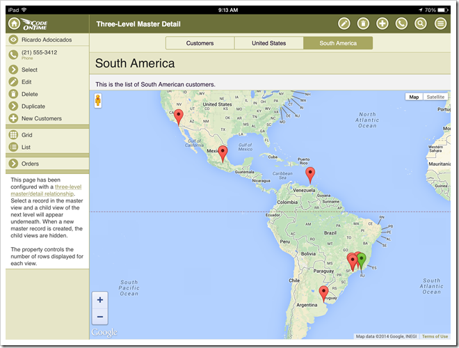
The next release of Code On Time will include extended support for tabbed page layouts in apps with Touch UI.

If a data controller exposes multiple views of data, then each view will have a dedicated tab at the top of a page.
IMG_0066.PNG (2)

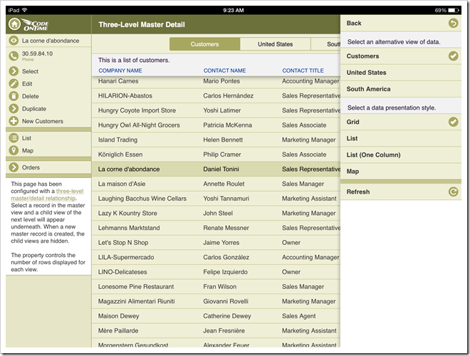
The view selector is also available in the context menu of the view.
IMG_0069.PNG (2)

The data presentation style options are available on the sidebar and in the context menu. The current options include List, Grid, and Map. Data Sheet, Chart and Calendar will become available soon.

The future releases will allow creating user-defined views of data with a dedicated style (List, Grid, Map, etc.), visible columns, sort expression,  and filters. Custom views will also be accessible via tab bar alongside the application defined views.

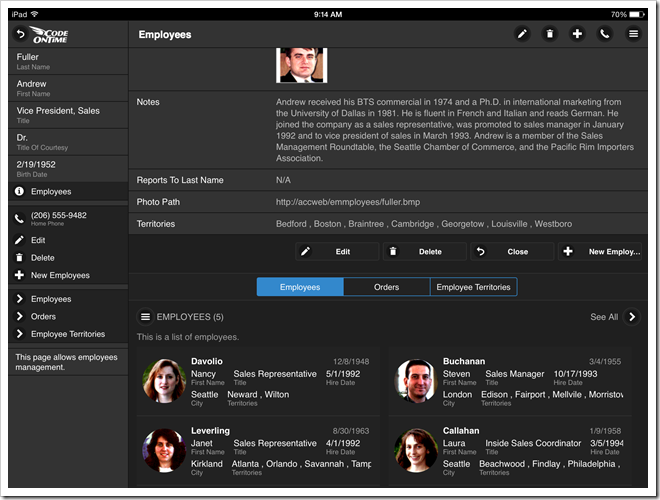
Master-detail pages will display child data views below the form views. If tab activators are specified, then a tab strip is also rendered to provide quick access to a subset of data starting with the first data row. View-specific “menu” button provides access to context menu options. Button “See All” allows working with an entire set of records.
IMG_0067.PNG (2)

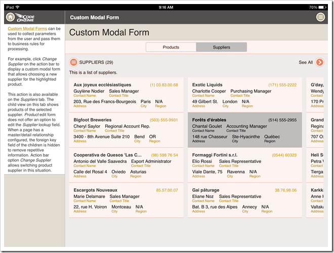
If multiple tabbed master data views are defined on a page, then a dedicated tab-strip is rendered.
IMG_0068

Touch UI works exactly in the same way on both mobile and desktop devices.

Here is a complex layout of a page with multiple master data views.
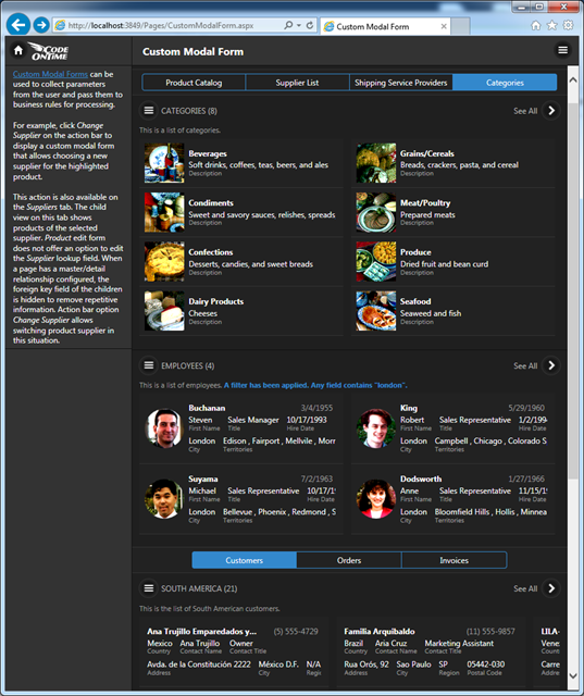
image

The release is expected to go out in June of 2014.

Wednesday, May 7, 2014PrintSubscribe
Display Density in Touch UI Apps

A size of user interface elements is an important consideration for any application. Touch UI provides a user-configurable setting Display Density that allows changing the density of text to satisfy personal preferences.

Application automatically selects Comfortable display density on mobile devices to provide a touch-friendly user interface.

Display density is set to Compact on desktop devices that do not have a touch-enabled screens.

Choose option Menu / Settings / Display Density / Compact to change the display density to Compact.

The screen shots show Comfortable and Compact lists of products side-by-side on iPhone 5.

A list of products displayed in 'Comfortable' density in an app with Touch UI on iPhone 5. A list of products displayed in 'Compact' density in an app with Touch UI on iPhone 5.

These screen shots compare Comfortable and Condensed lists of products.

A list of products displayed in 'Comfortable' density in an app with Touch UI on iPhone 5. A list of products displayed in 'Condensed' density in an app with Touch UI on iPhone 5.

This is a screen shot of the same product list on Surface 2 displayed with Compact density.

A list of products displayed on Surface 2 tablet in 'Compact' density in an app with Touch UI.

Condensed display density works best on desktop computers. Mouse pointer makes it easier to hit smaller user interface elements.  This display density must be explicitly selected by a user.

Next screen shot shows a “condensed” list of products on a desktop computer displayed in IE 11 on Windows 7.

A list of products displayed with 'Condensed' density on a desktop computer in IE11.

This is a “condensed’' rendering of products shown in “Grid” style in IE 11 on Windows 7.

A list of products displayed with 'Condensed' density and 'Grid' style on a desktop computer in IE11.