Tips and Tricks

Labels
AJAX(112) App Studio(8) Apple(1) Application Builder(245) Application Factory(207) ASP.NET(95) ASP.NET 3.5(45) ASP.NET Code Generator(72) ASP.NET Membership(28) Azure(18) Barcode(2) Barcodes(3) BLOB(18) Business Rules(1) Business Rules/Logic(140) BYOD(13) Caching(2) Calendar(5) Charts(29) Cloud(14) Cloud On Time(2) Cloud On Time for Windows 7(2) Code Generator(54) Collaboration(11) command line(1) Conflict Detection(1) Content Management System(12) COT Tools for Excel(26) CRUD(1) Custom Actions(1) Data Aquarium Framework(122) Data Sheet(9) Data Sources(22) Database Lookups(50) Deployment(22) Designer(177) Device(1) DotNetNuke(12) EASE(20) Email(6) Features(101) Firebird(1) Form Builder(14) Globalization and Localization(6) How To(1) Hypermedia(2) Inline Editing(1) Installation(5) JavaScript(20) Kiosk(1) Low Code(3) Mac(1) Many-To-Many(4) Maps(6) Master/Detail(36) Microservices(4) Mobile(63) Mode Builder(3) Model Builder(3) MySQL(10) Native Apps(5) News(18) OAuth(9) OAuth Scopes(1) OAuth2(13) Offline(20) Offline Apps(4) Offline Sync(5) Oracle(11) PKCE(2) Postgre SQL(1) PostgreSQL(2) PWA(2) QR codes(2) Rapid Application Development(5) Reading Pane(2) Release Notes(184) Reports(48) REST(29) RESTful(29) RESTful Workshop(15) RFID tags(1) SaaS(7) Security(81) SharePoint(12) SPA(6) SQL Anywhere(3) SQL Server(26) SSO(1) Stored Procedure(4) Teamwork(15) Tips and Tricks(87) Tools for Excel(2) Touch UI(93) Transactions(5) Tutorials(183) Universal Windows Platform(3) User Interface(338) Video Tutorial(37) Web 2.0(100) Web App Generator(101) Web Application Generator(607) Web Form Builder(40) Web.Config(9) Workflow(28)
Archive
Blog
Tips and Tricks
Thursday, January 30, 2014PrintSubscribe
User Guide for Mobile Lists

List is a common presentation style of data on mobile devices. Limited screen size calls for a stacked enumeration of data fields. Some fields may be provided with descriptive labels.

A list view in a mobile app created with Code On Time mobile app generator.

Applications produced with Code On Time have a responsive user interface design. Predefined and dynamic breakpoints will ensure that a list displays more fields with optional labels on a larger screen whenever possible. A simple change of a mobile device orientation will reveal additional information in list items.

 A list view on a mobile device with landscape orientation reveals addtional item details in a an app created with Code On Time mobile app generator.

Scrolling Items

User can scroll down to see items that are not visible on screen. Only a limited set of available data items is included in the initial rendering of a list. A special item labeled “Loading…” will become visible for a brief moment upon reaching the bottom of a list. Application detects that a user has reached the last visible list item and loads additional set of items from the server if they exist.

A list of items is about to be extened at the bottom in a mobile app created with Code On Time mobile app generator.   Additonal items were automatically loaded in a list after reaching the bottom of the initial data set in a mobile app created with Code On Time mobile app generator.

If a data item is edited or inserted by a user, then the application will retrieve a set of items containing the change.  That item will be displayed with an alternative background to indicated that it has been selected.

It is possible that the set of items with the selection is located somewhere in the middle of the entire data set. Scrolling up will reveal “Loading…” item at the top of the list in this case. Additional  items will become available shortly after an automatic interaction with the server.

A list is about to retreive additional items at the top in the mobile app created with Code On Time mobile app generator.   A list after additional items were loaded at the top in the app created with Code On Time mobile app generator.

Selecting an Item

There are two main methods of selecting an item in a list. The user can either tap an item or tap and hold an item for brief period of time. A tap on an item will cause an-application defined action to execute. Typically another view of data is displayed in response.

A tap on a list item will activate an application-defined action in a mobile-app created with Code On Time mobile app generator.   A form view of data item is displayed in response to an item tap in a mobile created with Code On Time mobile app generator.

Tapping and holding an item for three quarters of a second will cause an item to be selected but no action will be executed. This will result in item-specific actions to become available in the user interface of the list.

For example, the list without a selection offers “New” and “Search” actions on the  toolbar of a mobile app just before an item is tapped by a user. The tapped item will be illuminated for a moment with a highlighted background.

Actions 'Search' and 'New' are visible on the mobile application toolbar just before an item is tapped in the app created with Code On Time mobile app generator.

Selection of an item with “tap and hold” will cause “Edit”, “Delete”, and “Search” actions to show up. The selected item will have an alternative background.

Actions 'Edit', 'Delete', and 'Search' are available on application toolbar of a mobile app created with Code On Time mobile app generator.

Additional actions and presentation options can be accessed from the context menu of a list. The context menu will slide out after a user taps on the “Context Menu” button on the application toolbar.

Context menu is always available on the application toolbar of a mobile app created with Code On Time mobile app generator.   Context menu slides out in response to a tap on the 'Context Menu' button on the application toolbar of a mobile app created with Code On Time mobile app generator.

View Configuration

The first item in the context menu shows the name of the view and the total number of items available. Tap this item to display the view configuration options.

'View Configuration' menu option displays the name of the current view and number of items in a list displayed by a mobile app created with Code On Time mobile application generator.

A list may have a few application-defined alternative views of data with custom fields, sort order, and filter. Tap an alternative view of data to have it activated.

The list of available view configuration options in a mobile app created with Code On Time mobile application generator.   Alternative view option selected in the view configuration menu of a mobile app created with Code On Time mobile application generator.

The list will display the selected view of data.

An alternative view of customer list displayed in a mobile application created with Code On Time mobile/desktop app generator.

Presentation styles “List” and “Cards” are available in the view configuration of any list. The default presentation style of a list is “Cards”. This presentation style allows a list to be displayed in multiple columns if the screen size of a mobile device makes it possible.

The default presentation style 'Cards' displays three columns of items in a list of a mobile app when displayed in iPad Air. The application has been created with Code On Time mobile app generator.

Presentation style “List” will force the list to be displayed in a single column regardless of the screen resolution. This will result in more details to be visible in each item of a list on a larger screen.

Presentation style 'List' will force a list to display a single column of items regardless of the screen resolution of a mobile device. This presentation style is shown in a list of a mobile app created with Code On Time mobile app generator.

Note that additional presentation styles of data such as “Grid”, “Chart”, “Map”, and “Calendar” may be visible in the view configuration options as defined by application.

The selection of alternative view or presentation style will be “memorized” on the mobile device and remain specific to the user identity and list instance on the application page.

User can refresh the list items by choosing “Refresh” option in the view configuration menu. Any changes to the list data by other users will become visible on the mobile device.

'Refresh' option selected in the configuration menu of a list in a mobile app created with Code On Time mobile app generator.

Adding an Item

If a user swipes to the end of a list, then an additional item that allows executing “New” action is displayed at the bottom. This action is application-defined and may not be accessible to all users.

User can tap on the item to start entering a new data record.

An option to create a new item is displayed at the bottom of a list in a mobile app created with Code On Time mobile application generator.   User can start entering a new item by tapping on the option at the bottom of a list in a mobile app created with Code On Time mobile/desktop app generator.

Empty Lists

An empty list may be displayed to a user if the database table is empty or if the current list filter has produced no matches. Action shortcut “Refresh” and optional shortcut “New” will be displayed in the list.

Options to refresh a list and to create a new item are displayed in an empty list of a mobile app created with Code On Time mobile app generator.

List Heading

A list may display a heading item with a brief description of the list contents. If a list is scrolled down, then the heading will “stick” to the toolbar.

An optional list description is displayed before the first list item in a mobile app created with Code On Time mobile app generator.   A list description with a fixed position at the top of the toolbar is displayed when a list is scrolled in a mobile app created with Code On Time mobile app generator.

User can tap on the heading to dismiss it.

Thursday, June 13, 2013PrintSubscribe
Customizing the Header

The page header is displayed at the top of every page in a web application. By default, the application namespace is displayed in the header, along with the standard theme logo.
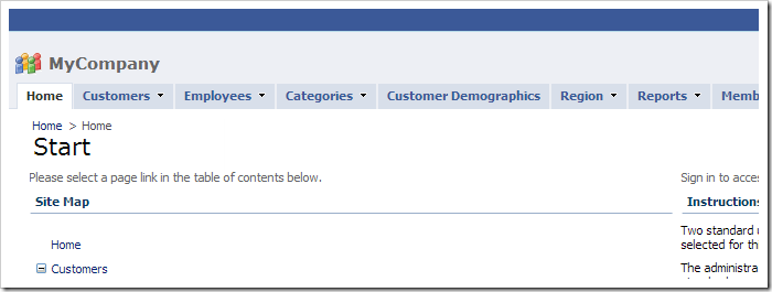
Default page header and logo in a Code On Time web app.

Let’s customize the header.

Changing Header Text and Icon

Start the web app generator. Click on the project name, select settings, and press Features. In the Page Header text box, paste the following:

Property Value
Page Header
<span style="color:darkred;">Code On Time</span>

Press Finish and continue to regenerate the web app. When complete, click on the project name and press Develop to open the project in Visual Studio.

In the Solution Explorer, drop your logo image into ~\App_Themes\MyCompany folder.
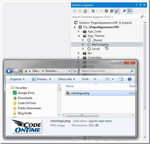
Dropping the logo file into MyCompany theme folder.

Next, right-click on ~\App_Themes\MyCompany and press Add | Style Sheet. Leave the default name and press OK to create the file “StyleSheet.css”.
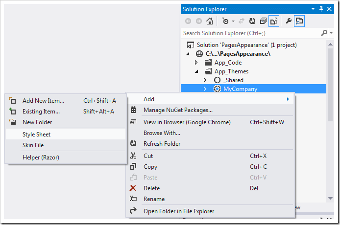
Adding a style sheet to the MyCompany theme folder.

Replace the contents with the following:

div#PageHeaderBar {
    background-image: url(colorlogo.png);
    height:42px;
    padding-top:30px;
}
    div#PageHeaderBar span {
        margin-left: 110px;
        font-size:32px;
    }
Save the file, and refresh the browser window. The new logo and header will be visible.
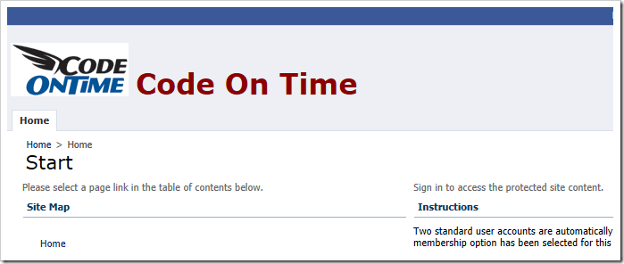
Code On Time web app with customized header text and logo.

Placing a Custom User Control in the Header

Sometimes it may be necessary to place dynamic content in the header area. Let’s create custom user control that will be displayed in the header on the Customers page.

Start the Project Designer. In the Project Explorer, right-click on Customers page node and press New Container.
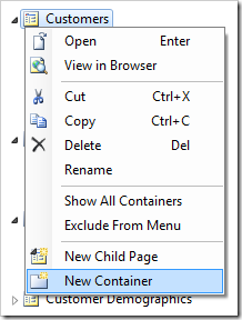
Adding a new container to the Customers page.

Press OK to save the container with default settings. In the Project Explorer, right-click on Customers / c101 container and press Rename.
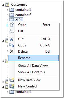
Renaming the new container.

Change the container name to “page”, and press Enter key to save.

User controls in the container “page” will be placed in special placeholders on the page when the app is generated. The name of the control instance determines the placeholder.

Right-click on Customers / page, and press New Control.
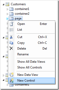
Adding a new control to the 'page' container.

Next to the User Control lookup on the form, click the New User Control icon.

Creating a new user control.

Assign a name to the new user control.

Property Value
Name CustomerHeader

Press OK to create the new user control. Press OK to save the properties of the control instance and have it added to the Customers / page container.

Right-click on Customers / page / control1 – CustomerHeader and press Rename.
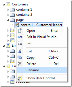
Renaming the new control in the 'page' container.

Change the name to “header” and press Enter key to apply the change.

On the toolbar, press Browse. When generation is complete, navigate to the Customers page. The page will look like the picture below if there are no style sheet rules affecting the header area.
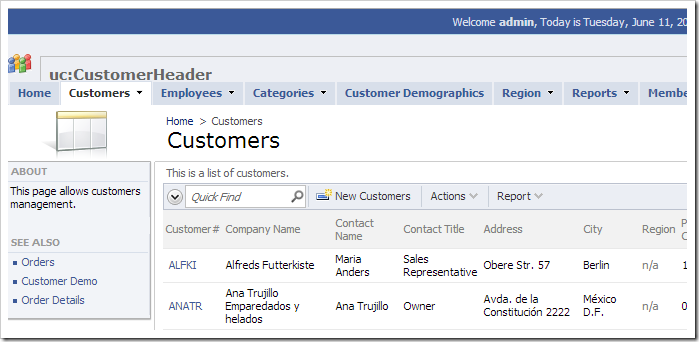
Unchanged custom user control replacing the default header text.

Dynamically Updating the Page Header

Let’s change the custom user control to make it display the primary key value from the selected data row of the Customers master data view.

Right-click on Customers / page / header – CustomerHeader and press Edit in Visual Studio.
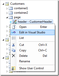
Editing the control in Visual Studio.

Replace the existing code base after the <%@ Control %> element with the following:

<asp:UpdatePanel ID="UpdatePanel1" runat="server">
    <ContentTemplate>
        <asp:Button ID="Button1" runat="server" style="margin-left:120px;"
            Text="Get Customer Info" OnClick="Button1_Click" />
        <asp:Label ID="Label1" runat="server" Text="Label"></asp:Label>
    </ContentTemplate>
</asp:UpdatePanel>

Right-click anywhere in the file, and press View Code. Add the following method:

C#:

protected void Button1_Click(object sender, EventArgs e)
{
    Control dataViewExtender = Parent.NamingContainer
        .FindControl("PageContentPlaceHolder").FindControl("view1Extender");
    Label1.Text = ((MyCompany.Web.DataViewExtender)dataViewExtender).SelectedValue;
}

Visual Basic:

Protected Sub Button1_Click(ByVal sender As Object, ByVal e As EventArgs)
    Dim dataViewExtender As Control = Parent.NamingContainer.
        FindControl("PageContentPlaceholder").FindControl("view1Extender")
    Label1.Text = CType(dataViewExtender, MyCompany.Web.DataViewExtender).SelectedValue
End Sub

Save the file. The event handler will respond to a click on the button “Button1”. First, it will find the instance of “view1Extender”. Next, the selected value will be copied to the label “Label1”.

Switch back to the browser. Navigate to the Customers page, and notice that the header text has been replaced with a button and a label.
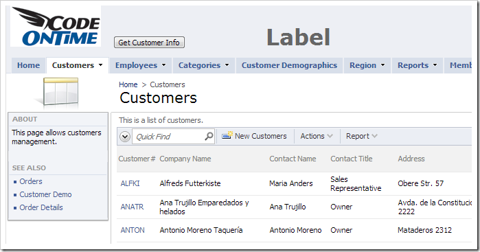
Customized user control replacing the header element.

Select a customer, and press Get Customer Info button. The label will be updated with the selected Customer ID.
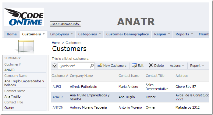
The header label is dynamically updated with the selected CustomerID.

Wednesday, April 3, 2013PrintSubscribe
Data View Refresh

Data views are only automatically refreshed by the client library when data is inserted, updated, or deleted. The user can force a refresh using the Refresh icon in the bottom right corner of every data view. In addition, the Refresh Interval property can be configured to refresh the data view based on a timer.

image

Certain situations require a refresh based on different conditions. For example, suppose that there are multiple tabs displaying similar data.

Multiple tabs displaying different lists of Orders.

The user may change the value of a record in one of the views.

Order date of an order is changed.

However, when the user switches to another view showing the same record, the old value will be displayed.

The order date is not updated for the same record in a different tab.

Let’s add a custom user control that will contain some custom JavaScript. This code will refresh the data view when the tab is changed in order to ensure that the data visible to the user is always fresh.

Creating Views

Start the Project Designer. In the Project Explorer, switch to the Controllers tab. Right-click on Orders / Views / grid1, and press Copy. Right-click on Orders / Views node, and press Paste to duplicate the view.

Copying view 'grid1' of Orders controller.     image

Do this one more time to create three grid views. Double-click on Orders / Views / v100.

Copied view 'v100' of Orders controller.

Make the following changes:

Property New Value
Id OrdersToShip
Label Orders To Ship
Filter Expression
OrderDate is null

Press OK to save. Double-click on Orders / Views / v101.

Copied view 'v101' of Orders controller.

Make the following changes:

Property New Value
Id HighFreight
Label High Freight
Filter Expression
Freight > 30

Press OK to save.

Setting Up the Page

Switch to the Pages tab. On the toolbar, press the New Page icon.

Adding a page to the project.

Assign a name to the page:

Property New Value
Name Filtered Orders

Press OK to save. Drop the new Filtered Orders page node to the right of Home page node.

Dropping 'Filtered Orders' page node on the right side of 'Home' page node.     Page 'Filtered Orders' is now second in the menu.

Right-click on Filtered Orders page, and press New Container.

Adding a container to a page.

Keep the defaults and press OK to save. Right-click on the new container and press New Data View.

Adding a data view to container 'c101'.

Assign the following values:

Property Value
Controller Orders
View grid1
Tag Orders
Activator Tab
Text Orders

Press OK to save. Create another data view with the following properties:

Property Value
Controller Orders
View OrdersToShip
Tag Orders To Ship
Activator Tab
Text Orders To Ship

Create one more data view.

Property Value
Controller Orders
View HighFreight
Tag High Freight
Activator Tab
Text High Freight

Save the data view.

Adding User Control

Right-click on Filtered Orders / c101 container node, and press New Control.

Adding a new control to container 'c101'.

Next to the User Control property, click on the New User Control icon.

Creating a new user control.

Assign a name:

Property Value
Name RefreshDataView

Press OK to save the user control and insert it into the property. Press OK again to save the control.

On the toolbar, press Browse to generate the web application and user control. When complete, right-click on Filtered Orders / c101 / control1 – RefreshDataView node, and press Edit in Visual Studio.

Edit the user control in Visual Studio via the context menu option in the Project Explorer.

The custom user control file will open in Visual Studio. Replace the content after the <%@ Control %> element with the following:

<script type="text/javascript">
    Sys.Application.add_load(function () {
        $('div.TabBar td.Item').click(function () {
            var linkText = $(this).find('a').text();
            var tag = linkText;
            var dataView = Web.DataView.find(tag, 'Tag');
            if (dataView) {
                if (dataView._isBusy == false && dataView.get_isDisplayed())
                    dataView.refresh();

            }
        });
    })
</script>

Viewing the Results

Save the file, and switch to the web app open in your browser window. Navigate to the Filtered Orders page. The page will have three tabs displaying different filtered lists of orders. Note the Order Date of the first record.

Three tabs displaying different lists of orders.

Switch to the High Freight tab. Edit the first record, and change the Order Date.

Changing the Order Date of an order.

Save the change, and switch back to the first tab. Note that the data view refreshes and the updated data is displayed.

The data view has been refreshed - the record is showing the latest changes.