Mobile

Labels
AJAX(112) App Studio(7) Apple(1) Application Builder(245) Application Factory(207) ASP.NET(95) ASP.NET 3.5(45) ASP.NET Code Generator(72) ASP.NET Membership(28) Azure(18) Barcode(2) Barcodes(3) BLOB(18) Business Rules(1) Business Rules/Logic(140) BYOD(13) Caching(2) Calendar(5) Charts(29) Cloud(14) Cloud On Time(2) Cloud On Time for Windows 7(2) Code Generator(54) Collaboration(11) command line(1) Conflict Detection(1) Content Management System(12) COT Tools for Excel(26) CRUD(1) Custom Actions(1) Data Aquarium Framework(122) Data Sheet(9) Data Sources(22) Database Lookups(50) Deployment(22) Designer(177) Device(1) DotNetNuke(12) EASE(20) Email(6) Features(101) Firebird(1) Form Builder(14) Globalization and Localization(6) How To(1) Hypermedia(2) Inline Editing(1) Installation(5) JavaScript(20) Kiosk(1) Low Code(3) Mac(1) Many-To-Many(4) Maps(6) Master/Detail(36) Microservices(4) Mobile(63) Mode Builder(3) Model Builder(3) MySQL(10) Native Apps(5) News(18) OAuth(9) OAuth Scopes(1) OAuth2(13) Offline(20) Offline Apps(4) Offline Sync(5) Oracle(11) PKCE(2) Postgre SQL(1) PostgreSQL(2) PWA(2) QR codes(2) Rapid Application Development(5) Reading Pane(2) Release Notes(183) Reports(48) REST(29) RESTful(29) RESTful Workshop(15) RFID tags(1) SaaS(7) Security(81) SharePoint(12) SPA(6) SQL Anywhere(3) SQL Server(26) SSO(1) Stored Procedure(4) Teamwork(15) Tips and Tricks(87) Tools for Excel(2) Touch UI(93) Transactions(5) Tutorials(183) Universal Windows Platform(3) User Interface(338) Video Tutorial(37) Web 2.0(100) Web App Generator(101) Web Application Generator(607) Web Form Builder(40) Web.Config(9) Workflow(28)
Archive
Blog
Mobile
Wednesday, March 4, 2015PrintSubscribe
Creating Custom Charts

Apps created with Code On Time generator will automatically compose up to nine charts based on the columns present in your tables. If the default charts are insufficient, then the developer may choose to define their own charts for each data view.

Charts are configured using a simple tagging language applied on the data fields of a view. Let’s start configuring charts for the Orders page of the Northwind sample app.

Creating a Chart

Start the Project Designer. In the Project Explorer on the right side of the screen, switch to the Controllers tab and double-click on the Orders / Views / grid1 / CustomerID data field.
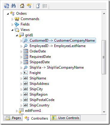
Clicking on the CustomerID data field of the Orders controller.

Change the following property:

Property Value
Tag pivot1-row1-column

The tag does the following: “pivot1” will declare that the data field CustomerID will be used for pivot with ID of “1”. The keyword “row1” declares that the data field will be used to define the first row. Finally, the keyboard “column” declares the chart type.

Press OK to save the data field. On the toolbar, press Browse to regenerate the app and open it in the default browser. When the page comes up, navigate to the Orders page. There will be a single chart of type “column” available.
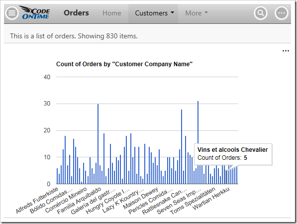
A simple column chart in Orders.

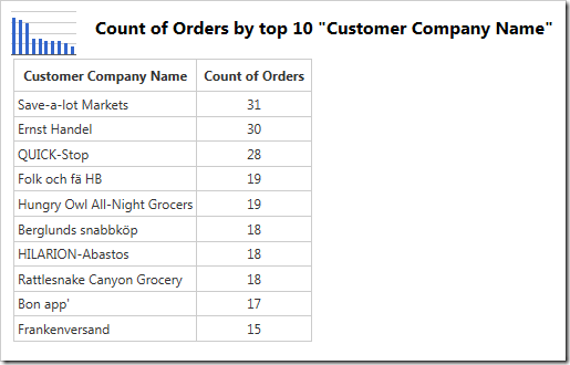
The data behind the chart is shown in the table below:
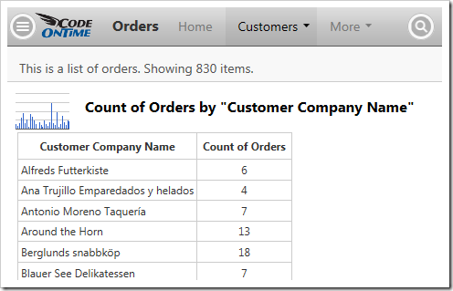
The data behind a simple column chart in Orders.

The first column shows the values of each row (the customer company name). The second column is the actual value used to render the chart. No value field was specified by the developer, so a count of records has been used.

Sorting

Notice that the order of rows is alphabetical. Let’s sort the rows in descending order by the value in the second column. Replace the tag using the method described above with the following:

Data Field Tag
CustomerID pivot1-row1-column-sortdescbyvalue

The image below shows the new chart, with the rows sorted.
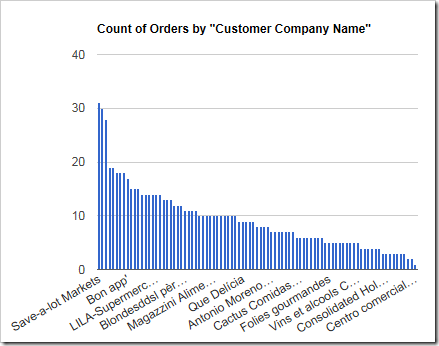
Orders column chart with the columns sorted by value

The data will look like the following:
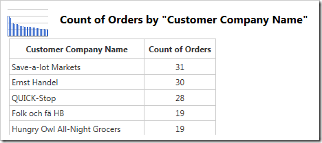
The data has been sorted by value.

This has given us the correct order, but this chart can still be improved. Notice that there are too many columns displayed, making it hard to read. Let’s reduce that number.

Reducing the Result

Replace the tag with the following:

Data Field Tag
CustomerID pivot1-row1-column-sortdescbyvalue-top10

The “topX” keyword will only take the top X number of rows, and will throw away the rest. The new chart can be seen below.
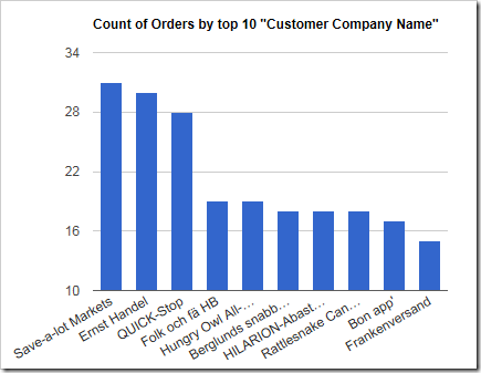
The new chart only shows 10 columns.

The table can be seen below.

Only 10 rows are available in the table.

There are now ten rows of data available, as expected.

It may be possible that the user does not want the rest of the rows to be hidden, but grouped into one last column.

The “Other” Column

Using the “other” keyword in combination with “topX” will only display the top X number of rows. For rows that do not make the cut, their values will be summed up into an “Other” row. Use the following tag:

Data Field Tag
CustomerID pivot1-row1-column-sortdescbyvalue-top10-other

The new chart will display this “Other” column.
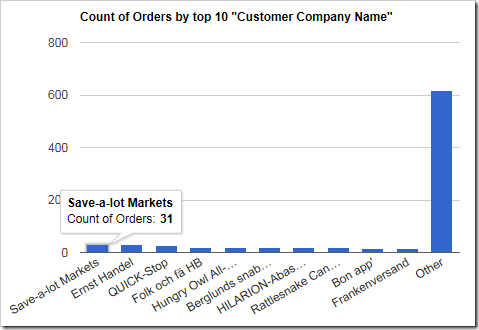
Only the top 10 customers are displayed, and the rest are grouped into an 'Other' column.

The values in this “Other” column will also be present in the chart data.
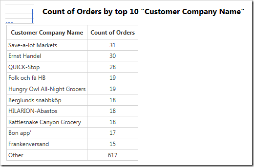
Values for the "Other" column are displayed as the last row in the table.

Defining Titles

Notice that a title has been automatically generated from the chart definition. The title, as well as the horizontal and vertical axis labels, can also be defined.

Replace the tag with the following. Notice that multiple space-separated tags are defined.

Data Field Tag
CustomerID pivot1-row1-column-sortdescbyvalue-top10 pivot1-title:"My Top 10 Customers"   pivot1-haxistitle:"Customers"        pivot1-vaxistitle:"Orders"

The new chart will use the specified titles:
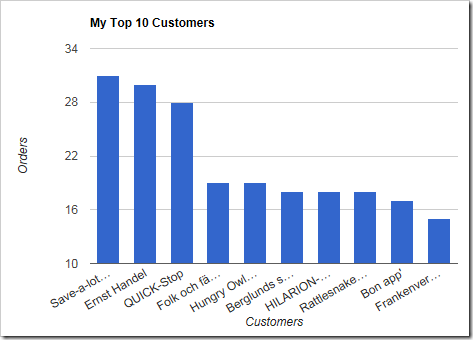
An Orders chart with custom titles.

The new title will be shown above the table as well:
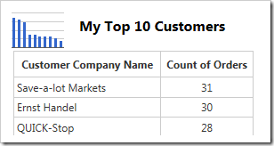
The chart data also shows a custom title.

This chart looks complete. Let’s add another chart that shows how many orders were received over time.

Working With Dates

Orders table in the Northwind database contains the OrderDate field. Let’s show how many orders were received per quarter. Apply the following tags to the relevant data fields:

Data Field Tag
OrderDate pivot2-row1-quarter-line

The “quarter” keyword will group the values by quarters. The “line” keyword is the chart type.
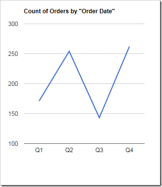
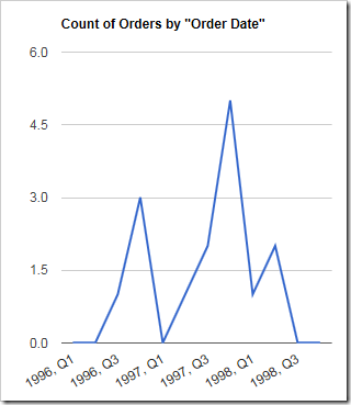
A chart showing the count of orders by quarter.

In this chart, the orders have now been grouped by the quarter. Notice that there are no years – we need to define another group in order to split the orders by year, and then by quarter.
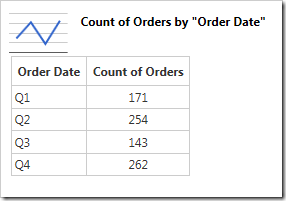
The chart data shows how the orders have been grouped by quarter.

Make the following changes:

Data Field Tag
OrderDate pivot2-row1-year-line pivot2-row2-quarter

This configuration will define a chart that uses the OrderDate field twice – first time to group by year, and then to group by quarter. The results can be seen below.
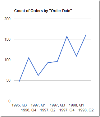
The chart groups orders by year, and then by quarter.

The new chart now shows quarters from each year that Northwind has been in business.
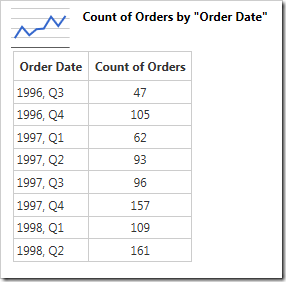
The chart table groups orders by year, and then by quarter.

Revealing Gaps

Suppose that the data has some gaps in the time period. The example below was filtered to customer “Frankenversand”, and it is clear that “1997, Q1” is missing. A missing row is easy to spot in the table, but it would be harder to spot in the chart.
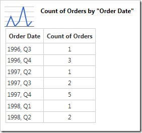
The chart data reveals a missing row - '1997, Q1'.

Use the “all” keyword to ensure that gaps are displayed in the result.

Data Field Tag
OrderDate pivot2-row1-year-line pivot2-row2-quarter-all

Empty data periods are now revealed on the chart.

The chart now presents gaps in the data.
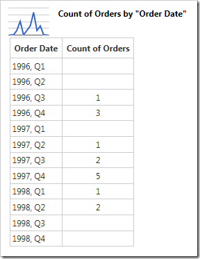
Empty gaps are revealed in the chart data.

This chart looks good with the current data set. What happens when the data takes on a different shape?

Automatic Date Sizing

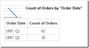
The view has been filtered to only include data for 3 months. The end result is not so useful or attractive when using year/quarter.
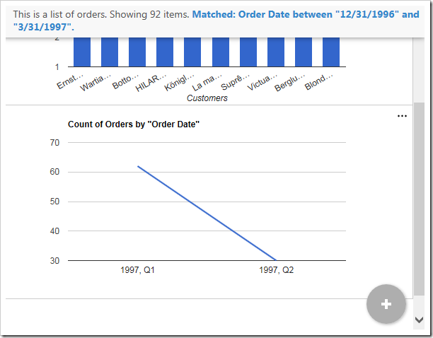
When the data has been filtered to three months, grouping by quarter is not that helpful.

The table is equally unhelpful.

When the data has been filtered to three months, grouping by quarter is not that helpful.

This is where the “date” keyword comes to the rescue. Instead of manually specifying the date groupings, we will command the API to compose several result and use the best fit. Replace the tag with the following:

Data Field Tag
OrderDate pivot2-row1-line-date

It appears that the chart using year/month/week has the most useful presentation according to the algorithm.
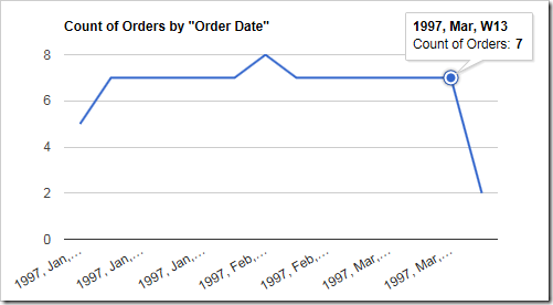
The auto date algorithm has decided to use year/month/week as the best grouping.

The table now reveals more useful information as well.
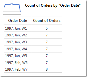
The chart data shows values grouped by week.

Specifying a Column Field

It may be helpful to split apart each data point by introducing a column field. Let’s show the number of orders from the top three customers. Change the tags for pivot2 as follows:

Data Field Tag
CustomerID pivot2-col1-top3-sortdescbyvalue
OrderDate pivot2-row1-columnstacked-date

The chart will now show a breakdown of orders from the top three customers at each date.
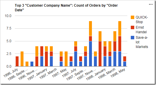
The chart now displays orders broken down by customer over time.

The table will now have multiple columns.
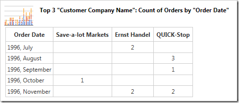
The data shows the orders broken down into columns by customer over time.

Specifying a Value Field

Instead of simply showing a count of orders, let’s use the sum of Freight as the value. To do this, we will need to define the data field Freight as a value field. Specify the tags below. The “sum” keyword determines the type of value. By default, the chart will use “count”.

Data Field Tag
CustomerID pivot2-col1-top3-sortdescbyvalue
OrderDate pivot2-row1-columnstacked-date
Freight pivot2-val1-sum

The chart will now display values according to the sum of Freight field.
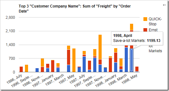
The chart now uses the sum of Freight as the value.

The table will reveal the correct values.
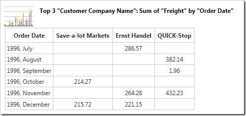
The table shows the use of sum of Freight as the value.

Saturday, January 24, 2015PrintSubscribe
Charts Everywhere

Every IT project involves collection of data. Development teams put a lot of thought into database design, middleware programming, business rules. Analysis of data is always somewhere a few milestones away on the project timeline. Sure the charts can make your app look good, but one needs data to feed the charts. Therefore the data analysis and charts will only become a feature of a project if it survives the initial developments stages.

Users Love Charts

Why do users love charts? The charts can tell the story that the raw data cannot.

For example, a typical list of orders hides a treasure trove of information that can be unlocked if data is pivoted, sorted, counted, and summed.  Consider the collection of charts in the screenshot below.

Charts view style in a Touch UI app created with Code On Time app generator.

These charts are derived from the orders stored in the Northwind database. The master-detail form with order data is shown next.

Master-detail form view in a Touch UI app created with Code On Time app generator.

Data fields Order Date, Employee Last Name, Ship Via Company Name, and Ship Country can truly illuminate the business processes within the Northwind mail order company.

For example, we can answer the following questions:

  • Which countries are the main contributors to the sales?
  • Which employee is the most productive?
  • How much are shippers utilized to fulfill orders?
  • Are sales getting better over time?
  • Which employee is contributing the most to the expense of fulfilling orders?
  • How do sales compare year over year?
  • Which month can be expected to be the busiest?

The charts in the screenshot answer the questions.

Charts in the app with Touch UI created with Code On Time.

Charts Are Created Automatically

Application framework has a built-in ability to recognize what data can be analyzed. “Lookup” and “date” fields are tagged to produce various charts without any need for programming.

If the compatible fields are detected than the “Charts” view style becomes available to end users. Charts are literally everywhere!

Sample chart displayed in the user interface of an app with Touch UI.

Developers can tag the fields for charting by default.  A typical “chart” tag in a data controller XML file will cause the chart above to become available when “Charts” view style is activated.

<dataField fieldName="ShipVia" aliasFieldName="ShipViaCompanyName" 
tag="pivot1-row-pie3d"/>

The server-side code of application will pivot the data and package it in the fashion suitable for chart presentation. Application produces multiple pivots while reading the same set of records from the database.  A single request to the server will retrieve all pivots for the charts displayed when “Charts” view style is activated.

The built-in ability to pivot data can be utilized to create custom charts and data presenters.

Responsive Presentation of Charts

Charts are responsive. Users will be able to interact with charts on any device. The small form factor will cause a simple list of charts to be displayed. The height of the charts is computed based on the available width and the height of the display.

Responsive charts are displayed in a window with small form factor in a Touch UI app.

Application will try to fit as many charts as possible on screen without requiring user to scroll horizontally to see the entire set of charts.

Wide displays will allow Touch UI to render multiple charts without the need for scrolling.

Activating “Charts” View Style

The option to activate “Charts” view style is visible on the sidebar as shown in the illustration above. The sidebar may not be visible on all screen sizes.

Context menu provides “Charts” option in the list of data presentation styles. A single touch or click will show the available charts.

Context menu includes an option to activate Charts view style in an app with Touch UI.   Charts view style in an app with Touch UI created with Code On Time app generator.

Shaping The data In The Charts

Users shape the data set rendered in the “Charts” style with the help of Quick Find, Adaptive Filters, and Advanced Search.

For example, a user can specify a criteria for “deep search” that requires data to match the ship country to France and Italy and have associated line items with products in categories that include “Confections” and “Seafood”.

Advanced Search screen in an app with Touch UI.

Here is the result set rendered in the “List” style. User can access “Charts” view style by touching or clicking the context menu button on the right side of the toolbar.

Activating context menu in a Touch UI application.

Here is the set of charts reflecting the “deep search” criteria that required searching in orders and related order details.

Charts view style shows data produced by deep search of orders and linked order details in Touch UI application.

This screenshot shows charts for orders shipped to Canada, USA, and UK and placed by employees Buchanan and Fuller.

Compact set of charts rendered in Charts view style in an app with Touch UI.

User may activate responsive grid view style to see the data behind the charts.

Responsive grid view style in a Touch UI app created with Code On Time.

Wider window will show charts distributed in three columns.

Responsive Charts view style displayed three charts side-by-side in an app with Touch UI.

Thursday, July 24, 2014PrintSubscribe
Touch UI for Any Data, Anywhere (Stored Procedures, Web Services, etc.)

Code On Time release 8.0.7.0 introduces ability to generate custom data controllers directly from Project Designer. The source of data is up to you – the app generator will handle any data anywhere! Create amazing Touch and Desktop UI for data returned from stored procedures, web services, file system, etc.  The release also introduces a collection of important bug fixes and performance improvements. Continue reading for the full list.

Generating Controllers from Project Explorer

Create a new data controller, right-click the corresponding node in Project Explorer and choose Generate from SQL option to create a data controller based on a free-form SELECT statement , stored procedure, or any other SQL script .

'Generate from SQL' and 'Generate from Fields' options in Code On Time app generator.

“Command Text”  Controller

If the script is an arbitrary SELECT statement, then indicate that the script defines a command text. This option will configure a custom command for the data controller and ensure the maximum efficiency at runtime. You can also specify an optional “base” table name if you want the controller to support Update, Insert, and Delete.

Configuring a data controller based on arbitrary SELECT statement in Code On Time app generator.

Verify the script and click OK. Copy and paste the new controller on any page.

An app with Touch UI created with Code On Time.

“Business Rule” Controller

If you want to configure a data controller based on a stored procedure, then you will need to indicate that the script defines a business rule.

Configuring a data controller based on a stored procedure in Code On Time.

The controller will be enhanced with a collection of business rules. There will be no command.

Rule enableResultSet will instruct application framework to use the custom result set.

set @BusinessRules_EnableResultSet = 1
-- Enable caching of the result set. Duration is specified in seconds.
-- set @BusinessRules_ResultSetCacheDuration = 30 

Rule getData will produce the result set.

EXEC    [dbo].[Employee Sales by Country]
        @Beginning_Date = N'1/1/1980',
        @Ending_Date = N'1/1/2014'

Note that Update, Insert, and Delete are prevented by default.

set @BusinessRules_PreventDefault = 1
-- implement insert here

Implement your own business logic in the corresponding SQL or “Code” business rules. The output of the stored procedure will be stored in an instance of DataTable class. Developers can specify optional cache duration to improve performance of controllers based on “slow” stored procedures.

Business rules of a data controller based on a stored procedure displayed in Project Explorer of Code On Time app generator for desktop and mobile devices.

Drop the controller on a page to see it in action.

A data controller based on a stored procedure displayed in Touch UI application created with Code On Time.

“Thin Air” Controller

If you data is not coming from the database, then use another approach. Define a collection of fields for the new data controller. Right-click the data controller and choose Generate from Fields option. This will create a collection of “Code” business rules that produce an empty DataTable class instance with the columns matching the data controller fields.

A custom data controller produces data from 'thin' air in an app created with Code On Time.

Implement the code to populate the DataTable instance in the file that contains GetData business rule.

Imports MyCompany.Data
Imports System
Imports System.Collections.Generic
Imports System.Data
Imports System.Linq
Imports System.Text.RegularExpressions
Imports System.Web
Imports System.Web.Security

Namespace MyCompany.Rules

    Partial Public Class CustomDataSource3BusinessRules
        Inherits MyCompany.Data.BusinessRules

        ''' <summary>
        ''' This method will execute in any view before an action
        ''' with a command name that matches "Select".
        ''' </summary>
        <Rule("GetData")> _
        Public Sub GetDataImplementation()
            ResultSet = CreateCustomDataSource3DataTable()
        End Sub

        Private Function CreateCustomDataSource3DataTable() As DataTable
            Dim dt As DataTable = New DataTable()
            dt.Columns.Add("Title", GetType([String]))
            dt.Columns.Add("Published", GetType(DateTime))
            dt.Columns.Add("Reviewed", GetType(DateTime))
            '
            ' Populate rows of table "dt" with data from any 
' source (web service, file system, database, etc.) '
Dim r As DataRow = dt.NewRow() r("Title") = "Building modern applications with Code On Time" r("Published") = New DateTime(2014, 12, 15) dt.Rows.Add(r) Return dt End Function End Class End Namespace

Note that Update, Insert, and Delete commands are prevented by default. You can implement your own routines when needed. Also make sure that you have specified the primary key fields to allow selection of data .

Here is the data controller in a live application.

A data from 'thin' air displayed in an app with Touch UI created with Code On Time app generator.

This feature is available in all product editions. Detailed tutorials with step-by-step instructions will be published later this week.

Bug Fixes and Enhancements

The release includes an important fix for Unlimited edition users. Generated applications were failing previously if the browser was not supplying Accept Encoding header in HTTP requests, which resulted in a non-function page displayed to the end users in both Desktop and Touch UI. The web server was reporting HTTP error 400 (Bad request).

Application framework will also not execute custom business rules twice. The bug was introduced in the previous release.

Business rules are not executed for the selected and unchecked row when multiple selection is enabled in Desktop UI.

This is the list of other enhancements and bug fixes included in the release:

  • Non-IE desktop browsers will not report “Invalid date” message in Touch UI.
  • Touch UI updates all visible summary views in Touch UI when a page is resized.
  • Filter information and "Clear" option are displayed correctly in master and detail context menus in Touch UI.
  • Summary views in Touch UI do not wrap "See All" option on the next line.
  • Touch UI displays "Showing N items." message in the view description.
  • Item styles RadioButtonList, ListBox and CheckBoxList are now supported in Touch UI. The latter enables many-to-many fields.
  • Method $app.mobile.activeLink will not strip "focus" from the active tab on touch-enabled devices.
  • Touch UI now uses action header text, command name, and command argument to eliminate duplicate actions from the context menu. Previous implementation has relied on command name and argument only, which have resulted in “lost” context menu options.
  • Fixed the bug in Quick Find that was causing incorrect search results when fields "shorter" than the search sample are present in a grid/list view.
  • Navigating to a "hashed" url of a protected page will not cause a duplicate history event in webkit browsers.
  • Page title is displayed inline when sidebar is visible to allow more space for toolbar buttons.
  • Taphold on field value in a grid column will display a popup with a complete text of the field value if the value is partially hidden.
  • Touch UI allows static text selection with a mouse in desktop browsers.
  • Fixed page height decrease caused by a refresh of a summary view in Touch UI.
  • Removed "keyup" and "keydown" events causing appscrolling  event in wrappers in Touch UI applications.
  • Taphold can be done with Ctrl+Click when using a mouse in Touch UI applications. The other option is to press the mouse button down and holding it at least 750 milliseconds before release.
  • Fixed ResetSkipCount method to ensure that a correct page is loaded from Result Set under all conditions.
  • User and Role manager have been improved for a consistent behavior in Desktop and Touch UI apps.
  • Sync of selected key value is performed by application framework if the number of submitted key values matches the number of primary key fields.
  • Focus on an input field in Touch UI will also select the field value.
  • Blob key field is converted to a string when a check for "null" BLOB field is performed in Touch UI.
  • Removed icons-png folder from the ~/touch/images folder of generated apps. The complete set of SVG icons available in Touch UI are now listed in ~/touch/icons.html file includes in every project.
  • Fixed Export exception when server rules are null.
  • Ensured EnableMinifiedCss is generated for all users.

The next release will be out in early August of 2014. We expect to include further enhancements to the Touch UI and a new server-side Reporting API that will produce binary reports on the server. The feature will also be extended to Email Business Rules to enable reports as attachments.