Form Builder

Labels
AJAX(112) App Studio(7) Apple(1) Application Builder(245) Application Factory(207) ASP.NET(95) ASP.NET 3.5(45) ASP.NET Code Generator(72) ASP.NET Membership(28) Azure(18) Barcode(2) Barcodes(3) BLOB(18) Business Rules(1) Business Rules/Logic(140) BYOD(13) Caching(2) Calendar(5) Charts(29) Cloud(14) Cloud On Time(2) Cloud On Time for Windows 7(2) Code Generator(54) Collaboration(11) command line(1) Conflict Detection(1) Content Management System(12) COT Tools for Excel(26) CRUD(1) Custom Actions(1) Data Aquarium Framework(122) Data Sheet(9) Data Sources(22) Database Lookups(50) Deployment(22) Designer(177) Device(1) DotNetNuke(12) EASE(20) Email(6) Features(101) Firebird(1) Form Builder(14) Globalization and Localization(6) How To(1) Hypermedia(2) Inline Editing(1) Installation(5) JavaScript(20) Kiosk(1) Low Code(3) Mac(1) Many-To-Many(4) Maps(6) Master/Detail(36) Microservices(4) Mobile(63) Mode Builder(3) Model Builder(3) MySQL(10) Native Apps(5) News(18) OAuth(9) OAuth Scopes(1) OAuth2(13) Offline(20) Offline Apps(4) Offline Sync(5) Oracle(11) PKCE(2) Postgre SQL(1) PostgreSQL(2) PWA(2) QR codes(2) Rapid Application Development(5) Reading Pane(2) Release Notes(183) Reports(48) REST(29) RESTful(29) RESTful Workshop(15) RFID tags(1) SaaS(7) Security(81) SharePoint(12) SPA(6) SQL Anywhere(3) SQL Server(26) SSO(1) Stored Procedure(4) Teamwork(15) Tips and Tricks(87) Tools for Excel(2) Touch UI(93) Transactions(5) Tutorials(183) Universal Windows Platform(3) User Interface(338) Video Tutorial(37) Web 2.0(100) Web App Generator(101) Web Application Generator(607) Web Form Builder(40) Web.Config(9) Workflow(28)
Archive
Blog
Form Builder
Thursday, March 25, 2021PrintSubscribe
Lines, Lines, Lines

 Horizontal and Vertical Lines

The signature feature of Touch UI is the “lined paper” style of data presentation. A list of items is rendered in the table format that looks like a spreadsheet. A single data item is displayed in a form with the rows of values separated by horizontal lines. The reading pane mode provides a great example of that.


The height of each row is automatically adjusted to fit the content. The form will also distribute the field values in multiple columns if the floating is enabled and the form is wide enough.


Developers have a great control over the horizontal and vertical lines globally and on the fine-grained level. Let’s learn more about it.

Grid Lines

The vertical lines in the grid can be hidden in the file ~/touch-settings.json:


Setting the ui.grid.lines.vertical property to false will hide the vertical lines and force the framework to display the “n/a” abbreviation in the empty data cells in a muted color to provide a visual point of reference for the “null” values.


Compare this to the default presentation with the horizontal and vertical lines, where the “empty” values are easy to spot without a visual aid.


If you prefer the default grid presentation with the horizontal and vertical lines but need to hide the vertical lines in a particular data view, then have it tagged as
grid-lines-vertical-none to achieve the same effect.

If the opposite effect is needed then hide the horizontal lines by setting the ui.grid.lines.horizontal to false in ~/touch-settings.json or tag a view as grid-lines-horizontal-none.


The minimalist presentation can be achieved by turning the horizontal and vertical lines “off” either in ~/touch-setting.json or by tagging a data view simultaneously with the two tags.


This is the no-lines view in the grid:


The boundaries of the selected field value are easy to see in the inline editing mode whether or not the grid has a look of a spreadsheet.

Form Lines

Get that minimalist look in the forms by getting rid of the horizontal lines.


You can accomplish that by setting ui.form.lines.horizontal option to false in ~/touch-settings.json


The tag form-lines-horizontal-none will hide the horizontal lines in a data view form shown below.


Form with the horizontal lines hidden will display an “Optional” text as a placeholder for the fields that accept the “null” value. The placeholders are visible when the end user is entering a new record or editing an existing one. This standard placeholder text can be overridden by setting a custom placeholder for the data field in the data controller view.


Finally you can have the lines to wrap around the field values like this.


The “outlined” input focus will work well when the input lines are enabled. This configuration of ~/touch-settings.json will display the lines around the text inputs and show the thick outline in the accent color of the theme when an input is focused.


Wednesday, March 13, 2019PrintSubscribe
Faster Than Ever, Unlimited Trial With Fewer Limits
Release 8.7.10.0 is yet another steps towards the wonderful v9. This release features exceptional speed of code generation when you are making project design iterations. If you have an existing project created awhile ago, then make sure that you can generate it with the new release to get ready for Live Project Designer in Code On Time v9.

Unlimited Edition Trial is also included. The new release removes the limit on the number of data models in the project. You can create apps with any number of entities.

We are accepting requests for private live demonstrations of Offline Sync. A number of framework enhancements are introduced in the release in the preparation for the launch of this new exciting product. Just a few clicks will magically convert your online database app into disconnected (always offline) application.

If you would like to see the demo of Offline Sync then please open a support ticket and let us know your availability. Numerous changes to the Offline Data Processor (ODP) are included in the release. The completion date of ODP is rapidly approaching. We will switch the version numbering to 8.8.0.0 when ODP is released to production.

The following features and bug fixes are included in release 8.7.10.0:

  • (Touch UI) Calendar view correctly evaluates values of primary key fields when the presented in summary mode (dashboard).
  • (Client Library) Visible When and Read Only When expressions correctly evaluate $master.FieldName expressions.
  • (Offline Sync) Data download is initiated when "starting.app" event is triggered to prevent blinking.
  • (Framework) If an app without authentication is asked to confirm the user identity by Cloud On Time on branded app then a suggestion to add membership to the app is displayed. The app without a security system will not be installed.
  • (Model Builder) Command "Add all entities" will create data models for each remaining entity in alphabetic order.
  • (Touch UI) Tab bar algorithm shows "More" button with invisible tabs in fewer situations. Most of the time all tabs will be visible if there is a real estate on screen. Previously "..." option was rendered even when there was some space to fit the tabs at the bottom of the screen.
  • (Framework) Cached ~/touch-settings.json will be reloaded if it has changed or if web.config has changed.
  • (Project Wizard) New Project form does not show the name of the previously selected project in the window title anymore.
  • (Framework) Commit result is marked with date+time in "Date" property when returned to Offline Data Processor.
  • (Touch UI) Method $app.touch.toSmartDate(d) will return a smart date produced from the supplied date value.
  • (Framework) Exception is not raised when calling headerField() method on a data view that was not fully initialized.
  • (Touch UI) The text of static lookup items is presented correctly in grid/list/cards. Radio Button List, Check Box List, and List Box correctly show the selected value in edit mode for such items.
  • (Touch UI) The background of the field name in context menu displayed for field values is matched with the background color of the popup.
  • (ODP) If the entire set of rows is provided and the partially-loaded  set of rows does not exist then the row-by-row processing with key comparison is not performed.
  • (ODP) If pageSize is not defined in ODP configuration then the default value is 100.
  • (Touch UI) If event menuitem.app has stopped selection of menu item then the visual "selected" style is applied to the previously selected item.
  • (AppGen) Data access objects and Blob.generated.cs(vb) files are re-generated when controllers are changed.
  • (AppGen) Adaptive code generation minimizes transformation of unchanged files.
  • (AppGen) Publishing of the app will cause refresh of the ApplicationServices.Generated.cs(vb) file during the next code generation session.
  • (Framework) Arguments in the URL specified in the root of the app will not cause an exception when CMS is enabled.


Sunday, August 5, 2018PrintSubscribe
Cloud On Time of OSX

Code On Time is pleased to announce Cloud On Time for OSX. Applications created with Code On Time will execute as native apps with optional offline/disconnected mode on Apple Mac family of devices. Cloud On Time for iOS is already available in Apple App Store and works with applications generated with Code On Time 8.7.5.0 and above. Become an expert developer of business apps for Apple platform in no time.

Cloud On Time app downloads the front end of your application directly to the device storage. If you application has Offline Sync Add-On, then the data is downloaded to the device during the front end installation. Cloud On Time app allows connecting multiple applications and provides native experience to the end users.  Application front end is automatically updated when changes are detected.
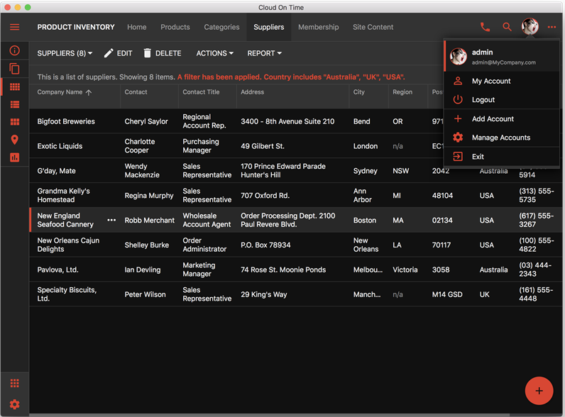
Application based on Touch UI running in native mode on OSX.Cloud On Time app provides the fastest pathway to native application development with Code On Time. There is no need to go through a lengthy approval process with major the App Stores. There is no need to learn mobile development for each of the platforms. Use Cloud On Time app to test your application in mobile mode or run your entire portfolio of business applications on it!

Soon we will be offering custom branded versions of Cloud On Time that you will be able deploy to the app stores. An account and developer subscription with each App Store will be required. The branded version of Cloud On Time will be wired to work only with your own application backend. The source code of branded app is generated and compiled on our servers. You will be required to submit the binary package to the app store on your own.

A single application created with Code On Time will work on any device with any form factor with optional offline/disconnected mode. Simply install Cloud On Time to your device and connect to the app. The same app will work in any modern web browser. Offline/disconnected mode is available only in Cloud On Time or custom branded apps.
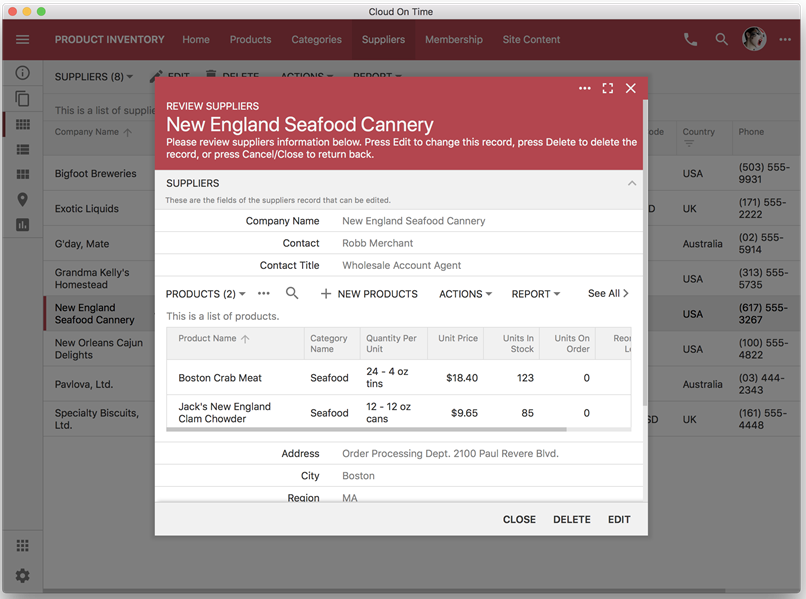
Create complex master-detail forms that work in online and offline mode across a range of mobile devices and in modern web browsers.Cloud On Time app performs management of the front end files of your application on the device. End user can maintain multiple user accounts per application and switch between their accounts in seconds. Application front end files (HTML, JavaScript, CSS, Fonts) are loaded from your device in the native webview. Cloud On Time performs remote HTTP requests to the application backend via native API of the device. It also provides access to the device camera, storage, and more. The responsive nature of the front end will present your app in the best possible way on a tablet, phone, or when you are taking advantage of side-by-side application execution in modern mobile operating systems. Sophisticated data input controls are built-in.
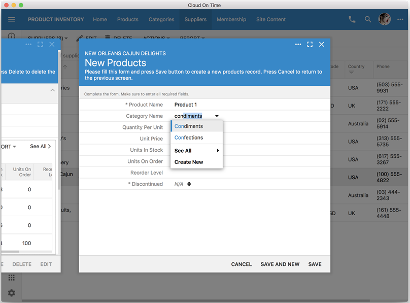
Powerful data input in apps based on Touch UI requires no custom coding and works uniformly on all devices.Cloud On Time for Android is our next target with custom branded versions of Cloud On Time to follow. Stay tuned and subscribe to our newsletter!

Continue to Scrollbars