Release 8.5.11.0 is here! This release contains several major features, bug fixes, as well as major performance enhancements to the Form Rendering Engine in Touch UI.
Basket Lookups
The headliner feature for this release is Basket Lookups. This feature permits using Lookup, AutoComplete, and DropDownList item styles for many-to-many relationships. Property Target Controller is now visible in Project Designer when one of these view styles is selected. The property must point to a compatible data controller that corresponds to the many-to-many junction table in the database.
Many-to-many relationships permit connecting records together in any combination. Typically, a list of available values are enumerated in a separate table, and a joining table will connect the primary record with a number of values. For example, a product can be tagged with multiple keywords, such as “New”, “Exclusive”, “Discontinued”, and etcetera.
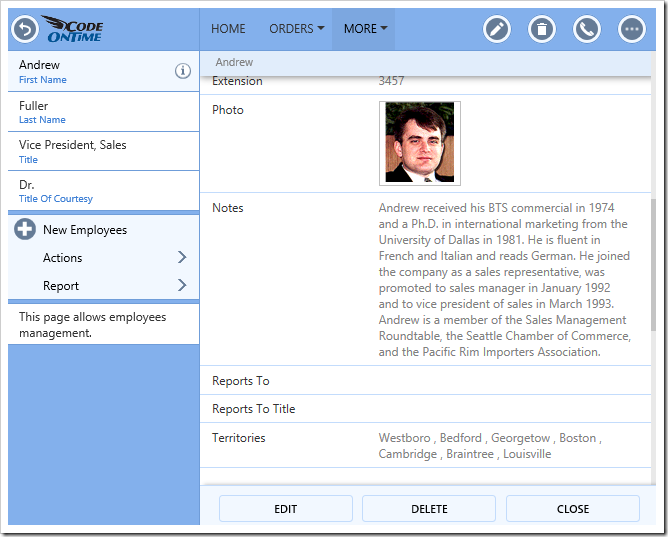
In read-only mode, many-to-many fields are displayed as a comma-separated list of values.
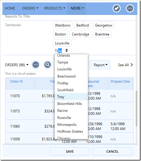
Upon pressing Edit, each item will be rendered in a box, and the input control will be rendered on the following line.
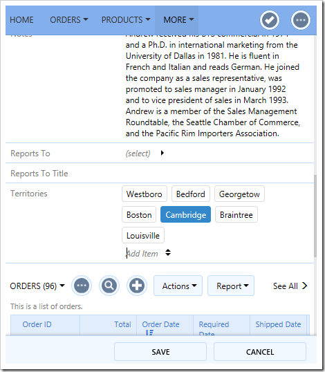
The user can tap on an item, or use arrow and Backspace keys to remove items. Typing in or activating the dropdown and selecting an item will add that item to the list. The basket input control behaves just like the original lookup, auto complete, or drop down list control.
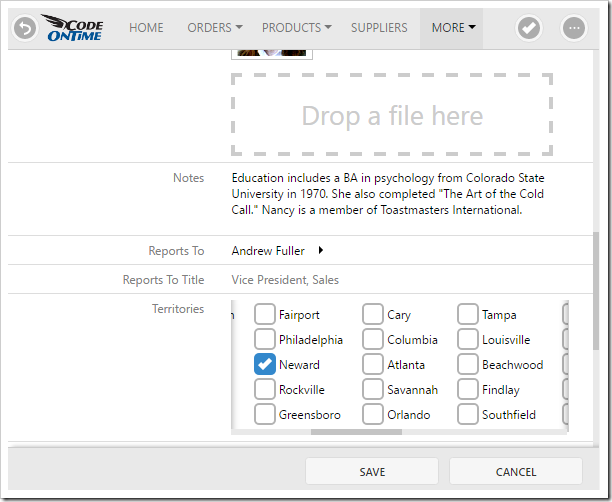
Basket Lookups offer a better alternative to the Check Box List (displayed below) when there is a large number of items to choose from.
The Wizard feature is now introduced in Touch UI. The “Wizard” property has been added to categories. When the client library detects that at least one category has the “Wizard” property defined, the form will be rendered in Wizard mode. A list of steps will be enumerated using the values of the “Wizard” property, and a status bar will be shown for the available steps. The “Visible When” property can be used to conditionality hide steps based on field values. Actions “Prev” and “Next” will be automatically injected into “Form” scope, and the “Cancel” action will be moved to the leftmost position.
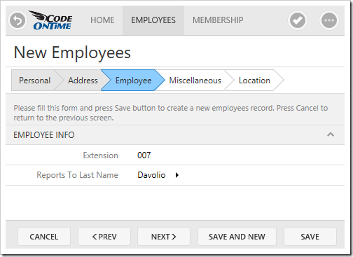
Click here to learn more about configuring Wizards.
Wizard is the core feature that enables rapid simplified configuration of projects in the upcoming Code On Time V9.
Responsive Templates
The goal of Touch UI is to ensure a consistent and usable UI across a wide range of screen sizes. Automatically created templates will position fields and categories depending on the width of the screen. Release 8.5.11.0 will allow defining multiple view templates based on the screen width.
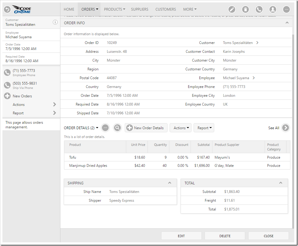
For example, the Orders form of the Northwind Demo will render in two columns.
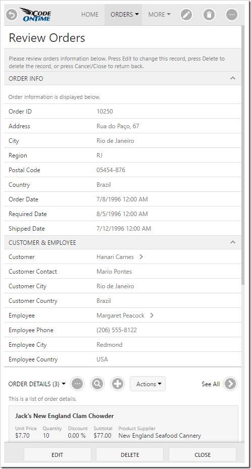
On smaller devices, the form will be displayed in one column.
Developers can define multiple templates for different sizes in the HTML view template file by using the “data-layout-size” attribute. For example, two form layouts can be defined in a file ~/Views/Customers.editForm1.html:
<div data-layout="form" data-layout-size="sm">
    ...
</div>
<div data-layout="form" data-layout-size="tn">
    ...
</div>
When the user opens the form, the client library will parse the file and use the largest possible template that matches the currently available width (minus the sidebar). The possible values are listed below.
| Value |
Minimum Width (px) |
| tn |
0 |
| xxs |
480 |
| xs |
640 |
| sm |
768 |
| md |
992 |
| lg |
1200 |
| xl |
1440 |
Batch Edit With Dependent Lookups
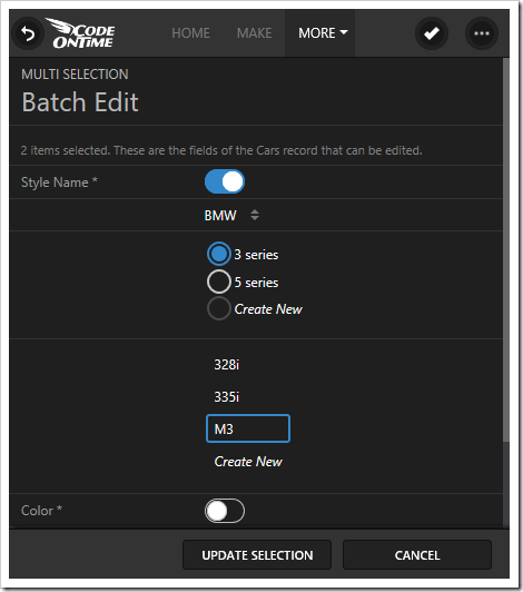
The previous release overhauled the Batch Edit functionality by rendering a custom form. Each available field is rendered as a checkbox. When the checkbox is enabled, an input is displayed below, and the value of that input will be used to batch update the selected records.
Release 8.5.11.0 now handles the situation with dependent lookups, to ensure that data validity is preserved. When a series of fields are dependent, these fields will be grouped under the same checkbox, and the user is required to set all related values.
Date values rendered in Touch UI will now display simplified values, such as “Today” or “Next Mon”. These values are much easier for the user to comprehend without having to consult a calendar. Dates between a week ago and in two weeks will show days of the week. Dates occurring this year will show the month and date. Any dates with time values set to 12:00 AM will hide the time. The original value is still viewable by hovering over the text. This feature can be disabled from the user settings.
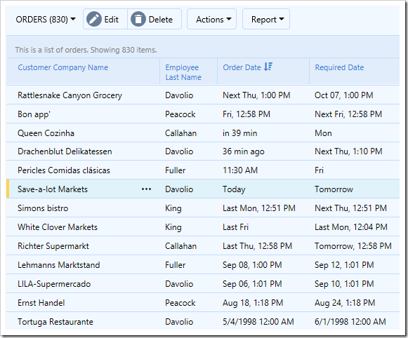
Click here to learn more about Smart Dates.
In previous releases, form action buttons were displayed above and below the form. The default mode for “Show Action Buttons” has been changed to the new value “Auto”. This will render the action buttons in a fixed footer at the bottom of the screen. This ensures that the user always has easy access to the actions available at the time. It also avoids the visual overhead of duplicate button rows on small forms.
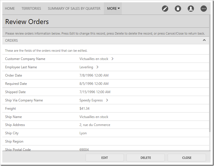
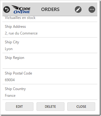
Medium size screens will align the buttons to the right of the footer. Larger screens will align the buttons to the center of the footer, to ensure proximity to the inputs. Very small screens, such as those on mobile devices, will display action buttons at the bottom of the form, in order to maximize usable screen space.
Object References in Touch UI
Object references have made a return in 8.5.11.0! When the form is in read mode, a chevron will be displayed next to the field value. Pressing on the chevron will load the edit form for that record.
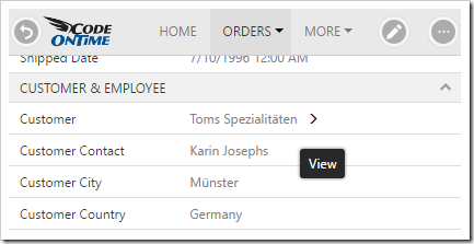
To hide the object reference, tag the data field as “lookup-details-hidden”.
It is now possible to automatically geocode an address value and save the result to predefined Latitude and Longitude fields. Simply tag the relevant address fields with “geocode-city”, “geocode-region”, “geocode-zip”, and “geocode-country”, and tag the positional fields with “geocode-latitude” and “geocode-longitude”. On Insert or Update, if the address values have changed, Google Geocoding API will be queried using the specified API key. The results will be saved in the positional fields.
It is also possible to manually trigger this request inside a C# or Visual Basic business rule, as in the example below.
decimal latitude;
decimal longitude;
if (Geocode(address, out latitude, out longitude))
    Result.ShowAlert("Latitude: " + latitude + ", Longitude: " + longitude);
An additional function has been added to calculate driving distance between two addresses. It can be used in code business rules, as in the example below.
decimal meters = CalculateDistance(sourceAddress, destinationAddress);
decimal miles = meters * 0.00062137m;
Make sure to follow Google Maps APIs Terms of Service when using these functions.
Features and Enhancements
A partial list of new features, enhancements, and fixes in release 8.5.11.0 is shown below.
- Touch UI
- Type-sensitive keyboards will be displayed on mobile devices (Number, Phone, URL, Email).
- “Flicking” horizontally in Grid presentation will scroll one screen at a time.
- If the HTML file of a view template contains the name of another view template file, that file will be loaded.
- Forms are now incrementally rendered based on what is visible at the time.
- Form buttons will align to the right on smaller screens.
- Auto-complete window will highlight matching text.
- Field values can now be placed inside category descriptions.
- If a DateTime field does not allow time selection, selecting the day of the month will hide the input.
- Tooltip will not cover the Search button in Advanced Search.
- Resolved issues with Auto Highlight First Row.
- Resolved issues with Date Picker not setting correct date depending on the order of selection.
- Mini calendar on sidebar will now resize correctly to display filter values.
- Removed “Labels In Form” user setting.
- Actions now support jQuery Mobile icons containing a dash (such as “carat-r”).
- Removed spinning bar icon in Chrome.
- Lookups now support Data Text Fields that are numeric types.
- User theme selection will be differentiated by user name.
- General
- Fixed exception with systems that do not have .NET 3.5 installed.
- Content Framework detection will work with both ASPX controls and HTML pages. This resolves the issue with Bootstrap-based dedicated login pages.
- Added support for $quickfind and $quickfinddisabled to limit the number of fields included in Quick Find query.
- Creating a data field in the Project Designer will no longer throw “DataType is undefined” error.
- Controllers built from data models will use the column configured as the alias as the “Data Text Field”.
- The “Copy” property will now be configured with the correct name of the field from the lookup controller, instead of the column name.
- Fixed issue with generated apps using Turkish “i” in the generated code.
- New JavaScript methods editing() and inserting() can be used in Visible When and Read Only When expressions, as a replacement for this.get_isEditing(). The result is correctly evaluated when user presses “Edit”.
- Many-to-many fields now show “New Item” if New Data View is enabled, to support adding new items inline.
- Fixed exception if no models are defined when Project Wizard “Summary” step is opened.
- Generator will now request to install IIS Express 10.0 if no IIS Express installation is detected.
- Filter text displayed at the top of views will show a simpler date representation.
- New implementation of BusinessRules.Whitelist and Blacklist to avoid performance regression.
- Fields named “Password” or “Pwd” will have Text Mode set to “Password”.
- Renamed “Click OK” to “Press Save” in resources to account for touchscreen users.
- Data Objects will no longer create properties for on demand fields.
- SharePoint Factory option will be hidden if .NET 3.5 is not installed.
In addition to the items listed above, there are a large number of other fixes and performance enhancements.