Application Factory

Labels
AJAX(112) App Studio(7) Apple(1) Application Builder(245) Application Factory(207) ASP.NET(95) ASP.NET 3.5(45) ASP.NET Code Generator(72) ASP.NET Membership(28) Azure(18) Barcode(2) Barcodes(3) BLOB(18) Business Rules(1) Business Rules/Logic(140) BYOD(13) Caching(2) Calendar(5) Charts(29) Cloud(14) Cloud On Time(2) Cloud On Time for Windows 7(2) Code Generator(54) Collaboration(11) command line(1) Conflict Detection(1) Content Management System(12) COT Tools for Excel(26) CRUD(1) Custom Actions(1) Data Aquarium Framework(122) Data Sheet(9) Data Sources(22) Database Lookups(50) Deployment(22) Designer(177) Device(1) DotNetNuke(12) EASE(20) Email(6) Features(101) Firebird(1) Form Builder(14) Globalization and Localization(6) How To(1) Hypermedia(2) Inline Editing(1) Installation(5) JavaScript(20) Kiosk(1) Low Code(3) Mac(1) Many-To-Many(4) Maps(6) Master/Detail(36) Microservices(4) Mobile(63) Mode Builder(3) Model Builder(3) MySQL(10) Native Apps(5) News(18) OAuth(9) OAuth Scopes(1) OAuth2(13) Offline(20) Offline Apps(4) Offline Sync(5) Oracle(11) PKCE(2) Postgre SQL(1) PostgreSQL(2) PWA(2) QR codes(2) Rapid Application Development(5) Reading Pane(2) Release Notes(183) Reports(48) REST(29) RESTful(29) RESTful Workshop(15) RFID tags(1) SaaS(7) Security(81) SharePoint(12) SPA(6) SQL Anywhere(3) SQL Server(26) SSO(1) Stored Procedure(4) Teamwork(15) Tips and Tricks(87) Tools for Excel(2) Touch UI(93) Transactions(5) Tutorials(183) Universal Windows Platform(3) User Interface(338) Video Tutorial(37) Web 2.0(100) Web App Generator(101) Web Application Generator(607) Web Form Builder(40) Web.Config(9) Workflow(28)
Archive
Blog
Application Factory
Tuesday, December 28, 2010PrintSubscribe
Multiple Value Filters

Code On Time applications now support multiple value adaptive filters that can be activated from the context menu of a columns in a grid view and in a search bar.

The screen shot below shows new Filter option in the context menu of Category Name column or the Products page.

image

The menu option will activate a a selection window similar to the one below.

image

Displayed options are sensitive to the presence of other filters. The window automatically adapts the list of available options.

Here you can see the products filtered by Category Name and Supplier Company Name. Both fields are filtered by multiple values.

image

If you activate the search bar by clicking on the arrow next to the Quick Find field then the new “include” function is selected in the relevant search parameter. Click on any of the filter options in the search value field of a parameter to activate the option selection window.

image

Notice that options presented in the selection window are sensitive to search criteria entered on the search bar if the window has been activated from the search bar.

image

Multiple value filtering works with all data types including numbers and dates. The next screen shot shows products further restricted to those with Reorder Level of “0” and “10”.

image

Users can collapse the search bar and further refine the search results using the Quick Find search box.

Multiple value filtering significantly simplifies development of data aware applications and saves tremendous amount of time required to develop a similar functionality from scratch. Multiple value filtering requires no programming and is automatically available in all views of your application.

Thursday, December 2, 2010PrintSubscribe
Auto-Complete Lookup Style

The resent release of  Code On Time  supports new Auto-Complete style of data lookup. This style of data lo0kup does not require pre-fetching of data items, works well with large data sets, supports incremental search and multi-field copy.

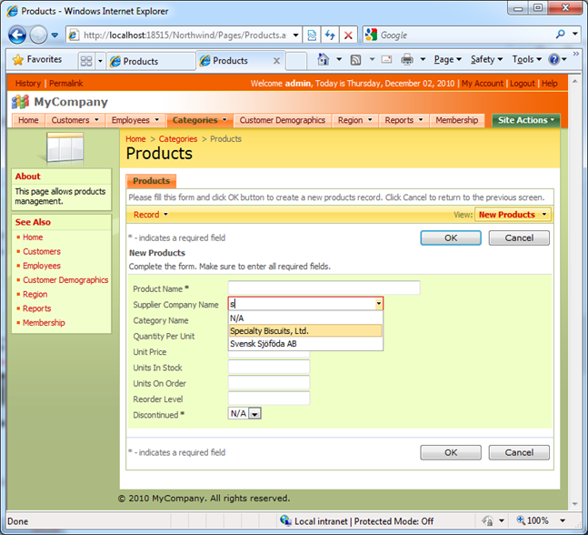
The picture below shows the Auto-Complete lookup style in action. User has types a letter “S” in Supplier Company Name lookup field and has the first matching option automatically selected. Just hit Tab or Enter key to enter the value or continue typing to refine the visible options. 
image

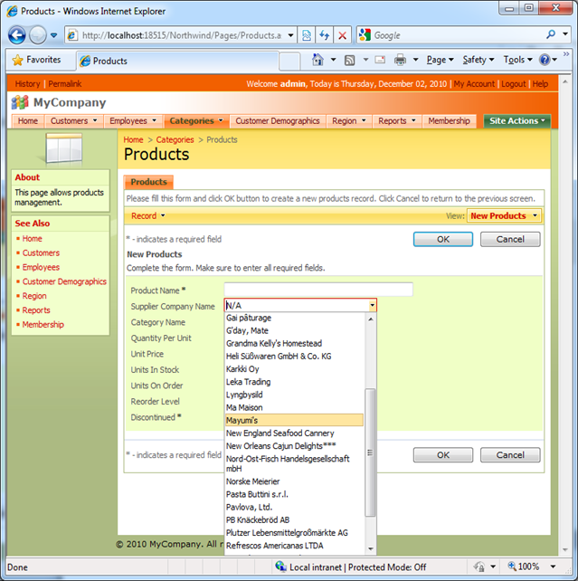
User can also click on the drop arrow to get the list of up to 300 records that match the entered sample.
image

The incremental search in auto-complete lookup field is case-insensitive.  If a field is optional and inactive then the empty value is indicated as N/A.  The empty lookup field will clear up to allow immediate data entry upon receiving input focus.

If a text is entered but not validated by matching it to an existing lookup record then the value automatically reverts to the previous state when focus is lost.

Why Use Auto-Complete Lookup Style?

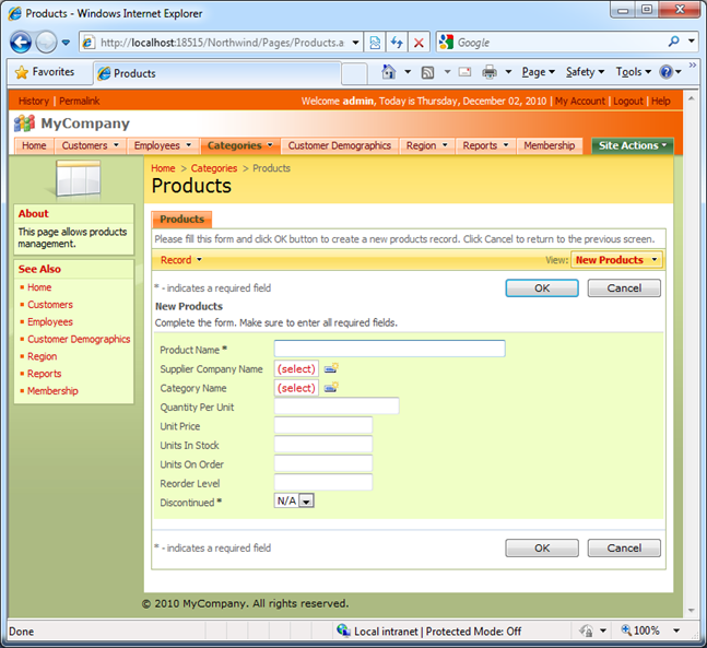
The code generator automatically configures foreign key fields to present powerful data lookup window. The screen shot below shows a product record in “new” mode. Supplier Company Name and Category Name lookups are represented by “(select)” link.
image

If a user clicks on Supplier Company Name link then the Supplier data lookup window is presented.  Users can see multiple field columns, page, sort, and filter records.
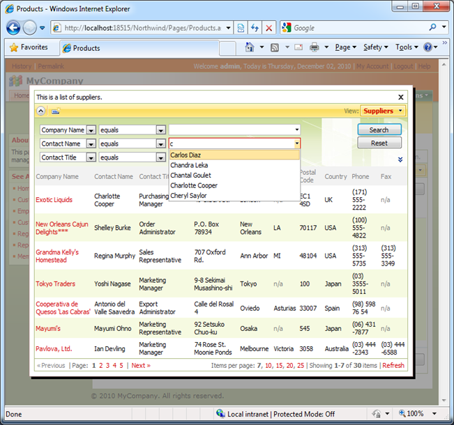
image

Sometimes it turns out to be too much. Extra mouse clicks are never appreciated if users have to enter a lot of data.

An alternative is to use a List Box or Drop Down List lookup style. Supplier Company Name field is presented as a list box and Category Name field is rendered as a drop down list of available categories in the following screen shot.
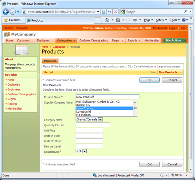
image

The disadvantage of this approach is the need to retrieve the lookup values upfront in order to populate the drop down list and the list box controls. The list boxes and drop down lists will not work well with large sets of records.

Configuring Auto-Complete Lookup Style

Open the project in designer, select the Products data controller, and start editing properties of SupplierID field.

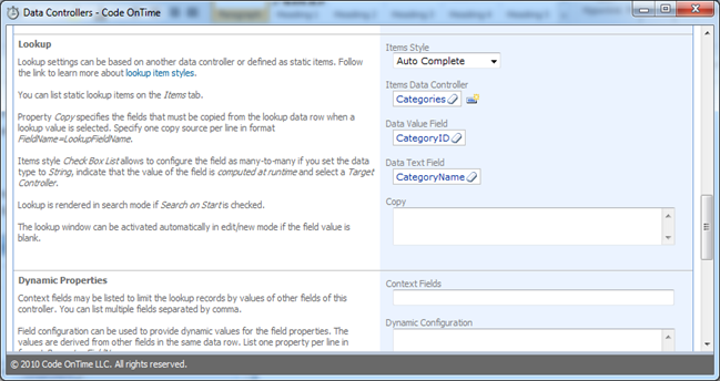
Set Items Style to Auto Complete, set Data Value Field to SupplierID, and assign Company Name to Data Text Field property. It is critical to select the Data Text Field to ensure that the auto-complete input control allows incremental search for records.
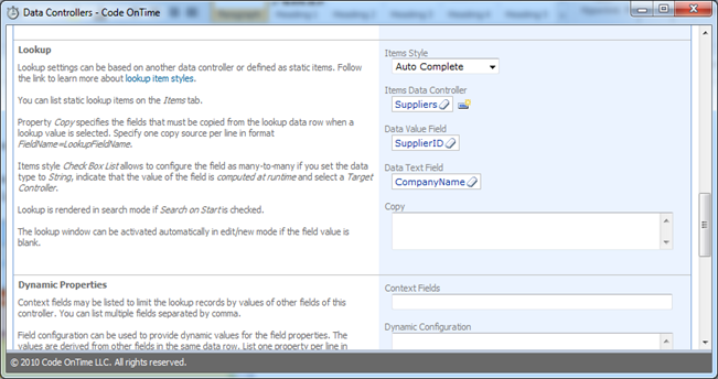
image

Save the changes, select the SupplierID field again and click on Data Fields tab. Enter 30 in the Columns property for each binding of the field to the data controller views. A data field is a binding of a field to a view. Three data fields (bindings) are linked to createForm1, editForm1, and grid1 in the next illustration.
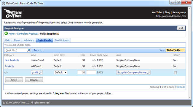
image

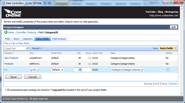
Make similar changes to the CategoryID field in the Products data controller.
image

image

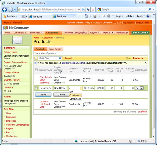
Generate the project and let your users to enjoy the auto-complete functionality. The following screen shot shows the Auto-Complete lookup displayed inline in the Category Name column of the grid1 view.
image

Saturday, November 13, 2010PrintSubscribe
Order Form Sample

In this tutorial we will detail the process of creating a custom Order Form with Code On Time generator and Web Site Factory project. We will customize the sample application generated straight from the Northwind database.

Customization includes creating a new page, adding data views to the page, configuring data controllers to calculate the extended priced of order detail records, the subtotal and total amounts of the order, and freight charges. We will also apply a custom template to alter the presentation of the form.

The screen shot below represents the final product of project customization.

image

Here is the same form rendered in “read-only” mode.

image

 Download this tutorial now! (6172K)

Watch the tutorial on our YouTube channel:

Part 1: http://www.youtube.com/watch?v=ekb8_S7YaRM

Part 2: http://www.youtube.com/watch?v=syGsUTuK2ZE

Part 3: http://www.youtube.com/watch?v=zImXeWos1U0

Continue to Custom Field Editors