Blog

Labels
AJAX(112) App Studio(8) Apple(1) Application Builder(245) Application Factory(207) ASP.NET(95) ASP.NET 3.5(45) ASP.NET Code Generator(72) ASP.NET Membership(28) Azure(18) Barcode(2) Barcodes(3) BLOB(18) Business Rules(1) Business Rules/Logic(140) BYOD(13) Caching(2) Calendar(5) Charts(29) Cloud(14) Cloud On Time(2) Cloud On Time for Windows 7(2) Code Generator(54) Collaboration(11) command line(1) Conflict Detection(1) Content Management System(12) COT Tools for Excel(26) CRUD(1) Custom Actions(1) Data Aquarium Framework(122) Data Sheet(9) Data Sources(22) Database Lookups(50) Deployment(22) Designer(177) Device(1) DotNetNuke(12) EASE(20) Email(6) Features(101) Firebird(1) Form Builder(14) Globalization and Localization(6) How To(1) Hypermedia(2) Inline Editing(1) Installation(5) JavaScript(20) Kiosk(1) Low Code(3) Mac(1) Many-To-Many(4) Maps(6) Master/Detail(36) Microservices(4) Mobile(63) Mode Builder(3) Model Builder(3) MySQL(10) Native Apps(5) News(18) OAuth(9) OAuth Scopes(1) OAuth2(13) Offline(20) Offline Apps(4) Offline Sync(5) Oracle(11) PKCE(2) Postgre SQL(1) PostgreSQL(2) PWA(2) QR codes(2) Rapid Application Development(5) Reading Pane(2) Release Notes(184) Reports(48) REST(29) RESTful(29) RESTful Workshop(15) RFID tags(1) SaaS(7) Security(81) SharePoint(12) SPA(6) SQL Anywhere(3) SQL Server(26) SSO(1) Stored Procedure(4) Teamwork(15) Tips and Tricks(87) Tools for Excel(2) Touch UI(93) Transactions(5) Tutorials(183) Universal Windows Platform(3) User Interface(338) Video Tutorial(37) Web 2.0(100) Web App Generator(101) Web Application Generator(607) Web Form Builder(40) Web.Config(9) Workflow(28)
Archive
Blog
Sunday, December 10, 2017PrintSubscribe
Tab Bar, Transparent Notifications, Selection After Actions

Code on Time release 8.6.11.0 introduces the Tab Bar, the new cool feature that automatically enhances your app if you define custom icons for some of the pages.

Tab Bar in the app with Touch UI created with Code On Time application generator.

Notifications now work in concert with fixed footers and action promotion button but lifting them when notification is displayed.

Notification bar moves fixed content (Tab Bar, Aggregates, Promo button) up when displayed in Touch UI apps.

Fixed footers typically display Tab Bar, form action bar, aggregates, and “Promo” button.

If you enter th following configuration in ~/touch-settings.json file, then notifications will become transparent and display on the left side of the screen when there are no fixed footer.

{
  "ui": {
    "notify": {
      "location": "left",
      "transparent": true,
      "enabled": true
    }
  }
}

Transparent notifications can be now displayed on top of the screen content.

Account Manager displays the current user icon in “selected” state. If the other identities available are expired, then they get displayed with the “Signed Out” indicator.

Current user identity is displayed as 'selected' item in relevant menus and panels in Touch UI apps.

One important feature is now available to developers of business rules. By default, any custom action will reduce the selected items to the last one selected at the time when the action was invoked.

It may be desirable to preserve the entire selection of items or have the selection completely cleared.

Now developers can @Result_KeepSelection and @Result_ClearSelection parameters. Simply assign value 1 to the parameter if you program SQL business rules. C#/VB developers can assign true to Result.KeepSelection and Result.ClearSelection properties.

The following features and fixes are included in the release:

  • Notifications can be transparent if ui.notify.transparent = true is specified in touch-settings.json.
  • Added support for @Result_ClearSelection in business rules to clear the selected keys after an action.
  • Added support for @Result_KeepSelection in business rules to keep the selected keys after an action.
  • Ensured SiteContent is not included with .NET 3.5/4.0 projects.
  • Fixed. MicrosoftAjax.js not included in .NET 3.5/4.0 projects.
  • Fixed. MimeMapping compilation issue in .NET 3.5/4.0 projects.
  • Keyboard input received from the user correctly postpones the "idle user detection".
  • Notifications for sort/filter/group/refresh are prefixed with the data view field name when available.
  • Menu item representing the current user is displayed in “selected” state in panels and menus.
  • Indicator "Signed Out" is displayed in account manager next to the user name when needed.
  • Notification is always displayed as a full-width bar if there is a fixed footer.
  • Fixed footer at the bottom of the screen is moved upward when notification bar is displayed.
  • Displaying of Tooltip for popups and panels when available. Items based on actions use description of the action as a tooltip.
  • Material icon is now used to render "drop down arrow" for a more consistent presentation.
  • RTF input loses focus when user clicks on static content of the page in WebKit browsers.
  • Email fields are correctly displayed in the summary on the fully expanded sidebar.
  • Email icon shows up on the toolbar and in the row context menu when email fields are detected.
  • "Select" business rules do not run on server when "Distinct" requests to read data are executed.
  • Distinct requests for data are not corrupted by presence of Select business rules.
  • Context-dependent auto-complete passes null for the parent value if it has not been selected.
  • Fixed issue with OAuthHandler detecting "Sync User" incorrectly.
  • Fixed. Dependent Lookup Auto Complete is not filtering when typing in, but filters when the drop down arrow is clicked.
  • Fixed the issue with incorrect DataView field header text prefixing in notifications.
  • Fixed issue switching calendar tabs for all languages.
  • Blob Handler now uses correct column name for primary keys.
  • Fixed issue with SiteContent model detection in MySQL apps.
  • Touch Calender now correctly uses quick find, filters, and advanced search.
  • Added null check for UrlReferrer in businessrules.cc/vb
  • Added dynamic controller serialization in JSON format to support Offline Data Processor.
Tuesday, December 5, 2017PrintSubscribe
Tab Bar

Page of an application built with Touch UI represents an individual mini-app, also known as Single Page App or SPA. Shared navigation system of application links together multiple SPAs.

Developers can assign icons to individual pages to signify their purpose. Icons are displays at the bottom of the sidebar on the left side of the page and in the drop down menus at the top of the page.

Sidebar displays page icons when specified in apps created with Touch UI.   Page icons are visible in the dropdown navigation menus in apps created with Touch UI and Code On Time app generator.

The sidebar provides easy access to the first three or four pages with icons, which works great on larger screens. The sidebar is not visible on the smaller devices. Touch UI introduces a new method of providing quick access to important pages called Tab Bar.

Tab Bar is automatically displayed at the bottom of the screen whenever the sidebar is not visible

Tab Bar is displayed at the bottom of the screen if at least two icons are defined in the menu of the app created with Code On Time.

Tab Bar disappears as soon as the sidebar becomes visible, which may happen if device orientation has changed or when the app window is resized.

Tab Bar is hidden when the sidebar is visible to the user in apps based on Touch UI.

The width of tabs will automatically increase on large screens.

Tab Bar appears as soon as the sidebar stops being visible in the app based on Touch UI.

Tabs automatically expand and collapse. Some tabs may be shifted off-screen when the minimal tab width is reached. The invisible tabs are replaced with “More” button if there is not enough space to fit all of them at the bottom of the screen. Invisible tab icons are displayed when “More” button is activated on the Tab Bar.

'More' button is displayed when some of the tabs are not able to fit on screen in application based on Touch UI.  Invisible tab icons are displayed when 'More' button is activated on the Tab Bar in app created with Code On Time.

If you do prefer not to have the Tab Bar then turn if “off” by entering the following configuration property in ~/touch-settings.json file:

{
  "ui": {
    "menu": {
      "tabbar": false
    }
  }
}

If you love the Tab Bar, then consider enabling this feature on any screen size by settings ui.menu.tabbar to true.

{
  "ui": {
    "menu": {
      "tabbar": true
    }
  }
}

This setting will remove icons from the sidebar and transfer them to the permanently visible Tab Bar at the bottom of the screen.

Set 'ui.menu.tabbar' property in touch-settings.json to 'true' to permanently enable the Tab Bar in app created with Code On Time.

Page icons will be visible on a screen of any size.

Tab Bar displays icons of important pages in app based on Touch UI.

Notifications displayed in the app will move the Tab Bar and the “promo” button upwards.

Notifications displayed in the app will move the Tab Bar and the “promo” button upwards in apps based on Touch UI, created with Code On Time.

The tab bar will slide down to the bottom of the screen when the notification is dismissed.

Thursday, November 30, 2017PrintSubscribe
Changing Application Configuration

The file Web.config is the main settings and configuration database of a ASP.NET web application. The file is encoded in XML format. Code On Time generator automatically creates and configures the web.config file based on the selected project settings.

Every subsequent generation of the project will recreate the web.config file.

It may be necessary to change the web.config file to link custom component libraries or enter custom entries required for the project. The application generator allows specifying Web.Config modification instructions to manipulate the file contents.

Start the web application generator, click on the project name, and select Settings. Click on Web Server Configuration.
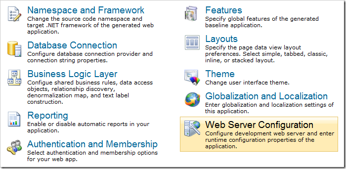
Web Server Configuration option on the Settings page of Code On Time web application generator.

The page of the wizard will have the Web.Config modification instructions textbox.
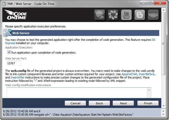
Web.Config modification instructions on the Web Server Configuration page.

AppendChild

The AppendChild modification instruction will add elements as children of the specified element, provided that the element exists.

For example, consider the /configuration/appSettings section of a Web Site Factory project.

<configuration>
  <appSettings>
    <add key="ChartImageHandler" value="storage=file;timeout=20;dir=c:\TempImageFiles\;" />
  </appSettings>
  ...
</configuration>

Insert the following snippet in the Web.Config modification instructions:

AppendChild: /configuration/appSettings

<add key="Setting1" value="Value1" />
<add key="Setting2" value="Value2" />

Generate the application. Open the web.config file, and find the new add elements. They were placed as children of /configuration/appSettings node.
<configuration>
  <appSettings>
    <add key="ChartImageHandler" value="storage=file;timeout=20;dir=c:\TempImageFiles\;" />
    <add key="Setting1" value="Value1" />
    <add key="Setting2" value="Value2" />
  </appSettings>
  ...
</configuration>

InsertBefore and InsertAfter

The InsertBefore modification instruction will add elements on the same level, before the specified node.

Append the previous modification instruction with the following snippet to insert the third add element before the second add element with key of “Setting1”:

InsertBefore: /configuration/appSettings/add[2]

<add key="Setting3" value="Value3" />

The web.config file will look like this:

<configuration>
  <appSettings>
    <add key="ChartImageHandler" value="storage=file;timeout=20;dir=c:\TempImageFiles\;" />
    <add key="Setting3" value="Value3" />
    <add key="Setting1" value="Value1" />
    <add key="Setting2" value="Value2" />
  </appSettings>
  ...
</configuration>
Alternatively, the InsertAfter instruction can be used to place the new element after the first add element with key of “ChartImageHandler”:

InsertAfter: /configuration/appSettings/add[1]

<add key="Setting3" value="Value3" />

The result will be the same.

<configuration>
  <appSettings>
    <add key="ChartImageHandler" value="storage=file;timeout=20;dir=c:\TempImageFiles\;" />
    <add key="Setting3" value="Value3" />
    <add key="Setting1" value="Value1" />
    <add key="Setting2" value="Value2" />
  </appSettings>
  ...
</configuration>

Delete

The Delete modification instruction will delete the element and any siblings. The nothing element is not incorporated in the web.config file but must be provided for the instruction to work.

For example, the configuration/appSettings element contains one add element by default:

<configuration>
  <appSettings>
    <add key="ChartImageHandler" value="storage=file;timeout=60;dir=c:\TempImageFiles\;" />
  </appSettings>
  ...
</configuration>

Use the following modification instructions:

Delete: /configuration/appSettings/add

<nothing/>

This will result in all add elements being removed.

<configuration>
  <appSettings />
... </configuration>

Editing an Element Property

Use the “SetAttribute” instruction to modify the value of an attribute.

For example, let’s have the application compile with debug mode enabled. The debug attribute of the compilation element is set to “false” by default:

<configuration>
  <system.web>
    <compilation debug="false" targetFramework="4.6">
    ...
    </compilation>
  </system.web>
</configuration>

Use the following instructions (each application will probably use different key tokens, so you will need to copy your own <assemblies> section):

SetAttribute: /configuration/system.web/compilation
debug: true

This will result in the following:

<compilation debug="true" targetFramework="4.0">
  <assemblies> … </assemblies>
</compilation>
Continue to November Hotfixes