Forms in Touch UI apps are laid out by HTML templates. When a form view is requested in the application framework, the ~/Views folder is queried for a template with file name of [Controller Name].[View Name].html. If the developer has placed a file matching that name in the Views folder, then the framework will read the file and pass it to the client library. The client will then use this template and inject data field inputs, labels, data views, and other controls into the template before rendering to the user. Otherwise, the client library will automatically build a template based on the definitions of categories and data fields.
The picture below shows the automatically built template for the default editForm1 view of Orders controller in the sample Northwind app.
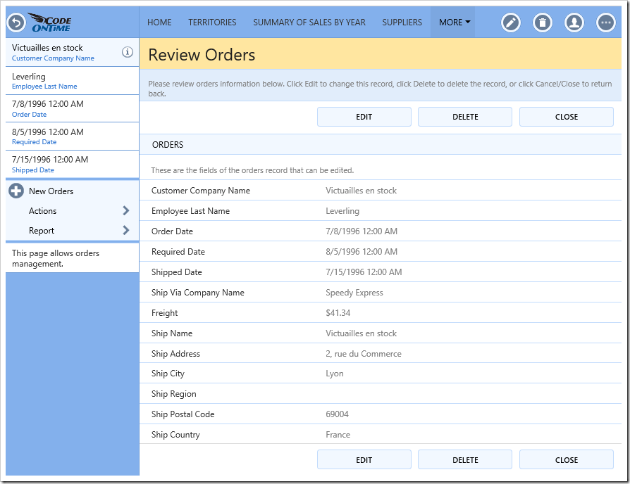
The generated template can be seen below.
<div data-container="collapsible" data-wrap="false" data-header-text="Orders">
    <div data-container="row">
        <div data-control="description">These are the fields of the orders record that can be edited.</div>
    </div>
    <div data-container="row">
        <span data-control="label" data-field="CustomerID">CustomerID</span>
        <span data-control="field" data-field="CustomerID">[CustomerID]</span>
    </div>
    <div data-container="row">
        <span data-control="label" data-field="EmployeeID">EmployeeID</span>
        <span data-control="field" data-field="EmployeeID">[EmployeeID]</span>
    </div>
    <div data-container="row">
        <span data-control="label" data-field="OrderDate">OrderDate</span>
        <span data-control="field" data-field="OrderDate">[OrderDate]</span>
    </div>
    <div data-container="row">
        <span data-control="label" data-field="RequiredDate">RequiredDate</span>
        <span data-control="field" data-field="RequiredDate">[RequiredDate]</span>
    </div>
    <div data-container="row">
        <span data-control="label" data-field="ShippedDate">ShippedDate</span>
        <span data-control="field" data-field="ShippedDate">[ShippedDate]</span>
    </div>
    <div data-container="row">
        <span data-control="label" data-field="ShipVia">ShipVia</span>
        <span data-control="field" data-field="ShipVia">[ShipVia]</span>
    </div>
    <div data-container="row">
        <span data-control="label" data-field="Freight">Freight</span>
        <span data-control="field" data-field="Freight">[Freight]</span>
    </div>
    <div data-container="row">
        <span data-control="label" data-field="ShipName">ShipName</span>
        <span data-control="field" data-field="ShipName">[ShipName]</span>
    </div>
    <div data-container="row">
        <span data-control="label" data-field="ShipAddress">ShipAddress</span>
        <span data-control="field" data-field="ShipAddress">[ShipAddress]</span>
    </div>
    <div data-container="row">
        <span data-control="label" data-field="ShipCity">ShipCity</span>
        <span data-control="field" data-field="ShipCity">[ShipCity]</span>
    </div>
    <div data-container="row">
        <span data-control="label" data-field="ShipRegion">ShipRegion</span>
        <span data-control="field" data-field="ShipRegion">[ShipRegion]</span>
    </div>
    <div data-container="row">
        <span data-control="label" data-field="ShipPostalCode">ShipPostalCode</span>
        <span data-control="field" data-field="ShipPostalCode">[ShipPostalCode]</span>
    </div>
    <div data-container="row">
        <span data-control="label" data-field="ShipCountry">ShipCountry</span>
        <span data-control="field" data-field="ShipCountry">[ShipCountry]</span>
    </div>
</div>
Each category is converted to a div element with attribute data-container set to “collapsible”. A header bar will be rendered, and a border at the bottom of the container. The value of attribute “data-header-text” will be rendered as the text in the header bar. The “data-wrap” attribute is set to “false” in order to allow the field label and value to render in two columns for sufficiently wide screens. Collapsible containers will take the full width if they are the only container in that row. Otherwise, a border and drop shadow will be rendered on the left and right sides. Collapsible containers are an easy way to group fields in an attractive way.
Inside the category, several data containers of type “row” are added. These containers take the full width of the outer container, and will render a border above in order to delineate rows.
Inside each row container, there are various span elements marked with different data-control attributes.
The first data-control element is marked as “description”, and contains the category description. This text will be rendered smaller and with a lighter color.
The next data-control element is marked as “label”, and has a data-field attribute with value defined as the name of a data field in the view. The text of the element will be replaced by the label defined for that data field. When the form is in edit mode, the color of the text will be grey, and clicking on this element will shift focus to the nearest field control with matching data-field.
The other data-control element used in this template is “field”. The content of this element will be replaced by the value of the field matched by the name specified in the data-field attribute. The text wrapped in square brackets provide for easy debugging if the field is not matched to a data field in the view. The text will be rendered as grey when the form is in read-only mode. When the form is switched to edit mode, the color will change to black and the user will be able to click on the element to start editing the field value.
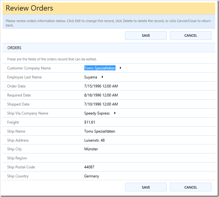
Note that there is no limit to the number of times a data field can be used for a label or field control. The client library will automatically synchronize the values of these fields after a user makes changes to the field.
There are various other utility containers that offer different capabilities for laying out your fields.
Tabs
Tabs are a common user interface element used to group fields. See an example below.
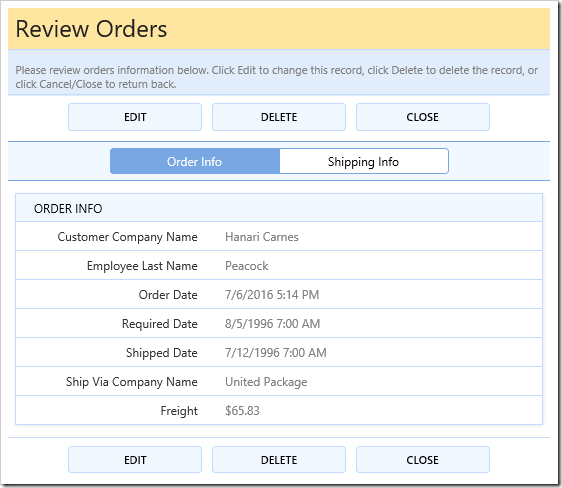
Tabs can be created by defining a “tabset” container that contains a set of tabs. Within this container, several “tab” containers can be defined, each with a “data-tab-text” value that defines the label displayed on the tab. The template used to create the example can be seen below.
<div data-container="tabset">
    <div data-container="tab" data-tab-text="Order Info">
        <div data-container="collapsible" data-header-text="Order Info">
            <div data-container="row">
                <span data-control="label" data-field="CustomerID">CustomerID</span>
                <span data-control="field" data-field="CustomerID">[CustomerID]</span>
            </div>
            <div data-container="row">
                <span data-control="label" data-field="EmployeeID">EmployeeID</span>
                <span data-control="field" data-field="EmployeeID">[EmployeeID]</span>
            </div>
            <div data-container="row">
                <span data-control="label" data-field="OrderDate">OrderDate</span>
                <span data-control="field" data-field="OrderDate">[OrderDate]</span>
            </div>
            <div data-container="row">
                <span data-control="label" data-field="RequiredDate">RequiredDate</span>
                <span data-control="field" data-field="RequiredDate">[RequiredDate]</span>
            </div>
            <div data-container="row">
                <span data-control="label" data-field="ShippedDate">ShippedDate</span>
                <span data-control="field" data-field="ShippedDate">[ShippedDate]</span>
            </div>
            <div data-container="row">
                <span data-control="label" data-field="ShipVia">ShipVia</span>
                <span data-control="field" data-field="ShipVia">[ShipVia]</span>
            </div>
            <div data-container="row">
                <span data-control="label" data-field="Freight">Freight</span>
                <span data-control="field" data-field="Freight">[Freight]</span>
            </div>
        </div>
    </div>
    <div data-container="tab" data-tab-text="Shipping Info">
        <div data-container="collapsible" data-header-text="Shipping Info">
            <div data-container="row">
                <span data-control="label" data-field="ShipName">ShipName</span>
                <span data-control="field" data-field="ShipName">[ShipName]</span>
            </div>
            <div data-container="row">
                <span data-control="label" data-field="ShipAddress">ShipAddress</span>
                <span data-control="field" data-field="ShipAddress">[ShipAddress]</span>
            </div>
            <div data-container="row">
                <span data-control="label" data-field="ShipCity">ShipCity</span>
                <span data-control="field" data-field="ShipCity">[ShipCity]</span>
            </div>
            <div data-container="row">
                <span data-control="label" data-field="ShipRegion">ShipRegion</span>
                <span data-control="field" data-field="ShipRegion">[ShipRegion]</span>
            </div>
            <div data-container="row">
                <span data-control="label" data-field="ShipPostalCode">ShipPostalCode</span>
                <span data-control="field" data-field="ShipPostalCode">[ShipPostalCode]</span>
            </div>
            <div data-container="row">
                <span data-control="label" data-field="ShipCountry">ShipCountry</span>
                <span data-control="field" data-field="ShipCountry">[ShipCountry]</span>
            </div>
        </div>
    </div>
</div>
This template can be used by creating a file at “~/Views/Orders.editForm1.html” and replacing the contents with the above HTML template.
Columns
Data fields can be placed into multiple columns using the data-container=“column” attribute.
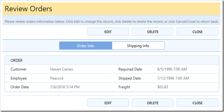
Each column container must have a width specified. See example of template below:
<div data-container="tabset">
    <div data-container="tab" data-tab-text="Order Info">
        <div data-container="collapsible" data-header-text="Order">
            <div data-container="column" style="width: 50%">
                <div data-container="row">
                    <span data-control="label" data-field="CustomerID">CustomerID</span>
                    <span data-control="field" data-field="CustomerID">[CustomerID]</span>
                </div>
                <div data-container="row">
                    <span data-control="label" data-field="EmployeeID">EmployeeID</span>
                    <span data-control="field" data-field="EmployeeID">[EmployeeID]</span>
                </div>
                <div data-container="row">
                    <span data-control="label" data-field="OrderDate">OrderDate</span>
                    <span data-control="field" data-field="OrderDate">[OrderDate]</span>
                </div>
            </div>
            <div data-container="column" style="width: 49%">
                <div data-container="row" data-wrap="false">
                    <span data-control="label" data-field="RequiredDate">RequiredDate</span>
                    <span data-control="field" data-field="RequiredDate">[RequiredDate]</span>
                </div>
                <div data-container="row">
                    <span data-control="label" data-field="ShippedDate">ShippedDate</span>
                    <span data-control="field" data-field="ShippedDate">[ShippedDate]</span>
                </div>
                <div data-container="row">
                    <span data-control="label" data-field="Freight">Freight</span>
                    <span data-control="field" data-field="Freight">[Freight]</span>
                </div>
            </div>
        </div>
    </div>
    <div data-container="tab" data-tab-text="Shipping Info">
        <div data-container="row">
            <span data-control="label" data-field="ShipVia">ShipVia</span>
            <span data-control="field" data-field="ShipVia">[ShipVia]</span>
        </div>
        <div data-container="row">
            <span data-control="label" data-field="ShipName">ShipName</span>
            <span data-control="field" data-field="ShipName">[ShipName]</span>
        </div>
        <div data-container="row">
            <span data-control="label" data-field="ShipAddress">ShipAddress</span>
            <span data-control="field" data-field="ShipAddress">[ShipAddress]</span>
        </div>
        <div data-container="row">
            <span data-control="label" data-field="ShipCity">ShipCity</span>
            <span data-control="field" data-field="ShipCity">[ShipCity]</span>
        </div>
        <div data-container="row">
            <span data-control="label" data-field="ShipRegion">ShipRegion</span>
            <span data-control="field" data-field="ShipRegion">[ShipRegion]</span>
        </div>
        <div data-container="row">
            <span data-control="label" data-field="ShipPostalCode">ShipPostalCode</span>
            <span data-control="field" data-field="ShipPostalCode">[ShipPostalCode]</span>
        </div>
        <div data-container="row">
            <span data-control="label" data-field="ShipCountry">ShipCountry</span>
            <span data-control="field" data-field="ShipCountry">[ShipCountry]</span>
        </div>
    </div>
</div>
Custom Content
One of the main reasons to define a custom template for your view would be to place custom content. The example below places several headers, images, and glyphicons among data field rows.
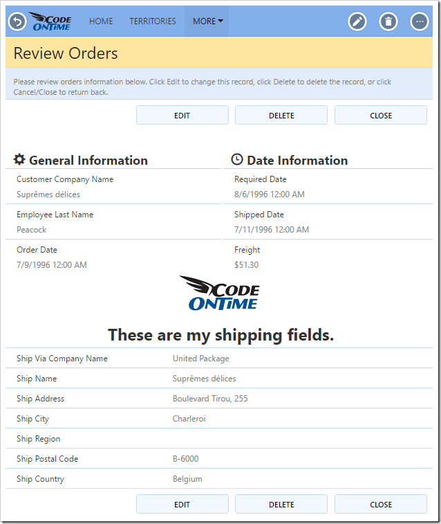
Containers with a type of “content” allow placing any content into them, without any special effects being added by the client library. Styles are applied on the proper elements in order to ensure the correct positioning of form elements.
<div data-container="content" data-wrap="true">
    <div data-container="column" style="width: 50%">
        <div data-container="content">
            <h2 style="padding-left: 12px"><span class="glyphicon glyphicon-cog"></span> General Information</h2>
        </div>
        <div data-container="row">
            <span data-control="label" data-field="CustomerID">CustomerID</span>
            <span data-control="field" data-field="CustomerID">[CustomerID]</span>
        </div>
        <div data-container="row">
            <span data-control="label" data-field="EmployeeID">EmployeeID</span>
            <span data-control="field" data-field="EmployeeID">[EmployeeID]</span>
        </div>
        <div data-container="row">
            <span data-control="label" data-field="OrderDate">OrderDate</span>
            <span data-control="field" data-field="OrderDate">[OrderDate]</span>
        </div>
    </div>
    <div data-container="column" style="width: 49%">
        <div data-container="content">
            <h2 style="padding-left: 12px"><span class="glyphicon glyphicon-time"></span> Date Information</h2>
        </div>
        <div data-container="row" data-wrap="false">
            <span data-control="label" data-field="RequiredDate">RequiredDate</span>
            <span data-control="field" data-field="RequiredDate">[RequiredDate]</span>
        </div>
        <div data-container="row">
            <span data-control="label" data-field="ShippedDate">ShippedDate</span>
            <span data-control="field" data-field="ShippedDate">[ShippedDate]</span>
        </div>
        <div data-container="row">
            <span data-control="label" data-field="Freight">Freight</span>
            <span data-control="field" data-field="Freight">[Freight]</span>
        </div>
    </div>
</div>
<div data-container="content" style="padding: 0 1em 0.5em; text-align: center; height: 100px;">
    <img src="/touch/logo-color.png" style="vertical-align: bottom; padding-right: 6px" />
    <h1>These are my shipping fields.</h1>
</div>
<div data-container="content" data-wrap="false">
    <div data-container="row">
        <span data-control="label" data-field="ShipVia">ShipVia</span>
        <span data-control="field" data-field="ShipVia">[ShipVia]</span>
    </div>
    <div data-container="row">
        <span data-control="label" data-field="ShipName">ShipName</span>
        <span data-control="field" data-field="ShipName">[ShipName]</span>
    </div>
    <div data-container="row">
        <span data-control="label" data-field="ShipAddress">ShipAddress</span>
        <span data-control="field" data-field="ShipAddress">[ShipAddress]</span>
    </div>
    <div data-container="row">
        <span data-control="label" data-field="ShipCity">ShipCity</span>
        <span data-control="field" data-field="ShipCity">[ShipCity]</span>
    </div>
    <div data-container="row">
        <span data-control="label" data-field="ShipRegion">ShipRegion</span>
        <span data-control="field" data-field="ShipRegion">[ShipRegion]</span>
    </div>
    <div data-container="row">
        <span data-control="label" data-field="ShipPostalCode">ShipPostalCode</span>
        <span data-control="field" data-field="ShipPostalCode">[ShipPostalCode]</span>
    </div>
    <div data-container="row">
        <span data-control="label" data-field="ShipCountry">ShipCountry</span>
        <span data-control="field" data-field="ShipCountry">[ShipCountry]</span>
    </div>
</div>
Actions
Form templates also allow positioning actions defined in the controller onto the form.
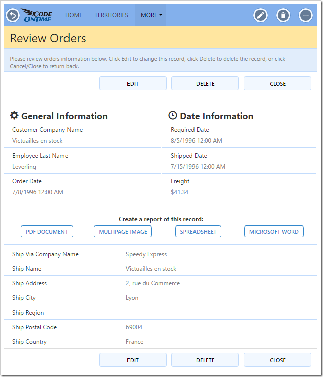
Actions are defined in the HTML template by placing an element with attribute data-control of value “action”. Then, add an attribute “data-action” with value of “[Action Group ID]/[Action ID]”. The text of the element will be replaced by the action label.
<div data-container="content" data-wrap="true">
    <div data-container="column" style="width: 50%">
        <div data-container="content">
            <h2 style="padding-left: 12px"><span class="glyphicon glyphicon-cog"></span> General Information</h2>
        </div>
        <div data-container="row">
            <span data-control="label" data-field="CustomerID">CustomerID</span>
            <span data-control="field" data-field="CustomerID">[CustomerID]</span>
        </div>
        <div data-container="row">
            <span data-control="label" data-field="EmployeeID">EmployeeID</span>
            <span data-control="field" data-field="EmployeeID">[EmployeeID]</span>
        </div>
        <div data-container="row">
            <span data-control="label" data-field="OrderDate">OrderDate</span>
            <span data-control="field" data-field="OrderDate">[OrderDate]</span>
        </div>
    </div>
    <div data-container="column" style="width: 49%">
        <div data-container="content">
            <h2 style="padding-left: 12px"><span class="glyphicon glyphicon-time"></span> Date Information</h2>
        </div>
        <div data-container="row" data-wrap="false">
            <span data-control="label" data-field="RequiredDate">RequiredDate</span>
            <span data-control="field" data-field="RequiredDate">[RequiredDate]</span>
        </div>
        <div data-container="row">
            <span data-control="label" data-field="ShippedDate">ShippedDate</span>
            <span data-control="field" data-field="ShippedDate">[ShippedDate]</span>
        </div>
        <div data-container="row">
            <span data-control="label" data-field="Freight">Freight</span>
            <span data-control="field" data-field="Freight">[Freight]</span>
        </div>
    </div>
</div>
<div data-container="content" style="padding: 0 1em 0.5em; height: 40px; text-align: center;">
    <h4 style="padding-bottom: 6px">Create a report of this record:</h4>
    <span data-control="action" data-action="ag7/a1" style="width: 25%; float: left">PDF</span>
    <span data-control="action" data-action="ag7/a2" style="width: 25%; float: left">Image</span>
    <span data-control="action" data-action="ag7/a3" style="width: 25%; float: left">Excel</span>
    <span data-control="action" data-action="ag7/a4" style="width: 25%; float: left">Word</span>
</div>
<div data-container="content" data-wrap="false">
    <div data-container="row">
        <span data-control="label" data-field="ShipVia">ShipVia</span>
        <span data-control="field" data-field="ShipVia">[ShipVia]</span>
    </div>
    <div data-container="row">
        <span data-control="label" data-field="ShipName">ShipName</span>
        <span data-control="field" data-field="ShipName">[ShipName]</span>
    </div>
    <div data-container="row">
        <span data-control="label" data-field="ShipAddress">ShipAddress</span>
        <span data-control="field" data-field="ShipAddress">[ShipAddress]</span>
    </div>
    <div data-container="row">
        <span data-control="label" data-field="ShipCity">ShipCity</span>
        <span data-control="field" data-field="ShipCity">[ShipCity]</span>
    </div>
    <div data-container="row">
        <span data-control="label" data-field="ShipRegion">ShipRegion</span>
        <span data-control="field" data-field="ShipRegion">[ShipRegion]</span>
    </div>
    <div data-container="row">
        <span data-control="label" data-field="ShipPostalCode">ShipPostalCode</span>
        <span data-control="field" data-field="ShipPostalCode">[ShipPostalCode]</span>
    </div>
    <div data-container="row">
        <span data-control="label" data-field="ShipCountry">ShipCountry</span>
        <span data-control="field" data-field="ShipCountry">[ShipCountry]</span>
    </div>
</div>
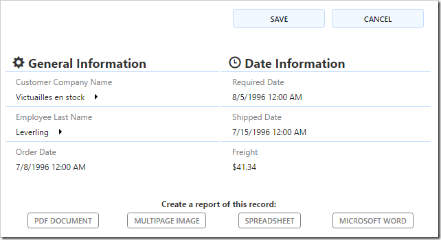
Note that the action will always be visible in the form. If the action is not configured to be usable in the current form mode, it will render as greyed out. For example, see the screenshot below to see the actions greyed out when the user presses “Edit”.
Data View Fields
One powerful capability offered by form templates is the positioning of data view fields. The example below places a list of order details associated with the current order.
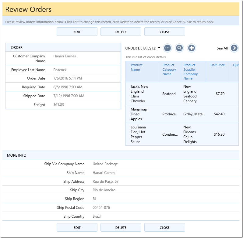
For the example below, make sure to add a new field to the Orders controller:
| Property |
Value |
| Field Name |
OrderDetails |
| Type |
DataView |
| Data View Controller |
OrderDetails |
| Data View |
grid1 |
| Filter Field #1 |
OrderID |
Save the new field. Then, drag the new field onto editForm1 of Orders controller to create a data field.
The template for the example can be seen below. The data view field is placed in the template as a data-control with value “dataview”.
<div data-container="column" style="width: 50%">
    <div data-container="collapsible" data-header-text="Order">
        <div data-container="row">
            <span data-control="label" data-field="CustomerID">CustomerID</span>
            <span data-control="field" data-field="CustomerID">[CustomerID]</span>
        </div>
        <div data-container="row">
            <span data-control="label" data-field="EmployeeID">EmployeeID</span>
            <span data-control="field" data-field="EmployeeID">[EmployeeID]</span>
        </div>
        <div data-container="row">
            <span data-control="label" data-field="OrderDate">OrderDate</span>
            <span data-control="field" data-field="OrderDate">[OrderDate]</span>
        </div>
        <div data-container="row">
            <span data-control="label" data-field="RequiredDate">RequiredDate</span>
            <span data-control="field" data-field="RequiredDate">[RequiredDate]</span>
        </div>
        <div data-container="row">
            <span data-control="label" data-field="ShippedDate">ShippedDate</span>
            <span data-control="field" data-field="ShippedDate">[ShippedDate]</span>
        </div>
        <div data-container="row">
            <span data-control="label" data-field="Freight">Freight</span>
            <span data-control="field" data-field="Freight">[Freight]</span>
        </div>
    </div>
</div>
<div data-container="column" style="width: 49%">
    <div style="padding-left: 1em">
        <div data-control="dataview" data-field="OrderDetails">[OrderDetails]</div>
    </div>
</div>
<div data-container="content" data-wrap="false">
    <div data-container="collapsible" data-header-text="More Info">
        <div data-container="row">
            <span data-control="label" data-field="ShipVia">ShipVia</span>
            <span data-control="field" data-field="ShipVia">[ShipVia]</span>
        </div>
        <div data-container="row">
            <span data-control="label" data-field="ShipName">ShipName</span>
            <span data-control="field" data-field="ShipName">[ShipName]</span>
        </div>
        <div data-container="row">
            <span data-control="label" data-field="ShipAddress">ShipAddress</span>
            <span data-control="field" data-field="ShipAddress">[ShipAddress]</span>
        </div>
        <div data-container="row">
            <span data-control="label" data-field="ShipCity">ShipCity</span>
            <span data-control="field" data-field="ShipCity">[ShipCity]</span>
        </div>
        <div data-container="row">
            <span data-control="label" data-field="ShipRegion">ShipRegion</span>
            <span data-control="field" data-field="ShipRegion">[ShipRegion]</span>
        </div>
        <div data-container="row">
            <span data-control="label" data-field="ShipPostalCode">ShipPostalCode</span>
            <span data-control="field" data-field="ShipPostalCode">[ShipPostalCode]</span>
        </div>
        <div data-container="row">
            <span data-control="label" data-field="ShipCountry">ShipCountry</span>
            <span data-control="field" data-field="ShipCountry">[ShipCountry]</span>
        </div>
    </div>
</div>