Universal Input is the major technological advantage of apps based on Touch UI. The forms do not contain the physical HTML input elements. The values are rendered as text, which is perfect for reading. If the user clicks on the value, then the framework will create a native HTML text input control and place it over the value. It may also open a built-in virtual keyboard to make it easier to type on mobile devices.
This approach makes the forms look natural since the values are not embedded in the restrictive text boxes and flow naturally on the page. It also improves performance making possible responsive data-driven surveys with hundreds of inputs.
The active input control may have one of the three styles of focus that help the user to see the active input.
Underline
The default highlighting for input focus in Touch UI is the line going below the entire length of the field value. The line matches the color of the accent.
Outline Focus
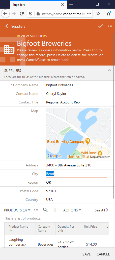
The second alternative is to outline the entire value. The City name is outlined in the modal form in the screenshot.
You will need to change the configuration file ~/app/touch-settings.json as follows to replace the default “underline” style with the “outline”.
Minimalist Focus
There is also a minimalist variation of the focus for a clean uncluttered look. The City name shows up as a selected text ready to be changed or replaced on focus in this screenshot. Set the style to “none” for a minimalist input focus.
Label Color Accent
You have another option to make the input focus more obvious if you prefer. Set up the label property of the focus to true in touch-settings.json.
The input label will get a touch of accent color when the focus is acquired.
Initial Text Selection
The framework makes another important configuration of the input on focus. It will either select the entire text value or place the cursor of the text input control at the end of the value. The former is done when the end user is operating the app with the mouse pointer and the latter is taking on touch screens.
You can override the default behavior like this:
This will result in the direct opposite of the default configuration with the cursor placed right after the last word of the Contact Title in the screenshot: