Configuring a Check Box

Labels
AJAX(112) App Studio(7) Apple(1) Application Builder(245) Application Factory(207) ASP.NET(95) ASP.NET 3.5(45) ASP.NET Code Generator(72) ASP.NET Membership(28) Azure(18) Barcode(2) Barcodes(3) BLOB(18) Business Rules(1) Business Rules/Logic(140) BYOD(13) Caching(2) Calendar(5) Charts(29) Cloud(14) Cloud On Time(2) Cloud On Time for Windows 7(2) Code Generator(54) Collaboration(11) command line(1) Conflict Detection(1) Content Management System(12) COT Tools for Excel(26) CRUD(1) Custom Actions(1) Data Aquarium Framework(122) Data Sheet(9) Data Sources(22) Database Lookups(50) Deployment(22) Designer(177) Device(1) DotNetNuke(12) EASE(20) Email(6) Features(101) Firebird(1) Form Builder(14) Globalization and Localization(6) How To(1) Hypermedia(2) Inline Editing(1) Installation(5) JavaScript(20) Kiosk(1) Low Code(3) Mac(1) Many-To-Many(4) Maps(6) Master/Detail(36) Microservices(4) Mobile(63) Mode Builder(3) Model Builder(3) MySQL(10) Native Apps(5) News(18) OAuth(9) OAuth Scopes(1) OAuth2(13) Offline(20) Offline Apps(4) Offline Sync(5) Oracle(11) PKCE(2) Postgre SQL(1) PostgreSQL(2) PWA(2) QR codes(2) Rapid Application Development(5) Reading Pane(2) Release Notes(183) Reports(48) REST(29) RESTful(29) RESTful Workshop(15) RFID tags(1) SaaS(7) Security(81) SharePoint(12) SPA(6) SQL Anywhere(3) SQL Server(26) SSO(1) Stored Procedure(4) Teamwork(15) Tips and Tricks(87) Tools for Excel(2) Touch UI(93) Transactions(5) Tutorials(183) Universal Windows Platform(3) User Interface(338) Video Tutorial(37) Web 2.0(100) Web App Generator(101) Web Application Generator(607) Web Form Builder(40) Web.Config(9) Workflow(28)
Archive
Blog
Friday, May 4, 2012PrintSubscribe
Configuring a Check Box

The Discontinued field in the Products controller is a Boolean field. By default, Code On Time web application generator assigns Drop Down List style to fields of this type, which allows “Yes”, “No”, or “(select)” options to be selected. The “(select)” option represents null, “Yes” represents True, and “No” represents False.
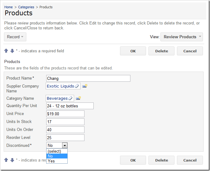
'Discontinued' field with items style of 'Drop Down List'

However, this field is mandatory, and can only be in two states — True or False. It would be more convenient to the end user if this field was presented as a Check Box.

Start the Project Designer. In the Explorer, switch to the Controllers tab. Double-click on Products / Fields / Discontinued field node.
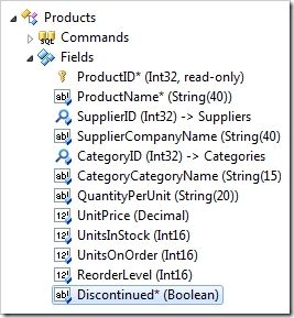
Discontinued field of the Products controller in the Project Explorer

Make the following changes:

Property New Value
Allow null values False
Code Default 0
Items Style Check Box

Press OK to save your changes. On the tool bar, click on Browse to generate the application.

When the application opens in your default browser, navigate to Products page. You will see that Discontinued field is now a check box.
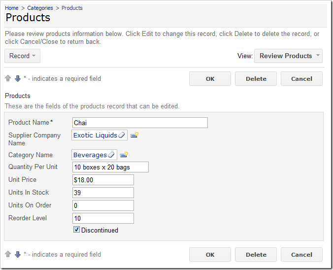
'Discontinued' field now displayed as a Check Box

In the grid view, the Discontinued field is rendered as a check box as well.
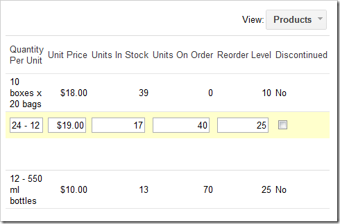
Discontinued field rendered as check box in Products grid view

The text displayed to the right of the Check Box in form view can be changed using the Header Text property of the data field.

Switch back to the Design environment. In the Project Explorer, double-click on Products / Views / editForm1 / c1 – Products / Discontinued data field node.
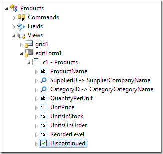
Discontinued data field in the editForm1 data view of Products controller

Change the following property:

Property Value
Header Text This product is no longer available.

Press OK to save the data field, and press Browse on the tool bar. Select a record on the Products page. You will see the new Header Text is displayed to the right of the check box.
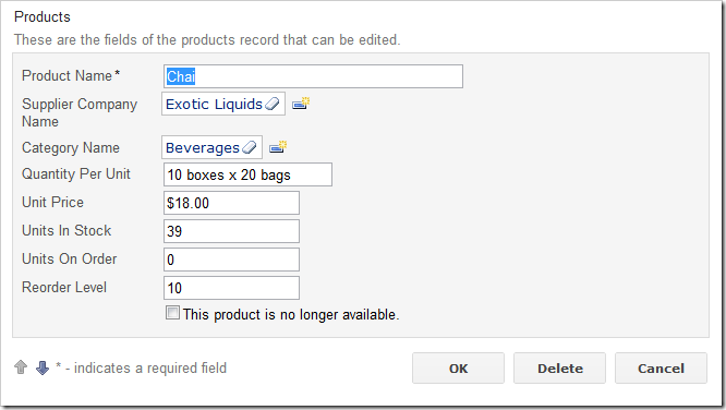
'Discontinued' check box data field with a custom Header Text