Let's review some of the many great features available in a typical application built with Data Aquarium Framework.
Paging and navigation
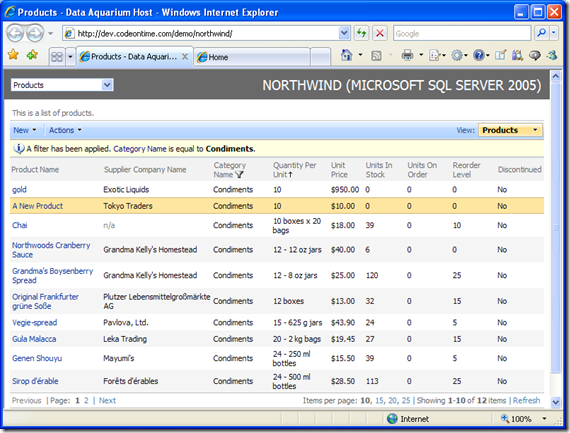
The pager is displayed below the grid of records. You can use Next and Previous links to advance from one page to another, or click on the page number to get to the desired page. The page size is controlled by Items per page section next to the pager. The default values are 10, 15, 20, and 25. You always know the current page range, which is currently displayed in the Showing section of the page. If your data has been edited, you can click Refresh in the bottom right corner.
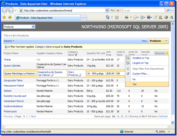
As you can see, the pager is very powerful and provides a great deal of control to the end user.
Sorting and Filtering
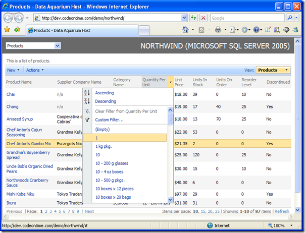
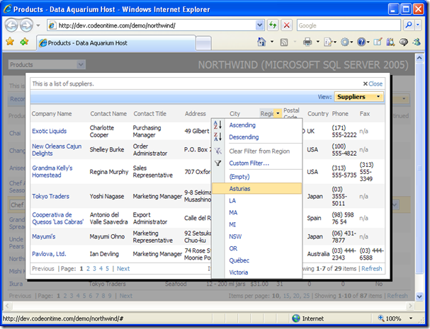
All data views support advanced filtering and sorting. Mouse over the column header and press the arrow for filtering and sorting options. You can alphabetically sort A-Z or Z-A by pressing Ascending or Descending, respectively. The distinct column value filters are listed, and selecting one will cause the record set to trim to the selection. Custom filtering with user-defined conditions is also available in most columns.
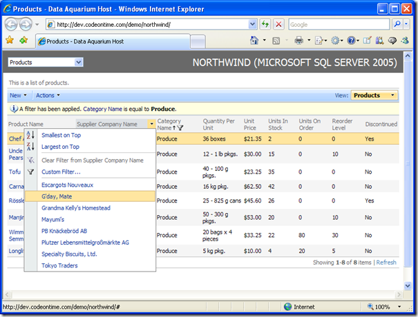
Once a filter is selected, the number of filter values in the other fields will reduce accordingly. Only available filter options are displayed, which is known as Adaptive Filtering. In the example below, the category is limited to Produce, and only shows suppliers that sell produce. All other fields are filtered in a similar fashion. If you wish to remove the filter, press Clear Filter.
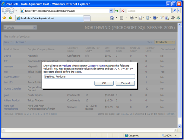
When you select Custom Filter, a popup text box appears. Enter the full or partial sample value you wish to filter by, and press OK to filter. Cancel brings you to the previous screen. You can even add multiple sample values separated by commas, as in the example below. The >, <, >=, or <= operators can also be used to create a filter for numeric values. For example, if you enter >10,<50 in the unit price filter then only the products priced between $10 and $50 will be displayed.
Editing Records
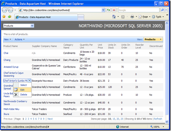
When you mouse over any row in the first column of the grid view, an arrow appears next to the field value. Click on it, and a drop down will extend. If you click on Select, it will lead you to the item's form view. If you click Edit, you can edit the item in place, and can change any of the fields displayed. This is convenient if you would like to work information in a spreadsheet fashion. Clicking Delete will cause the record deletion.
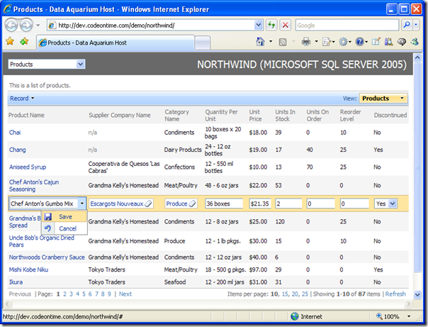
The next picture shows the selected row in the edit mode. You can now change any of the fields. For lookup values, a custom popup window shows up when you click on the field. Clicking on the eraser icon will reset the field to blank. For logical fields, drop downs are automatically generated. You can customize your application to display lookup values as drop downs, list boxes, and radio button lists. When you are finished, you can select the drop down arrow next to the field in the first column, and press Save to save all changes, or Cancel to go back without editing the entry. The same options are available on the action bar in the Record menu.
In the picture below, you can see a custom lookup control for the Suppliers lookup field. You can page through the suppliers, set the number of records per page, and even sort and filter, as is available in the main grid view. Click on a link in the first column to select the supplier, or press Close to exit without changes. The escape key will also cancel the window.
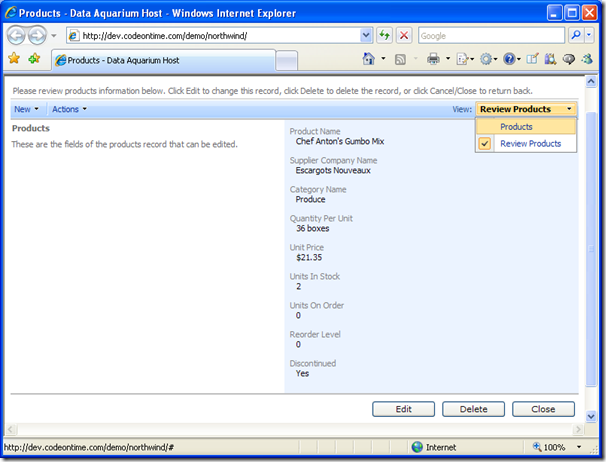
You can also click on an item to go to the form view. Here, you can go into edit mode by pressing Edit, or delete the record by pressing Delete. The Close button brings you back to the previous screen. You can also select Products in the View drop down to go back, as shown in the picture. The New menu option on the action bar in the top left corner allows you to enter a new record into the database.
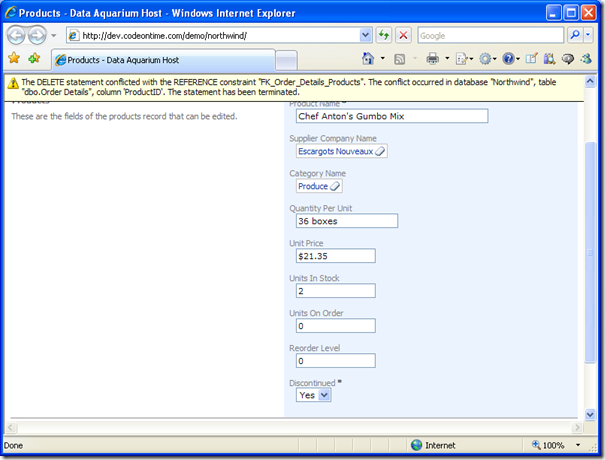
Notice when you try to delete an item that already has orders, an error message appears and remains in position even if you scroll up or down. Upon your next button press, this message will disappear.
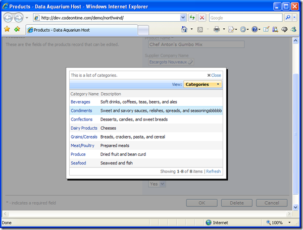
The lookup controls in the form view work the same way as when you edit the item in the grid view. Paging, sorting, and filtering in the lookup windows will work as well. Notice that in lists with a small number of records, the paging options are automatically hidden. You can see that in the Categories lookup window in the picture below.
Custom Actions
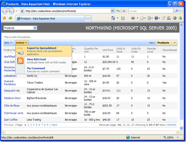
At the top of the web app, there is a bar with several buttons. The New option allows you to create new records. The View button allows you to change your view. The Actions option can contain custom commands. If you need more buttons to be placed or to code your buttons differently, you can easily add and edit them by editing the generated data controller descriptors with your favorite code editor, such as Microsoft Visual Studio. Visual Studio also provide full intelli-sense support for data controllers.
Creating a New Record
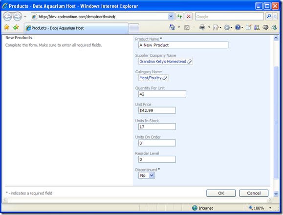
Creating a new record is a simple affair. All that is required is to select New [Record Type] from the New drop down. You will be taken to new record form view, which contains all editable fields. You can type in values, bring up a lookup control for lookup values, and select an option from a drop down on the fields that require you to do so. Once complete, press OK to create your new record, or Cancel to go back to the previous screen without saving.
The new record will be displayed and highlighted upon pressing OK. If you decide you want to page away, your selected record will remain highlighted and the filters and sorting will remain preserved, should you choose to return. This also occurs if you edit or view an item and return. This allows for easy and fast data input.
This is just a short preview of some of the great user interface features that Data Aquarium Framework has to offer. Find more useful resources on our support page.