Data Sheet

Labels
AJAX(112) App Studio(6) Apple(1) Application Builder(245) Application Factory(207) ASP.NET(95) ASP.NET 3.5(45) ASP.NET Code Generator(72) ASP.NET Membership(28) Azure(18) Barcode(2) Barcodes(3) BLOB(18) Business Rules(1) Business Rules/Logic(140) BYOD(13) Caching(2) Calendar(5) Charts(29) Cloud(14) Cloud On Time(2) Cloud On Time for Windows 7(2) Code Generator(54) Collaboration(11) command line(1) Conflict Detection(1) Content Management System(12) COT Tools for Excel(26) CRUD(1) Custom Actions(1) Data Aquarium Framework(122) Data Sheet(9) Data Sources(22) Database Lookups(50) Deployment(22) Designer(177) Device(1) DotNetNuke(12) EASE(20) Email(6) Features(101) Firebird(1) Form Builder(14) Globalization and Localization(6) How To(1) Hypermedia(2) Inline Editing(1) Installation(5) JavaScript(20) Kiosk(1) Low Code(3) Mac(1) Many-To-Many(4) Maps(6) Master/Detail(36) Microservices(4) Mobile(63) Mode Builder(3) Model Builder(3) MySQL(10) Native Apps(5) News(18) OAuth(8) OAuth Scopes(1) OAuth2(11) Offline(20) Offline Apps(4) Offline Sync(5) Oracle(10) PKCE(2) PostgreSQL(2) PWA(2) QR codes(2) Rapid Application Development(5) Reading Pane(2) Release Notes(178) Reports(48) REST(29) RESTful(29) RESTful Workshop(15) RFID tags(1) SaaS(7) Security(80) SharePoint(12) SPA(6) SQL Anywhere(3) SQL Server(26) Stored Procedure(4) Teamwork(15) Tips and Tricks(87) Tools for Excel(2) Touch UI(93) Transactions(5) Tutorials(183) Universal Windows Platform(3) User Interface(338) Video Tutorial(37) Web 2.0(100) Web App Generator(101) Web Application Generator(607) Web Form Builder(40) Web.Config(9) Workflow(28)
Archive
Blog
Data Sheet
Sunday, April 15, 2018PrintSubscribe
Data Field Tag: Overview

The data field Tags property is a space-separated list of values used by the client library to automatically add enhanced functionality at run-time. The table below shows available values and their related function.

Value Function
action-call
action-call-disabled
Will render a Call action to activate the device’s dialer application to make a call to the field value. The “disabled” tag will disable the automatic Call action.
action-email
action-email-disabled
Will render an Email action to open the device’s emailing application to send an email to the field value. The “disabled” tag will disable the automatic Email action.
action-url
action-url-disabled
Will render a Link action to treat the field value as a URL. The “disabled” tag will disable the automatic URL action.
calendar-date The primary date field to be used for Calendar presentation style.
calendar-end The “end” date field to determine date range in Calendar presentation style. In forms, will also configure the calendar input to automatically jump to this field from the “calendar-date” field and only allow date values in the future relative to the “calendar-date” field to be selected.
calendar-color The value field that will assign colors to each record.
calendar-text The field will be used as the primary displayed text in an event in Calendar presentation style.
calendar-disabled Will disable calendar presentation style processing for this field.
calendar-input-disabled Will disable calendar input control for this field in Touch UI.
calendar-input-data-none Will disable automatic query of record counts displayed in the calendar input control.
calendar-input-future Only allows selecting date values in the future.
created-coords When a new record is created, the geolocation will be requested from the browser and saved into the field in the form “[latitude],[longitude]” (without brackets or quotation marks).
created-latitude When a new record is created, the latitude will be requested from the browser and saved into the field.
created-longitude When a new record is created, the longitude will be requested from the browser and saved into the field.
data-sheet-freeze The data field will be “frozen” when in second generation data sheet view. The user can still unfreeze the column by activating “Unfreeze” option in the column header dropdown.
focus-auto Opening the form in edit mode will focus this field first.
header-image-original If the field is a BLOB, will render image as header in full quality.
header-text The value of this field (in grid1) will be displayed as the header in Touch UI forms.

hierarchy-parent

The foreign key data field will be used as the parent when creating and rendering a hierarchy in second generation data sheet view. Examples include: ManagerID, ReportsTo.
import-duplicate-test When importing records, the process will search for records with matching values in fields with this tag. If it exists, it will skip this record.
import-duplicate-accept When importing records, the process will search for records with matching values in fields with this tag. If it exists, it will update the existing record.
lookup-auto-advance Advances to the next field when the user makes a selection in the lookup control.
lookup-details-hidden Will hide the lookup details arrow from the user to prevent direct access to the lookup record.
lookup-distinct Searches for "distinct" values in the lookup controller.
lookup-null-value-none Hides "null" value in Drop Down List, Radio Button List, and ListBox.
map-latitude
map-longitude
map-address
map-state
map-city
map-region
map-postalcode
map-zipcode
map-zip
map-country
Use both “map-latitude” and “map-longitude”, or at minimum “map-address” and “map-city” in order to enable Map presentation style in Touch UI.
map-none Will disable map processing for this data field.
modified-coords When a record is modified, the geolocation will be requested from the browser and saved into the field in the form “[latitude],[longitude]” (without brackets or quotation marks).
modified-latitude When a record is modified, the latitude will be requested from the browser and saved into the field.
modified-longitude When a record is modified, the longitude will be requested from the browser and saved into the field.
smart-dates-disabled Disables smart dates feature for this field.
view-selector-none Disables view selector tabs on the lookup view.

Tags are also used to configure the Chart presentation style. All chart tags start with the keyword “pivotX”, with X being the ID of the pivot. Learn more about how to format chart tags.

These keywords must be combined with dashes “-” to form a tag. Note that keywords with “X” require an integer value replacing the X. If not specified, the default value is 0.

Note that keywords can be split into multiple tags. For example, specifying “pivot1-row1-area” will be equivalent to “pivot1-row1 pivot1-area”. Do not specify duplicate keywords for the same pivot.

Some keywords support specifying a string value. This keyword must be the last keyword of the tag. Format these keywords like the following:

pivot1-title:"This is the title"

The table below enumerates the available keywords.

Keyword Function
pivotX The integer value X determines the pivot ID that the properties will be applied to.
rowX The data field will be used as a row. The index of the row is X.
colX The data field will be used as a column. The index of the column is X.
valX The data field will be used as a value. The index of the value is X.
area
areastacked
bar
barstacked
candlestick
column
columnstacked
candlestick
donut
geo
map
line
pie
pie3d
scatter
table
This keyword determines the chart type. If this keyword is not specified on at least one tag referencing pivot X, then the pivot will not be rendered as a chart.
small
medium
large
Determines the default size for the chart in the user interface.
topX Only the top X number of rows or columns will be kept. The rest will be hidden.
other When used in combination with “topX”, the hidden rows or columns will be collapsed into an “Other” row or column.
date This keyword, used on a DateTime data field, will compose multiple pivots with different configurations. The pivots tested are: year, year/quarter, year/month, year/month/weekofyear, year/month/day. The pivot with the number of rows closest to 25 will be selected for use.
sum
min
max
avg
count
These keywords will determine the value that will be used when calculating cells.
timeofday
second
minute
halfhour
hour
day
dayofweek
weekofmonth
week
weekofyear
twoweek
month
quarter
year
These keywords determine the date bucket mode. The DateTime value will be parsed and use the relevant part of the date.
all Lookup data fields will select all distinct values from the database and ensure that all possible lookup values will be present in the row or column. DateTime data fields will make sure that each bucket between the first and last row or column will be present.
hideblank The “blank” row or column will be hidden.
sortasc
sortdesc
sortascbyval
sortdescbyval
Use the “sort” keyword to determine the sorting order for values of this row or column. Specify “sortasc” or “sortdesc” to sort the row or column alphabetically or numerically. Specify “sortascbyval” or “sortdescbyval” to sort the rows or columns numerically by the value itself.
maximize The chart will take the full allocated space in the view. Axis labels and titles will be displayed inside the chart area.
crosshair Crosshairs will be enabled for the supported graphs.
title
haxistitle
vaxistitle
Specify a string value to set the relevant title text.
format Specifies an ICU Decimal format string.  Supported .NET-compatible formats are “c”, “C”, “d”, “D”, “e”, “E”, “f”, “F”, “n”, “N”, “p”, “P”, “x”, “X”. 
haxisformat
vaxisformat
Controls how the horizontal or vertical axis labels are formatted. Supported values are “none”, “decimal”, “scientific”, “percent”, “currency”, “short”, “long”.
region Specify a string value to set the region mode for “geo” chart.
displaymode Specify a string value to set the display mode for “geo” chart.
resolution Specify a string value to set the resolution for “geo” chart.
curve Enables curvature in the “line” chart.
explorer Enables zooming and panning in the “line” chart.
maptype Specify a string value to set the Map Type in “map” chart type.
enablescrollwheel Enables the scroll wheel for zooming in “map” chart type.
usemaptypecontrol Enables the Map Type control in “map” chart type.
pointshape Specify a string value to set the point shape.
pointsize Specify a value to set the point size.
orientation Specify a string value for the orientation of the chart.
animation Enables the loading animation.
grandtotal Will show a “Grand Total” row and column for the pivot. Not suggested to be used in conjunction with a chart.
Friday, March 1, 2013PrintSubscribe
Geo Tagging, “OR” in Quick Find, DB2, PostgreSQL, Data Sheet Preview

Code On Time release 7.0.7.0 introduces the following features and enhancements:

  • Quick Find supports "OR" if comma “,” or semicolon ";" are entered by the user. Expressions, such as "40 biscuit, beverages 10" are now supported. Quick Find will also skip "aliased" fields when composing a 'where' clause.
     
  • Geo Tagging has been introduced in the client library to allow tagging data with latitude/longitude of the geographical location of the user at the time of data entry.
     
  • Preview of 2nd generation data sheet view is integrated in the release. The new implementation supports horizontal scrolling and freezing of columns, vertical scrolling of data rows, and rendering of hierarchies in projects based on SQL Server and Oracle. 
     
  • PostreSQL database engine is now supported.
     
  • DB2 database engine is now supported.
     
  • Virtualization node set plugin CreateBusinessRule assigns “id” attribute to enable dynamic registration of business rules.
     
  • Designer correctly saves data fields when "Code Filter" property is changed.
     
  • Navigation button is displayed correctly in IE10.
     
  • Grid view templates are compatible with JavaScript business rules.
     
  • Rich Text fields in modal form views will not raise an exception when a field value is changed and the form is closed.
     
  • Data field support new "Tag" property to support column freezing, hierarchies, geo-location, and other future client library enhancements.
     
  • Projects with custom membership correctly integrate an authentication module used to authenticate export and REST requests.
     
  • Batch edit will correctly retain the selection of "update" checkboxes in the views with large number of fields.
Thursday, February 28, 2013PrintSubscribe
“Freezing” Data Fields

A common practice in data sheets is to “freeze” a column so that essential information is always displayed for each row. The second generation data sheet allows both freezing columns at run-time, as well as configuring a column to be frozen at design-time.

Freezing at Run-Time

Create a sample Northwind web application. Browse the site, and navigate to the Order Details page. On the action bar, press Actions | Show in Data Sheet.
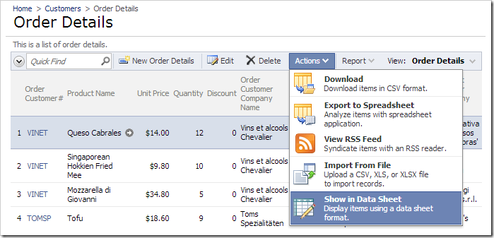
Changing the grid view to data sheet view.

Activate the column header dropdown for Product Name, and press Freeze.
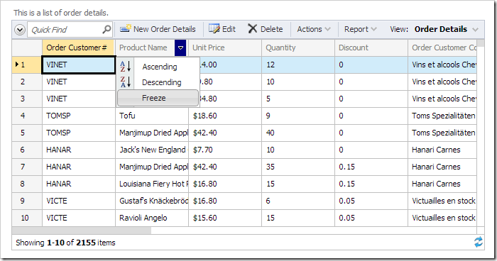
Activating 'Freeze' option for Product Name column.

All columns up to the frozen column will change color. When the data sheet is scrolled to the right, the frozen columns will continue to be displayed.
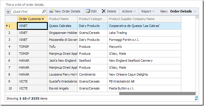
Frozen columns 'Order Customer#' and 'Product Name' continue to be displayed when the data sheet is scrolled to the right.

Columns can be added or removed from the freeze by activating the Freeze option for that column. You may unfreeze the column by activating the column header dropdown and pressing Unfreeze.
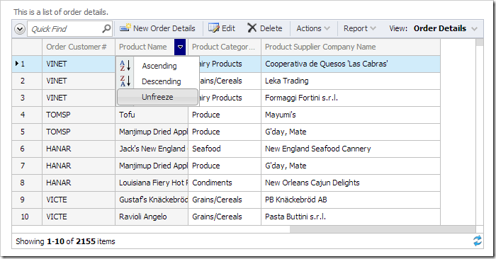
Unfreezing the Product Name column.

Freezing at Design-Time

Start the Project Designer. In the Project Explorer, double-click on Customers / Order Details / container1 / view1 (OrderDetails, grid1) / grid1 / ProductID –> ProductProductName data field node.
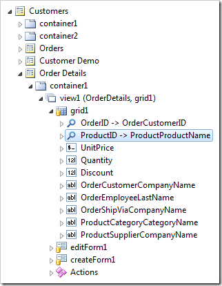
Data field 'ProductID' of view 'grid1'.

Assign a tag.

Property New Value
Tags data-sheet-freeze

Press OK to save the field. On the toolbar, press Browse. On the action bar, press Actions | Show in Data Sheet.

Changing the grid view to data sheet view.

When the data sheet loads, the Product Name column will be frozen by default.

The column 'Product Name' is frozen by default.

The frozen columns can still be changed by the user using the method described in the previous section.

Continue to Configuring Hierarchy