User Interface

New editions, sidebar enhancements, and navigation menu tree.

Labels
AJAX(112) App Studio(6) Apple(1) Application Builder(245) Application Factory(207) ASP.NET(95) ASP.NET 3.5(45) ASP.NET Code Generator(72) ASP.NET Membership(28) Azure(18) Barcode(2) Barcodes(3) BLOB(18) Business Rules(1) Business Rules/Logic(140) BYOD(13) Caching(2) Calendar(5) Charts(29) Cloud(14) Cloud On Time(2) Cloud On Time for Windows 7(2) Code Generator(54) Collaboration(11) command line(1) Conflict Detection(1) Content Management System(12) COT Tools for Excel(26) CRUD(1) Custom Actions(1) Data Aquarium Framework(122) Data Sheet(9) Data Sources(22) Database Lookups(50) Deployment(22) Designer(177) Device(1) DotNetNuke(12) EASE(20) Email(6) Features(101) Firebird(1) Form Builder(14) Globalization and Localization(6) How To(1) Hypermedia(2) Inline Editing(1) Installation(5) JavaScript(20) Kiosk(1) Low Code(3) Mac(1) Many-To-Many(4) Maps(6) Master/Detail(36) Microservices(4) Mobile(63) Mode Builder(3) Model Builder(3) MySQL(10) Native Apps(5) News(18) OAuth(8) OAuth Scopes(1) OAuth2(11) Offline(20) Offline Apps(4) Offline Sync(5) Oracle(10) PKCE(2) PostgreSQL(2) PWA(2) QR codes(2) Rapid Application Development(5) Reading Pane(2) Release Notes(178) Reports(48) REST(29) RESTful(29) RESTful Workshop(15) RFID tags(1) SaaS(7) Security(80) SharePoint(12) SPA(6) SQL Anywhere(3) SQL Server(26) Stored Procedure(4) Teamwork(15) Tips and Tricks(87) Tools for Excel(2) Touch UI(93) Transactions(5) Tutorials(183) Universal Windows Platform(3) User Interface(338) Video Tutorial(37) Web 2.0(100) Web App Generator(101) Web Application Generator(607) Web Form Builder(40) Web.Config(9) Workflow(28)
Archive
Blog
User Interface
Friday, March 1, 2024PrintSubscribe
Enterprise Edition, Resizable Sidebar, Tree Menu

Code On Time app builder version 8.9.37.0 introduces new product editions, resizable sidebar, menu items rendered as tree, multiple Offline Data Processor enhancements, and miscellaneous bug fixes.

Enterprise Edition

The new “Enterprise Edition” of Code On Time app builder combines Offline Sync with the formerly Unlimited Edition. Offline Sync is the magical ingredient that turns an online app into an offline application capable of running without Internet connection in all major browsers and in the native mode.

Community Edition

The new “Community Edition” is the special version of the Enterprise Edition. Developers can use this new product to create any number of apps with any number of users for educational, nonprofit, and commercial purposes. Download the Community Edition now and start building your first offline or online app!.

Resizable Sidebar

An app displays a sidebar when the device screen or browser window is large enough and has a landscape orientation. Users can resize the app sidebar by dragging the right border separating the sidebar from the page contents. A double-click on the sidebar divider will toggle its width between the default and mini state. Developers can now set their preferred sidebar width in the Client / User Interface section of the App Studio settings.

image2.png
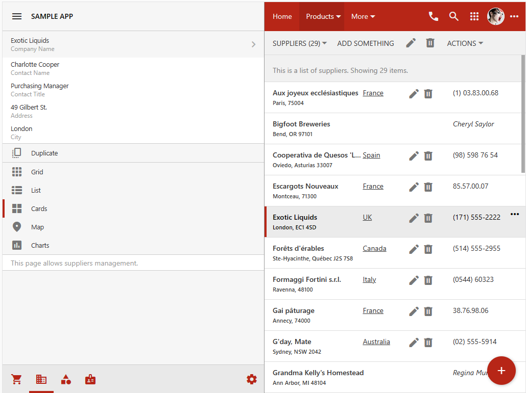
The screenshot shows the sidebar resized to take up half of the app window. The list of suppliers shows the cards formatted by a custom render. The user-defined width of the sidebar will be adjusted to make sure that it never exceeds the 50/50 proportion when the display orientation or window size is changed.

The sidebar will switch to a mini state when users drag the sidebar divider all the way to the left.

Tree Menu

The new Tree presentation style of navigation menu is activated when developers use the App Studio to set the Settings / Client / User Interface / Menu / Location property to have the Sidebar value.

image1.png
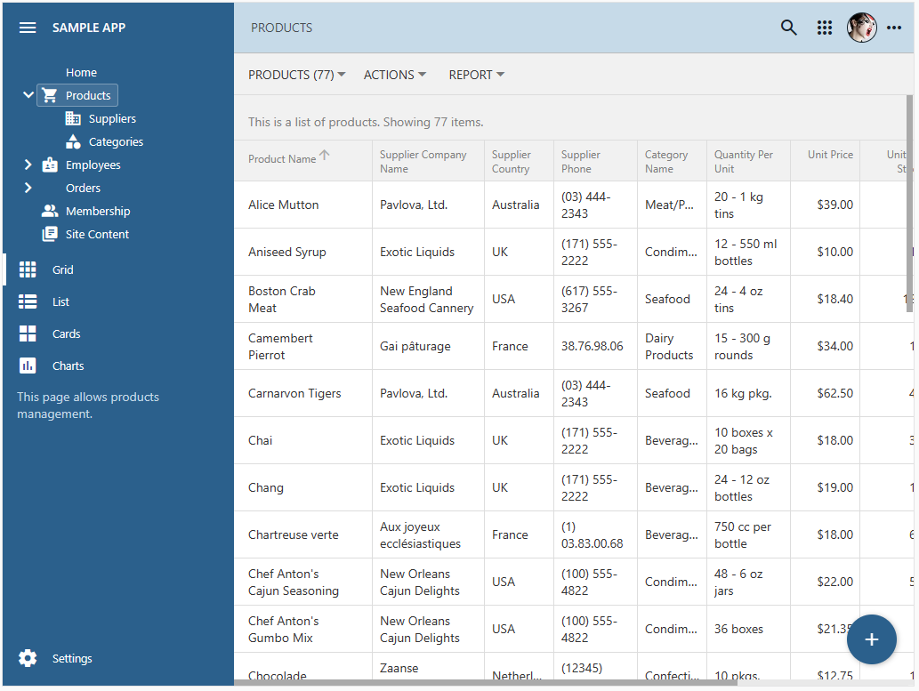
Developers may choose to display the app navigation menu in the sidebar. The default presentation style of the sidebar menu is set to Tree. The compact navigation hierarchy blends seamlessly in the user interface.

The ThreeView is the new user interface component of Touch UI. It was first introduced in the App Studio tools to present hierarchies of the data controllers, navigation menu, data models, and settings. The future product released will demonstrate other exciting uses for this simple and powerful feature.

Features

The following bug fixes and features are included in the release:

  • (Framework) Integrated jQuery 3.7.1 in the application framework.
  • (Framework) Upgraded to the latest Newtonsoft.Json and YamlDotNet.
  • (Touch UI) The sidebar is now resizable.
  • (Touch UI) Added the TreeView-based menu to the app sidebar.
  • (ODP) The offline data processor detects the undefined context values and converts them to null when populating the static lookup items with the context dependency.
  • (ODP) The offline data processor is using the controller metadata to construct the filter when performing requests. Previously the data fields in the PageView instance were used instead, which provided an insufficient set of fields in some instances.
  • (Framework) Fixed incorrect population of the static lookup values for the fields with context mapping when the value of such a field is first changed and then restored by the user.
  • (Framework) The SQL exception is not raised when users search/filter views that have both the many-to-many fields and "formula" fields.
  • (App Gen) Add-ons section is disabled in the Project Wizard. All existing and future add-on features are now added to the apps created with the Enterprise Edition.
  • (Data Aquarium) The JavaScript business rules engine will report the runtime exceptions in a notification.
  • (Touch UI) Context menu renderer ignores the leading dividers that may be occasionally available under some conditions. This eliminates the "thick" dividing lines in the sidebar and list menus.
  • (Reporting) BLOB-based images in the RDLC reports are using the hash of the validation key for the request validation purposes.
  • (Touch UI) The $app.touch.notify() method invoked with the "block:true" option will block the incoming notifications until the specified notification is dismissed. This prevents the App Studio from blocking an exception raised when an app is started in development and the server-side exception is reported on the start.
  • (Framework) The new ReportBase.ToReportDefinition(string) method allows overriding the contents of the RDLC report definition XML document at runtime.
  • (Touch UI) Removed the legacy theming of the "native" apps.
  • (Framework) The cache key for the combined CSS included the theme, accent, and the authentication status of the current user. The latter was not included previously.
  • (Touch UI) The menu treeview in the sidebar is positioned below the list of context actions if 'ui.menu.position' is set to 'bottom'.
  • (Offline Sync) The Settings option is not available to the offline users on offline pages.
  • (Touch UI) The "My Account" option is not available if the device is not online.
  • (Offline Sync) The standard offline/offline123% user account is automatically created when the membership is installed in the database.
  • (App Studio) The "thin" scrollbar is displayed in the code generation log when the app is generated or synchronized in the studio.
  • (App Studio) The app is surrounded with a thin border when the studio mode is activated.
  • (Offline Sync) The "cloud" icon on the toolbar will reflect the pending uploads when the static pages are without data.
  • (PWA) The worker closes the "offline" database in the IndexedDB if there "blob" store is not found.
  • (Offline Sync) The offline-sync.js is linked to the app payload only if the user is in the “Offline” role.
  • (Offline Sync) The offline capability is integrated in the apps created with the Enterprise Edition and Community Edition of Code On Time.
  • (Touch UI) The menu options, app buttons, and user avatar icon are instantly visible on the content pages, fullscreen data pages, and summary pages when the physical HTML page is loaded in the browser window.
  • (App Studio) The correct theme is loaded for the App Studio when the user toggles the Light|Dark theme in the settings.
  • (Touch UI) The Quick Find displays the auto-complete results fetched from the data visible in the view. This functionality was broken in the previous release.
  • (App Gen) The legacy versions of jQuery are removed from the project when the solution file is revised.
  • (Touch UI) The default sidebar width is specified in the ui.sidebar.width parameter in ~/app/touch-settings.json.
Tuesday, January 9, 2024PrintSubscribe
List and Cards

Effective data presentation can make or break an application. Developers have an option to render the list items and cards for a custom presentation of the field values mixed with the text, hyperlinks, actions, and images.

Customize your list items and cards with JavaScript!

Here is how the Edit and Delete actions are represented in the items and cards when specified as icons.

image1.png
The data controller actions can render as icons in the item and layouts. The vast library of Google Material Symbols provides the source of beautiful pictograms for an application created with Code on Time app builder.

The cards of product categories have the category image and text centered side-by-side in the middle.

image2.png
The minimal JavaScript code and HTML markup can liven up the default rendering of even the simplests sets of data.
Saturday, December 16, 2023PrintSubscribe
Render All The Way This Season!

Touch UI Framework has long been using the A tag (anchor element) to represent data items in grids, lists, and cards. This approach is inherited from the jQuery Mobile that served as the framework foundation many years ago. It does make a lot of sense to represent the actionable elements of the user interface as a link. On the other hand it is not possible or recommended to place a link in a link or wrap a link around the table or other complex markup.

Release 8.9.36.0 uses the div tag (content division element) as a container for the data items in grids, lists, and cards. This makes possible the custom renderers for the list items and cards.

image1.png
Custom list items and cards can be produced with JavaScript. Developers declare custom renderers for the views in the data controllers to produce items with the data field values, static text, links, buttons, icons, and images. Full inline editing capabilities are supported automatically.

The data items in screenshots above are rendered with the following code that makes use of the template literals for formatting. Touch UI framework creates an instance of an object with the properties set to the field values. The custom renderer function is invoked as the method of the object instance during the rendering process. Place this code to the ~/app/js folder in a file with an arbitrary name.

JavaScript
12345678910111213141516171819202122232425262728293031323334353637383940414243444546474849505152(function () {

    $app.touch.render.Suppliers = {
        grid1: {
            cards: doRenderItem,
            list: doRenderItem
        }
    };

    function doRenderItem(dataView, container) {
        if (this.Country === 'USA')
            return `
                <div style="display:flex;justify-content:space-between;margin-right:40px">
                  <div style="font-weight:600;width:80%;overflow:hidden;text-overflow:ellipsis" class="app-field app-field-CompanyName">
                    ${this._formatted.CompanyName}
                    <br/>
                    <span style="font-size:.8em">${this._formatted.City}, ${this._formatted.Region} ${this._formatted.PostalCode}</span>
                  </div>
                  <div style="width:20%;">
                    <i>${this._formatted.ContactName}</i>
                  </dvi>
                </div>
                `;
        return `
            <div style="display:flex;justify-content:space-between;margin-right:40px">
                <div style="font-weight:600;width:40%;overflow:hidden;text-overflow:ellipsis" class="app-field app-field-CompanyName">
                    ${this._formatted.CompanyName}
                    <br/>
                    <span style="font-size:.8em">${this._formatted.City}, ${this._formatted.Region} ${this._formatted.PostalCode}</span>
                </div>
                <div style="text-align:left;width:20%;;overflow:hidden;text-overflow:ellipsis"  class="app-field app-field-Country">
                <a href="https://codeontime.com?supplierId=${this.SupplierID}" target2="_blank">${this._formatted.Country}</a>
                </div>
                <div style="width:20%;white-space:normal;visibility:${this.SupplierID == null ? 'hidden' : 'visible'}">
                    <!--
                    <a data-action-path="ag4/a1" title="Try that">Edit</a>
                    <a data-action-path="ag1/a3" title="Go do this!">Delete</a> 
                    -->
                  
                    <!--              
                    <span data-control="action" data-action-path="ag4/a1">Edit</span> 
                    <span data-control="action" data-action-path="ag1/a3">Delete</span> 
                    -->
                  
                    <i class="app-icon material-icon" data-action-path="ag4/a1" title="Edit">edit</i>
                    <i class="app-icon material-icon" data-action-path="ag1/a3" title="Delete">delete</i>  
                </div>
                <div style="text-align:left;width:20%;"  class="app-field app-field-Phone">${this._formatted.Phone}</div>
            </div>
            `;
    }
})();

Here is an example of the custom cards that display images.

image2.png
The minimal JavaScript code and HTML markup can liven up the default rendering of even the simplests sets of data.

The following features, bug fixed, and enhancements are included in this release:

  • (Charts) The "day" cell in month presentation is inferred from the drag & drop target.
  • (ODP) Offline Data Processor now handles the 'url' and 'download' actions in the "summary" data views.
  • (Inline Editor) Inline editor does not throw an exception when the data item is removed.
  • (Touch Core) Added support for the "div"-based list items.
  • (Touch UI) Virtual page transitions start in the next animation frame. Previously the transitions started immediately, which causes a premature completion of animation on the fast devices.
  • (Touch UI) Custom "more" buttons can be introduced to the item by list/card custom renderers.
  • (Touch UI) The menu strip fades in when the window is resized.
  • (Touch UI) Html elements with "data-action-path" attribute are handled with the universal code.
  • (Touch UI) Actions embedded in the item or card correctly trigger whether or not the multi-select is enabled. Clicked/tapped action elements are searched in the "Action Column", "Grid", "Action Bar", and "Custom" scopes.
  • (Touch UI) The grid/list/cards items are rendered as div elements. Previously the anchor element was used. It is now possible to embed the "a" elements inside of the item markup when needed.
  • (Touch UI) Custom HTML renderers specified in the $app.render class are invoked. Developers can specify a custom renderer function as $app.render.[controller].[viewId].[list|card]. The function is invoked on the instance of a JavaScript object that has every field raw value as the property. The formatted values are specified in the "this._formatted" instance. The renderer must return the physical contents of the list item or card.
  • (Touch UI) The minimum height of the list/card is set to fit vertically the actions available in the "Action Column'' scope.
  • (Touch UI) The context menu of a field in the data item does not display the lookup "View" option if the data field is tagged as view-details-hidden.
  • (Touch UI) The notification that was invoked with the exception instance will stop the ongoing transition and set the framework to the "page ready" state.
  • (Touch UI) Custom actions can be specified in the custom markup of a data item or card
  • (Virtual Keyboard) The virtual keyboard displayed on the values with the spaces or text breaking characters will not cause the value to appear as "wrapped".
  • (App Studio) The inspector will skip the CSS tests that are not supported in the browser. The corresponding exception is logged in the console.
  • (Touch UI) Replaced the "a" tag with the "div' tag in the grid/list/cards presentation.
  • (Touch UI) Fixed incorrect rendering of the field selector and legend expansion in the calendar.
  • (Touch UI) Enhanced the visual presentation of the lists and cards in forms.
  • (PropGrid) The properties with the conditional complexity are identified whether or not they have the 'visibility' property of their own.
  • (ODP) The cleanup of the expired "changed" images is performed in the function to ensure compatibility with IE11. Please note that the new features of the Touch UI framework will not be compatible with this browser.
  • (Touch UI) The vertical menu takes into account the top of the virtual screen when nodes with the children are collapsed and expanded.
  • (Prop Grid) Optimized the tagging of properties.
  • (Touch UI) The modal form views with the modal-max-(tn|xxs|xs|md|lg|xl|xxl) will be 1 pixel wider than before.
  • (PropGrid) Method _tagged(regex) assigned to the property evaluation targets will return an object without properties if the matching is not found.
  • (RESTful) The view IDs specifies in the resources will not force the RESTful API to treat them as the view ID specifier. Instead they are treated as row identifiers. The new method RESTfulREsource.SegementIsIdentifier return return true when the data controller name is Views and there is an identifier of the Controllers. This allows App Studio to fetch views from the data controllers by their "id" attribute value.
  • (Universal Input) Pressing Delete, Backspace, and Space in the input field will not cause the vertical scrolling in the webkit browsers.
  • (PropGrid) The read-only fields will not clear when Delete, Backspace, and Del keys are pressed.
  • (Prop Grid) The "compound" complex properties are collapsed when are displayed in the Properties Window for the first time. Their value color matches the color of the editable input fields. The "boolean" subproperties contribute their name to the "compound' field value while the other subproperties are contributing their value instead.
  • (Prop Grid) Double-clicking the compound value of the complex property will expand or collapse its children.
  • (Prop Grid) The HTML selection is disabled completely in the Properties Window when users are dragging the mouse pointer between various elements.
  • (Prop Grid) Pressing Escape key will gradually remove the focus from the active input to the active property, from the active property to the property window. If there is no focused property in the Properties Window then the hierarchy is closed.
  • (ODP) The search implementation is using the native unicode support in the regular expressions available in the modern browsers.
  • (Framework) Prepared the alternative implementation of the $app;prettyText based on the native unicode classes available in the browsers. The framework will be switched to this implementation when the legacy Project Designer is disabled in the v9. This sys/unicode.js will be removed from the framework in v9.
  • (PropGrid) The smooth expansion of a complex property is not performed when the selected child property is focused during the initial display of the hierarchy.
  • (Touch UI) The notification messages appear as detached from the bottom of the screen by default. The 'ui.notify.detached' option controls behavior. Previously the notifications were displayed "flush" with the bottom of the screen.
  • (Touch UI) The new option 'ui.notify.bottomMargin' specifies whether there is margin between the bottom of the screen and the notification. The default value is true.
  • (2FA) If the email is not specified in server.2FA.setup.methods, then the automatic setup is always assumed to have the 'email: true' option.
  • (Prop Grid) Complex properties may be "comlex" on demand. If the child sub-properties are not visible, then the "complex" property is displayed as a "simple" property without a toggle next to it.