Data Sources

Labels
AJAX(112) App Studio(6) Apple(1) Application Builder(245) Application Factory(207) ASP.NET(95) ASP.NET 3.5(45) ASP.NET Code Generator(72) ASP.NET Membership(28) Azure(18) Barcode(2) Barcodes(3) BLOB(18) Business Rules(1) Business Rules/Logic(140) BYOD(13) Caching(2) Calendar(5) Charts(29) Cloud(14) Cloud On Time(2) Cloud On Time for Windows 7(2) Code Generator(54) Collaboration(11) command line(1) Conflict Detection(1) Content Management System(12) COT Tools for Excel(26) CRUD(1) Custom Actions(1) Data Aquarium Framework(122) Data Sheet(9) Data Sources(22) Database Lookups(50) Deployment(22) Designer(177) Device(1) DotNetNuke(12) EASE(20) Email(6) Features(101) Firebird(1) Form Builder(14) Globalization and Localization(6) How To(1) Hypermedia(2) Inline Editing(1) Installation(5) JavaScript(20) Kiosk(1) Low Code(3) Mac(1) Many-To-Many(4) Maps(6) Master/Detail(36) Microservices(4) Mobile(63) Mode Builder(3) Model Builder(3) MySQL(10) Native Apps(5) News(18) OAuth(8) OAuth Scopes(1) OAuth2(11) Offline(20) Offline Apps(4) Offline Sync(5) Oracle(10) PKCE(2) PostgreSQL(2) PWA(2) QR codes(2) Rapid Application Development(5) Reading Pane(2) Release Notes(178) Reports(48) REST(29) RESTful(29) RESTful Workshop(15) RFID tags(1) SaaS(7) Security(80) SharePoint(12) SPA(6) SQL Anywhere(3) SQL Server(26) Stored Procedure(4) Teamwork(15) Tips and Tricks(87) Tools for Excel(2) Touch UI(93) Transactions(5) Tutorials(183) Universal Windows Platform(3) User Interface(338) Video Tutorial(37) Web 2.0(100) Web App Generator(101) Web Application Generator(607) Web Form Builder(40) Web.Config(9) Workflow(28)
Archive
Blog
Data Sources
Friday, March 3, 2017PrintSubscribe
Touch UI 2017, Modals, Import, Identity Manager, OAuth, SharePoint

Release 8.6.0.0 has arrived! This release contains thousands of changes to the application framework and client library. A new revision of Touch UI has been created to match modern user design principles. Modal Forms, Import, Search, and Themes have all been implemented or overhauled for this release. The new Identity Manager and OAuth support for Facebook, Google, Windows Live, and SharePoint make it easy for your users to login and/or switch accounts. The next generation of SharePoint is now supported with Software-as-a-Service (SaaS) mode.

Read on to explore the new features available in release 8.6.0.0. Learn more about upcoming Native Online and Offline Apps.

New YouTube Channel

Watch our brand new YouTube channel! See Touch UI 2017 in action and learn the latest development techniques.

Subscribe to the channel now! New videos will be published weekly. The transcripts of the videos will soon be available on our website in HTML and PDF format.

Modal Forms

Modal forms are now supported in Touch UI. Modals offer an enhanced sense of context and continuity to the user.

Forms will be displayed in modal presentation if sufficient screen space is available. The modal will be sized based on a proportion of the screen’s width and height. Opening additional forms will slide the form in a modal from right side of the screen. The user can tap the previous modal to go back.

Every modal offers access to the “more” menu, represented by the three dot icon in the top right corner. The close icon will return the user to the previous form or grid.
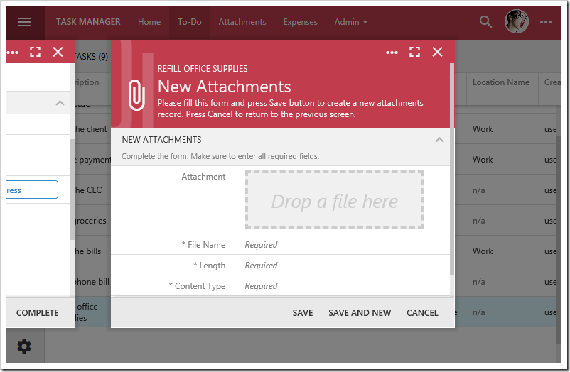
"New Attachments" modal form displayed in Touch UI 2017.

The maximize icon allows the user to expand the modal to fill the screen.
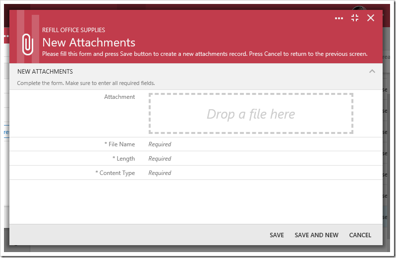
Modal form that has been maximized.

If there is insufficient width to render the form in a modal, it will be rendered in full screen mode. The view tag “modal-never” will also force full screen presentation.
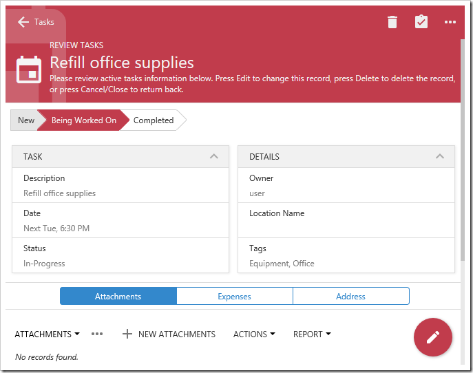
Form is displayed in full screen mode.

Forms that have been tagged with “modal-always” will always be rendered in a modal window.
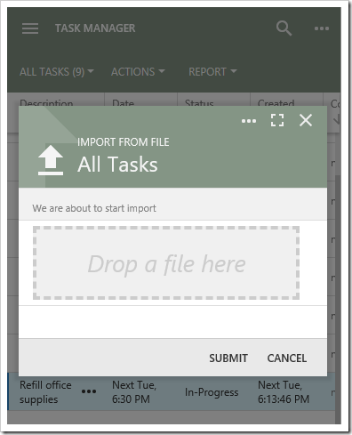
A form marked as always modal on a tiny screen.

A system of tags allows control over the sizing of modals. See the table below for more details.

Tag Description
modal-always Always render form as a modal.
modal-never Never render form as a modal.
modal-when-tn
modal-when-xxs
modal-when-xs
modal-when-sm
modal-when-md
modal-when-lg
modal-when-xl
modal-when-xxl
Will begin rendering the form as modal if the screen is at least the specified logical size. Default is “md”.
modal-fit-content Shrink the modal to fit the content. These modals will begin stacking, instead of sliding from the right.
modal-title-none Disables the modal title bar.
modal-buttons-more-none Disables the “more” icon.
modal-buttons-fullscreen-none Disables the “fullscreen” icon.
modal-tap-out Closes the modal form if the user taps outside the modal area.
modal-max-tn
modal-max-xxs
modal-max-xs
modal-max-sm
modal-max-md
modal-max-lg
modal-max-xl
modal-max-xxl
modal-max-any
The max width of the modal will be restricted to the selected logical size.
modal-dock-top
modal-dock-left
modal-dock-right
modal-dock-bottom
Docks the modal window to the specified side of the window.

New Theming Engine

A lighter touch has been applied to themes in Touch UI. Starting with release 8.6.0.0, the user has the ability to select “Light” or “Dark” base theme. Then, the user can select an accent for the theme. Each accent contains a combination of toolbar, sidebar, and icon color definitions.

The picture below shows “Light” theme with “Aquarium” accent.
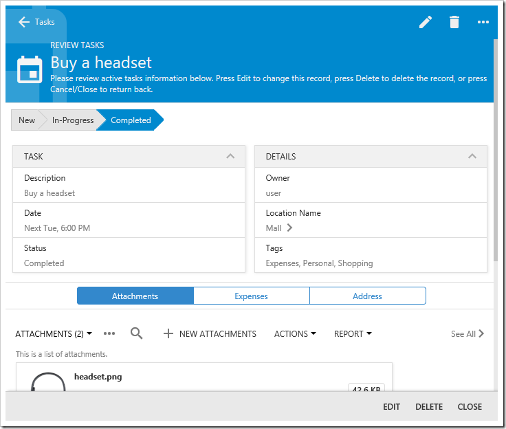
Light theme with Aquarium accent in Touch UI 2017.

Here is “Light” theme with “Dark Knight” accent.
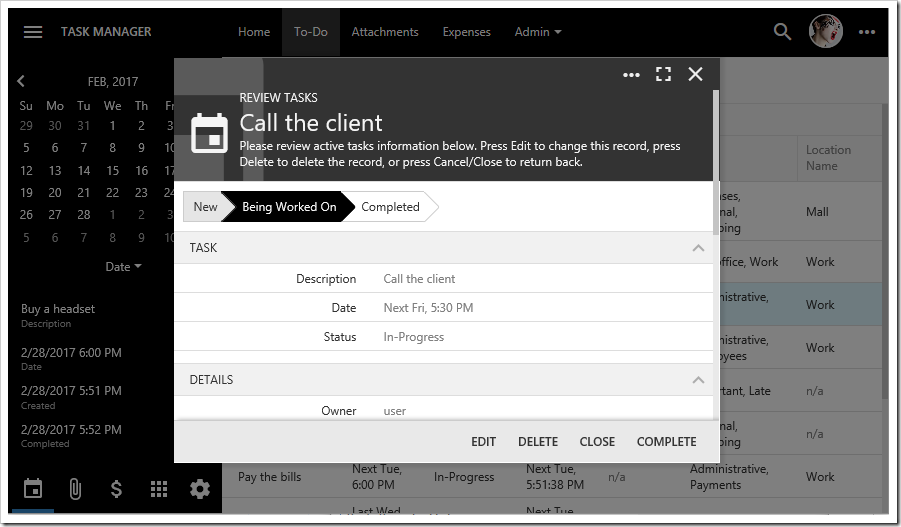
Light theme with Dark Knight accent in Touch UI 2017.

Finally, here is a sample of “Light” theme with “Plastic” accent.
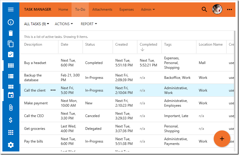
Light theme with Plastic accent in Touch UI 2017.

The new theme engine significantly reduces the amount of CSS that comes with each app, resulting in smaller apps and better performance. It also makes possible the ability to create your own themes easily using a few colors. CoT v9 will offer a built-in Theme Builder.

Note that Dark theme did not make it into this release. We will be adding it in a subsequent release. Additional color variations will be added as well.

4,000+ Icons

Starting with release 8.6.0.0, over 4,000 icons are available for use in apps created with Touch UI. Icons can be applied to a page, view, or action to help the user in navigation and data manipulation.

By default, every application comes integrated with 1,650 icons from the Material icons library, provided for re-use by Google under the Apache License Version 2.0. There are 260 Halfling glyphicons (included with Bootstrap 3.0 under MIT License integrated as well. Additional icon libraries Font Awesome (730) and Ionicons (1,466) can be included using the method described here.
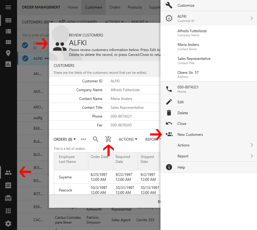
Icons available on actions, forms, and pages.

Import for Touch UI

A new implementation of Import has been added to Touch UI. The “Import” action is no longer hidden from the user. By default, it is available under the Actions menu.
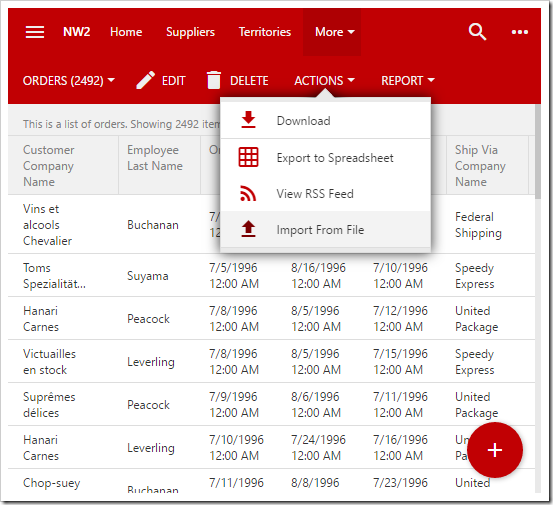
"Import From File" action available on the Actions menu of the action bar.

This action will open the Import modal form, prompting the user to select a file for upload.
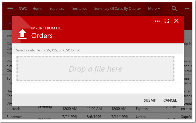
First screen of the Import process allows the user to upload a CSV, XLS, or XLSX document.

Upon selecting a file and pressing “SUBMIT”, the file will be processed. The next form will require the user to map the column headers of the imported file with the fields defined in the command argument of the Import action, or “createForm1”. Sample values from the imported file will be displayed as footer text in each field.
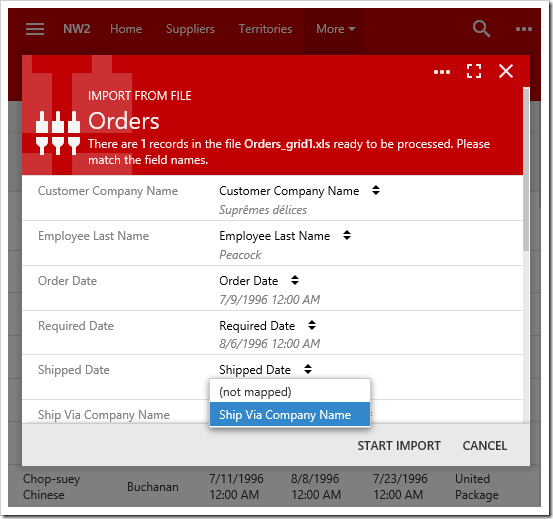
Second screen of the Import process allows the user to map columns from the imported file to fields in the controller.

Upon pressing “START IMPORT”, the client will begin resolving lookups and submitting batch insert requests to the server. A modal form will display the status of the import process.
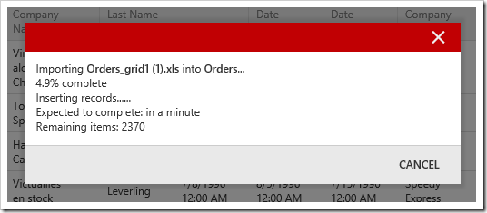
During the Import process, a modal will show status.

The user will be alerted to the fact that the import process was completed.

When Import is complete, a modal will alert the user.

Enhanced Basket Lookups

This release enhances keyboard support for “Basket” lookups. This style, compatible with “Lookup”, “Auto Complete”, and “Drop Down List”, will display a list of values associated with a particular record. Users can use the lookup control to add additional items.
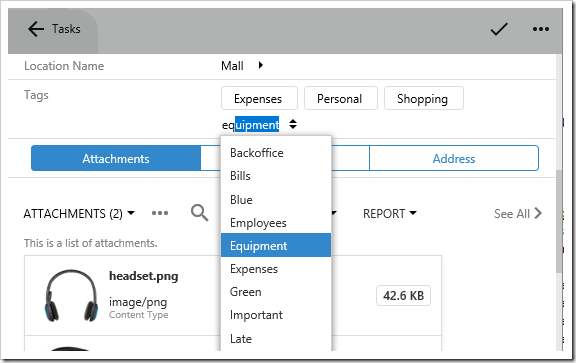
The "Tags" basket lookup shows multiple tags added to the task. A dropdown allows adding more tags.

Tap on an item to remove it from the list, or view details of that record.
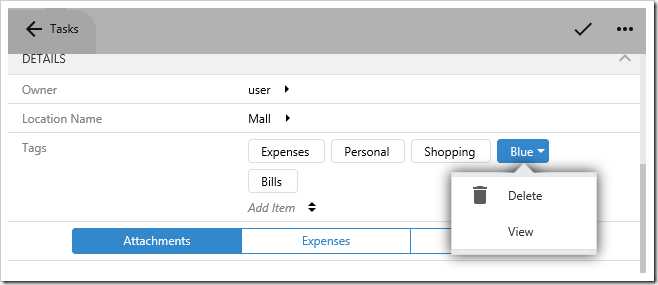
Tapping on an item allows viewing or deleting the item.

If the “New Data View” is specified for the field, the user can type in a new item and press “Enter”. If there is only one required field, the record will be inserted and added. Otherwise, the create form will be shown. This allows rapid entry of items. Note that non-basket lookups also allow creating items in a similar fashion.

The “Basket” lookup style offers a great way to create many-to-many records if the Check Box List does not cut it.

Splash Screen

Many app stores recommend the use of a splash screen showing a logo or app name when the app is first started. Apps created with release 8.6.0.0 will show a splash screen for 2 seconds when the user begins a new session. The application logo is displayed in the top right corner. The app footer text is displayed in the bottom right corner. A default background image is displayed on the left side.
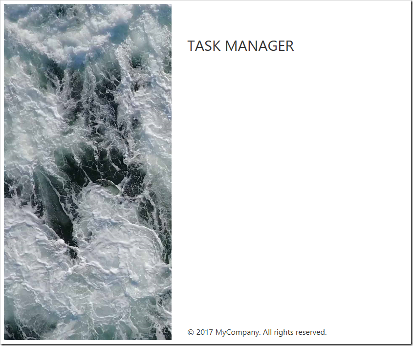
Splash screen for apps created with Touch UI 2017.

Learn how to customize the application logo and background.

Identity Manager

Previous releases required users to sign in every time they start working with the app. The new Identity Manager will store login tokens in the browser’s local storage. If the user enables “Remember Me”, the encrypted token will also enable the user to automatically sign in when their session needs to be refreshed. This login token is valid for up to one week. Otherwise, the token will simply remember the user’s name.

When the user begins a new session, an attempt will be made to sign in with the most recently used credential that contains a login token, if one is detected. The loading screen below will be displayed during the login attempt.
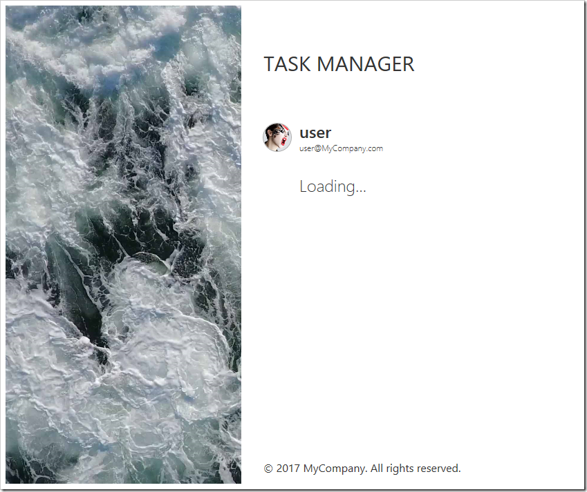
Automatic login for users that remember their password.

Otherwise, if there are any credentials, the list will be displayed.
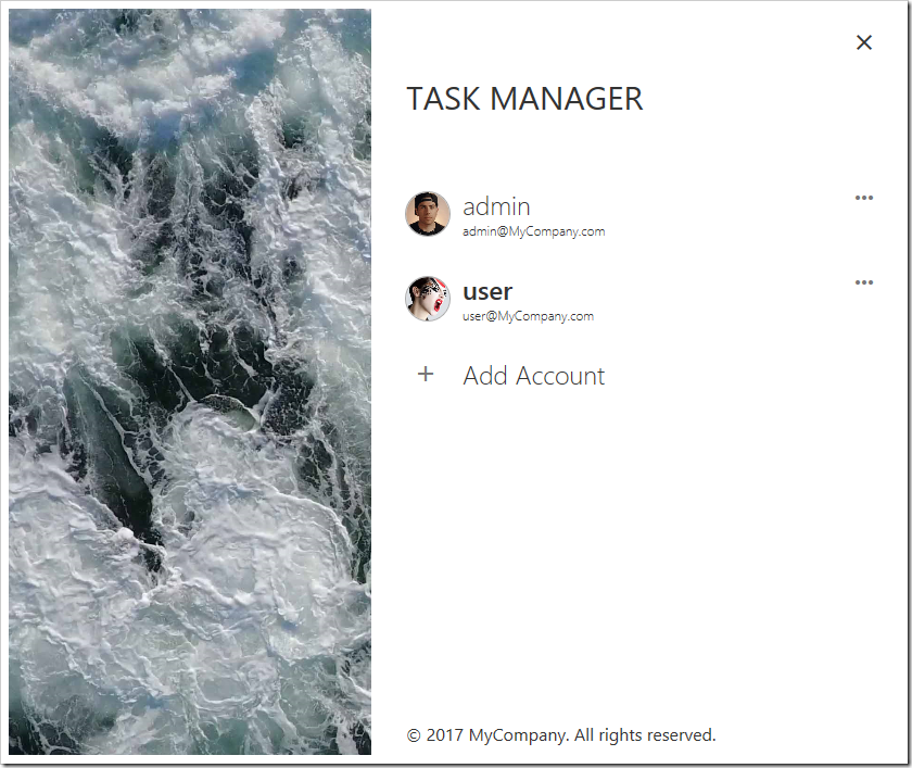
A list of users is displayed on the Identity Manager screen.

The user can select an identity to sign in, and the login form will be displayed. They can also use the three dot icon to remove the identity.

A user icon will be rendered in the top right corner of the screen when signed in. Pressing the icon allows access to the account panel. The user can view their account, log out, switch to different user, add an additional account, or manage the list of accounts.
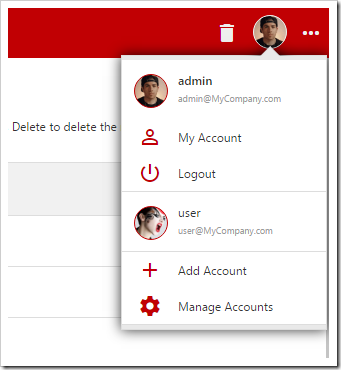
User can switch between accounts using the account panel in the top right corner.

When the screen is too narrow to display the user icon in the top right corner, the user icon will be accessible under the menu panel.
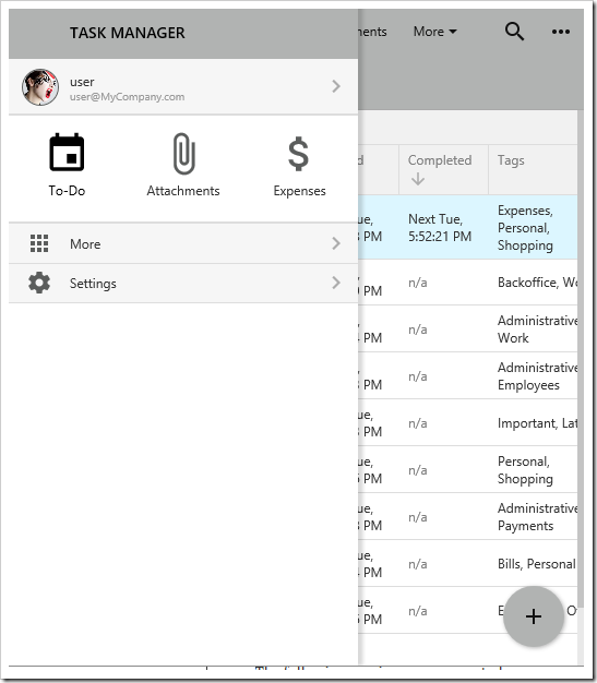
Account panel can accessed from the menu panel if space is insufficient for the user icon.

If login tokens are remembered for several accounts, it becomes trivial to switch between them – similar to how your smartphone allows jumping between different email accounts.

Open Authentication Support for Google, Facebook, Windows Live, SharePoint

Apps created with release 8.6.0.0 support integration with external authentication services via the OAuth 2.0 API. This feature is available in Unlimited edition. Enable the functionality for each service via the following procedure:

  1. Register your app with the external service.
  2. Register the external service with the app.
  3. Login.

The following services are supported:

Actions to login with a service are automatically displayed in the login form when that service is enabled.
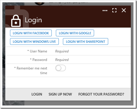
Login with service actions displayed on the login form.

SharePoint Software-as-a-Service

SharePoint Factory project type was originally created as a server-side application that ran a traditional Code On Time Desktop app inside SharePoint 2010. However, the most recent editions of SharePoint (Online and 2016) do not offer the capability to run server-side applications inside the server farm. They do allow embedding simple client-side web apps. As such, the best solution to bring your favorite Code On Time pages into the SharePoint instance is to embed an external Web Site Factory or Web App Factory project in an iframe.
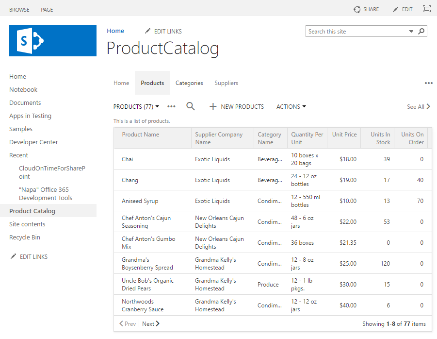
Code On Time app running inside SharePoint Online in SaaS mode.

We now offer the Data Connector for Cloud On Time add-in on the SharePoint Store. Install this add-in to your SharePoint instance. Place the new “Data Connector” web part onto a page, and connect the web part to your app. Once your app has been registered with SharePoint and vice versa, the web part will show a permission request to the user.

User identity is delegated to the SharePoint instance via OAuth support. The SharePoint user simply grants access to your external site, and a matching user identity will be created and automatically signed in to your app.

Learn how to configure the data connector add-in.

Mini Sidebar

The sidebar and menu button behavior has been changed. On larger screens, a wide sidebar is displayed by default.
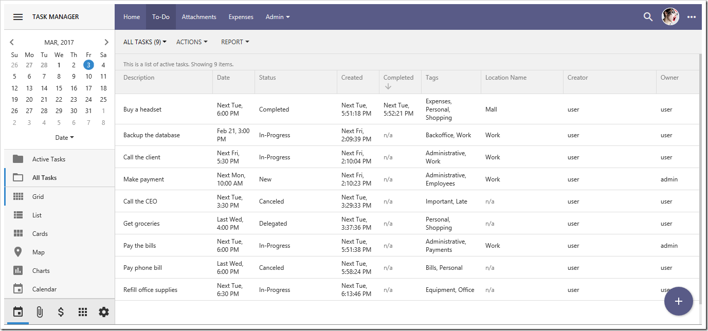
The full sidebar displayed in a Touch UI app

Medium size screens (such as a virtual iPad Pro) will default to the mini sidebar.
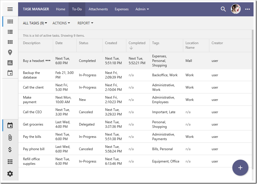
Touch UI app with mini sidebar.

Pressing the hamburger icon in the top left corner will toggle between the full and mini sidebar.

Expanded Keyboard Support

The new release offers better support for keyboard navigation, helping experienced users manipulate data with ease. Arrow keys can be used to navigate the grid or panels. Additional shortcuts have been added:

  • Ctrl+F will search the first visible view on the screen.
  • F10 will trigger the menu button.
  • Shift+F10 brings up the “more” panel.
  • Esc will either close any pending panels, or navigate back to the previous screen.

The developer can also define custom keyboard shortcuts for actions. If the action is visible to the user, pressing that key combination will trigger that action. For example, configure “N” to create a new record from the grid. Configure “Delete” to delete the selected record. Configure “C” to mark a record as “Complete”.

User Icons

The app displays the user identity in the app toolbar and Identity Manager. By default, the first letter will be displayed. The developer can also configure avatars to be supplied for each user.
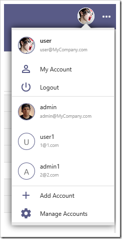
The user icon on the toolbar offers access to the different identities registered on that device.

Touch Settings

In prior releases, app configuration options were statically generated into a code file. The code would return this static definition to the user. Release 8.6.0.0 now first reads from the “~/touch-settings.json” file in the root of the project. This file is blank by default. If various configuration settings are not present in the file, it will write default values specified at generation time. Otherwise, it will take the values defined in the file. It is also possible to programmatically change values in the settings before it returns back to the client.

This behavior now allows us to rapidly introduce new configuration settings to get you app to look and behave the way you want. For example, to configure the menu to render in the sidebar, use the following config:

{
  "ui": {
    "menu": {
      "location":  "sidebar"
    }
  }
}

The result can be seen below.
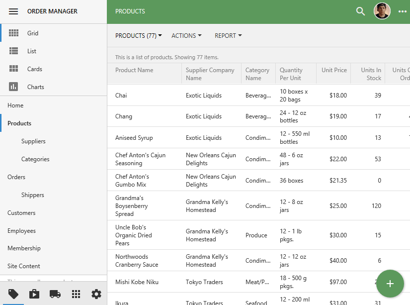
Menu is displayed in the sidebar.

Some of the changes that can be made:

  • Move the menu to the toolbar, sidebar, or hide it.
  • Move the “Apps” button to the toolbar.
  • Disable the Quick Launch area of the sidebar.
  • Restrict the number of themes available to the user.
  • Disable user options, such as “Promote Actions” or “Initial List Mode”.
  • Configure a logo and background for the app.
  • Disable the splash screen.
  • Disable the Identity Manager.

See a sample configuration below. Some of the settings will be subject to change.

{
  "defaultUI": "TouchUI",
  "appName": "Inventory Manager",
  "map": {
    "apiKey": null
  },
  "charts": {
    "maxPivotRowCount": 100
  },
  "ui": {
    "theme": {
      "name": "Light",
      "accent": "Aquarium",
      "preview": null
    },
    "displayDensity": {
      "mobile": "Auto",
      "desktop": "Condensed"
    },
    "list": {
      "labels": {
        "display": "DisplayedBelow"
      },
      "initialMode": "SeeAll"
    },
    "menu": {
      "location": null,
      "apps": {
        "tiles": null,
        "location": "sidebar"
      }
    },
    "actions": {
      "promote": true,
      "reverse": null,
      "autoReverse":  null
    },
    "transitions": {
      "style": "slide"
    },
    "sidebar": {
      "when": "Landscape",
      "mini": true,
      "toolbar": true,
      "icons": true,
      "views": {
        "styles": null,
        "names": null,
        "collapsed": false
      }
    },
    "showSystemButtons": null,
    "smartDates": true
  },
  "settings": {
    "enabled": true,
    "options": {
      "displayDensity": true,
      "theme": true,
      "transitions": true,
      "sidebar": true,
      "labelsInList": true,
      "showSystemButtons": true,
      "promoteActions": true,
      "smartDates": true,
      "initialListMode": true
    }
  },
  "membership": {
    "enabled": null,
    "profile": "view switch login logout",
    "help": true,
    "accountManager": {
      "enabled": true
    }
  },
  "help": {
    "enabled": null
  },
  "search": {
    "quickFind": {
      "history": {
        "enabled": true,
        "depth": 25
      }
    }
  },
  "splash": {
    "enabled": true,
    "duration": null,
    "background": "/images/acme-bkg.jpg",
    "logo": "/images/acme-logo.png"
  }
}

A schema will be supplied in the near future to help construct your configuration. COT v9 will offer a built-in configuration editor.

Data Islands

The new “Data Island” feature allows web-dev savvy users to create their own pages using client-side templating. Simply configure a “$app.execute” script block on your page, and the server will automatically replace that block with the requested data in JSON format using standard data controller requests. Add tags to your HTML template, and the data will be rendered according to the template when page loads in the browser without making requests to the server.

Data islands are perfect for public-facing web pages that do not require data interactivity. For example, you can add pages that display product info, account status, etc.

The example below uses a simple Bootstrap table to render the list of products.
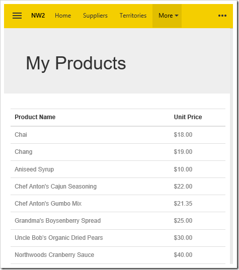
Products rendered with Boostrap CSS styling using the new Data Island feature.

The source code of the page is shown below.

<!doctype html>
<html>
<head>
    <meta charset="utf-8">
    <title>Product Info</title>
</head>
<body data-authorize-roles="*">
    <div data-app-role="page" data-content-framework="bootstrap">
        <div class="jumbotron">
            <div class="container">
                <h1>My Products</h1>
            </div>
        </div>
        <div class="container">
            <table class="table">
                <tr>
                    <th>Product Name</th>
                    <th>Unit Price</th>
                </tr>
                <!-- repeating control -->
                <tbody data-control="repeater" data-source="ProductList">
                    <tr>
                        <td><span data-control="field" data-field="ProductName"></span></td>
                        <td><span data-control="field" data-field="UnitPrice"></span></td>
                    </tr>
                </tbody>
            </table>
        </div>
    </div>

    <!-- data island request -->
    <script data-type="$app.execute">
        ({
            "controller": "Products",
            "view": "grid1",
            "pageIndex": 0,
            "pageSize": 100,
            "sortExpression": null,
            "id": "ProductList"
        })
    </script>

    <!-- optional client-side post-render processing -->
    <script>
        $(document).on('start.app', function () {
            var productList = $app.data["ProductList"];
            if (productList && productList.length) {
                // process
            }
        });
    </script>
</body>
</html>

Search

The new Quick Find uses a modal form to render above the page content.
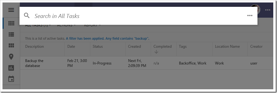
The new Quick Find panel displayed as a modal at the top of the screen.

Pressing the three dot icon will open the advanced search modal window.

IMPORTANT: Release 8.6.0.0 has the advanced search mode in a “temporary disabled” state.  The new advanced search allows complete customization of the user interface but is not quite stable at the moment. The feature will be re-enabled in the maintenance release expected to go out on March 13.

Miscellaneous

The release includes a host of other new features, improvements, and fixes. Some of the items are listed below:

  • CORS Support.
  • JavaScriptSerializer has been replaced with Newtonsoft.JSON to offer significantly greater performance .
  • File sizes are now displayed using “KB”, “MB”, “GB”, etc.
  • Issue with DateTime fields being shifted in reports has been resolved.
  • Footer Text property is now supported in Touch UI.
  • Floating category will create multiple internal columns in Touch UI.
  • Categories now offer “Flow” property. A value of “New Column” will render the category in a new column. A value of “New Row” will ensure that the category will move onto the next row, below any previous columns. This enables developers to configure several tabs of data views below the primary form, much like the “Tabbed” layout in previous versions of the app generator.
  • Touch UI dropdowns now render over the value, instead of below.
  • Static lookups in Touch UI grids will no longer query the database to fetch items.
  • Data View field properties are now supported.
  • “When Key Selected” is not re-enabled when opening an action in the Project Designer.
  • Removed several timers to allow Touch UI pages to load faster.
  • Alerts and confirms now use the new modal windows.
  • Desktop has been renamed to “Legacy”.
  • Legacy UI no longer scrolls incorrectly when a business rule changes a field value.
Friday, January 23, 2015PrintSubscribe
Creating Project for Touch UI

What is Touch UI?

Touch UI is the new user interface of single page apps (SPA) created with Code On Time database application generator. This responsive user interface is based on jQuery Mobile and adapted to work on both mobile and desktop devices with any screen size. It also integrates popular Bootstrap framework to simplify content creation and content oriented SPAs.

Choose Project Type

Touch UI is available in applications created as Azure Factory, Mobile Factory, Web App Factory, or Web Site Factory project.

End users of your application will not be able to tell its project type. 

Developers will notice that Mobile Factory and Web Site Factory project files are grouped in folders, which allows Microsoft ASP.NET to compile the code dynamically. Web App Factory project has a more complex folder structure and uses a solution file to keep track of the project components. It must be compiled in Visual Studio explicitly. These three project types can be deployed to any physical or hosted Windows Sever.

Azure Factory project type is similar to Web App Factory. It is designed specifically for deployment and hosting in Microsoft Azure as a cloud service.

The most versatile and simplest to maintain project type is Web Site Factory.

Choosing a project type for an application with Touch UI.

Start the app generator and create a new application by choosing the desired project type.

Framework and User Interface

Make sure that application framework is set to .NET Framework 4.5 or higher. Also select Touch UI as the user interface default option.

If you are creating your project with Unlimited edition of the app generator, then your application will support both Touch UI and Desktop UI. The secondary user interface will work with browsers that are not compatible with HTML5. Your app will automatically downgrade to desktop user interface as needed. If you choose Desktop UI as a default user interface option then Touch UI will only be activated on mobile devices.

Note that dual user interface is not supported in other product editions.

Specifying Framework and User Interface for an app with Touch UI.

Click Next until your reach a page that allows configuring a database connection for your project.

Configuring Data Provider

 Code On Time allows creating apps straight from your database or from external data sources such as web services or file system.

The default data provider for the app is Microsoft SQL Server. A variety of other database engines is also supported.

If you are not planning to use a database engine as a source of data then choose Custom Data Provider option in the drop down.

Specifying a data provider for an app with Touch UI.

Click on the button with three dots next to Connection String input to configure the connection string for the selected provider.

Setting Up a Sample Data Set

If you are creating a project for Microsoft SQL Server or Microsoft SQL Server Express then you can configure a sample database that is used in the tutorials.

First make sure to specify your server address. If you have Microsoft SQL Express installed on your computer then make sure to enter “.\sqlexpress” without double quotes in the Server input field.

Enter Northwind in the Database input and click Create button. A confirmation will be displayed when an empty database has been created.

Creating an empty sample database for a project with Touch UI.

Select Northwind  in the drop down under Sample Tables. Click Install to create a sample data set. Wait for the confirmation to be displayed.

Populating empty sample database with data for a project with Touch UI.

Add a security system to your project by clicking Add button under Membership section.

Adding a security system to a project with Touch UI.

The new database with sample data is configured and you can click OK to save settings and see the application connection string parameters.

Controllers, Pages, or Empty Project

Now it is time to decide if you want the app generator to create sample data controllers and pages (single page apps) from the contents of your database.

If you are planning to build a collection of single page apps using jQuery Mobile or Bootstrap then choose only Data Controllers to generate. Consider taking advantage of the automatically created SPAs and choose Data Controllers and Pages. If the pages are not matching your needs then you can always delete them later in Project Designer.

If your plan to define data controllers later then choose Empty Project instead.

Choosing data controller and page creation mode for the app with Touch UI.

Choosing Database Tables

The app generator can created data controllers and SPAs for every table and view found in the database. This will be the case if you proceed to the Next step.

For the purpose of the tutorials click Change  next to “All database tables and views are included in this project” and choose tables listed at the bottom of the next screenshot.

Choosing specific tables to be used for generation of data controllers and SPAs in a Touch UI app.

New database tables and views can be added to a project later. 

Press Next until your arrive to Reporting configuration section of your project.

Reporting

Application framework  creates dynamical reports in PDF, Word, Excel, and TIFF format. Complex master-detail custom reports can also be created.

We recommend enabling reports even if you are creating SPAs with jQuery Mobile or Bootstrap without relying on data presentation capabilities of Touch UI. Reports can be defined on the server and invoked with minimal  JavaScript code via custom user interface.

Enabling reports for an app with Touch UI.

Generating Application

Continue pressing Next and you will reach a page with a summary of data controllers that will be created in your project. The summary will be blank if you are creating a project with a custom data provider.

Summary of data controllers that will be created in Touch UI app by Code On Time application generator.

Click Generate button and wait for the  web browser window to open.

Starting project code generation in Code On Time.

Application generator will create the source code of your project, compile it, launch IIS Express, and start the web browser with the home page address of your app loaded.

Exploring App with Touch UI

Touch UI application is a collection of pages (single page apps) that provide access to content or data. A unified navigation system allows switching between single page apps. The default application will have a single SPA called home with several virtual pages.

The default home page of a single page app created with Code On Time.

Click on Site Map or Instructions to transition to the corresponding virtual page of the SPA. The default transition on Android devices is “fade”. Other mobile devices and desktop computers will use “slide” transition animation.

Proceed to Instructions and click or touch Login button. Enter admin/admin123% as user identity and hit Enter key.

Logging into a Touch UI app created with Code On Time.

SPA Home will reload and three  options will be displayed in the sitemap.

Home SPA of a user with a known identity in a Touch UI app.

Option Membership allows administrators to access user and role manager built into the app.

Buil-in user and role manager in app with Touch UI.

If you have an app created with Data Controller and Pages then the navigation menu will have numerous SPA options.

A navigation system with single page apps automatically created by Code On Time applicaiton generator.

Application SPAs will provide access to data stored in database tables and views. This particular single page app allows managing employees stored in the sample database in Employees table.

A single page app allows managing employees in the application with Touch UI created with Code On Time.

Changing App Settings

Click or touch Menu button on the left side of the application toolbar. Select Settings option in the menu and change the application theme to Dark.

Changing settings of application with Touch UI.

This is how the Membership Manager will look in Dark theme. There are 37 themes to choose from.

An alternative Dark theme activated in an app with Touch UI.

Touch or click Menu button again and select Logout in the slide-out drawer panel. The current SPA will reload.

Logging out of the app with Touch UI.

The original application theme will be displayed. You are now an anonymous user and the default theme will be activated.

If the last SPA has required authorization than that application page will not be loaded. Instead user will be transitioned to the home SPA accessible to anonymous users and asked to log in.

Home SPA will request identification if the user just has logged out of the SPA that required authorizaton in an application with Touch UI.

Many application settings and features are user-configurable and stored in the local database of your browser.

Configuring Default Settings of Touch UI

You can specify default settings of Touch UI for your project such as global display density or label alignments in data-enabled SPAs.

For example, if you notice that transition animations between virtual pages are not smooth enough on the hardware of your end users than consider changing default settings for transitions. Select your project on the start page of the app generator and choose Features in the project settings.

Change features of the app with Touch UI in Code On Time.

Select Touch UI section and set Transitions to None. This will disable transitions between virtual pages of SPAs by default.

Specifying default configuration settings for the Touch UI application.

Application end users can still choose their preference for transitions on their own.

Developers can remove various settings from the user interface with a few lines of JavaScript.

Saturday, August 9, 2014PrintSubscribe
Passing Business Rule Properties to Stored Procedures

Code On Time generator allows creating data controllers from the result set of a stored procedure. Some stored procedures use parameters in order to perform operations on the data. In the Northwind sample database, the [Employee Sales By Country] stored procedure shows total sales amounts grouped by employee, and then by country. It accepts two parameters, @Starting_Date and @Ending_Date to determine the filter.

Let’s create a controller from this stored procedure and pass parameters to the script via properties in the BusinessRules class of the app.

This picture shows the results of the stored procedure with @Beginning_Date and @Ending_Date parameters returned by a business rule property.

Employee Sales by Country stored procedure results filtered by a business rule property.

The CREATE script for the stored procedure can be seen below.

CREATE procedure [dbo].[Employee Sales by Country] 
@Beginning_Date DateTime, @Ending_Date DateTime AS
SELECT    Employees.Country, 
        Employees.LastName, 
        Employees.FirstName, 
        Orders.ShippedDate, 
        Orders.OrderID, 
        "Order Subtotals".Subtotal AS SaleAmount
FROM Employees INNER JOIN 
    (Orders INNER JOIN "Order Subtotals" ON Orders.OrderID = "Order Subtotals".OrderID) 
    ON Employees.EmployeeID = Orders.EmployeeID
WHERE Orders.ShippedDate Between @Beginning_Date And @Ending_Date

Creating the Controller

Start the Project Designer. In the Project Explorer, switch to the Controllers tab. Click on the New Controller icon on the toolbar.

Creating a new controller.

Enter a name for the controller.

Property Value
Name EmployeeSalesByCountry

Press OK to save. Right-click the new controller and press “Generate From SQL…”.

Generating the controller from an SQL script.

In the SQL script textbox, paste in the following script. The debug section is removed from the business rule when the application framework executes the script at runtime and declares the business rule properties as SQL parameters.

-- debug
DECLARE @BusinessRules_BeginningDate datetime,
        @BusinessRules_EndingDate datetime
-- end debug

EXEC [dbo].[Employee Sales by Country]
    @BusinessRules_BeginningDate,
    @BusinessRules_EndingDate

Press OK to generate the controller.

Adding Controller To Page

Next, let’s add the controller to a page. Right-click on the controller and press Copy.

Copying the EmployeeSalesByCountry controller.

Switch to the Pages tab in the Project Explorer. On the toolbar, press the New Page icon.

Creating a new page in the project.

Give a name to the page and press OK to save.

Property Value
Name Employee Sales By Country

Drop the new page to the right side of Home page node to place it second in the site menu.

Dropping a page to the right side of Home page node.     Employee Sales By Country page placed after the Home page node in the site menu.

Right-click on the page and press Paste to instantiate the controller as a data view on the page.

Pasting on the Employee Sales By Country page.     The EmployeeSalesByCountry controller has been added to the page as a data view.

Adding Business Rule Property

Let’s create two properties in the BusinessRules class. These properties will return a DateTime value that will be picked up and used by the query to filter the results. If the user is in role “Administrators”, it will display all records between 1970 and 2000. Otherwise, no records will be displayed.

On the Project Designer toolbar, press Browse to first generate the web app. Then, press Develop to open the solution in Visual Studio.

In the Solution Explorer on the right side, right-click on App_Code folder and press Add | Class.

Adding a new class to the project.

Assign a name of “EmployeeSalesByCountryProperties” and press OK to create the file. Replace the contents of the file with the following:

C#:

using System;

namespace MyCompany.Data
{
    public partial class BusinessRules
    {
        public static DateTime BeginningDate
        {
            get
            {
                if (Controller.UserIsInRole("Administrators"))
                    return new DateTime(1970, 1, 1);
                else 
                    return DateTime.Now;
            }
        }

        public static DateTime EndingDate
        {
            get
            {
                if (Controller.UserIsInRole("Administrators"))
                    return new DateTime(2000, 1, 1);
                else
                    return DateTime.Now;
            }
        }
    }
}

Visual Basic:

Imports Microsoft.VisualBasic

Namespace MyCompany.Data
    Partial Public Class BusinessRules

        Public ReadOnly Property BeginningDate As DateTime
            Get
                If Controller.UserIsInRole("Administrators") Then
                    Return New DateTime(1970, 1, 1)
                Else
                    Return DateTime.Now
                End If
            End Get
        End Property

        Public ReadOnly Property EndingDate As DateTime
            Get
                If Controller.UserIsInRole("Administrators") Then
                    Return New DateTime(2000, 1, 1)
                Else
                    Return DateTime.Now
                End If
            End Get
        End Property

    End Class
End Namespace

Make sure to save the file.

Viewing the Results

Press Ctrl+F5 to start the app without debugging. Log in as an administrator and navigate to the Employee Sales By Country page. Notice that all 809 records are displayed.

All employee sales are displayed.

Log out, and log in again as a user. Notice that no records are displayed.

No employee sales are displayed.