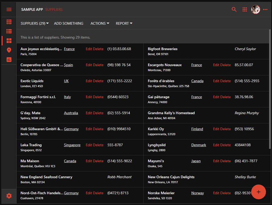
Data controllers allow an application to manipulate the database table rows or the output of the cloud APIs. A controller derived from a data model has the grid1 view. Its purpose is to present the corresponding collection of data items in Grid, List, or Cards style. The Grid style is the spreadsheet view of data rows. The List and Cards styles present data rows as formatted items. A list item breaks a data row into multiple columns of field values. A card item flows the field values in multiple rows. The Cards style renders data rows as item cards of the same height distributed in multiple columns.
Effective data presentation can make or break an application. Developers have an option to render the list items and cards for a custom presentation of the field values mixed with the text, hyperlinks, actions, and images.
 Custom list items and cards are produced with JavaScript. Developers declare a custom renderer for a view in a data controller to format items with the data field values, static text, links, buttons, icons, and images. Full inline editing capabilities are supported automatically.
Customizing List Without Code
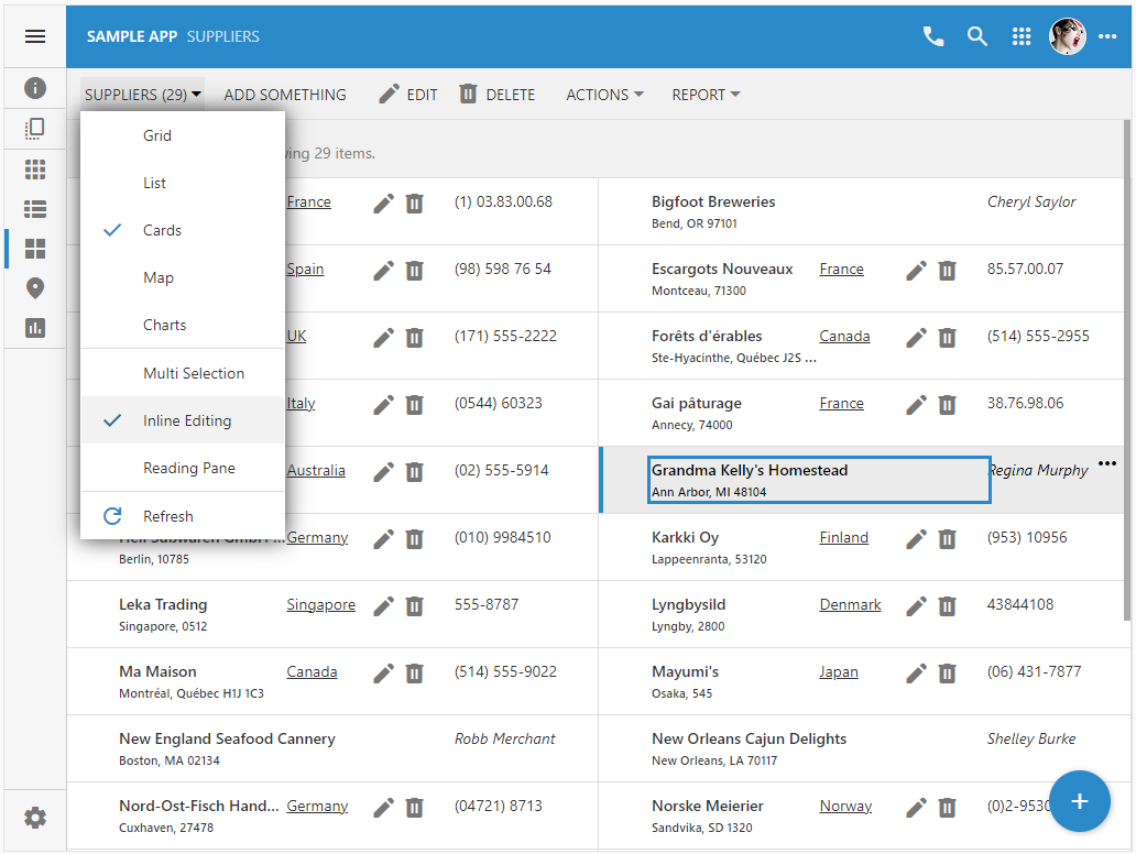
The List view style is available as the presentation mode in the grid1 view by default. Users enable this presentation style by selecting the corresponding icon on the sidebar or choosing the option in the view selector menu. The item field values are distributed in the three columns with the labels positioned on the left side or below the values. The contents of the long values will wrap to the next line to accommodate the entire text, which may result in the list items of varying height.
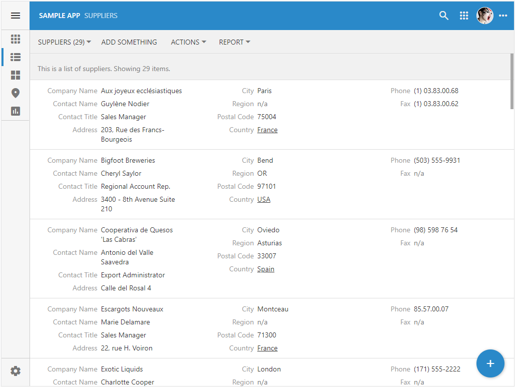 This is an example of the List view style with the labels presented on the left side of values. Labels will appear below their value on the smaller screens. Items with the long text values are taller than their peers.
Application framework assigns the list- tags to the data fields in the grid1 view when the List mode is activated by users. Developers can “tag” the data fields in the view when designing the app. The following tags can be applied to the view data fields to customize the List presentation:
|
Tag
|
Description
|
|
list-column
|
The field value starts the new column of values.
|
|
list-nolabel
|
There is no field label next to the value.
|
|
list-label
|
The label is attached to the field value.
|
|
list-count
|
The field value is rendered on the right side of the list item with the contrasting background surrounded with the border.
|
|
list-aside
|
The field value is rendered on the side of the list item.
|
|
list-thumb
|
The field value is rendered as the thumbnail on the left side of the item.
|
|
list-none
|
The field value is not rendered.
|
The following tags were applied to the data field in the Suppliers / views / grid1 view. Note that multiple list- tags can be assigned to the same data field.
|
Data Field
|
Tags
|
|
Company
|
list-column list-label
|
|
ContactName
|
list-label
|
|
ContactTitle
|
list-label
|
|
Address
|
list-column list-nolabel
|
|
City
|
list-nolabel
|
|
Region
|
list-nolabel
|
|
PostalCode
|
list-nolabe
|
|
Phone
|
list-nolabel
|
|
Fax
|
list-none
|
The effect of the tags is shown in the screenshot. The fields with the labels are grouped in the first column. The remaining fields with the exception of the Fax field are grouped in the second column and rendered without labels.
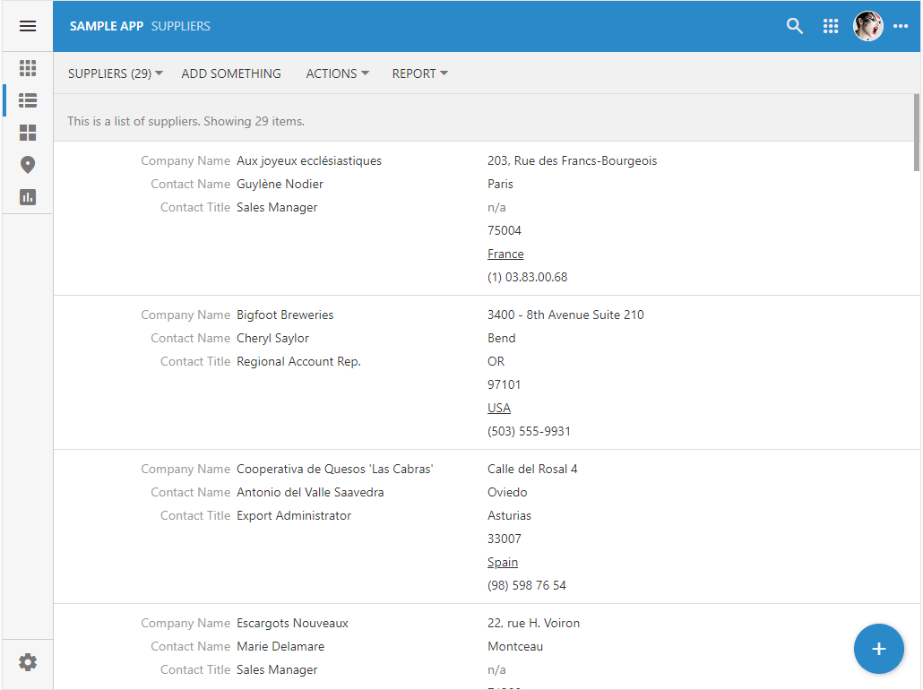 This is an example of the List view style customized with the tags. There are two columns of values in each item. Values is the second column have no label.
Customizing Cards Without Code
The Cards view style is another presentation mode available in the grid1 view by default. The value of the first data field is the card heading presented in the bold without label. The remaining item field values are flowing from the left to the right with the labels positioned below the values. The framework groups the field values into paragraphs. The contents of the long values will clip, which ensures that the cards will have the same height. The cards are distributed in one, two, or three columns. The number of columns depends on the available real estate of the view.
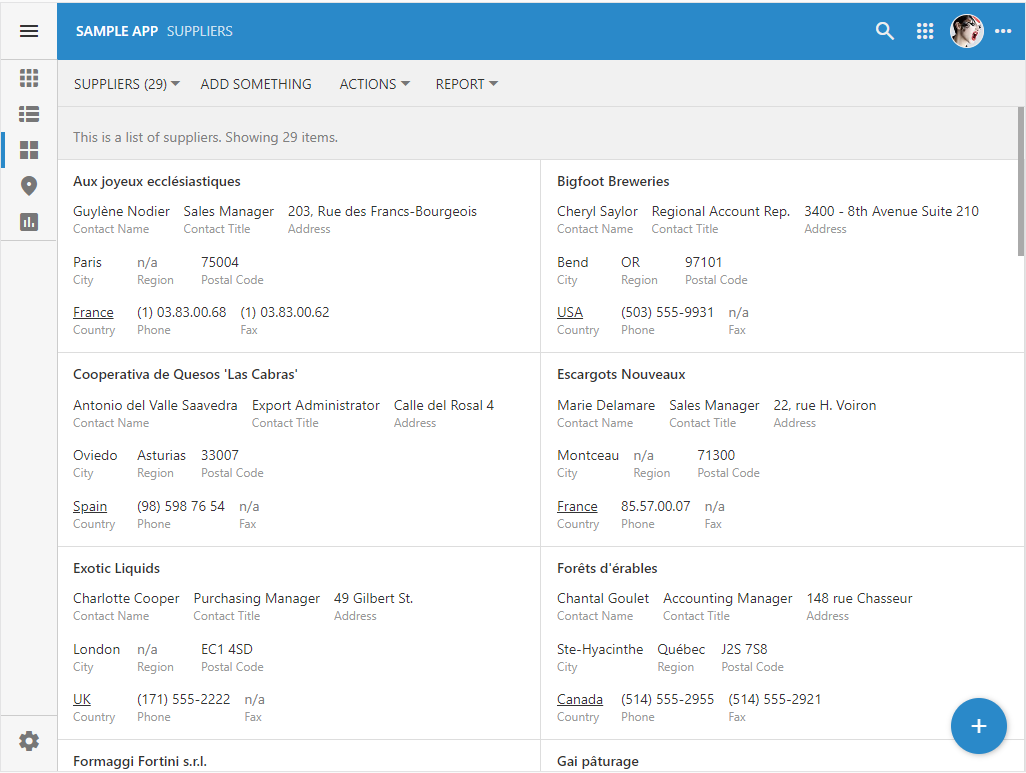 The Cards view style presents two columns of the infinitely scrollable cards. The header field value is followed by the three paragraphs containing three field values each. The long field values are clipped. All cards have the same height.
The following card- tags can be applied to the fields to customize the Cards presentation:
|
Tag
|
Description
|
|
card-heading
|
The field value appears at the card heading in bold font without label.
|
|
card-para
|
The field value starts the paragraph of values.
|
|
card-nolabel
|
There is no field label next to the value.
|
|
card-label
|
The label is attached to the field value.
|
|
card-count
|
The field value is rendered on the right side of the card with the contrasting background surrounded with the border.
|
|
card-aside
|
The field value is rendered on the side of the card.
|
|
list-thumb
|
The field value is rendered as the thumbnail on the left side of the card.
|
|
list-none
|
The field value is not rendered.
|
A data field can be tagged with list- and card- tags at the same time.
Coding Card/Item Renderer
Custom formatting of items and cards can be accomplished with JavaScript. Create a JavaScript file with an arbitrary name in the ~/app/js folder of the project and paste the following code. This sample declares the doRenderItem function as the renderer of list and card items in the Suppliers / grid1 view.
JavaScript
123456789101112131415161718192021222324252627282930313233343536373839404142(function () {

    $app.touch.render.Suppliers = {
        grid1: {
            cards: doRenderItem,
            list: doRenderItem
        }
    };

    function doRenderItem(dataView, container) {
        if (this.Country === 'USA')
            return `
                <div style="display:flex;justify-content:space-between;margin-right:40px">
                  <div style="font-weight:600;width:80%;overflow:hidden;text-overflow:ellipsis" class="app-field app-field-CompanyName">
                    ${this._formatted.CompanyName}
                    <br/>
                    <span style="font-size:.8em">${this._formatted.City}, ${this._formatted.Region} ${this._formatted.PostalCode}</span>
                  </div>
                  <div style="width:20%;">
                    <i>${this._formatted.ContactName}</i>
                  </dvi>
                </div>
                `;
        return `
            <div style="display:flex;justify-content:space-between;margin-right:40px">
                <div style="font-weight:600;width:40%;overflow:hidden;text-overflow:ellipsis" class="app-field app-field-CompanyName">
                    ${this._formatted.CompanyName}
                    <br/>
                    <span style="font-size:.8em">${this._formatted.City}, ${this._formatted.Region} ${this._formatted.PostalCode}</span>
                </div>
                <div style="text-align:left;width:20%;;overflow:hidden;text-overflow:ellipsis"  class="app-field app-field-Country">
                <a href="https://codeontime.com?supplierId=${this.SupplierID}">${this._formatted.Country}</a>
                </div>
                <div style="width:20%;white-space:normal;visibility:${this.SupplierID == null ? 'hidden' : 'visible'}">
                    <span data-control="action" data-action-path="ag4/a1">Edit</span>
                    <span data-control="action" data-action-path="ag1/a3">Delete</span>
                </div>
                <div style="text-align:left;width:20%;"  class="app-field app-field-Phone">${this._formatted.Phone}</div>
            </div>
            `;
    }
})();
The renderer is invoked at runtime on the instance of the data object that has its fields set to the values of the data item. An alternative format is provided for the suppliers from the USA. The template literals are used heavily for simple formatting. The blocks of HTML start and end with the backtick character. Arguments dataView and container refer to the DataView instance and HTML element that serves as the item or card container. The renderer returns the HTML string that will be assigned to the container.
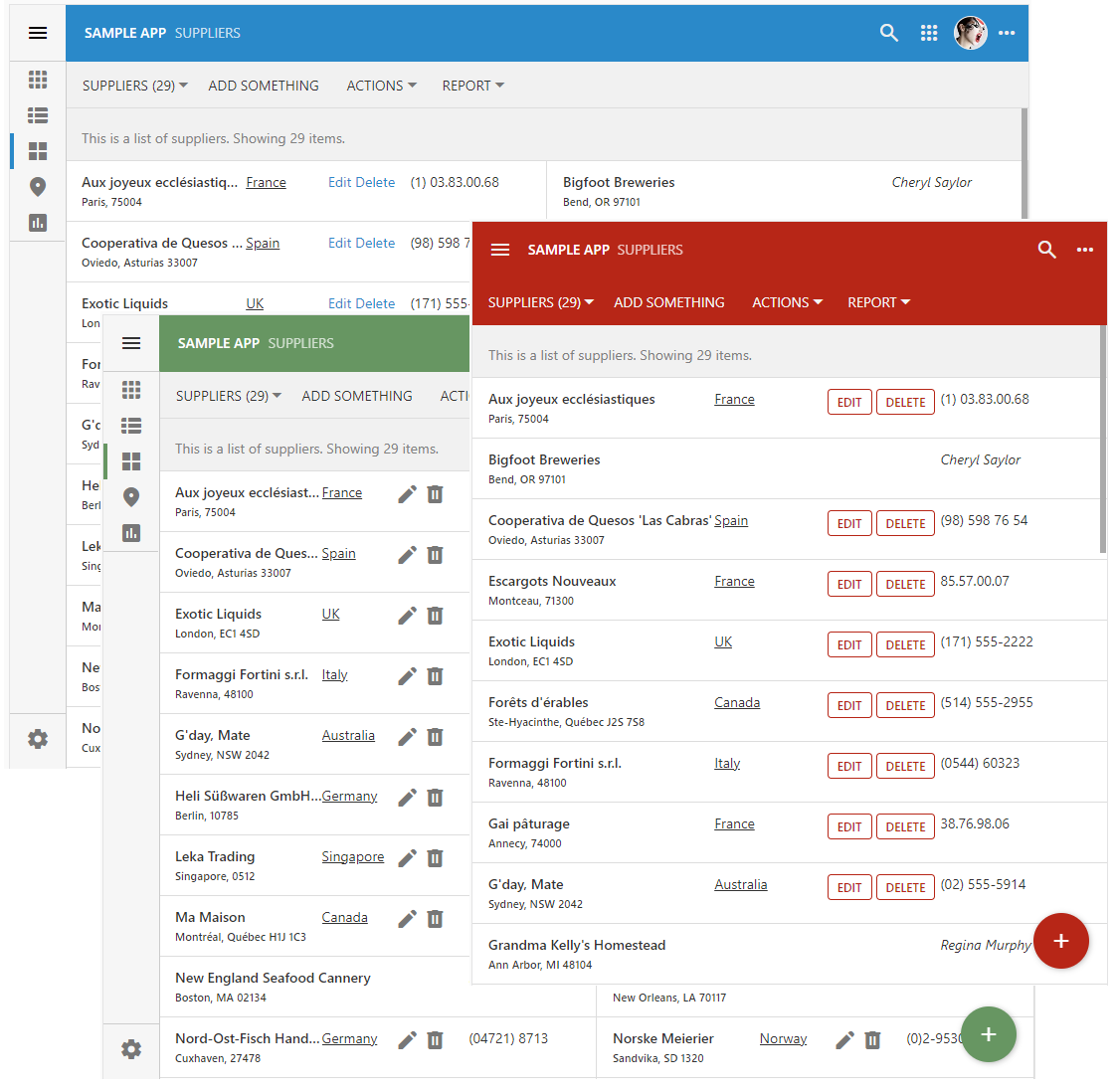
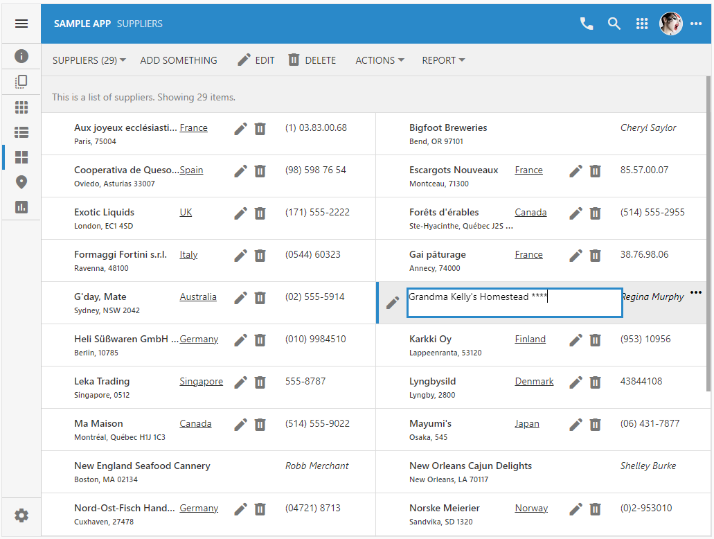
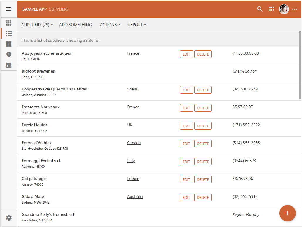 The custom render output for the List view style is shown in the picture. The hyperlink with the country of origin points to the external website and includes the supplier ID as the parameter. The italicized contact name is shown on the right hand side of the item for the suppliers from the United States. Otherwise the supplier phone number is displayed with the Edit and Delete actions shown in the preceding column.
Developers debug a custom item renderer by placing a breakpoint in their code in Visual Studio. The sample “this” instance is shown in the screenshot. The raw values of a data item are available as fields named after the data fields in the controller view. Their formatted text versions are grouped in the object instance referenced by the _formattted field.
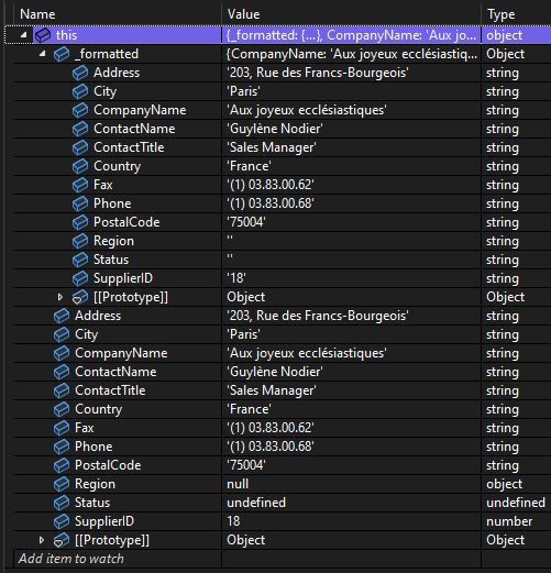 The this._formatted field makes it easy to create custom items. The item field values are accessible as pre-formatted strings. The raw values can be accessed as fields of “this” instance.
The render function is invoked for each data item with its this keyword pointing to the object instance that represents the raw and formatted values of the data item.
The sample renderer specifies the CSS properties of the HTML elements directly in their style attribute. Developers can reference the custom classes in any CSS stylesheet placed under the ~/app/css folder of the project.
Layout With Flexbox
The layout of the item and card content is achieved in the sample renderer with the flexbox display. It provides the simple layout model that distributes children of the flexbox container element in rows or columns.
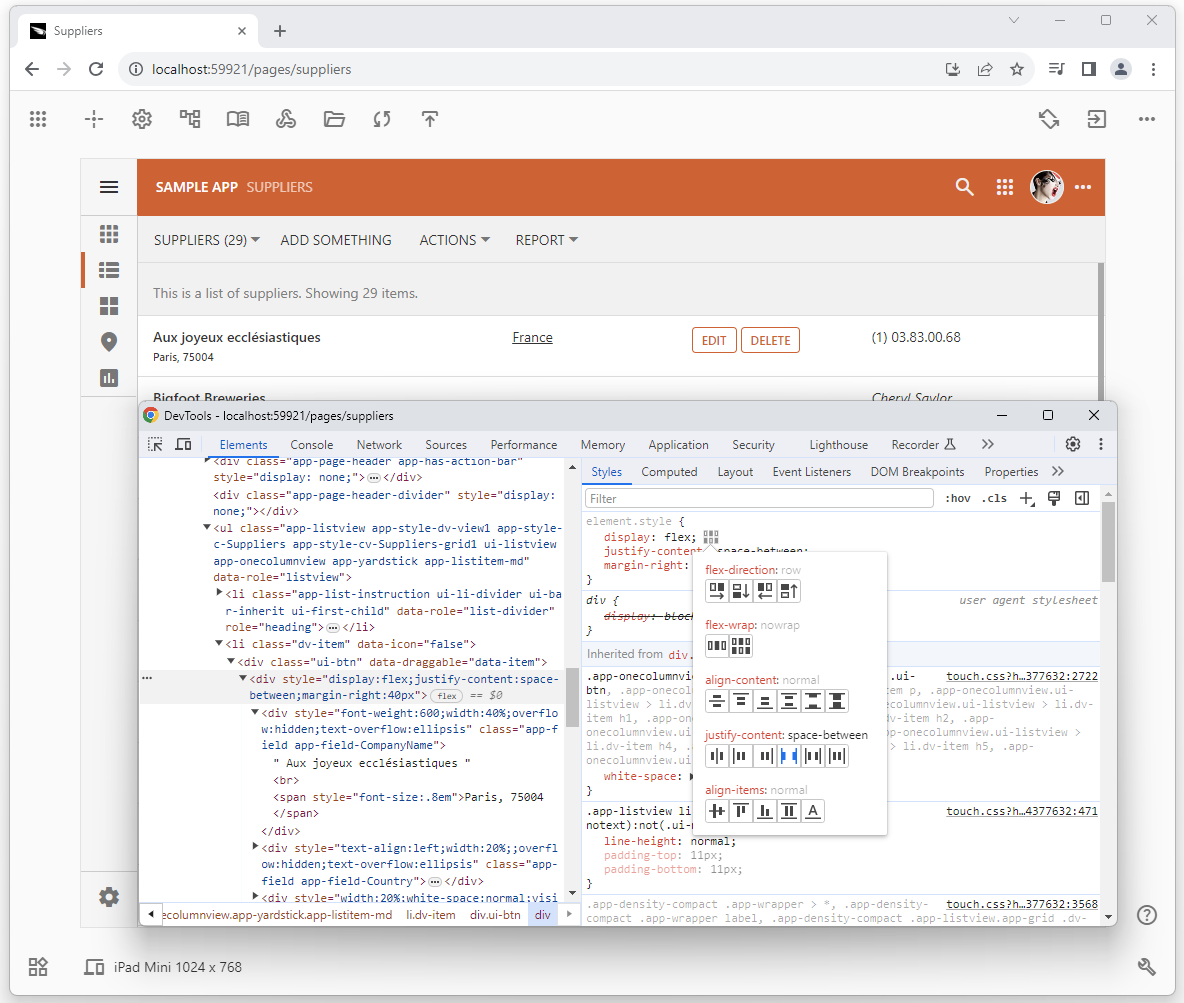 Use the flex display to layout the contents of the cards and item. Flexbox provides a robust and easy mechanism to place the content in the items and cards.
Hyperlinks
A hyperlink with the target attribute will open a new browser tab when clicked. The hyperlink may point to any location and include values of the data item in the path or parameters. The example below is the fragment of the HTML produced by the sample custom renderer.
JavaScript
1`<a href="https://codeontime.com?supplierId=${this.SupplierID}" target="_blank">${this._formatted.Country}</a>`
The hyperlink will have a themed presentation. By default, the hyperlinks are displayed as underlined text.
Action Buttons
An HTML element with the data-control and data-action-path attributes is rendered as a button if the former is set to the action value. The action of the data controller is referenced as the action group identifier separated with the forward slash from the action identifier in the data-action-path value.
HTML
12<span data-control="action" data-action-path="ag4/a1">Edit</span>
<span data-control="action" data-action-path="ag1/a3">Delete</span>
The action element will be visible whether or not there is Visible When expression specified for the corresponding action. Developers must evaluate the field values of the “this” instance before including the action element in the layout of the item or card.
Actions Links
An action link is defined as an “anchor” element with the data-action-path attribute.The “link button” will take less space then a button and may blend better in the layout of the item or card.
HTML
12<a data-action-path="ag4/a1" title="Try that">Edit</a>
<a data-action-path="ag1/a3" title="Go do this!">Delete</a>
The “accent” color of the theme is applied to an “action link” to distinguish it from the static text. Here is an example of the modified sample renderer with the Edit and Delete actions rendered as links.
 The action links have an “them accent” color. A tap on the link will execute the action specified in the data-action-path attribute.
Actions Icons
A graphical icon may be a better choice to represent an action. Use the vast library of Google Material Symbols to specify actions as icons. Pick the desired icon and enter its name in lower case while replacing the spaces with the “underline” character. Surround the name with the “i” tag that has its class attribute set to app-icon material-icon and the data controller action specified in the data-action-path attribute.
HTML
12<i class="app-icon material-icon" data-action-path="ag4/a1" title="Edit">edit</i>
<i class="app-icon material-icon" data-action-path="ag1/a3" title="Delete">delete</i>
Here is how the Edit and Delete actions are represented in the items and cards when specified as icons.
 The data controller actions can render as icons in the item and layouts. The vast library of Google Material Symbols provides the source of beautiful pictograms for an application created with Code on Time app builder.
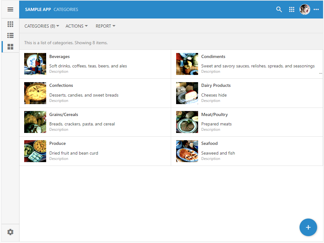
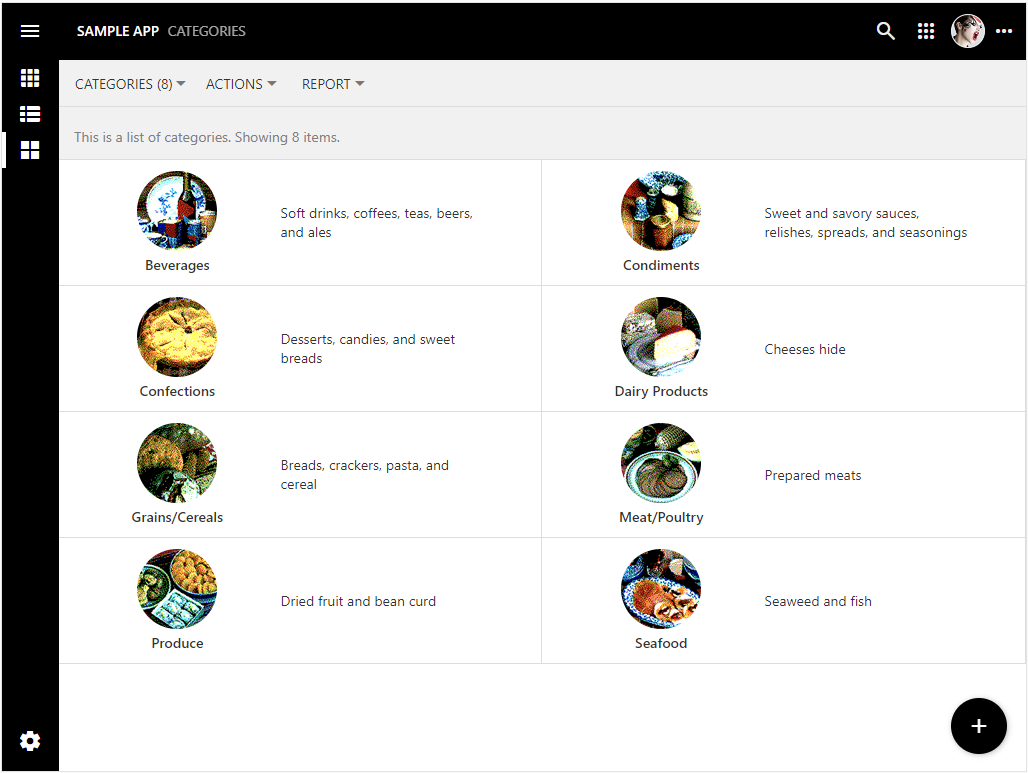
Images
The on-demand fields are rendered as thumbnails in the items and cards. The thumbnail is positioned on the side of the content. Here is an example of the product categories rendered as cards.
 The BLOB (binary large object) fields are rendered as thumbnails if their On Demand Style is set as Image or Signature. The thumbnail occupies the left side of the item or card.
Define the new content renderer shown below in the separate JavaScript file in the ~/app/js folder or include the closure contents into the existing custom code.
JavaScript
123456789101112131415161718192021222324252627(function () {

    $app.touch.render.Categories = {
        grid1: {
            cards: renderCategory,
            list: renderCategory
        }
    };

    function renderCategory() {
        return `
          <div style="display:flex;align-items:center;margin-right:40px">
            <div style="width:50%;text-align:center">
               <img src="/blob.ashx?CategoriesPicture=t|${this.CategoryID}" style="width:80px;height:80px;border-radius:40px"/>
               </br>
               <span style="font-weight:600">${this._formatted.CategoryName}</span>
            </div>
            <div style="width:50%;">
              <span style="white-space:wrap">
               ${this._formatted.Description}
               </span>
            </div>
          </div>
        `;
    }

})();
The cards of product categories have the category image and text centered side-by-side in the middle.
 The minimal JavaScript code and HTML markup can liven up the default rendering of even the simplests sets of data.
The image tag in the layout references the application BLOB handler in the src attribute. The CategoriesPicture parameter references the blob handler. The letter “t” is separated from the row primary key value with the “pipe” character. Use the “o” letter to fetch the original instead of its thumbnail version.
HTML
123<img
    src="/blob.ashx?CategoriesPicture=t|${this.CategoryID}"
    style="width:80px;height:80px;border-radius:40px"/>
The name of the handler is specified in the On Demand Handler property field of the data controller.
Inline Editing
Any HTML element in the layout of an item or card can become a placeholder of the inline editor if provided with the “magical” class names in the class attribute. Add the combination of the app-field and app-field-FIELD_NAME classes while replacing the “FIELD_NAME” with the name of the data field. For example, the “app-field app-field-CompanyName” combination will turn the HTML fragment into the inline editing placeholder for the CompanyName field.
HTML
123456789101112. . . . . . . . . .
<div style="display:flex;justify-content:space-between;margin-right:40px">
    <div style="font-weight:600;width:40%;overflow:hidden;text-overflow:ellipsis" class="app-field app-field-CompanyName">
       . . . . . . . . . . . .
    </div>
    <div style="text-align:left;width:20%;;overflow:hidden;text-overflow:ellipsis"  class="app-field app-field-Country">
        <a href="https://codeontime.com?supplierId=${this.SupplierID}">${this._formatted.Country}</a>
    </div>
    . . . . . . . . . . . .
    <div style="text-align:left;width:20%;"  class="app-field app-field-Phone">${this._formatted.Phone}</div>
</div>
. . . . . . . . . . . .
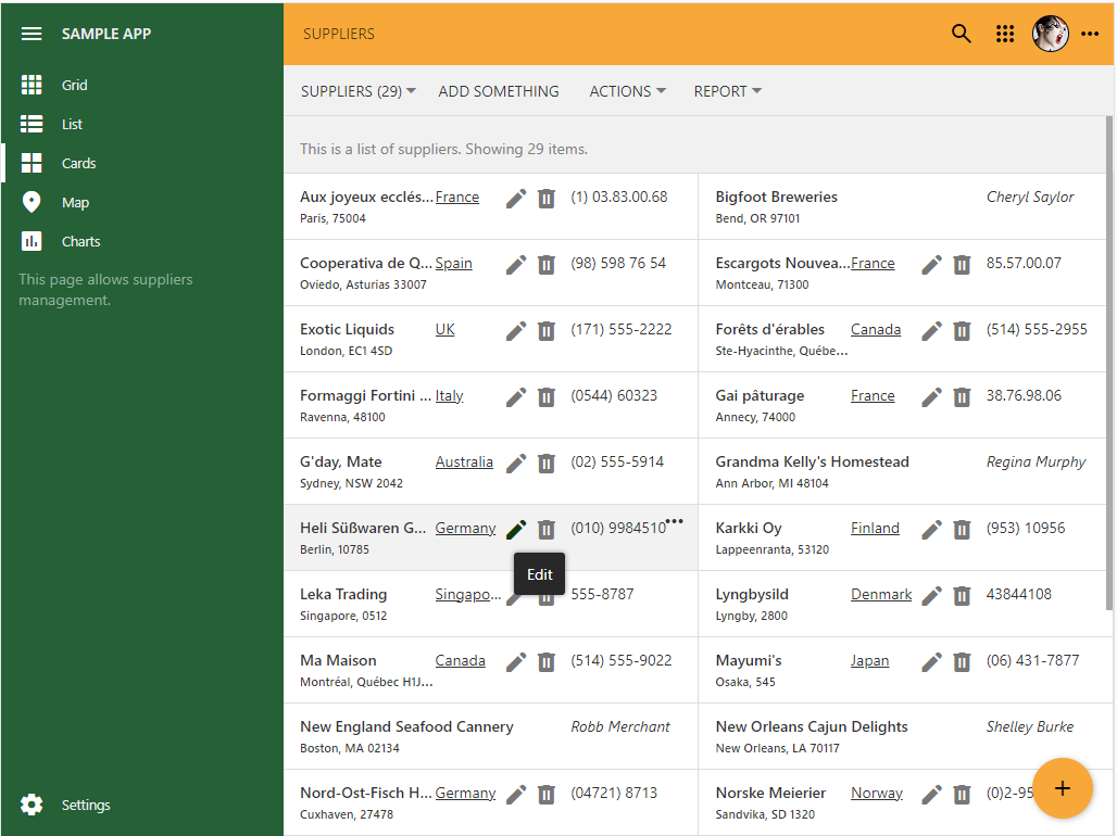
Users can activate the inline editing mode with the corresponding option in the view selector menu. The editing frame will appear over the placeholder when the item is selected.
 The inline editing mode is the built-in feature of Touch UI. Users navigate between items with the arrows keys and move focus between field values with the Tab key or Shirt+Tab combination.
Users are able to type in the new field value and press the Enter key to commit the changes or the Tab key to advance to the next field value.
 Users can press the F2 key to start editing or start typing after positioning the focus frame on the desired value.