Blog

Labels
AJAX(112) App Studio(7) Apple(1) Application Builder(245) Application Factory(207) ASP.NET(95) ASP.NET 3.5(45) ASP.NET Code Generator(72) ASP.NET Membership(28) Azure(18) Barcode(2) Barcodes(3) BLOB(18) Business Rules(1) Business Rules/Logic(140) BYOD(13) Caching(2) Calendar(5) Charts(29) Cloud(14) Cloud On Time(2) Cloud On Time for Windows 7(2) Code Generator(54) Collaboration(11) command line(1) Conflict Detection(1) Content Management System(12) COT Tools for Excel(26) CRUD(1) Custom Actions(1) Data Aquarium Framework(122) Data Sheet(9) Data Sources(22) Database Lookups(50) Deployment(22) Designer(177) Device(1) DotNetNuke(12) EASE(20) Email(6) Features(101) Firebird(1) Form Builder(14) Globalization and Localization(6) How To(1) Hypermedia(2) Inline Editing(1) Installation(5) JavaScript(20) Kiosk(1) Low Code(3) Mac(1) Many-To-Many(4) Maps(6) Master/Detail(36) Microservices(4) Mobile(63) Mode Builder(3) Model Builder(3) MySQL(10) Native Apps(5) News(18) OAuth(8) OAuth Scopes(1) OAuth2(11) Offline(20) Offline Apps(4) Offline Sync(5) Oracle(10) PKCE(2) PostgreSQL(2) PWA(2) QR codes(2) Rapid Application Development(5) Reading Pane(2) Release Notes(179) Reports(48) REST(29) RESTful(29) RESTful Workshop(15) RFID tags(1) SaaS(7) Security(80) SharePoint(12) SPA(6) SQL Anywhere(3) SQL Server(26) SSO(1) Stored Procedure(4) Teamwork(15) Tips and Tricks(87) Tools for Excel(2) Touch UI(93) Transactions(5) Tutorials(183) Universal Windows Platform(3) User Interface(338) Video Tutorial(37) Web 2.0(100) Web App Generator(101) Web Application Generator(607) Web Form Builder(40) Web.Config(9) Workflow(28)
Archive
Blog
Monday, December 25, 2017PrintSubscribe
Offline Data Processor, Native Apps, Code On Time v9 – Coming Soon!

The roadmap at https://codeontime.com/roadmap provides an overview, direction, and status of product development. The projected delivery dates are estimates and may change at any time.

Release 8.x.x.x Features

The major milestones in the near future are:

Offline Data Processor

The new client-side application feature in Touch UI apps will enable transactional data input. ODP is automatically engaged when DataView fields are modified. Changes begin to accumulate on the client and CRUD operations are simulated creating an illusion that data has been persisted. If the master record is saved then the entire log of server-side requests is submitted at once to the server. The server-side framework will start a database transaction, execute all requests, and commit them if there are no errors.

Offline Sync Add-On turns a an app with database backend in a fully-offline app.

ODP makes possible

  • Entering child rows without submitting the master record.
  • Creating complex wizard forms with child data view fields.
  • Building surveys with the DataView fields.
  • Confirmation controllers collecting complex parameters for business rules. Child DataView fields are accessible in business rules in JSON format.
  • “Always-offline” execution mode of apps.
  • Built-in Project Explorer configuration forms in the upcoming Code On Time v9.

ODP is expected in Release 8.8.0.0.

Native Apps

Native apps for Windows 7, Window 10 (Microsoft App Store), iOS (Apple App Store), and Android (Google Play Store) will become available to run applications created with Code On Time directly on native devices without using a web browser. Native App is a collection of HTML, JavaScript, CSS files integrated with a platform-specific code, interacting with your web server via HTTP to read-write data.

We will offer pre-made native apps available in the corresponding app stores. It will also be possible to create a native branded app that developers can deploy to the app stores on their own.

Native Apps are expected in Release 8.7.0.0.

Offline Sync Add-On

This is a new product that makes possible for Native Apps to run in a always-offline mode by extending ODP (Offline Data Processor) with the pre-emptive downloading of data from the server-side code deployed to a web server.

In essence you are building an app that works with a traditional database engine (SQL Server, Oracle, MySql, etc) or REST backend and turn it in a fully offline app without writing a single line of code with the help of Offline Sync Add-On,

Offline Sync Add-On is expected in Release 8.8.0.0.

Release 9.x.x.x

Our  next major goal is a new development environment named Code On Time v9.

Today Code On Time is a Windows Application that combines a hierarchical Project Explorer implemented as TreeView component available natively in Windows and built-in Web Browser. Developer navigates the trees of pages and controllers to access project configuration elements loaded in the web view. There is no web server involved. All settings are loaded from the local file system of the development machine. Configuration changes are persisted back to the local file system.

Code On Time v9 drops TreeView+WebBrowser development environment and replaces it with a JavaScript implementation embedded directly into the apps.

JavaScript equivalent of the Project Explorer will activate directly from the generated app and display alongside of the live pages. The new Project Explorer will synchronize with the application as user navigates through the app and activates screens/forms. Drag & drop operations from the Project Explorer to the app will  cause the live app to change. Modal Forms will be used to change properties. A new Object Inspector will simplify learning and change the app configuration with instant live preview.

The new Project Explorer needs a backend to discover the project configuration elements and to persist project changes.

We will offer three different backends.

Code on Time v9 - a Windows application that performs many of the functions of the current Code On Time v8, but does not have any user interface. Apps created with Code On Time v9 will detect its presence on the local computer and provide end users logged in as Administrators/Developers with an access to Project Explorer if the app is running as "localhost".

This backend is an equivalent of current Code On Time and will have exactly the same pricing model available at https://codeontime.com/buy.

Cloud On Time - a hosted application running in the cloud. It will have a built-in Database Designer that will allow creating tables/views in the cloud database. Programming will be possible with SQL business rules. This hosted app is being created with Code On Time v9.

This new backend will have a subscription-based pricing and let creating apps with Unlimited Edition features without installing anything on a development machine.

Cloud On Time Private Edition - a  version of Cloud On Time that can be privately deployed on premises.

The pricing for this backend is per-core of the deployment machine.

Code On Time v9 is a single development environment with 3 different backends. Development environment of v9 integrates directly in the apps.

Friday, December 15, 2017PrintSubscribe
Conditional Styling of Data in Touch UI

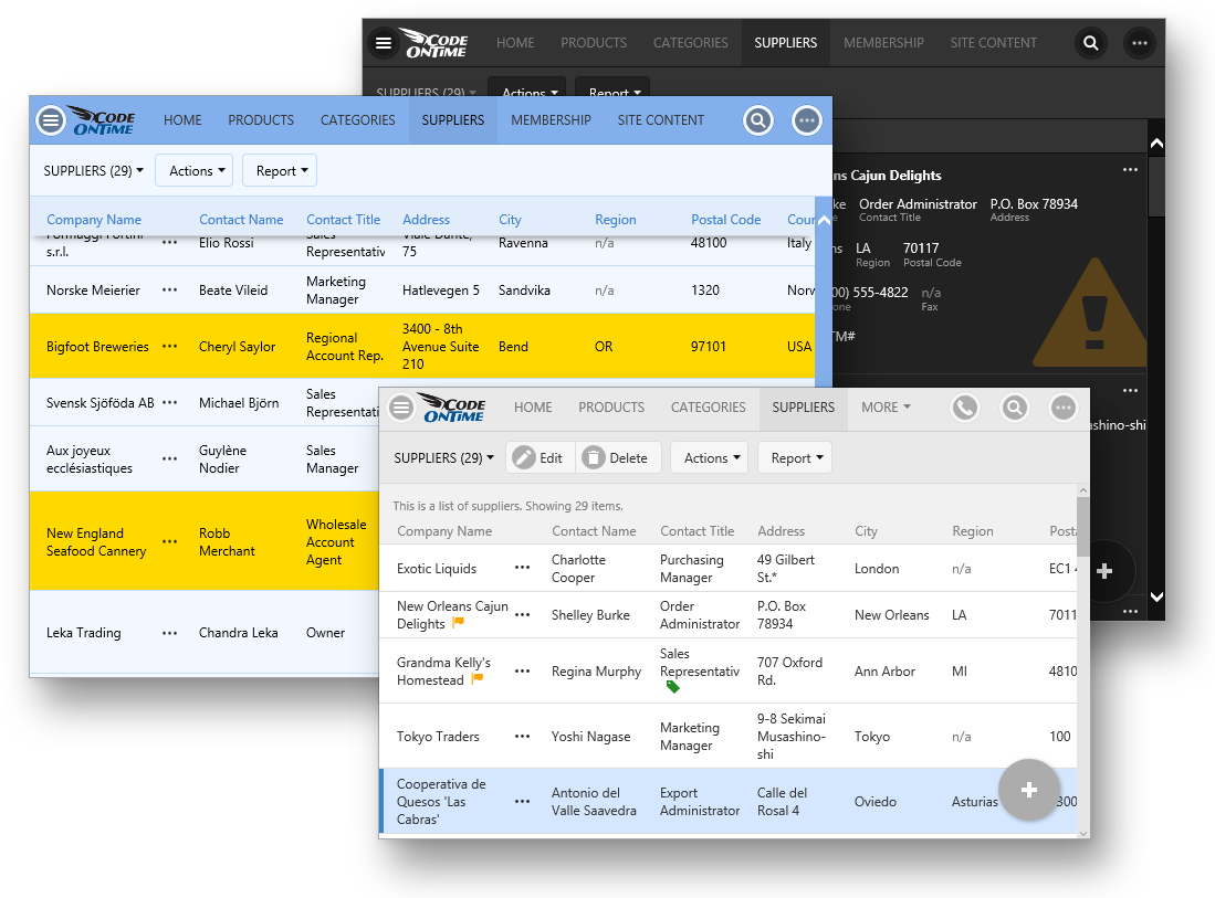
Have you ever wanted to give your grids and forms a personal touch? Release 8.5.7.0 makes it possible with the inclusion of conditional CSS rules. These rules allow defining JavaScript expressions that are executed for every row in the view. These expressions have access to the values of each record. When the expression passes, a CSS class will be added to the row. You can then add custom styling to these rows to tell a story.

The picture below shows several examples of custom styling in Touch UI.
image

Adding a View Style Rule

The first step is to define a set of rules that will add CSS classes to the correct rows. The following examples will use the sample Northwind project.

Open the Project Designer. In the Project Explorer, switch to the Controllers tab, and double-click on Suppliers / Views / grid1.
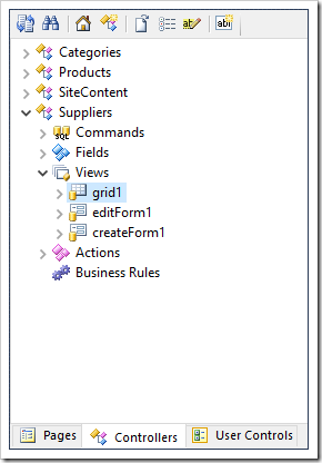
Selecting grid1 view of Suppliers controller.

The view will be opened on the left side of the window. Switch to the Styles tab at the top of the screen.
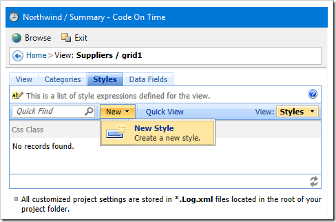
Adding a new style to the 'grid1' view of Suppliers controller.

On the toolbar, press New | New Style to open the create form. Enter the following settings.

Css Class myapp-country-usa
Test
$row.Country == 'USA'

This rule will add the class “myapp-country-usa” to every row where the “Country” column is equal to “USA”. The Test field is an expression written in JavaScript. The “$row” object is declared by the client library, and each field value is attached to this object when the expression is executed. The “myapp” prefix to the CSS class is added to ensure that there are no clashes with standard rules included in the application.

Press OK to save. Add one more style with the following configuration:

Css Class myapp-contact-title-sales
Test
$row.ContactTitle != null && $row.ContactTitle.match(/sales/i)

This rule will add “myapp-contact-title-sales” rule to every row where the Contact Title is equal to “sales”. The “i” at the end of the regular expression will ignore case.

Press OK to save. On the toolbar, press the Browse button to regenerate the app and open it in your default browser.

Notice that nothing has changed! The grid looks the same as it did before. The rules to add the CSS class has been added, but there have been no presentation changes that the user can see. By using Developer Tools (F12), the correct row can be inspected, and you can confirm that the class is present.
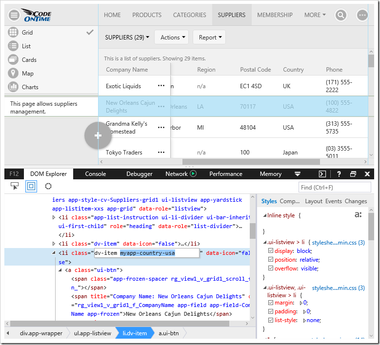
Inspecting the HTML of the page will reveal that the correct class has been added.

Next step will be to add some presentation to these rules.

Customizing Presentation with CSS

Switch back to the Project Designer, and press the Develop button at the top of the screen to open the project in Visual Studio.

In the Solution Explorer, right-click on the “~/css” folder, and press Add | Style Sheet button.

In releases 8.6.5.0 and below, add the file to the “~/touch” folder.
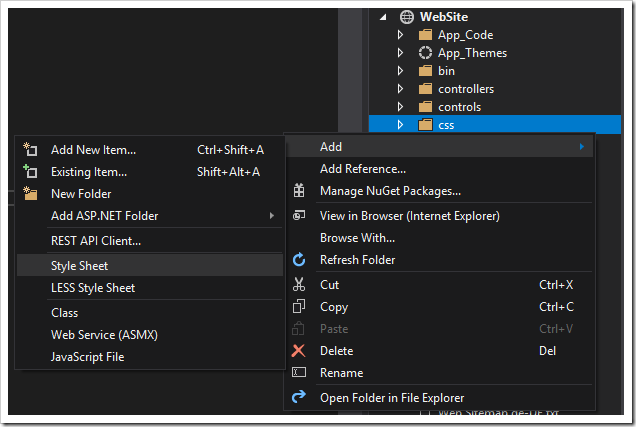
image

Paste in the following rule:

.myapp-country-usa > .ui-btn:not(:hover):not(.app-selected):not(.ui-btn-active),
.myapp-country-usa > .ui-btn:not(:hover):not(.app-selected):not(.ui-btn-active) .app-frozen-spacer {
    /* change this property */
    background-color: #ffd800 !important;
}

This rule will change the background color of the row, which has the class of “ui-btn”, as well as the spacer used as a background on the frozen column when the grid is scrolled to the right. This rule will not be used when the row is hovered over, clicked, or selected.

The result of this rule can be seen below.
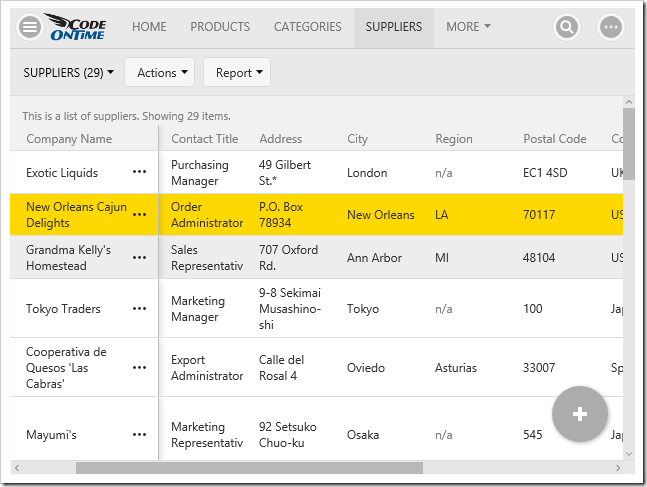
The new CSS rule will add a background color to the relevant rows.

Another way of adding a highlight to a row that does not clash with hover, highlight, or select presentation would be to add a bar on the left side of the row.

.myapp-country-usa .ui-btn::after,
.myapp-country-usa .ui-btn .app-frozen-spacer::after {
    display: inline-block;
    content: ' ';
    position: absolute;
    left: 0;
    top: 0;
    bottom: 0;
    width: 7px;
    /* change this property */
    background-color:  #ffd800 !important;
}

See the result in the screenshot. Notice that the yellow bar is still visible in the hovered first row, and the selected second row.
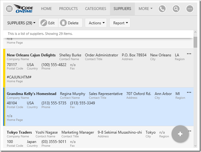
The new CSS rule will add a yellow bar to the left side of the relevant rows.

These rules can be combined, like so:

.myapp-country-usa > .ui-btn:not(:hover):not(.app-selected):not(.ui-btn-active),
.myapp-country-usa > .ui-btn:not(:hover):not(.app-selected):not(.ui-btn-active) .app-frozen-spacer {
    /* change this property */
    background-color: #ffd800 !important;
}

.myapp-country-usa .ui-btn::after,
.myapp-country-usa .ui-btn .app-frozen-spacer::after {
    display: inline-block;
    content: ' ';
    position: absolute;
    left: 0;
    top: 0;
    bottom: 0;
    width: 7px;
    /* change this property */
    background-color:  #ffd800 !important;
}

The first row shows the background color, and the second row shows the bar on the left side when the user hovers over with a mouse.
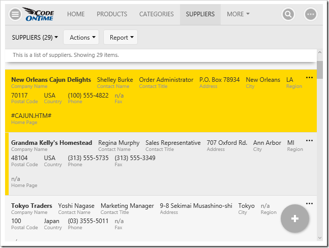
The previous two rules have been combined, showing a yellow background and yellow bar on the relevant rows.

A more subtle way of adding custom styling to a row is to add a colorful triangle to the corner of the record. In this rule, the triangle will only be displayed in “List” presentation style by prepending the class “.app-listview”.

.app-listview .myapp-country-usa .ui-btn::after,
.app-listview .myapp-country-usa .ui-btn .app-frozen-spacer::after {
    display: inline-block;
    content: ' ';
    position: absolute;
    width: 24px;
    height: 24px;
    transform: rotate(45deg);
    /* change these properties */
    top: 0;
    margin-top: -12px;
    left: 0;
    margin-left: -12px;
    background-color: forestgreen;
}

Here is the result. Notice that the triangle is still visible on the selected record.
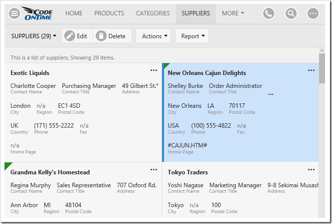
A green triangle has been added to the card.

The previous example places the triangle in the top left corner. It can be easily moved to any other corner by using a combination of “top”, “left”, “bottom”, and “right” attributes, and changing the corresponding margins. The color was also changed.

.app-listview .myapp-country-usa .ui-btn::after,
.app-listview .myapp-country-usa .ui-btn .app-frozen-spacer::after {
    display: inline-block;
    content: ' ';
    position: absolute;
    width: 24px;
    height: 24px;
    transform: rotate(45deg);
    /* change these properties */
    bottom: 0;
    margin-bottom: -12px;
    right: 0;
    margin-right: -12px;
    background-color: red;
}

The picture shows the triangle positioned in the bottom right corner.
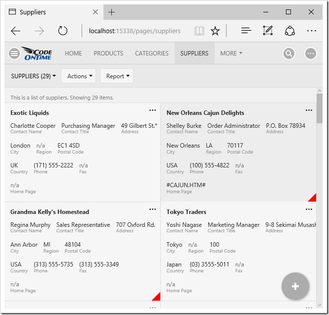
A red triangle has been added to the bottom right corner.

Using Glyphicons

Many different glyphicons are included in the application. These glyphicons can be used in conjunction with CSS rules to customize your application even further.

A page that displays all glyphicons can be found at ~/touch/icons.html. Find the glyphicon that you want to use, and you can look up the corresponding class in the file “~/touch/bootstrap.css”.  It will be necessary in order to get the correct character code for the icon.
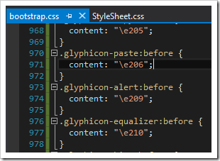
Finding the correct character code in the 'bootstrap.css' file.

Once the correct code has been located, it can be used in a custom CSS rule. The example below will place a large orange “alert” glyphicon in the “List” presentation style.

.app-listview:not(.app-grid) .myapp-country-usa > .ui-btn::after {
    display: inline-block;
    font-family: 'Glyphicons Halflings';
    font-style: normal;
    font-weight: normal;
    line-height: 1;
    position: absolute;
    /* change these properties*/
    content: "\e209";
    color: orange;
    font-size: 8em;
    bottom: 5px;
    right: 0;
    padding-left: 0.5em;
    opacity: .25;
}

The picture below shows the result.
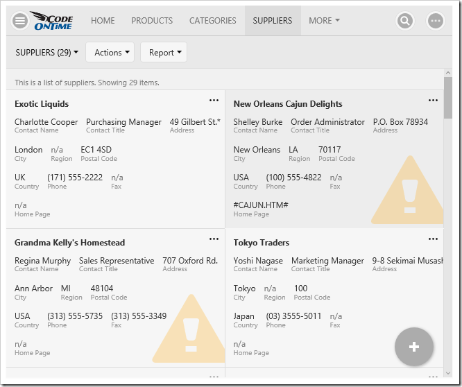
The new rule shows a large orange alert glyphicon in the background of the card.

Glyphicons can also be used in a more subtle way. They can be placed next to any field using the “.app-field-[FieldName]” syntax. This rule will place them next to the correct grid column in the row, and the correct value in other presentation styles.

.app-grid .myapp-country-usa .app-field-CompanyName::after,
.myapp-country-usa .app-field-CompanyName .app-field-data::after {
    display: inline-block;
    font-family: 'Glyphicons Halflings';
    font-style: normal;
    font-weight: normal;
    line-height: 1;
    padding-left: .5em;
    /* change these properties  */
    color: orange;
    content: "\e034";
}

The result is below.
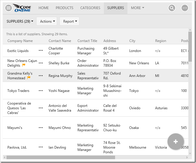
A smaller orange 'flag' glyphicon has been added next to the CompanyName field of the grid.

Conditional styling is also supported in forms too! When the form is in read mode, the classes will be present. Make sure to add the style expressions defined at the beginning of this article to “editForm1” view of Suppliers controller.

The result can be seen below.
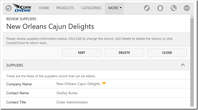
The same flag glyphicon has been added to the form.

Sunday, December 10, 2017PrintSubscribe
Tab Bar, Transparent Notifications, Selection After Actions

Code on Time release 8.6.11.0 introduces the Tab Bar, the new cool feature that automatically enhances your app if you define custom icons for some of the pages.

Tab Bar in the app with Touch UI created with Code On Time application generator.

Notifications now work in concert with fixed footers and action promotion button but lifting them when notification is displayed.

Notification bar moves fixed content (Tab Bar, Aggregates, Promo button) up when displayed in Touch UI apps.

Fixed footers typically display Tab Bar, form action bar, aggregates, and “Promo” button.

If you enter th following configuration in ~/touch-settings.json file, then notifications will become transparent and display on the left side of the screen when there are no fixed footer.

{
  "ui": {
    "notify": {
      "location": "left",
      "transparent": true,
      "enabled": true
    }
  }
}

Transparent notifications can be now displayed on top of the screen content.

Account Manager displays the current user icon in “selected” state. If the other identities available are expired, then they get displayed with the “Signed Out” indicator.

Current user identity is displayed as 'selected' item in relevant menus and panels in Touch UI apps.

One important feature is now available to developers of business rules. By default, any custom action will reduce the selected items to the last one selected at the time when the action was invoked.

It may be desirable to preserve the entire selection of items or have the selection completely cleared.

Now developers can @Result_KeepSelection and @Result_ClearSelection parameters. Simply assign value 1 to the parameter if you program SQL business rules. C#/VB developers can assign true to Result.KeepSelection and Result.ClearSelection properties.

The following features and fixes are included in the release:

  • Notifications can be transparent if ui.notify.transparent = true is specified in touch-settings.json.
  • Added support for @Result_ClearSelection in business rules to clear the selected keys after an action.
  • Added support for @Result_KeepSelection in business rules to keep the selected keys after an action.
  • Ensured SiteContent is not included with .NET 3.5/4.0 projects.
  • Fixed. MicrosoftAjax.js not included in .NET 3.5/4.0 projects.
  • Fixed. MimeMapping compilation issue in .NET 3.5/4.0 projects.
  • Keyboard input received from the user correctly postpones the "idle user detection".
  • Notifications for sort/filter/group/refresh are prefixed with the data view field name when available.
  • Menu item representing the current user is displayed in “selected” state in panels and menus.
  • Indicator "Signed Out" is displayed in account manager next to the user name when needed.
  • Notification is always displayed as a full-width bar if there is a fixed footer.
  • Fixed footer at the bottom of the screen is moved upward when notification bar is displayed.
  • Displaying of Tooltip for popups and panels when available. Items based on actions use description of the action as a tooltip.
  • Material icon is now used to render "drop down arrow" for a more consistent presentation.
  • RTF input loses focus when user clicks on static content of the page in WebKit browsers.
  • Email fields are correctly displayed in the summary on the fully expanded sidebar.
  • Email icon shows up on the toolbar and in the row context menu when email fields are detected.
  • "Select" business rules do not run on server when "Distinct" requests to read data are executed.
  • Distinct requests for data are not corrupted by presence of Select business rules.
  • Context-dependent auto-complete passes null for the parent value if it has not been selected.
  • Fixed issue with OAuthHandler detecting "Sync User" incorrectly.
  • Fixed. Dependent Lookup Auto Complete is not filtering when typing in, but filters when the drop down arrow is clicked.
  • Fixed the issue with incorrect DataView field header text prefixing in notifications.
  • Fixed issue switching calendar tabs for all languages.
  • Blob Handler now uses correct column name for primary keys.
  • Fixed issue with SiteContent model detection in MySQL apps.
  • Touch Calender now correctly uses quick find, filters, and advanced search.
  • Added null check for UrlReferrer in businessrules.cc/vb
  • Added dynamic controller serialization in JSON format to support Offline Data Processor.
Continue to Tab Bar