Blog

Labels
AJAX(112) App Studio(7) Apple(1) Application Builder(245) Application Factory(207) ASP.NET(95) ASP.NET 3.5(45) ASP.NET Code Generator(72) ASP.NET Membership(28) Azure(18) Barcode(2) Barcodes(3) BLOB(18) Business Rules(1) Business Rules/Logic(140) BYOD(13) Caching(2) Calendar(5) Charts(29) Cloud(14) Cloud On Time(2) Cloud On Time for Windows 7(2) Code Generator(54) Collaboration(11) command line(1) Conflict Detection(1) Content Management System(12) COT Tools for Excel(26) CRUD(1) Custom Actions(1) Data Aquarium Framework(122) Data Sheet(9) Data Sources(22) Database Lookups(50) Deployment(22) Designer(177) Device(1) DotNetNuke(12) EASE(20) Email(6) Features(101) Firebird(1) Form Builder(14) Globalization and Localization(6) How To(1) Hypermedia(2) Inline Editing(1) Installation(5) JavaScript(20) Kiosk(1) Low Code(3) Mac(1) Many-To-Many(4) Maps(6) Master/Detail(36) Microservices(4) Mobile(63) Mode Builder(3) Model Builder(3) MySQL(10) Native Apps(5) News(18) OAuth(8) OAuth Scopes(1) OAuth2(11) Offline(20) Offline Apps(4) Offline Sync(5) Oracle(10) PKCE(2) PostgreSQL(2) PWA(2) QR codes(2) Rapid Application Development(5) Reading Pane(2) Release Notes(180) Reports(48) REST(29) RESTful(29) RESTful Workshop(15) RFID tags(1) SaaS(7) Security(80) SharePoint(12) SPA(6) SQL Anywhere(3) SQL Server(26) SSO(1) Stored Procedure(4) Teamwork(15) Tips and Tricks(87) Tools for Excel(2) Touch UI(93) Transactions(5) Tutorials(183) Universal Windows Platform(3) User Interface(338) Video Tutorial(37) Web 2.0(100) Web App Generator(101) Web Application Generator(607) Web Form Builder(40) Web.Config(9) Workflow(28)
Archive
Blog
Wednesday, September 21, 2016PrintSubscribe
Show Action Buttons

Every form in web applications created with Code On Time display a row of buttons. The typical actions available in the “Form” scope include Edit, Delete, Close/Cancel, Save, and Save and New. In addition, actions that trigger custom calculations are often put in the “Form” scope. The default presentation mode for form actions is called “Auto”.

Auto

The “Auto” mode will present form buttons in the best location depending on the size of the screen. On medium size screens, the buttons will be aligned to the right side of a fixed bar at the bottom of the screen. This ensures that the buttons are in the same position every time a user opens the form, resulting in a smaller learning curve to the application.

On small screens, form action buttons are rendered in a fixed button bar at the bottom of the screen, aligned to the right.

Larger screens will result in the form buttons shifting to the center of the button bar, closer to the field values.

Large screens will render form actions aligned to the center of a fixed bar at the bottom of the screen.

If the screen is too small to display all form buttons, they will be automatically collapsed into a three-dot menu.

When action buttons do not fit in the available space, these actions will be folded under a three-dot menu.

If the screen is both narrow and short, the form buttons will be rendered at the bottom of the form. This will ensure that devices with small screens can maximize the amount of space used for display of field values.

Very small screens will render buttons at the bottom of the form.

None

It may be desirable to hide the form actions bar from the screen. Let’s remove the form buttons from the Orders screen of the sample Northwind project.

Start the Project Designer. In the Project Explorer, double-click on “Orders / container1 / view1 (Orders, grid1)” node.

Modifying view1 that shows Orders grid1 in Orders page.

Make the following change:

Property Value
Show Action Buttons None

Press OK to save, and press Browse on the toolbar to regenerate the app.

When the app comes up in the default browser, click on a record on Orders page to view the form. Notice that the form action buttons are no longer visible. The actions are still accessible in the top right corner of the screen.

The Orders form with form action buttons hidden.

The user can also access all actions by clicking on the three-dot menu in the top right corner to access the action panel.

The form action buttons are still available in the action sidebar.

Top

When Show Action Buttons is set to “Top”, the action buttons will be rendered above the form.

Action buttons are rendered at the top of the form.

Bottom

When Show Action Buttons is set to “Bottom”, the buttons will be rendered below the form.

Action buttons are rendered at the bottom of the form.

Top And Bottom

When Show Action Buttons is set to “Top and Bottom”, the buttons will be rendered both above and below the form. This can be helpful when the form is very long.

Action buttons are rendered at the top and bottom of the form.

Wednesday, September 21, 2016PrintSubscribe
Speeding Up Quick Find

The Quick Find feature is available by default in all data views of an application. This feature allows searching every field available in the grid all at once.

Quick Find can be triggered by pressing on the Search icon in the top right corner of the data view, or by typing when a full screen data view is in focus.
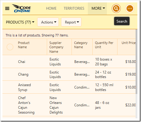
Activating the Quick Find by pressing the Search icon.

Type in a value and hit “Enter” key on the keyboard to begin the search.

Typing in a value to the Quick Find input box.

When the search is complete, the search query will be displayed in the view header and the results will be displayed in the grid.
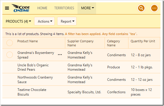
When Quick Find is triggered, the query is displayed in the header and the results below.

Each word separated by a space will search for results containing both words. Words separated by commas will search for results containing either word. Results can be negated by adding a dash (-) before the word. Exact phrases can be wrapped in “double quotes”. The example below executes the following search:

“Camembert Pierrot”, tea –grandma

The search returns records that contain the phrase “Camembert Pierrot” exactly, or records that contain “tea” and do not contain “grandma”.
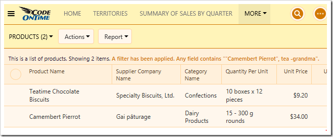
Two results are returned.

However, while using Quick Find is perfect for small to medium size tables or views with a small number of columns, it can cause a substantial performance hit when the grid contains many different columns, and there is a large number of records in the table. Each column must be searched for that particular combination of keywords. While it is still possible to use Advanced Search in order to query specific columns, it does not beat the convenience offered by Quick Find.

In order to avoid the performance hit caused by searching every column, it is possible to reduce the Quick Find search scope to an inclusive or exclusive set of fields in the grid.

Excluding Specific Fields Using “$quickfinddisabled”

The quickest way to add performance is to add the tag “$quickfinddisabled” to the Search Options property of the data field. This will exclude the column from the search.

Let’s remove the QuantityPerUnit data field from the Quick Find query of Products page in the sample Northwind project.

Start the Project Designer. Switch to the Project Explorer tab. Double-click on “Products / Views / grid1 / QuantityPerUnit” data field.
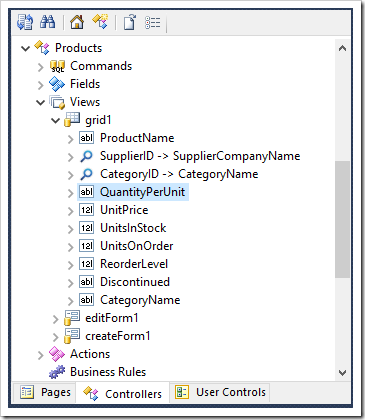
Editing the QuantityPerUnit data field of grid1 View of Products controller.

Make the following change:

Property Value
Search Options $quickfinddisabled

Press OK to save. On the toolbar, press Browse.

Navigate to the Products page and execute a Quick Find search. Notice that Quantity Per Unit will now be ignored when using Quick Find.
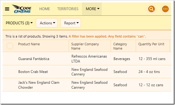
Quick Find will no longer use Quantity Per Unit field in the filter.

Including Specific Fields Using “$quickfind”

It is also possible to only include specific fields by using the “$quickfind” tag. Let’s reduce the Quick Find scope on Products page to only ProductName and CategoryName fields.

Switch back to the Project Designer. Make sure to clear any “$quickfinddisabled” tags, as these are exclusive.

Double-click on “Products / Views / grid1 / ProductName” data field node.
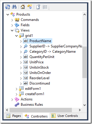
Editing ProductName data field in grid1 view of Products controller.

Make the following change:

Property Value
Search Options $quickfind

Press OK to save the data field.

The next data field to modify is CategoryName. However, this data field is being used as the Alias for CategoryID data field, and has not been added to grid1 view. We will need to add CategoryName data field to grid1 in order to modify the behavior. This data field will not be rendered twice.

Drag the field “Products / Fields / CategoryName” onto “Products / Views / grid1” view to instantiate a data field for CategoryName field.
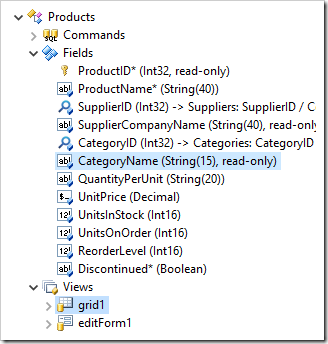
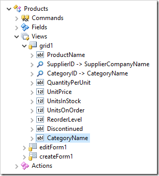
Dragging CategoryName field onto grid1 view.  The CategoryName data field has been added to grid1.

Next, change the configuration for CategoryName data field.

Property Value
Search Options $quickfind

Press OK to save. On the toolbar, press Browse. Navigate to Products page and search for “tea”. Notice that Supplier Company Name is not searched - results do not include those with Supplier of “Grandma Kelly’s Homestead”.
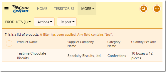
The Quick Find query has excluded all fields that were not tagged with "$quickfind".

Wednesday, September 21, 2016PrintSubscribe
Smart Dates

At a glance, dates can be hard to comprehend without having to open a calendar. Starting with release 8.5.11.0, date values will be replaced with Smart Dates. These smart dates represent text labels that will replace the original date value and show simplified versions of the value that are significantly easier to read and understand.

Smart dates will follow this algorithm:

  1. If the date is in the current year,
    1. and the date is in future days,
      1. and the date is tomorrow, the word “Tomorrow” will be shown.
      2. and the date is occurring within the next 7 days, then the shortened day of the week will be displayed.
      3. and the date is occurring 7-14 days in the future, then the label will be “Next” plus the day of the week.
      4. Otherwise, month and date will be displayed.
    2. and the date is today,
      1. and the time is midnight, then the word “Today” will be displayed.
      2. and it was within the last hour, then the words “XX min ago” will be displayed.
      3. and it is happening within the hour, then the words “in XX min” will be displayed.
      4. Otherwise, the time will be displayed.
    3. and the date is in past days,
      1. and the date is yesterday, the word “Yesterday” will be shown.
      2. and the date occurred < 7 days ago, the label will be “Last” plus the day of the week.
      3. Otherwise, the month and date will be displayed.
  2. Otherwise, the full value is displayed.

When the time value is not midnight, then the time will be displayed after the date.

See an example in the following picture.

List of Orders with Smart Dates enabled.

These smart dates are much simpler to read and understand than the original values, displayed below.

List of orders with Smart Dates disabled.

Hovering over the smart date will display the original value, when needed.

Hovering over a Smart Date will show the original value.

The same smart dates are displayed in the form.

Smart Dates displayed in the form

When the user edits the field, the true value will be displayed.

Editing a value in the form, the original date will be displayed.

The user can choose to disable this feature from the Settings panel. Click on the three-bar “hamburger” menu in the top left corner of the web app.

Activating the hamburger menu.

Select the “Settings” option in the panel that appears.

Selecting the Settings panel from the menu panel.

From the list of settings, select “Smart Dates”. Select Yes or No, and confirm to refresh the page in order to enable or disable the feature.

Enabling or disabling Smart Dates from the Settings panel.

The default value for this user setting can be configured in the Touch UI section of the Features page of the Project Wizard.

Modifying the default value for Smart Dates in the Features page of the Project Wizard.