User Interface

Labels
AJAX(112) App Studio(7) Apple(1) Application Builder(245) Application Factory(207) ASP.NET(95) ASP.NET 3.5(45) ASP.NET Code Generator(72) ASP.NET Membership(28) Azure(18) Barcode(2) Barcodes(3) BLOB(18) Business Rules(1) Business Rules/Logic(140) BYOD(13) Caching(2) Calendar(5) Charts(29) Cloud(14) Cloud On Time(2) Cloud On Time for Windows 7(2) Code Generator(54) Collaboration(11) command line(1) Conflict Detection(1) Content Management System(12) COT Tools for Excel(26) CRUD(1) Custom Actions(1) Data Aquarium Framework(122) Data Sheet(9) Data Sources(22) Database Lookups(50) Deployment(22) Designer(177) Device(1) DotNetNuke(12) EASE(20) Email(6) Features(101) Firebird(1) Form Builder(14) Globalization and Localization(6) How To(1) Hypermedia(2) Inline Editing(1) Installation(5) JavaScript(20) Kiosk(1) Low Code(3) Mac(1) Many-To-Many(4) Maps(6) Master/Detail(36) Microservices(4) Mobile(63) Mode Builder(3) Model Builder(3) MySQL(10) Native Apps(5) News(18) OAuth(8) OAuth Scopes(1) OAuth2(11) Offline(20) Offline Apps(4) Offline Sync(5) Oracle(10) PKCE(2) PostgreSQL(2) PWA(2) QR codes(2) Rapid Application Development(5) Reading Pane(2) Release Notes(179) Reports(48) REST(29) RESTful(29) RESTful Workshop(15) RFID tags(1) SaaS(7) Security(80) SharePoint(12) SPA(6) SQL Anywhere(3) SQL Server(26) SSO(1) Stored Procedure(4) Teamwork(15) Tips and Tricks(87) Tools for Excel(2) Touch UI(93) Transactions(5) Tutorials(183) Universal Windows Platform(3) User Interface(338) Video Tutorial(37) Web 2.0(100) Web App Generator(101) Web Application Generator(607) Web Form Builder(40) Web.Config(9) Workflow(28)
Archive
Blog
User Interface
Wednesday, December 27, 2017PrintSubscribe
Light and Dark

Long dark winter nights are calling for a different kind of GUI. Here comes the “Dark” theme.

New 'Dark' theme in an app build with Touch UI and Code On Time app generator.

Place the following in ~/touch-settings.json to lock-in the Dark theme with the Bitter Sweet accent.  This configuration will also disable “Settings” option in the GUI.

{
  "ui": {
    "theme": {
      "name": "Dark",
      "accent": "BitterSweet"
    },
    "transitions": { "style": "slide" }
  },
  "settings": { "enabled": true }
}

This is the “Light” version of the same app. It works best if you use the device in the bright light.

The 'Light' theme in an app build with Touch UI and Code On Time app generator.

Light and Dark theme are provided to give developers more options to express themselves and to allow upcoming native apps to have day and night time versions of the GUI, while still enabling rich customization with accents.

Accents do look more dramatic with the “Dark” theme. Try building your own theme accent now!

Dark theme with Construct accent in the app created with Code On Time.

Dark theme with Construct accent in the app created with Code On Time.

Dark theme with Construct accent in the app created with Code On Time. The context menu is open.

Dark theme with Construct accent in the app created with Code On Time. The context menu is open.

Dark theme with Construct accent in the app created with Code On Time. The sidebar is hidden and the tab bar is displays icons for frequently used app pages.

Dark theme with Construct accent in the app created with Code On Time. The sidebar is hidden and the tab bar is displays icons for frequently used app pages.

Dark theme with Aquarium accent in the app created with Code On Time.

Dark theme with Aquarium accent in the app created with Code On Time.  The form is open and context menu of the form is also visible.

Dark theme with Aquarium accent in the app created with Code On Time.  The form is open and context menu of the form is also visible.

Dark theme with Aquarium accent in the app created with Code On Time.  The form view is open and the "Data View" field is visible in the form.

Dark theme with Aquarium accent in the app created with Code On Time.  The form view is open and the Data View field is visible in the form.

Dark theme with Verdant accent in the app created with Code On Time.  The sidebar is expanded.

Dark theme with Verdant accent in the app created with Code On Time.  The sidebar is expanded.

Dark theme with Modern Rose accent in the app created with Code On Time.  The app is displayed in a small form factor.

Dark theme with Modern Rose accent in the app created with Code On Time.  The app is displayed in a small form factor. 

Dark theme with Modern Rose accent in the app created with Code On Time.  The navigation menu is open.

Dark theme with Modern Rose accent in the app created with Code On Time.  The navigation menu is open.

If Settings option is enabled, then users can access the themes and accents at runtime.

Settings panel of app built with Touch UI and Code On Time.

Theme and accent selection panel of app built with Touch UI and Code On Time.

Tuesday, December 5, 2017PrintSubscribe
Tab Bar

Page of an application built with Touch UI represents an individual mini-app, also known as Single Page App or SPA. Shared navigation system of application links together multiple SPAs.

Developers can assign icons to individual pages to signify their purpose. Icons are displays at the bottom of the sidebar on the left side of the page and in the drop down menus at the top of the page.

Sidebar displays page icons when specified in apps created with Touch UI.   Page icons are visible in the dropdown navigation menus in apps created with Touch UI and Code On Time app generator.

The sidebar provides easy access to the first three or four pages with icons, which works great on larger screens. The sidebar is not visible on the smaller devices. Touch UI introduces a new method of providing quick access to important pages called Tab Bar.

Tab Bar is automatically displayed at the bottom of the screen whenever the sidebar is not visible

Tab Bar is displayed at the bottom of the screen if at least two icons are defined in the menu of the app created with Code On Time.

Tab Bar disappears as soon as the sidebar becomes visible, which may happen if device orientation has changed or when the app window is resized.

Tab Bar is hidden when the sidebar is visible to the user in apps based on Touch UI.

The width of tabs will automatically increase on large screens.

Tab Bar appears as soon as the sidebar stops being visible in the app based on Touch UI.

Tabs automatically expand and collapse. Some tabs may be shifted off-screen when the minimal tab width is reached. The invisible tabs are replaced with “More” button if there is not enough space to fit all of them at the bottom of the screen. Invisible tab icons are displayed when “More” button is activated on the Tab Bar.

'More' button is displayed when some of the tabs are not able to fit on screen in application based on Touch UI.  Invisible tab icons are displayed when 'More' button is activated on the Tab Bar in app created with Code On Time.

If you do prefer not to have the Tab Bar then turn if “off” by entering the following configuration property in ~/touch-settings.json file:

{
  "ui": {
    "menu": {
      "tabbar": false
    }
  }
}

If you love the Tab Bar, then consider enabling this feature on any screen size by settings ui.menu.tabbar to true.

{
  "ui": {
    "menu": {
      "tabbar": true
    }
  }
}

This setting will remove icons from the sidebar and transfer them to the permanently visible Tab Bar at the bottom of the screen.

Set 'ui.menu.tabbar' property in touch-settings.json to 'true' to permanently enable the Tab Bar in app created with Code On Time.

Page icons will be visible on a screen of any size.

Tab Bar displays icons of important pages in app based on Touch UI.

Notifications displayed in the app will move the Tab Bar and the “promo” button upwards.

Notifications displayed in the app will move the Tab Bar and the “promo” button upwards in apps based on Touch UI, created with Code On Time.

The tab bar will slide down to the bottom of the screen when the notification is dismissed.

Friday, November 17, 2017PrintSubscribe
Notifications

Users love getting a confirmation for their actions but would not appreciate if the flow of data input is interrupted with blocking popups. Touch UI now has a built-in ability to automatically confirm Update, Insert, Delete data manipulations and Sort, Group, Search/Filter actions. In the screenshot below you can see an “Update” notification displayed at the bottom of the screen after product has been changed. Notification slide up from the bottom and stay for a short duration visible to the user without blocking interactions with the app. Notification automatically slides away or disappears if the user taps on it.
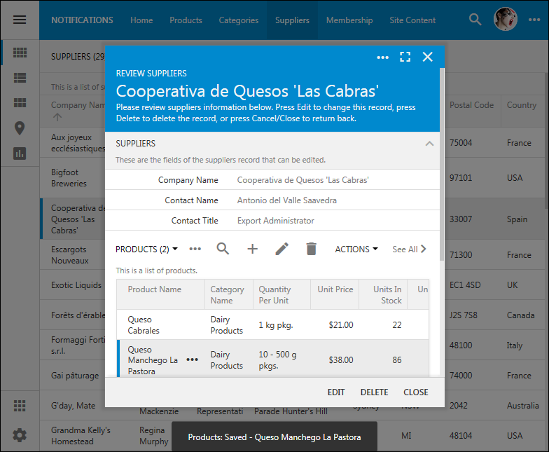
A notification confirming user action in app with Touch UI.

Notifications take the full display width on devices with small form factor.
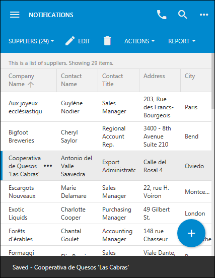
A notification on a small factor device takes the entire width of the screen in the app created with Code On Time.

Modify ~/touch-settings.json to allow displaying notifications on the left side of the screen on large display devices.

{
  "ui": {
    "notify": {
      "location": "left"
    }
  }
}
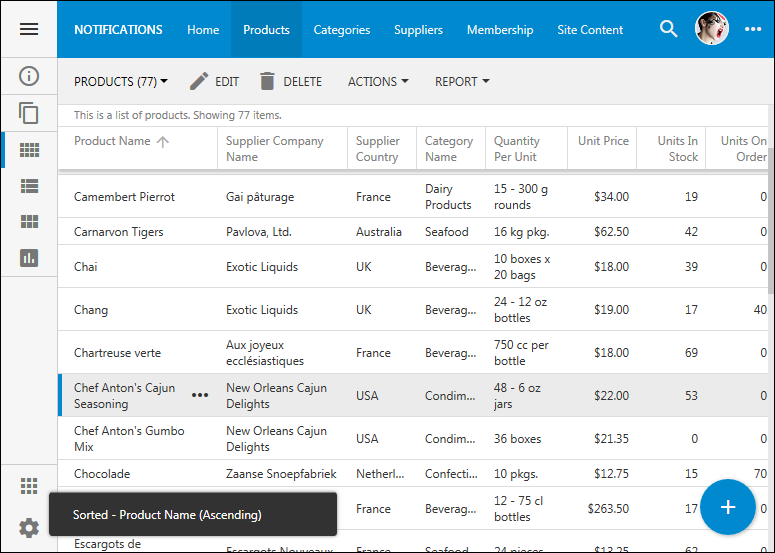
Action notifications can be displayed on the left side of the screen in apps with Touch UI.

It is easy to setup your own notification on any action. For example, set Notification property of Actions / ag2 (Form) / a4 – Update, Save when Edit action in Products controller as follows:

Property Value
Notification Saved "{ProductName}" priced at {UnitPrice}.

This will result in the following notifications:
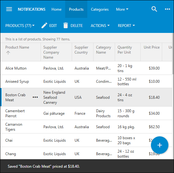
Custom notifications in Touch UI apps can reference field values.

The framework will automatically assign standard notifications to Insert, Update, and Delete commands in your data controllers if there is no value there.

Command Name Standard Notification
Insert Saved - {0}
Update Saved - {0}
Delete {$selected} deleted

Specifying {0} will include the value of the first visible data field in the view. Indexes are zero-based.

You can also {$selected} to specify the number of selected items or {$count} to specify the total number of items in the view.

If you want to disable a standard notification for a particular action, then enter $none in the Notification property of the action.

The fastest way to change the format of the standard notification is to change ^Saved^ and ^Deleted^ tokens using Visual Studio in the file Solution Name / Code On Time Items/ ClientLibrary.en-US.txt. Note that the culture in the name of the file may be different for your project. Save the changes in the file and re-generate the project. Use Ctrl+F5 to refresh the page to force the browser to load the update resources.

If the business rule forces a display of a message with Result.ShowMessage or Result.ShowViewMessage, then a corresponding notification will be displayed with medium duration.

Here is an example of SQL Business Rule handling a custom action.

set @Result_ShowMessage = 'Archived "' + @ProductName + '" product.'
set @Result_Continue = 1
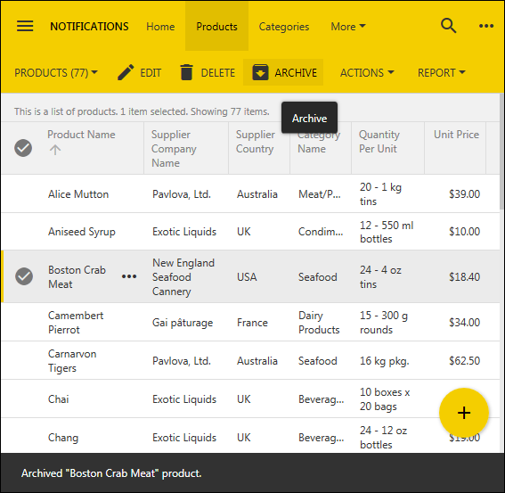
A custom notification emitted in an SQL business rule implemented in the app with Touch UI.

Standard notifications are always displayed with short duration.

The standard notifications can be displayed with ui.notify.enabled property. The default duration of the notifications expressed in milliseconds is defined as follows:

{
  "ui": {
    "notify": {
      "enabled": true,
      "duration": {
        "short": 2500,
        "medium": 5000,
        "long": 10000
      }
    }
  }
}

JavaScript business rules can send notifications as follows:

$app.touch.notify("Hello World");
$app.touch.notify({ text: "Hello World", duration: "long" });

The duration can be expressed in milliseconds. If force option is specified with value true, then any visible notification will be dismissed and your own notification will get displayed instead.

Future releases of the framework will further enhance notifications with an ability to provide a custom action or callback function that can activated by a button displayed directly in the notification.