User Interface

Labels
AJAX(112) App Studio(7) Apple(1) Application Builder(245) Application Factory(207) ASP.NET(95) ASP.NET 3.5(45) ASP.NET Code Generator(72) ASP.NET Membership(28) Azure(18) Barcode(2) Barcodes(3) BLOB(18) Business Rules(1) Business Rules/Logic(140) BYOD(13) Caching(2) Calendar(5) Charts(29) Cloud(14) Cloud On Time(2) Cloud On Time for Windows 7(2) Code Generator(54) Collaboration(11) command line(1) Conflict Detection(1) Content Management System(12) COT Tools for Excel(26) CRUD(1) Custom Actions(1) Data Aquarium Framework(122) Data Sheet(9) Data Sources(22) Database Lookups(50) Deployment(22) Designer(177) Device(1) DotNetNuke(12) EASE(20) Email(6) Features(101) Firebird(1) Form Builder(14) Globalization and Localization(6) How To(1) Hypermedia(2) Inline Editing(1) Installation(5) JavaScript(20) Kiosk(1) Low Code(3) Mac(1) Many-To-Many(4) Maps(6) Master/Detail(36) Microservices(4) Mobile(63) Mode Builder(3) Model Builder(3) MySQL(10) Native Apps(5) News(18) OAuth(8) OAuth Scopes(1) OAuth2(11) Offline(20) Offline Apps(4) Offline Sync(5) Oracle(10) PKCE(2) PostgreSQL(2) PWA(2) QR codes(2) Rapid Application Development(5) Reading Pane(2) Release Notes(180) Reports(48) REST(29) RESTful(29) RESTful Workshop(15) RFID tags(1) SaaS(7) Security(80) SharePoint(12) SPA(6) SQL Anywhere(3) SQL Server(26) SSO(1) Stored Procedure(4) Teamwork(15) Tips and Tricks(87) Tools for Excel(2) Touch UI(93) Transactions(5) Tutorials(183) Universal Windows Platform(3) User Interface(338) Video Tutorial(37) Web 2.0(100) Web App Generator(101) Web Application Generator(607) Web Form Builder(40) Web.Config(9) Workflow(28)
Archive
Blog
User Interface
Saturday, September 5, 2015PrintSubscribe
What is a Premium Line-of-Business App?

Databases organize the real-world information and transform it into the structured data. Ends users can share, analyze, and process the contents of databases with the help of custom applications. Application developers write custom database apps. Custom database apps are known as line-of-business applications. What is a Premium Line-of-Business App?

Multiple data presentation styles, sophisticated data entry forms,  complex page layouts, and touch-enabled responsive screens are the hallmarks of  a true Premium Line-of-Business App. Premium features typically imply a premium price of a lengthy application implementation . Code On Time application code generator eliminates the word “premium” from the price and drastically reduces application implementation time for developers.

1. Premium Data Presentation

Naturally, the purpose of a database app is to present data items to the end users. A premium database application will allow viewing data in multiple styles whenever more than one data item of the same type is displayed. List, Cards, Grid, Charts, Map, Calendar, and Spreadsheet presentation styles are elevating an app to a premium level.
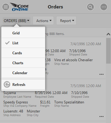
View styles available for selection by end users in a premium line-of-business database app.

List is a mandatory presentation style for a modern app. List makes it easy to present data on a device with any screen size. Data fields of list items in a premium database application will wrap to the next line on devices with a smaller screen size.
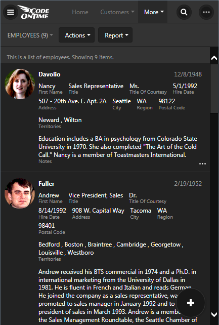
List veiw style in premium app created with Code On Time application generator.

List items must have a variable height to allow viewing data composed of any number of fields.

Cards is an alternative to a list view. Cards have the same height and will limit the visibility of long data values .
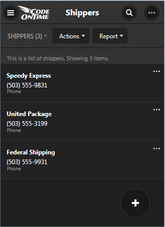
Cards view style displays data items of the same height in app created with Code On Time.

A premium database application will display cards in multiple columns on larger screens.
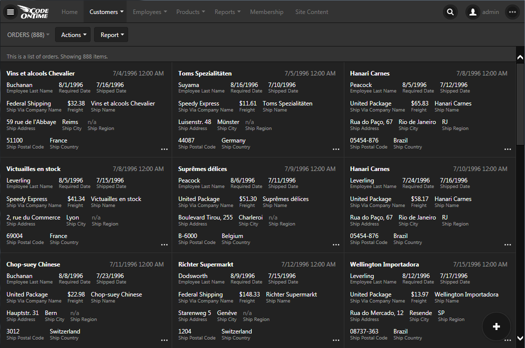
Large screen will display cards in multiple columns in a line-of-business database app created with Code On Time.

Grid presents data as a table of rows and columns to allow comparative analysis of data items.  This is a must-have view style for an application dealing with numbers.
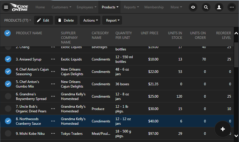
A responsive grid of data items with multiple selection controls in an app created with Code On Time.

The variable screen size of devices in the hands of end users poses a challenge to the design of a grid presentation. Typical desktop computers have plenty of the screen real estate while the screen size of tablets and smartphones can vary widely. The hallmark of a premium database apps is ability to display a responsive grid. Responsive design of a grid will hide the less important fields from the view on a smaller screen size.
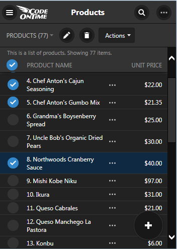
A responsive grid will collapse the less important columns in favor or more important information when a display area is small.

Premium database apps make it possible to display all data fields even on a small screen by enabling horizontal scrolling of data. Spreadsheet presentation style allows freezing columns and scrolling the invisible columns into the view.

Map brings work with data in  a real world in a premium database application. This view style can be triggered by a mere presence of City and Address fields.
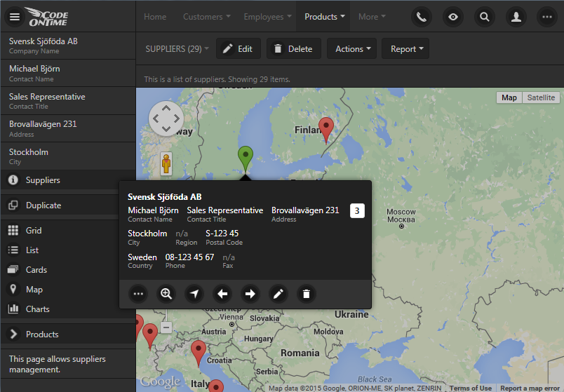
Your data is displayed in real world in Map view style of an app created with Code On Time.

Seeing a calendar of data items with dates makes enormous difference for the end users.

Calendar view must be available whenever the application end users are dealing with the dates. A premium database app will offer a variety of ways to see data on a calendar.

For example, Month presentation with drag & drop operations and infinite scrolling transform the traditional “wall” calendar into a powerful electronic record of events.
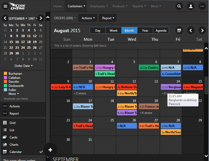
Electronic alternative to 'wall' calendar is the Month mode of Calendar view style in apps created with Code On Time.

Scheduling of events is convenient in the Day and Week modes. Make sure that your app does that too.
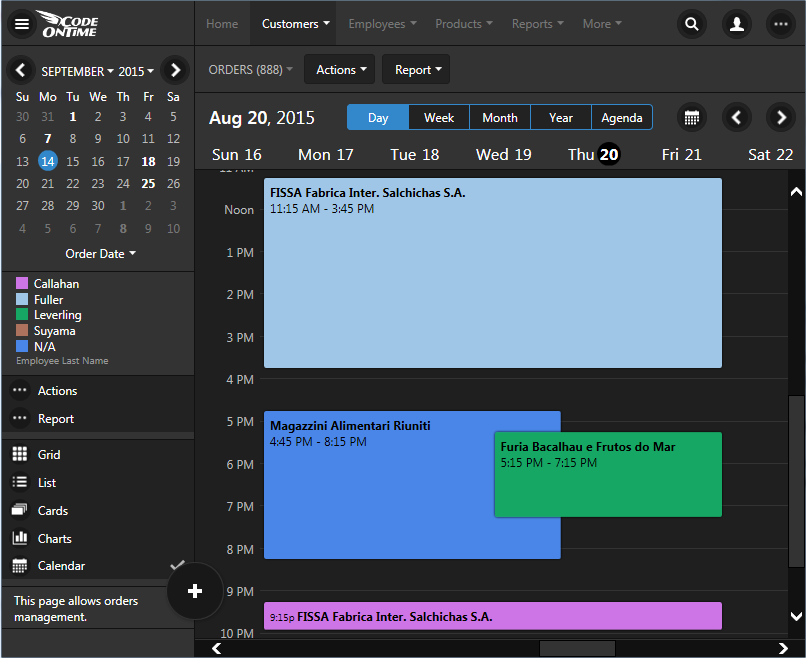
Drag & drop events to update start and end fields of data items in Day and Week mode of Calendar view style in apps created with Code On Time.

A premium calendar will give users a bird-eye look at the data in the Year mode.
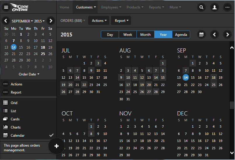
Year mode provides a great summary of events in the database when displayed in Calendar view style of an app created with Code On Time line-of-business database app generator.

Everyone needs a “to-do” list. That is the purpose of the Agenda mode in a premium Calendar view style. Application end users will not miss a thing!
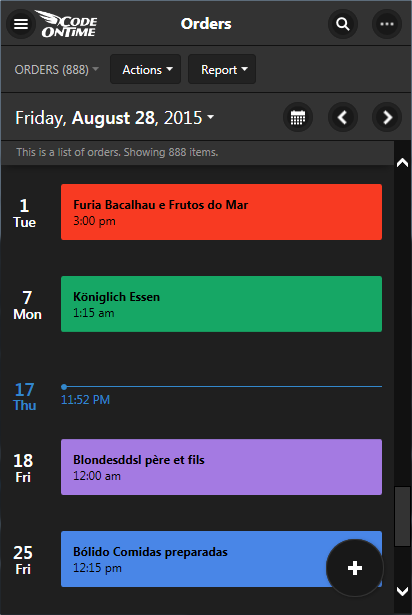
Agenda mode of Calendar view style is a perfect To-Do list for end users of apps created with Code On Time.

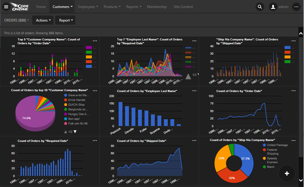
Charts allow the end users to “see” their data for what it is. A truly premium database app will offer a built-in ability to render data as charts whenever possible.
Agenda mode of Calendar view style is a perfect To-Do list for end users of apps created with Code On Time.

Ability to see the same data in multiple graphical representations will transform every list of data items in an instant dashboard. Zooming into charts and seeing data behind the graphs is what a premium database app shall provide. If the time is displayed on a chart then a premium app must choose the most appropriate time scale as well.
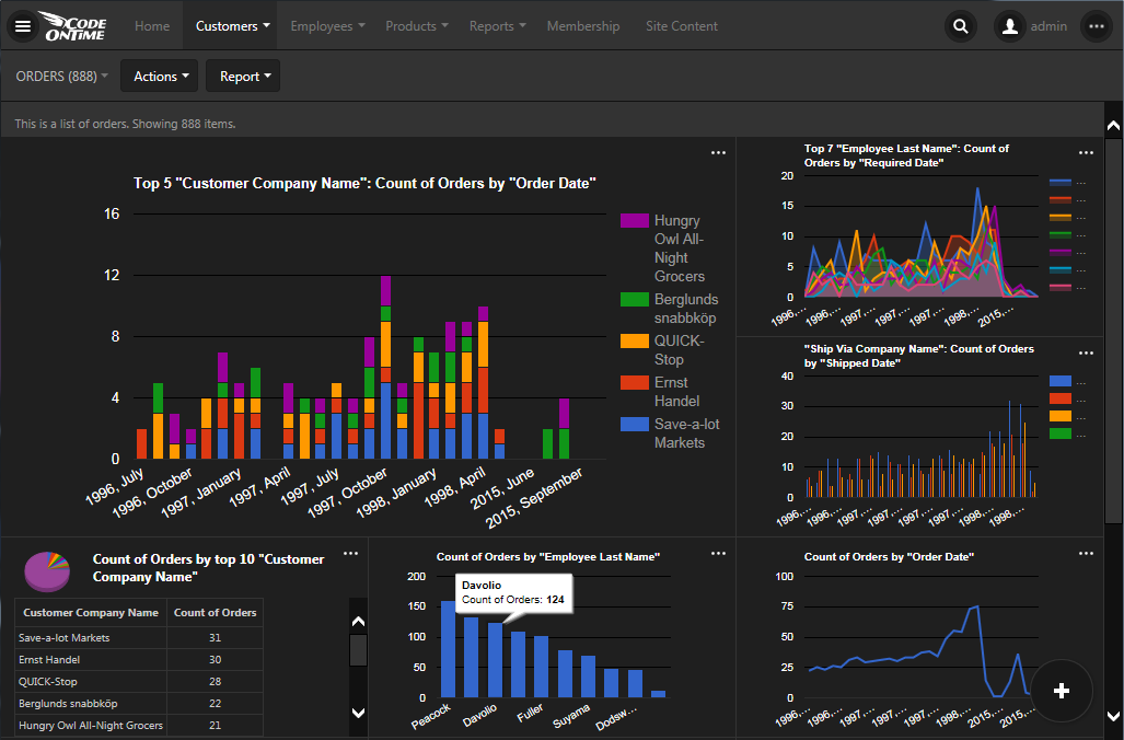
End users can zoom into charts, see data behind the graphs, and touch charts interactively in an app created with Code On Time.

Any filters applied to data must be instantly reflected in the charts.
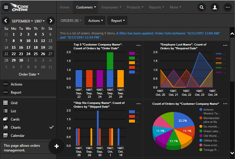
Charts view style responds to data filters including the ones applied from mini-calendar in an app created with Code On Time.

Filtering, Quick Find, Advanced Search

Data discovery comes in all shapes and forms to the end users. Sometimes it is convenient to see weekly or daily data sets. The mini calendar will be required to make it trivial in a premium app.
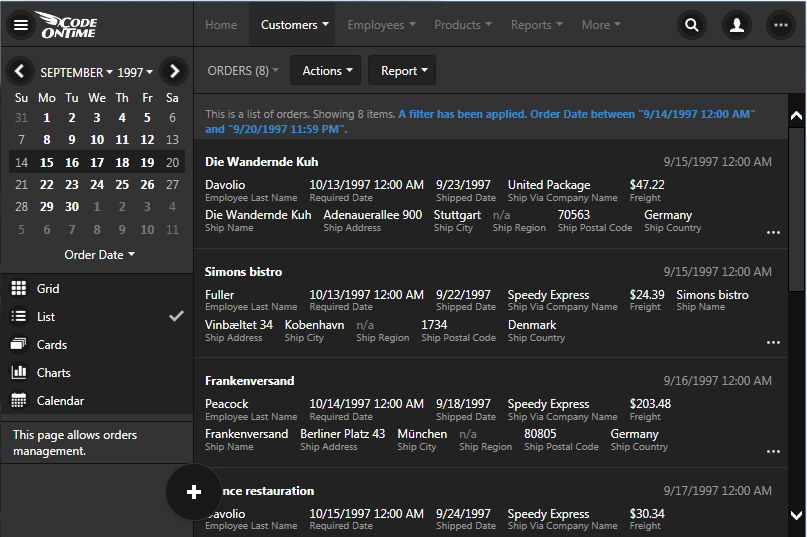
Mini-calendar makes it easy to filter data to week and day level in apps created with Code On Time.

Sometimes a user looks at the data value and wants to find all data rows with similar characteristics. A premium line-of-business application will let users to right-click any data value and apply an instance filter to it. Mobile devices will allow tapping and holding the value to bring about filtering options.
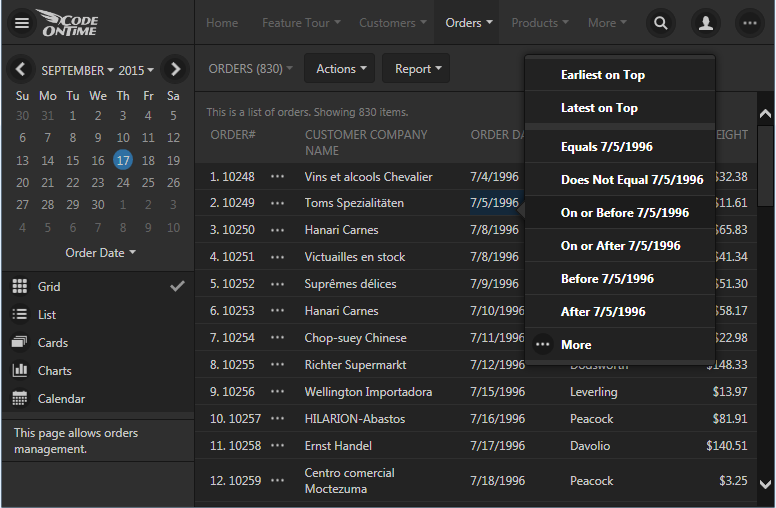
Touch UI allows activating quick filters when users tap and holds or right-clicks data values.

Selecting multiple values for a filter should be very simple in a premium application.
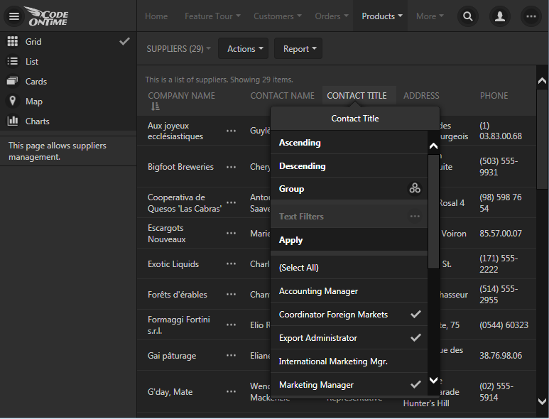
Multi-value filters are available in columns of responsive Grid view style in apps with Touch UI.

Search controls must be a touch or a click away in a premium app. Data search with simple conditions need to be supported to assist users with any level of expertise.
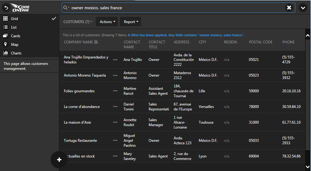
Ability to quickly find data is inherently available whenever more than one item is displayed to the user in an app with Touch UI.

Switching between quick find and advanced search will empower experienced users of a premium app.
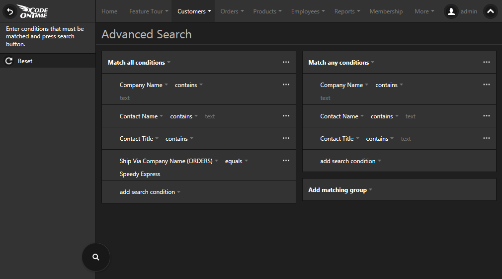
Touch UI includes powerful advanced search capabilities in line-of-business apps generated with Code On Time.

Multi-Column Grouping And Sorting

Sequence of a data flow can make or break an application. Grouping data items by any combination of columns will make your premium app to stand out of the crowd of mediocre solutions. Much more so if the end users are empowered to do that on their own without requesting help from application developers.
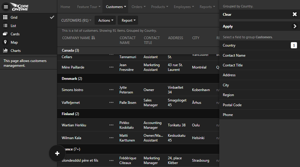
Multi-column grouping simplifies work of users with data in apps with Touch UI.

Business life is unpredictable.  Give your end users ability to sort data items by any combination of fields in any order. That will make their work a premium experience.
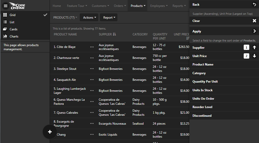
Multi-column sorting is something every end user dreams about when working with data. It is possible in apps created with Touch UI.

Premium Data Entry Forms

Data entry forms must automatically fit into any display size while offering sophisticated data lookups and data input controls.
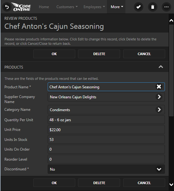
Responsive data entry forms work on any device in apps created with Code On Time thanks to the responsive nature of Touch UI.

Data fields on the forms need to be organized into multiple columns with optional tabs. A premium application implementation will abandon physical positioning of fields if favor of logical field groupings to enable effective display of forms on any screen size. Any other approach will increase the development costs tremendously.
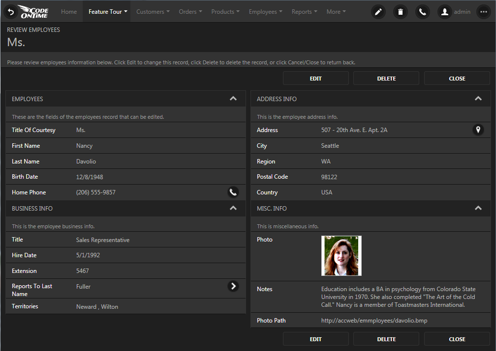
Logical grouping of fields bring order in the development of responsive user interfaces.

Complex Page Layouts

Simultaneous display of different kinds of data on a page is known as dashboard. Dashboards with complex page layouts should be easy to organize in a premium application.
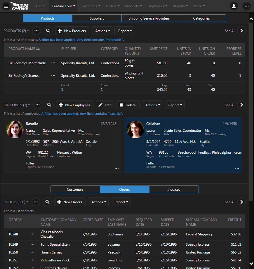
Complex page layouts or 'dashboards' are needed in premium line-of-business apps.  Code On Time application source code generator makes it possible.

Of course, there is no dashboard without charts.
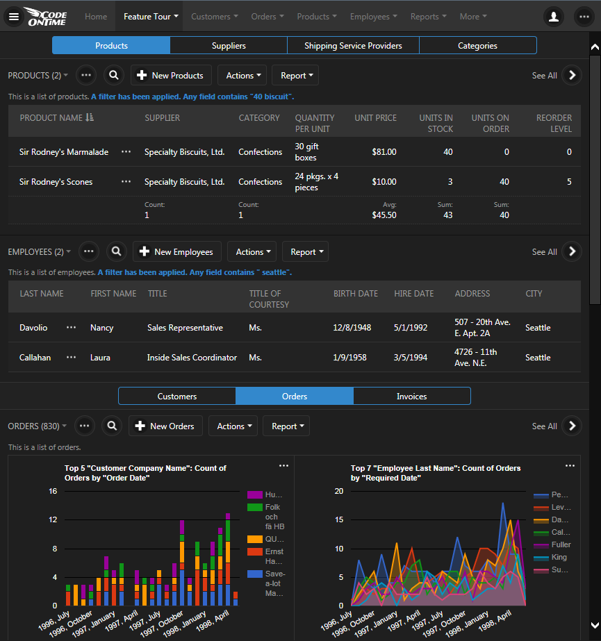
Dashboards can display both data and charts in premium line-of-business apps created with Code On Time application generator.

Support for Devices With Any Display Density

The display technology has improved and now even the smallest devices feature an exceptionally high density of pixels that cannot be seen with a human eye.

The following two screens are displaying the same exact application page on devices with a different density.
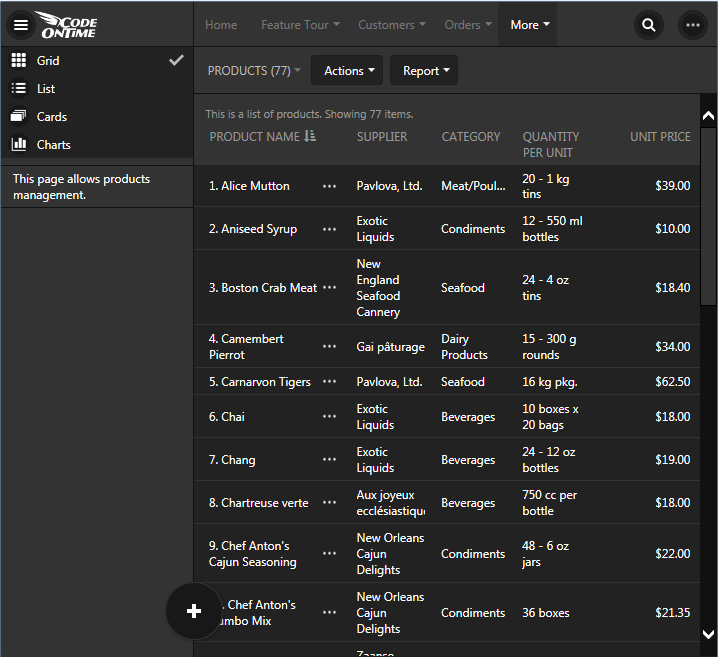
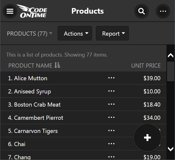
Touch UI responds in responsive fashion to available real estate and display density.

High display density will not blur icons or disable actions designed by application developer in an created with Code On Time.

Application must gracefully adjust to the available “viewport” that defines logical pixels of the display on the device. The icons should look crisp and functionality must be adapted in responsive fashion in a premium line-of-business application.

If your app looks too small or too large for a display then your app is likely not in the premium category.

Don’t forget that your end users will literally touch your apps on many devices. A premium app is ready for “touch” interactions on native touch screens and hybrid devices.

Conclusion

Does your app provide a less than premium experience to the end users? Does it take a lot of money and time to get things done?

If so then schedule a live demonstration of Code On Time. Our code generator will assist developers in producing consistently high quality source code of custom line-of-business applications with premium features for Mobile and Desktop devices. Give us a call at 1-877-467-6340.

Tuesday, September 1, 2015PrintSubscribe
“Calendar” View For You

Applications created with Code On Time use a well defined entity model that prescribes presentation of data as grid and form views and determines transition of views via actions. Data may come from any source. For example, a developer can defined an SQL query or stored procedure to read data from the database. An entity can also be programmed to read/write data from a web service, file system, or any other source. Application framework interprets the entity and displays data in various view styles. For example, a typical grid view can be rendered as responsive grid, list, collection of data cards, map, and charts. Request an interactive Webex presentation to learn more.

“Calendar” is a brand new view style that will become available with update 8.5.5.0 on September 2, 2015 . A presence of a “date” field will tell application framework that there is possibility of rendering data as a calendar. New view style offers Day, Week, Month, Year, and Agenda modes. Any field in the view can serve as a “color” field. The framework will assign a color to each data value.  End users can drag and drop events to change values of date fields. Standard form view of an entity is display when an event is selected enabling seamless editing of data.

“Day” view in the screen shot shows 4 data records rendered as events.

'Day' mode in calendar view of an app created with Code On Time.

Mini calendar on the side bar uses bold font to indicate dates of the month with events. Mini calendar alternates presentation of data between day and week mode when a particular date is clicked. Color legend shows associated data values, which represents the name of the employee assigned to the “order” event. An “event” is a record from Orders table of the Northwind sample.

“Week” view offers seven days of events. Future updates are expected to support 3 and 4 day weeks. Both “Day” and “Week” view are infinitely horizontally scrollable.

'Week' mode in calendar view of an app created with Code On Time.

“Month” view offers infinitely scrollable events organized in months.

'Month' mode in calendar view of an app created with Code On Time.

Click on any item in the color map on the sidebar and the application will “dim” events associated with other employees in “Day”, “Week”, “Month”, and “Agenda” views.

'Dimming' of events is possible by tapping on the color legend in 'Day', 'Week', 'Month', and 'Agenda' modes of calendar view style in apps created with Code On Time.

“Year” view offers analytical presentation of an entire year and also enables quick data-driven navigation to a month or a specific day.

'Year' view in Calendar view style of an app created with Code On Time.

“Agenda” view provides a convenient condensed summary list of events with a dynamic timeline.

'Agenda' view in Calendar view style of an app created with Code On Time.

All modes of the calendar view style are responsive. Smartphone users will see presentation scaled to fit the form factor of their device. For example, these two screen shots demonstrate “Day” and “Agenda” view on a typical smart phone.

'Day' view in Calendar view style of an app created with Code On Time displayed on a screen with small form factor.   'Agenda' view in Calendar view style of an app created with Code On Time displayed on a screen with small form factor.

These amazing capabilities require no programming or coding. Developers can opt to disable the calendar when not desired. Otherwise application will simply offer the end user yet another way to see their data.

Calendar view now joins a first class collection of presentations styles that were made available in the previous releases and greatly enhanced with this new iteration. View selector and sidebar provide access to every view style available for a particular dataset.

Selecting a view style for data presentation in an app created with Code On Time.

For example, charts view displays automatically constructed charts without developer writing any code.  Any number of custom charts can be defined when needed at design time.

'Charts' view style in an app created with Code On Time.

“Cards” view presents data items as multi-line cards with the same size. Application framework breaks each three fields in paragraphs offering another way to see data. Cards presented in 3, 2, or 1 column based on the screen size. The screenshot shows two columns of automatically configured cards.

'Cards' view style in an app created with Code On Time.

“List” view is the most universal presentation style that will work with fields of any length and any screen size. Field values float from left to right and continue on the next line.

'List' view style in an app created with Code On Time.

“Grid” view style enhances responsive presentation by introducing automatic data balancing. The new release reduces the number of visible columns by applying 2, 5, 8, 10, and 12 column breakpoints based on screen size when data is rendered. This makes it possible to display a grid of rows with “important” fields without being forced to scroll horizontally. For example, this screenshot shows five columns of data rows in Orders table.

Responsive 'Grid' view style in an app created with Code On Time.

Developers can indicate the minimal screen size that a particular column must be displayed on. For example, tag “grid-tn” will force a column to show up even on “tiny” screen. Small screes with show every column marked as “grid-sm”. The release notes of the update will explain expected logical pixels of tiny, extra small, small, medium, large, and extra large screens.

Previous release required explicit tagging of each field. The new approach is to assume that all fields must be displayed if possible. The mere intent of a developer to place a field in a grid implies that it must visible. Developer-defined tags simply enforcing display of fields on particular screen sizes in responsive grid. The next screenshot shows 8 columns displayed when the sidebar is not visible. Automatic data balancing ensures that “shorter” fields reclaim more real estate from “longer” fields with enforced minimal width to ensure quality “balanced” presentation of data in columns with fixed width.

Long press brings up a context menu with data sensitive options in an app created with Code On Time.

All view styles also support “long press” that allows displaying of context menu and selection of records on both desktop and touch-enabled devices. The screenshot above shows context-sensitive filtering and sorting options.

“Map” view style is one more method of presenting data that becomes available when latitude/longitude or Address/City fields are present in the gird view.

'Map' view style in an app created with Code On Time.

Context menus and data cards are now displayed at the bottom of the screen on devices with small form factor to enable easy touch operations. A couple of screenshots below show data card of “Map” view style and view selector on a small screen.

Data card displayed on a screen with small form factor presented by app created with Code On Time.   Context menu displayed on a screen with small form factor presented by app created with Code On Time.

The standard collection of presentation styles will be enhanced with horizontally scrollable “Datasheet” view and “Hierarchy” view styles. The implementation of remaining view style is well under way and is based on horizontal scrolling mechanism that was developed and perfected with “Calendar” view.

Monday, June 1, 2015PrintSubscribe
Responsive Grids, User Identity, and Preview of “Live” Content Editing

Code On Time release 8.5.4.0 introduces several important enhancements.

Touch UI now uses glyphicons to indicate sort and filter state. Contents of cells in responsive grid is wrapped to maximize the amount of visible information. The same “wrapped cell” design is implemented in “data sheet” view style, which will be available soon to complement responsive grid. The new view style will display a complete set of fields that can are scrolled horizontally on any screen size. The original implementation of responsive grid displayed rows of the same height making it difficult to read the content in the cells.

image

User identity icon is now displayed on the menu bar. The name of the user is displayed partially or completely next to the icon if the width of the device allows that. Otherwise the user name is displayed in the popup menu assigned to the icon.

image

Install integrated CMS in your app with Single Page App implementation model and you can try live editing of content pages. Add a content page based on any Bootstrap template to your project and select “Edit Page” in the “More” menu. If you choose “Properties’ then the app will redirect to the site content page. Only administrators, content editors, and developers are allowed to edit content pages.

image

Click on any content and change it directly in the browser.

image

Change the properties of content items.

image

Select glyphicons from context menu:

image

Save the page directly to integrated content management system.

image

Content pages stored in CMS are rendered both in Desktop and Touch UI. Live editing is only supported in Touch UI. Future releases will introduce a complete set of page editing capabilities that will enable constructing appealing content without effort. A collection of page templates and content fragments will be installed directly in the CMS.

The following bug fixes and enhancements are also included:

  • Master view refresh when children are changed is now supported in Touch UI. If a master view has one or more fields derived from child tables as aggregates (totals, counts, averages, etc.) then specifying “controller:NAME_OF_CHILD_DATA_CONTROLLER” in Context Fields property of a field will cause the master view to refresh and forms to recalculate the fields. This syntax is supported in both Desktop and Touch UI. The old syntax will also work.
     
  • Fixed desktop CSS but that has colored glyphicons in "content" pages. Now the color is scoped to ".DataViewContainer" selector.
     
  • Removed xmlns="http://www.w3.org/1999/xhtml" from SPA apps and enhanced content encoding tag in the output markup.
     
  • Introduced data-editable tag in content page templates to enable live editing of content.
     
  • Site content is considered to be text if its type is "application/javascript".
     
  • Desktop UI cancels pending "valueChanged" call in calcualted fields that leads to exceptions when a modal data view is closed.
     
  • Client framework will pass a combined filter that includes standard user filters and advanced search options when executing actions.
     
  • User Lookup does not crashes desktop UI anymore.
     
  • If a popup list of options does fit entirely on screen than Touch UI does not resize the menu and instead positions it sideways.
     
  • Touch UI aligns thumbnails vertically when Cards view style is active.
     
  • Touch UI aligns thumbnails to the top in lists with multiple paragraphs.

Calendar View Style is Coming Soon

We are getting close to completion of the new view style called Calendar. Take a look at a few screen shots below. The new view style uses a common “horizontal infinite scrolling” infrastructure in day and week sub-views shared with the upcoming “data sheet” view style. The screen shots are displayed without data. Data will be displayed on demand when user stops scrolling. The data pivoting technology implemented to support Smarts Charts is the foundation of the Calendar view style.

Year

image

Month

image

Week

image

Year View on  a Small Screen

image