Code Generator

Labels
AJAX(112) App Studio(7) Apple(1) Application Builder(245) Application Factory(207) ASP.NET(95) ASP.NET 3.5(45) ASP.NET Code Generator(72) ASP.NET Membership(28) Azure(18) Barcode(2) Barcodes(3) BLOB(18) Business Rules(1) Business Rules/Logic(140) BYOD(13) Caching(2) Calendar(5) Charts(29) Cloud(14) Cloud On Time(2) Cloud On Time for Windows 7(2) Code Generator(54) Collaboration(11) command line(1) Conflict Detection(1) Content Management System(12) COT Tools for Excel(26) CRUD(1) Custom Actions(1) Data Aquarium Framework(122) Data Sheet(9) Data Sources(22) Database Lookups(50) Deployment(22) Designer(177) Device(1) DotNetNuke(12) EASE(20) Email(6) Features(101) Firebird(1) Form Builder(14) Globalization and Localization(6) How To(1) Hypermedia(2) Inline Editing(1) Installation(5) JavaScript(20) Kiosk(1) Low Code(3) Mac(1) Many-To-Many(4) Maps(6) Master/Detail(36) Microservices(4) Mobile(63) Mode Builder(3) Model Builder(3) MySQL(10) Native Apps(5) News(18) OAuth(8) OAuth Scopes(1) OAuth2(11) Offline(20) Offline Apps(4) Offline Sync(5) Oracle(10) PKCE(2) PostgreSQL(2) PWA(2) QR codes(2) Rapid Application Development(5) Reading Pane(2) Release Notes(180) Reports(48) REST(29) RESTful(29) RESTful Workshop(15) RFID tags(1) SaaS(7) Security(80) SharePoint(12) SPA(6) SQL Anywhere(3) SQL Server(26) SSO(1) Stored Procedure(4) Teamwork(15) Tips and Tricks(87) Tools for Excel(2) Touch UI(93) Transactions(5) Tutorials(183) Universal Windows Platform(3) User Interface(338) Video Tutorial(37) Web 2.0(100) Web App Generator(101) Web Application Generator(607) Web Form Builder(40) Web.Config(9) Workflow(28)
Archive
Blog
Code Generator
Tuesday, March 3, 2015PrintSubscribe
Introduction to Charts

Every Code On Time web app comes with multiple ways of displaying your data. One way to visualize your data is with charts. See an example of charts on the Orders page of Northwind sample below.

Default data insight charts displayed for orders page of a Northwind sample app.

When a user activates the Charts presentation style, any developer-defined charts will be displayed. If none have been defined, then the application will automatically construct charts based on the data fields present in that view.

Activating Charts Presentation

Charts can be activated by clicking on the “Charts” presentation style option in the sidebar on the left hand side of the screen.

Selecting the Charts data presentation style from the sidebar.

If the device you are using is narrow or the sidebar has been disabled, you can click on the context menu button “…” in the top right corner of the screen to bring up the context menu.

Selecting the three dot context menu button in the top right corner of the screen.

Then, click on the name of the view to bring up view options.

Activating the view settings by clicking on the view name from the context menu.

Select the “Charts” data presentation style, and the view will refresh and display charts to the user.

Selecting the charts data presentation style from the view options menu.

Responsive Design

Charts offer a responsive design that will scale to fit any device, regardless of the device’s screen size. You can get a comprehensive snapshot of your data from your phone, tablet, or desktop computer. The largest screen sizes will display three columns of charts.

The largest screens and devices will show three columns of charts.

If the window is shrunk to a moderate size or the device is a tablet, two columns of charts will be shown instead.

Only two columns of charts will be shown when the device is of medium size.

Smaller devices will display one chart at a time.

Smaller devices show one chart at a a time.

If the device or window has a short height (or if your phone is rotated horizontally), then the charts will be shrunk vertically in order to fit at least one chart at a time on the screen.

Charts will shrink vertically to fit the screen size.

Sizing Charts

Charts can also be individually resized. Each chart is set to “Small” by default. This will render three columns on large screens, two columns on medium screens, and one column on small screens. If only one chart is present for the view, then that chart will always be maximum size available for the device.

The user can change the size of each chart by clicking on the three dot context menu “…” in the top right corner of the chart. Large devices will have access to “Small”, “Medium” and “Large” sizes.

User can define the size for the chart from the context menu

Select “Large” to display a chart at full width and height of the screen. “Large” charts will scale down to “Medium” size on moderately sized devices, and to “Small” if the device cannot fit medium charts.

Large charts take the full height and width of the screen.

“Medium” chart size uses two thirds of the width and height a large screen, leaving space for one small chart in each dimension.

Medium size charts will take 2/3s of the height and width of the screen.

Medium charts on a medium size device will take the full width and two thirds of the height, leaving room for one chart above or below.

Medium size charts on a medium size device will take the full width and 2/3s of the height.

Default chart sizes can also be specified by the developer at design time.

Filtering with Charts

Any filters applied to the data view will be used by the charts. Quick filter options are available for the relevant fields in the context menu of each chart.

Quick filtering options are available based on the fields that are present in the chart.

Clicking on the name of a field will open the filter panel for that field.

The filter panel for Customer Company Name has been opened.

Select several options from the panel and press “Apply” to filter. The charts will refresh with the new, filtered data.

An Orders chart that is filtered by the customer.

Child data views also derive the filter from the selected master record. The screen below shows charts giving insight to the orders from the customer “Save-a-lot Market” – Davolio seems to be the preferred employee.

Charts for orders that are specific to a customer that has been selected as the master record.

Viewing the Data Behind the Chart

Users also have the option to view the pivoted data that the chart is based on in a table. Click on the three dot context menu “…” in the top right corner of a chart. Select “Show Data” option.

The 'Show Data' option in the context menu of a chart.

The chart will be replaced by a table that shows the data. A miniature chart preview will be shown in the top left corner.

The data for the chart is displayed in a table.

Clicking on the mini chart in the top left hand corner will restore the chart. The user can also use the “Show Chart” option in the context menu.

The 'Show Chart' option will restore the chart.

Wednesday, August 27, 2014PrintSubscribe
Page Headers in Touch UI

Page headers are displayed at the top of every page to inform the user of which view or control they are currently working with. The picture below displays the page header of “Orders”, visible below the page title.

The "Orders" page header is displayed below the title bar.

In pages that display data views, the header is hidden on two conditions:

1. When the current view is the entry point to the page.

The "Customers" page header is hidden due to the fact that this view is the entry point to the page.

2. When the text of the page header matches the title of the page displayed on the menu bar at the top of the screen. For example, the child view of Employees on the Employees page in a sample Northwind app will not have a page header.

The child view does not show page header as it has the same text as the page title.

Hiding the Page Header

The header can also be hidden on a per-page basis.

Start the Project Designer. In the Project Explorer window, double-click on the Customers page.

Customers page in the Project Explorer.

Specify the following:

Property Value
Custom Style Tall

Save the page, and press Browse on the toolbar to generate the app and open the page in your default browser. Select a customer, and tap See All next to the list of orders. Note that the “Orders” page header is not displayed.

Customers page does not display any page headers.

Page Headers in Custom User Controls

The page header text for user controls is derived from the data-activator tag. By default, this tag is set to the name of the user control.

User controls show the control name as page header by default.

The header text can be specified using the data-page-header tag. For example, let’s specify the page header text for a freshly created user control. Open the user control file in Visual Studio and make the following highlighted addition:

...
<!-- 
    This section provides a sample markup for Touch UI user interface. 
-->
<div id="TestUserControl" data-app-role="page" data-activator="Button|TestUserControl" data-page-header="Custom Header">
    <div data-role="content">
        <p>
            Markup of <i>TestUserControl</i> custom user control for Touch UI.
        </p>
    </div>
</div>
...

Save the file and refresh the web page. Note that the page header text has been changed.

Custom header text has been specified for the user control page header.

The page header can be hidden by specifying “false” for the data-page-header tag. Make the following change:

...
<!-- 
    This section provides a sample markup for Touch UI user interface. 
-->
<div id="TestUserControl" data-app-role="page" data-activator="Button|TestUserControl" data-page-header="false">
    <div data-role="content">
        <p>
            Markup of <i>TestUserControl</i> custom user control for Touch UI.
        </p>
    </div>
</div>
...

Save the file and refresh. The page header will not be present.

The page header has been hidden on this user control page.

Saturday, August 9, 2014PrintSubscribe
Passing Parameter to Stored Procedure using a Custom Search Dialog

Code On Time apps offer the ability to display the results of a stored procedure. Some stored procedures require passing an SQL parameter in order to perform manipulations on the data.

In the Northwind sample database, the [Employee Sales By Country] stored procedure shows total sales amounts grouped by employee, and then by country. It accepts two parameters, @Starting_Date and @Ending_Date to determine the filter.

Let’s create a controller from this stored procedure. By default, the stored procedure will display all records between the years 1970 and 2000. In addition, we will add a custom action that will allow the user to specify the Beginning and Ending dates via a custom confirmation controller.

The picture below shows the confirmation controller form allowing the user to specify parameters for the stored procedure.

The confirmation controller form allows the user to select a beginning and ending date to pass to the stored procedure.

The CREATE script for the stored procedure can be seen below.

CREATE procedure [dbo].[Employee Sales by Country] 
@Beginning_Date DateTime, @Ending_Date DateTime AS
SELECT    Employees.Country, 
        Employees.LastName, 
        Employees.FirstName, 
        Orders.ShippedDate, 
        Orders.OrderID, 
        "Order Subtotals".Subtotal AS SaleAmount
FROM Employees INNER JOIN 
    (Orders INNER JOIN "Order Subtotals" ON Orders.OrderID = "Order Subtotals".OrderID) 
    ON Employees.EmployeeID = Orders.EmployeeID
WHERE Orders.ShippedDate Between @Beginning_Date And @Ending_Date

Creating the Controller to Display the Stored Procedure

Start the Project Designer. In the Project Explorer, switch to the Controllers tab. Click on the New Controller icon on the toolbar.
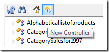
Creating a new controller.

Enter a name for the controller.

Property Value
Name EmployeeSalesByCountry

Press OK to save. Right-click the new controller and press “Generate From SQL…”.
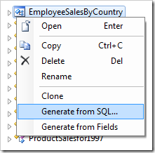
Generating the controller from SQL.

In the SQL script textbox, paste in the following script. The debug section is removed from the business rule when the application framework executes the script at runtime and declares the parameters.

-- debug
DECLARE @Session_BeginningDate datetime, @Session_EndingDate datetime
-- end debug

if (@Session_BeginningDate is null)
    set @Session_BeginningDate = '1970'

if (@Session_EndingDate is null)
    set @Session_EndingDate = '2000'


EXEC [dbo].[Employee Sales by Country]
    @Session_BeginningDate,
    @Session_EndingDate

Press OK to generate the controller.

Setting the Session Variable

Note that the parameters returned from the search dialog will not be cached. These parameters must be saved into a session variable. In the Project Explorer, double-click on the EmployeeSalesByCountry / Business Rules / Select (Sql / Before) – enableResultSet node.
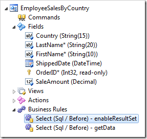
Selecting the 'enableResultSet' business rule from the EmployeeSalesByCountry controller.

Replace the script with the following:

set @BusinessRules_EnableResultSet = 1
-- Enable caching of the result set. Duration is specified in seconds.
-- set @BusinessRules_ResultSetCacheDuration = 30 

if (@Parameters_BeginningDate is not null)
    set @Session_BeginningDate = @Parameters_BeginningDate

if (@Parameters_EndingDate is not null)
    set @Session_EndingDate = @Parameters_EndingDate

Press OK to save the new script.

Adding Controller To Page

Next, let’s add the controller to a page. Right-click on the controller and press Copy.
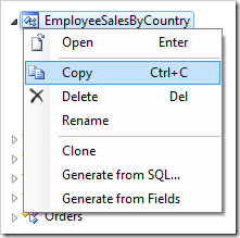
Copying the 'EmployeeSalesByCountry' controller.

Switch to the Pages tab in the Project Explorer. On the toolbar, press the New Page icon.
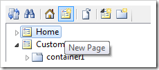
Adding a page to the app.

Give a name to the page and press OK to save.

Property Value
Name Employee Sales By Country

Drop the new page to the right side of Home page node to place it second in the site menu.
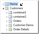
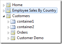
Dropping a page to the right of the Home page node.     Employee sales by country page is now second in the site menu.

Right-click on the page and press Paste to instantiate the controller as a data view on the page.
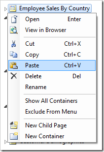
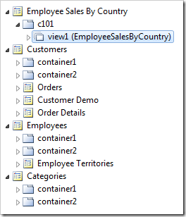
Pasting onto the 'Employee Sales By Country' page.     The EmployeeSalesByCountry controller has been instantiated as a view on the page.

Adding the Custom Action

Switch back to the Controllers tab in the Project Explorer. Right-click on EmployeeSalesByCountry / Actions / ag3 (ActionBar) – New node, and press New Action.
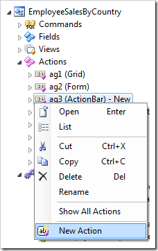
Creating a new action in the 'EmployeeSalesByCountry' controller.

Specify the following values:

Property Value
Command Name Search
Header Text Filter View
Confirmation

_controller=FilterEmployeeSales
_title=Select the Beginning and Ending Dates

Press OK to save the action.

Creating the Confirmation Controller

Let’s add a controller that will allow the user to specify BeginningDate and EndingDate parameters for the stored procedure.

On the Project Explorer toolbar, press the New Controller icon.

Adding a new controller to the project.

Enter a name for the controller.

Property Value
Name

FilterEmployeeSales

Click OK to save the controller. Right-click on FilterEmployeeSales / Fields node, and press New Field.
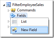
Adding a new field to the 'FilterEmployeeSales' controller.

Define the field as follows:

Property Value
Name BeginningDate
Type DateTime

Save the field, and create a second field with these values:

Property Value
Name EndingDate
Type DateTime

Save the EndingDate field. The confirmation controller is now complete.

Viewing the Results

On the Project Designer toolbar, press Browse. In the browser window that will open, navigate to the Employee Sales By Country page. Note that all 809 records are displayed.
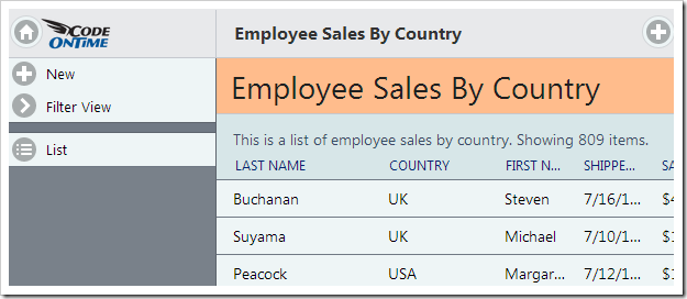
All 809 records are displayed on the 'Employee Sales By Country' page.

In the sidebar or context menu, press Filter View action. The page will navigate to a form with the Beginning Date and Ending Date fields. Enter values, and press OK.
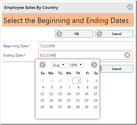
The confirmation controller form allows the user to select a beginning and ending date to pass to the stored procedure.

Note that the parameters have been passed to the stored procedure and there are only 17 records displayed now.
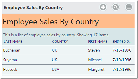
The BeginningDate and EndingDate parameters have been set by the confirmation controller.