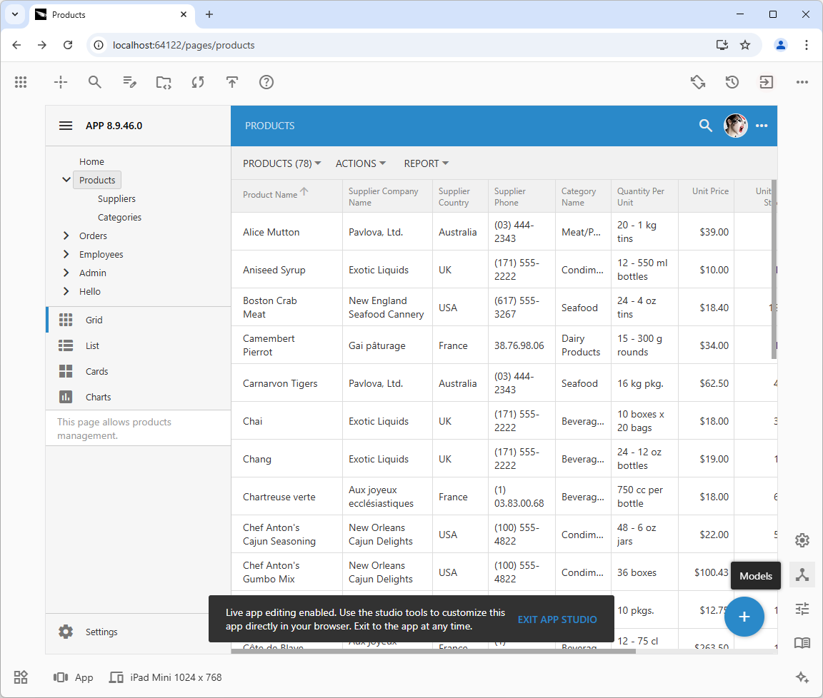
The December 2024 update to the App Studio introduced the all-new Properties Grid and configuration hierarchies. Code On Time release 8.9.46.0 brings enhanced app customization tools and an updated App Studio user interface. The UI redesign improves usability and development workflow.
Key new features of the App Studio, as shown in the screenshots, include:
- App Explorer: A powerful app configuration tool with horizontal or vertical layouts and an optional "table" mode.
- Live Inspection: Jump to the corresponding configuration element in the App Explorer by pointing and clicking on the UI of the live application.
- Global Search: A new search icon next to the “Inspect” button brings the search prompt to query all configuration hierarchies.
- Background Inspection: The App Explorer monitors the live app user interface as developers navigate the configuration hierarchies. When a match for a selected configuration element is found in the live application UI, the corresponding hierarchy node icon pulsates, and the element is highlighted with a focus frame.
- Peek Through: To get an unobstructed view of the live app with the focus frame on the matching UI element, press and hold Ctrl+Shift+Down anytime or Ctrl+Shift+Click on a pulsating node icon in the configuration hierarchy.
- Auto Complete: Code editors with auto-complete for data controller fields in SQL and JavaScript business rules.
The top toolbar contains the following buttons on the left side: “Apps”, "Inspect", "Search", "Edit Project Code", "Show Source Code", "Sync Design", and "Deploy". On the right side, at the bottom of the toolbar, are the "Settings", "Models", "Controllers", and "Pages" buttons. The icons representing the models and controllers have been updated.
 App Studio's quick access buttons, located at the bottom of the right toolbar, launch the unified App Explorer. Long-time Code On Time users will recognize these buttons as the tabs in the legacy Project Explorer .App Explorer allows developers to search by name, browse configuration hierarchies, and inspect the live app to find the corresponding configuration element.
App Explorer
App Explorer now combines a hierarchical view of the app configuration and the Properties Grid in both horizontal and vertical layouts. Developers can view the entire hierarchy as a tree, or use table mode to browse one level at a time.
Horizontal Layout
The new Properties Grid release features a side-by-side layout by default, unlike the initial release which positioned the configuration hierarchy tree above the properties. This new layout allows developers to use the full browser window height for interacting with the tree and displaying the maximum number of properties for the selected node.
Users can resize the Explorer panel by dragging its left edge. Double-clicking the left edge will either fit the hierarchy tree width or restore it to its default state. Dragging the middle divider changes the inner layout proportions; double-clicking the divider restores the default width of the properties.
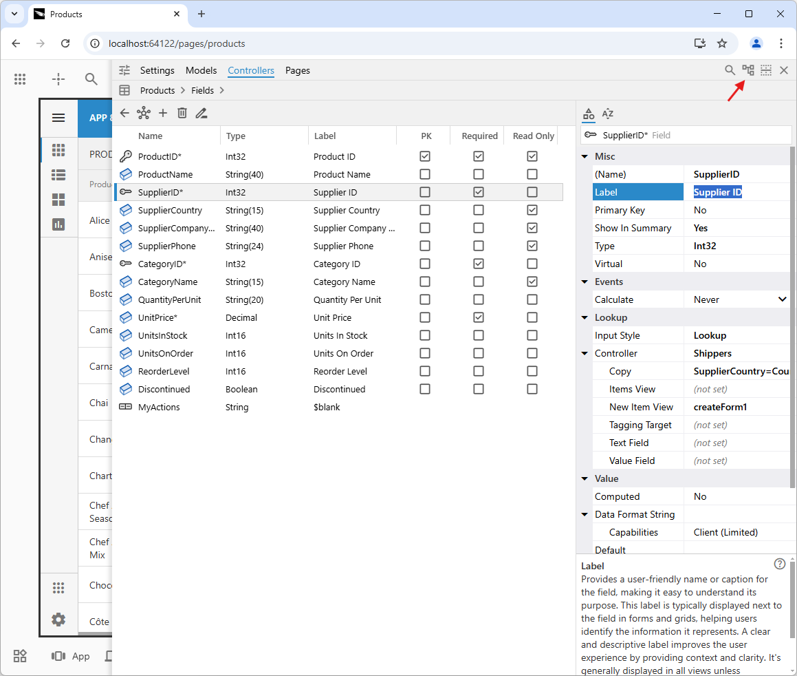
The Explorer’s title bar contains “Settings”, “Models”, “Controllers”, and “Pages” hierarchy tabs for quick switching between app configuration sections. On the right side of the title bar, there are four control buttons: “Search”, “Display Hierarchy as Table”, “Split Vertically”, and “Close”.
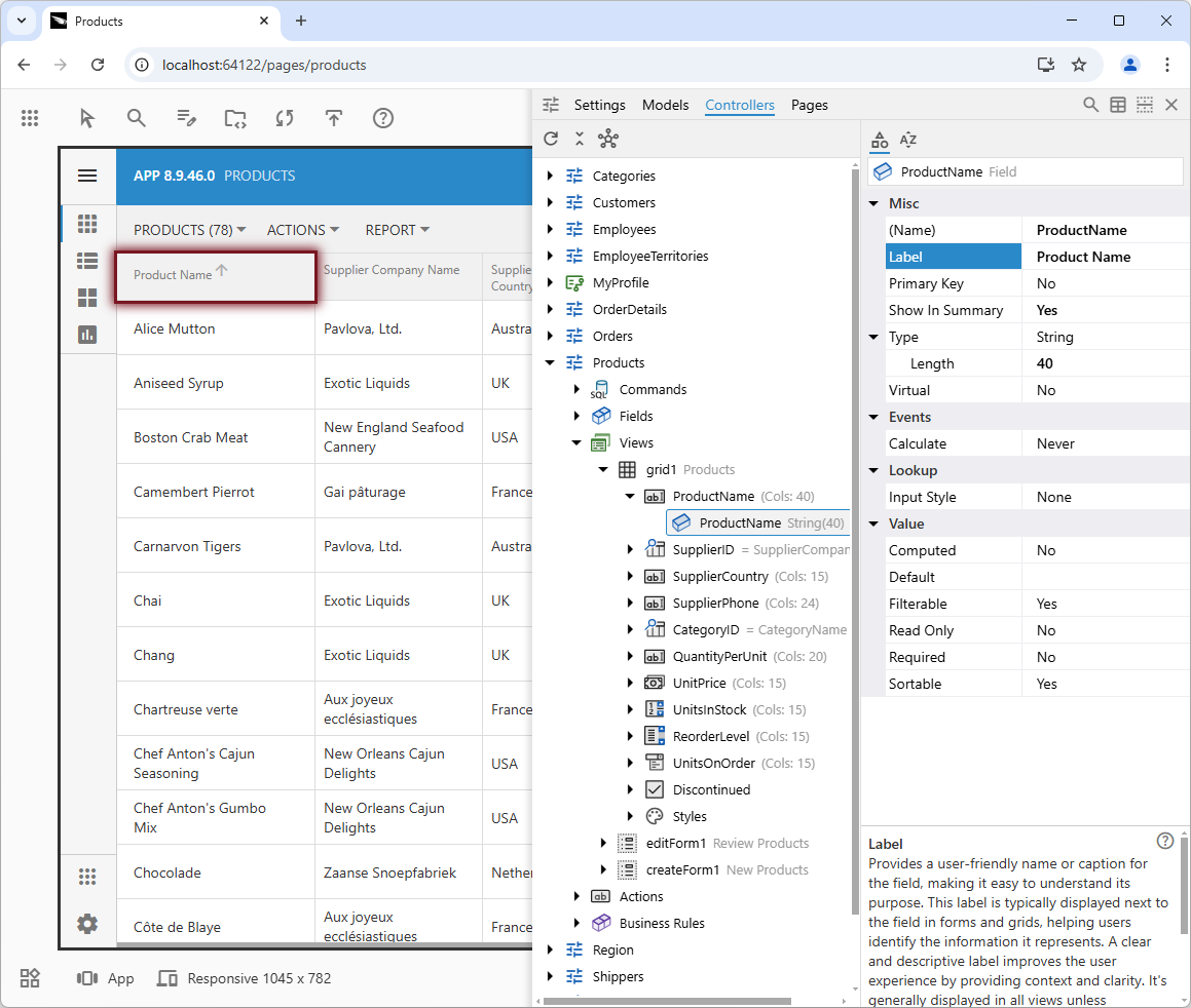
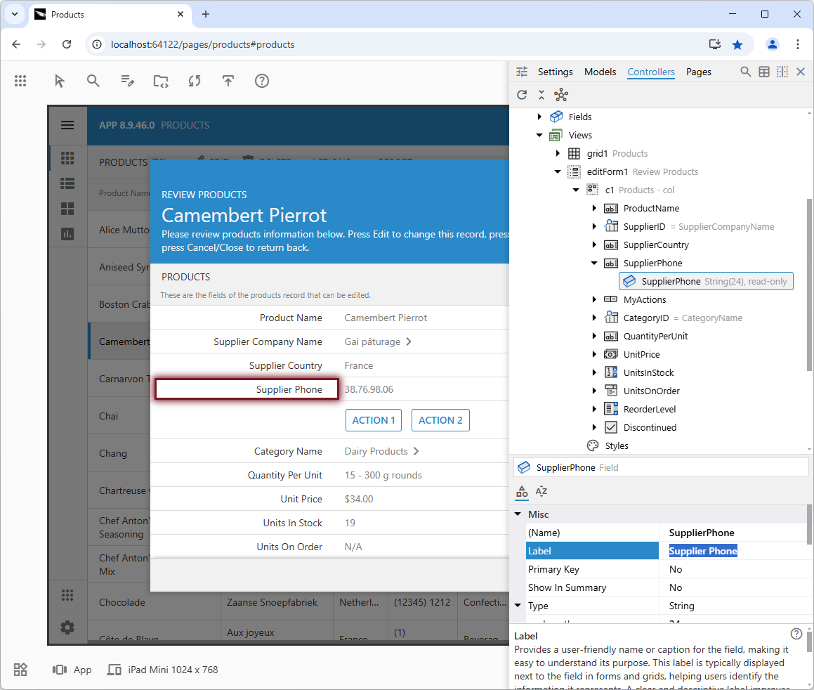
The provided screenshot displays the App Explorer following a live inspection of the "Product Name" column header. The image shows the attached hierarchy and properties side-by-side, with the "Label" property of the "ProductName" field selected. A brief description explains the property's purpose. Tabs within the title grant quick access to "Settings", "Models", "Controllers", and "Pages". The right side of the title contains buttons for "Search", "Display Hierarchy as Table", "Split Vertically", and "Close".
Vertical Layout
The "Split Vertically" toggle button will change the layout from horizontal to vertical. The layout toggle button icon will change, and its tooltip will read “Split Horizontally”. If the browser window isn't wide enough to fit the horizontal layout of the App Explorer, the vertical layout will be activated automatically.
The vertical layout stacks the tree and properties. The tabs in the Explorer’s title are grouped in the dropdown menu. Double-click the left edge to fit the tree width or to restore its default state. Drag the edge for a comfortable view of the tree and properties. Click the “Split Horizontally” to switch back to the horizontal layout.
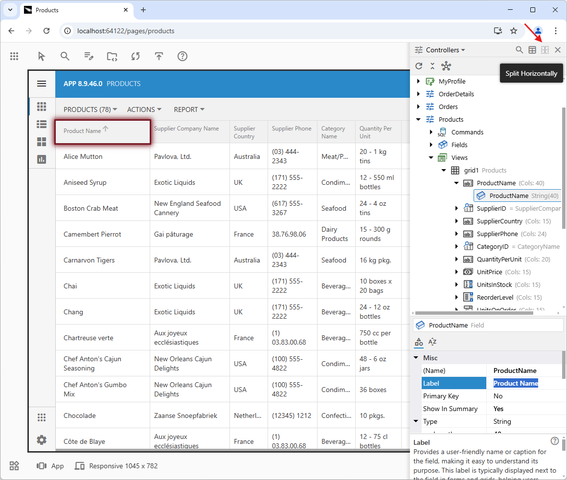
The App Explorer maintains the proportional tree/properties split even when the browser window is resized. If there is not enough horizontal space, the hierarchy tabs collapse into a dropdown list. To restore the default layout, click on the "Split Horizontally" button.
Hierarchy Tabs
The Explorer's title bar features a tabbed interface for streamlined navigation through the app's configuration. These tabs, labeled "Settings," "Models," "Controllers," and "Pages," provide quick access to different sections of the configuration. By selecting a tab, you can instantly restore the last chosen node within that specific area, eliminating the need to manually navigate back to your previous position. This tabbed layout promotes efficiency and allows for seamless switching between different aspects of the app's configuration, such as effortlessly transitioning from a controller configuration to its corresponding host page with a single click.
In scenarios where the horizontal space is limited, the tabbed interface dynamically adapts by collapsing the tabs into a dropdown menu. This ensures that the navigation remains accessible and functional regardless of the screen size or resolution.
Developers can access the specific configuration section from within the live app through a set of conveniently placed buttons at the bottom of the right toolbar in the App Studio mode. This eliminates the need to navigate away from the app to access the desired configuration area, further enhancing the overall user experience and streamlining the development process.
Table Mode
The "table" mode in App Explorer offers a streamlined alternative to the traditional tree-based navigation, especially when dealing with a large number of nodes at a single level. By presenting the nodes in a tabular format, developers gain a comprehensive overview of key properties at a glance. The first column lists the node names, while subsequent columns display attributes like type, label, and other metadata-defined properties. This layout allows for quick scanning and comparison, making it easier to identify specific nodes or discrepancies without navigating through a complex hierarchy. The table view simplifies the process of understanding and managing the relationships and characteristics of multiple nodes simultaneously.
The interactive features of the "table" mode enhance efficiency. Clicking on any cell within the table directly focuses on the corresponding property in the Property Grid. This immediate access eliminates the need for manual searching and scrolling, saving time and reducing the risk of errors. For instance, when examining a list of fields, a click on a field's "Required" cell instantly brings up the "Required" property in the Property Grid. This direct link between the table and the property details makes navigation and editing significantly faster. The automatic focus on the selected property ensures a seamless and intuitive workflow.
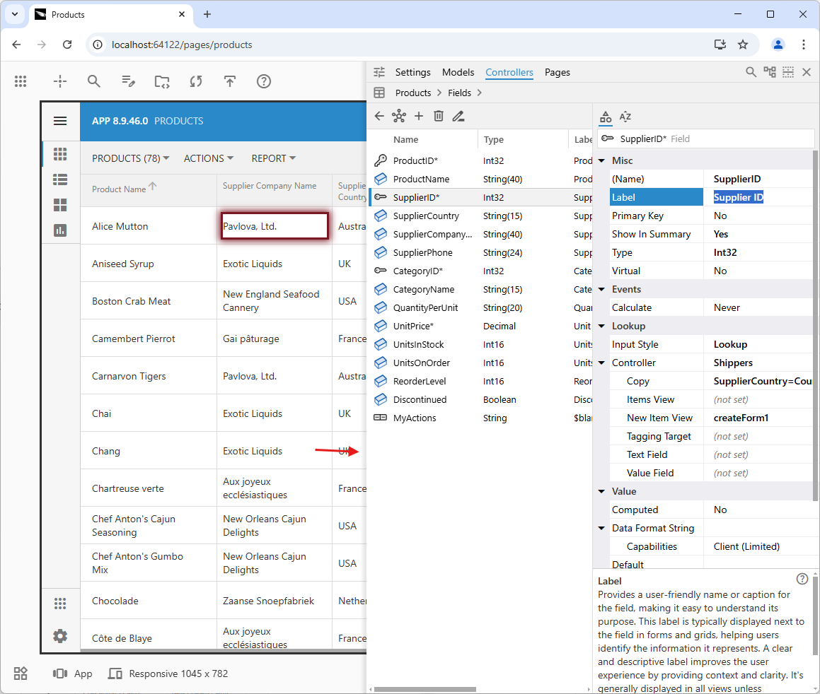
To adjust the App Explorer hierarchy table's width to fit the table, double-click its left edge. You can also drag this edge to your preferred size. The table allows for scrolling both vertically and horizontally. To select a node, click on its icon; to drill down (where possible), click on the text in the first column. Clicking on a property value within a table cell will select the node in the Properties Grid, and the focus will be on the corresponding property.
App Explorer also includes breadcrumbs displayed above the table, offering quick navigation to any level within the hierarchy. Unlike the "Back" button, which returns to the immediate parent level, the breadcrumbs allow users to jump directly to any desired level with a single click. This feature streamlines navigation, particularly in complex hierarchies, enabling efficient movement between different configuration levels.
Double-clicking the left edge of the App Explorer panel adjusts the hierarchy width to fit the content.
The table within the App Explorer features sticky column headers and a sticky first column, enhancing the scrolling experience when navigating up or left within the long or wide table.
The ability to view key node properties in a table format is incredibly useful. Clicking on a cell within the table rows will highlight the corresponding node in the Properties Grid and focus on the property associated with that cell. Boolean properties are displayed as checkboxes, allowing you to toggle the property value simply by clicking on them. Click the “Display Hierarchy as Tree” to switch to the standard navigation.
The presentation of boolean properties as checkboxes in the "table" mode adds another layer of convenience. These checkboxes not only visually indicate the state of the boolean properties but also allow for direct toggling. A simple click on a checkbox changes the property's value, streamlining the process of enabling or disabling features. This direct interaction is much faster and more intuitive than navigating through the Property Grid to find and modify each boolean setting individually. The combination of tabular layout, direct property access, and interactive boolean controls makes the "table" mode a powerful tool for managing and configuring applications efficiently.
The “Display Hierarchy as Tree” toggle button restores the default presentation by revealing the nodes on all levels.
Nodes can be dragged and dropped by developers in both the tree and table view. Developers can also use the node's context menu to cut, copy, and paste at any level of the hierarchy.
Live Inspection
The App Studio mode provides the most efficient way to modify the app configuration by inspecting the live user interface. When launched from Code On Time on the localhost address, the studio toolbars will appear around the edges of the browser. The application will function and look as if it were running in production mode.
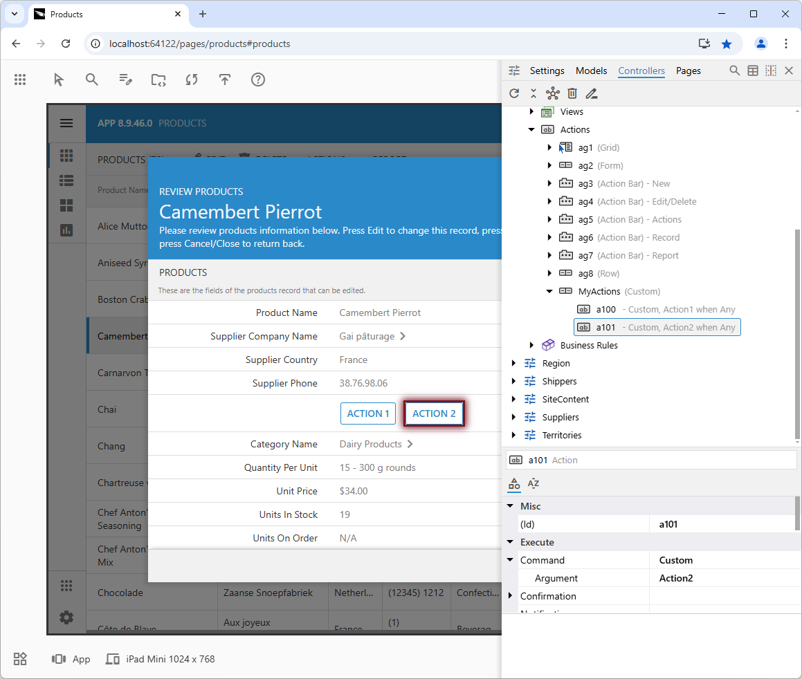
Click the "Inspect" button to start the live inspection mode. The button's icon will become an arrow with the tooltip "End Inspection". When moved within the app boundaries, the pointer icon will change into crosshairs. Clicking on the app UI will activate the App Explorer, and the corresponding hierarchy node and property will be selected whenever possible.
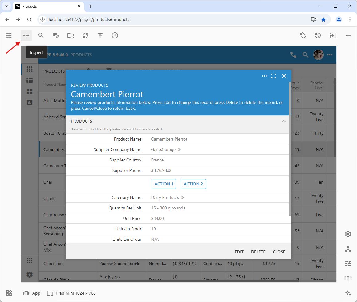
Clicking the "Inspect" button in the top studio toolbar activates the app's live inspection mode. The mouse pointer becomes a crosshair when hovering over the app's user interface elements. Clicking or tapping any element instantly displays the corresponding configuration element in the App Explorer, showing the configuration hierarchy node and its properties.
Code On Time's real-time inspection and modification features make app customization fast and enjoyable, even for beginners. Immediate results streamline your workflow, encourage experimentation, and lead to higher quality applications and faster development.
As developers navigate the configuration hierarchies in the App Explorer, the inspection continues in the background. If there is a corresponding UI element in the app for the selected node, its icon will start pulsating. The inspection frame will also move to highlight the matching region in the user interface.
As developers navigate the App Explorer hierarchies, the live app is inspected in the background. When a selected configuration node has a corresponding UI element, its icon will pulsate, and an inspection frame will appear over the matching UI element. To hide the App Explorer and get an unobstructed view of the app, perform the Ctrl+Shift+Click on the pulsating node icon, or press and hold Ctrl+Shift+Down keys.
To exit the App Explorer and return to the full application view, simply click anywhere outside the App Explorer. The application will stay in “live inspection” mode. Click on another area of the application to reactivate the App Explorer.
The live inspection mode makes locating the relevant configuration elements a breeze.
To resume your normal interaction with the application, click the "End Inspection" button located in the top studio toolbar. If you have altered the app properties or composition while navigating the configuration hierarchies in the App Explorer, the live UI will freeze. The “frozen” app will be covered with a semi-transparent screen with a diagonal zebra pattern. Click anywhere within the app boundaries to view the modified application. The App Studio will regenerate the app and reload the page to display the changes, if necessary.
Global Search
The Search button, located in the top studio toolbar next to the Inspect button, allows you to perform a global search across the entire app configuration. Click this button and enter your search term in the prompt that appears.
App Studio will quickly scan all hierarchies and display a list of nodes with highlighted matches. The full path to the node, including its hierarchy, is displayed beneath each result. Hover your mouse pointer over the node icon to view the type of app configuration element.
Select a result and press Enter to view the configuration node in the App Explorer.
While live inspection remains the most direct method for pinpointing specific elements, this search functionality offers a valuable alternative for broader or less defined queries.
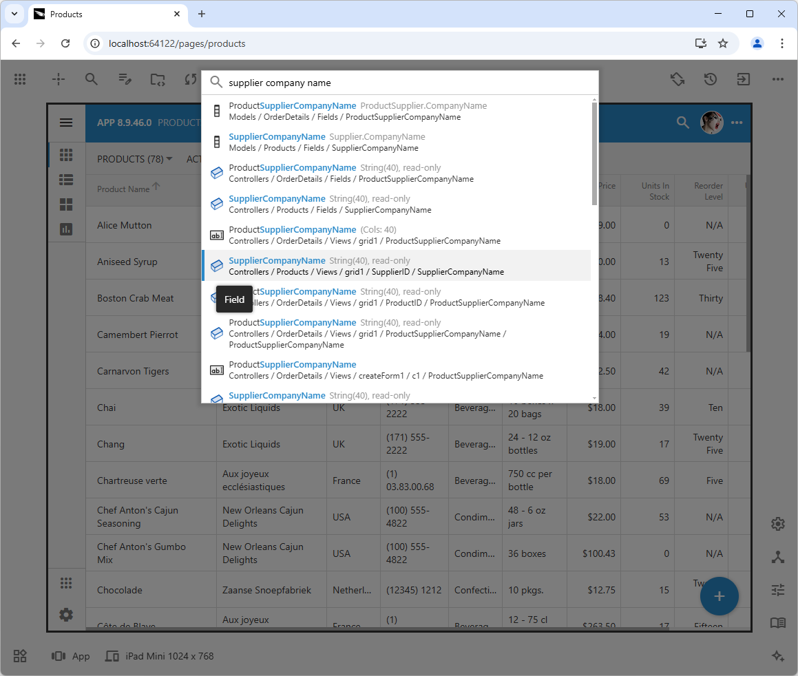
Finding application configuration elements is easy with App Studio's built-in search feature. Simply click the "Search" button located in the top toolbar of the studio, and enter your search terms into the provided prompt. The search icon within the prompt will pulsate to indicate that the search is in progress. Results will be displayed as a list of hierarchy nodes, each with its full path, including the hierarchy itself. Select any node to view it in the App Explorer.
Use the "Search" button on the right side of the Explorer’s window title to search within the active configuration section of the App Explorer. Alternatively, right-click on any node and select "Related Items" from the context menu to find relevant configuration elements.
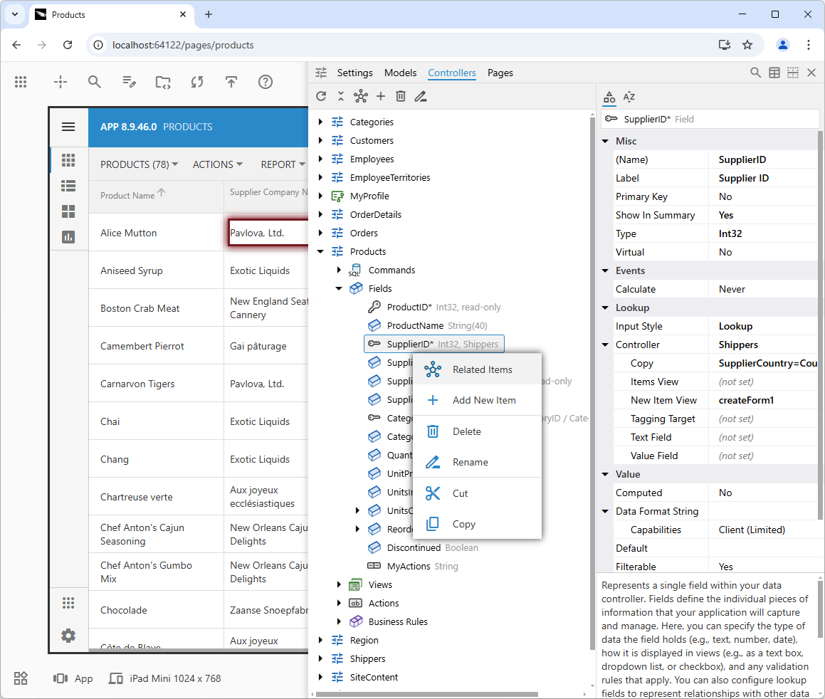
The “Related Items” action constructs the search prompt for a given node to help developers to find the other relevant configuration elements.
The "Related Items" query performs a comprehensive search for a set of specific search terms. These terms match the selected node and some of its parents, with their names enclosed in double quotes. The search results will display the relevant configuration elements. For instance, selecting "Related Items" from the context menu of a data controller field will reveal the corresponding field in the relevant model, the binding of the field within the views, and references to the field in the lookups.
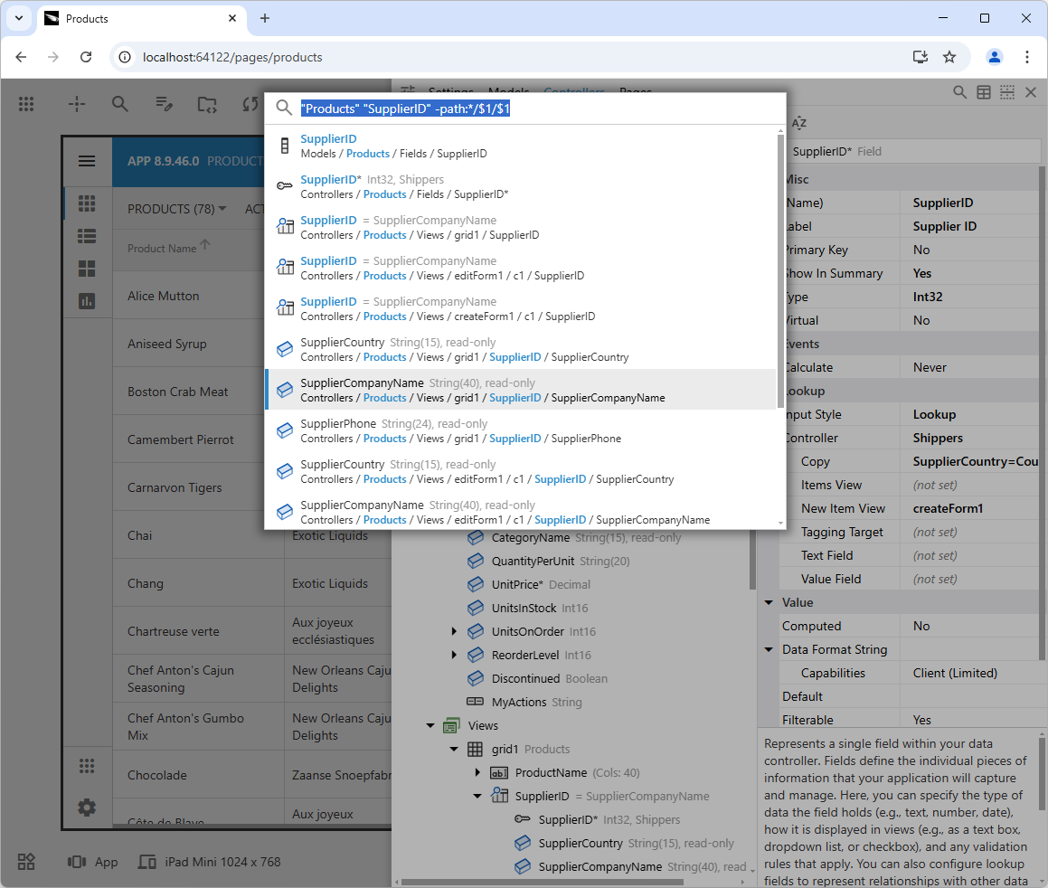
The "Related Items" context menu option allows you to quickly find associated items for many app configuration elements. The App Explorer tailors the search prompt to find the best matches, eliminating the need to search by name.
The search results also include the properties of the "Settings" hierarchy. For instance, you can search for "Light," "Theme," or "colors" to find the relevant app setting. The database connection setting can be found by entering the name of your database. Dynamic hierarchies, such as "Pages" or "Data Controllers," include their extended properties as columns in the "table" mode, and these are also included in the search results. You can locate the corresponding configuration element by entering the field label in double quotes.
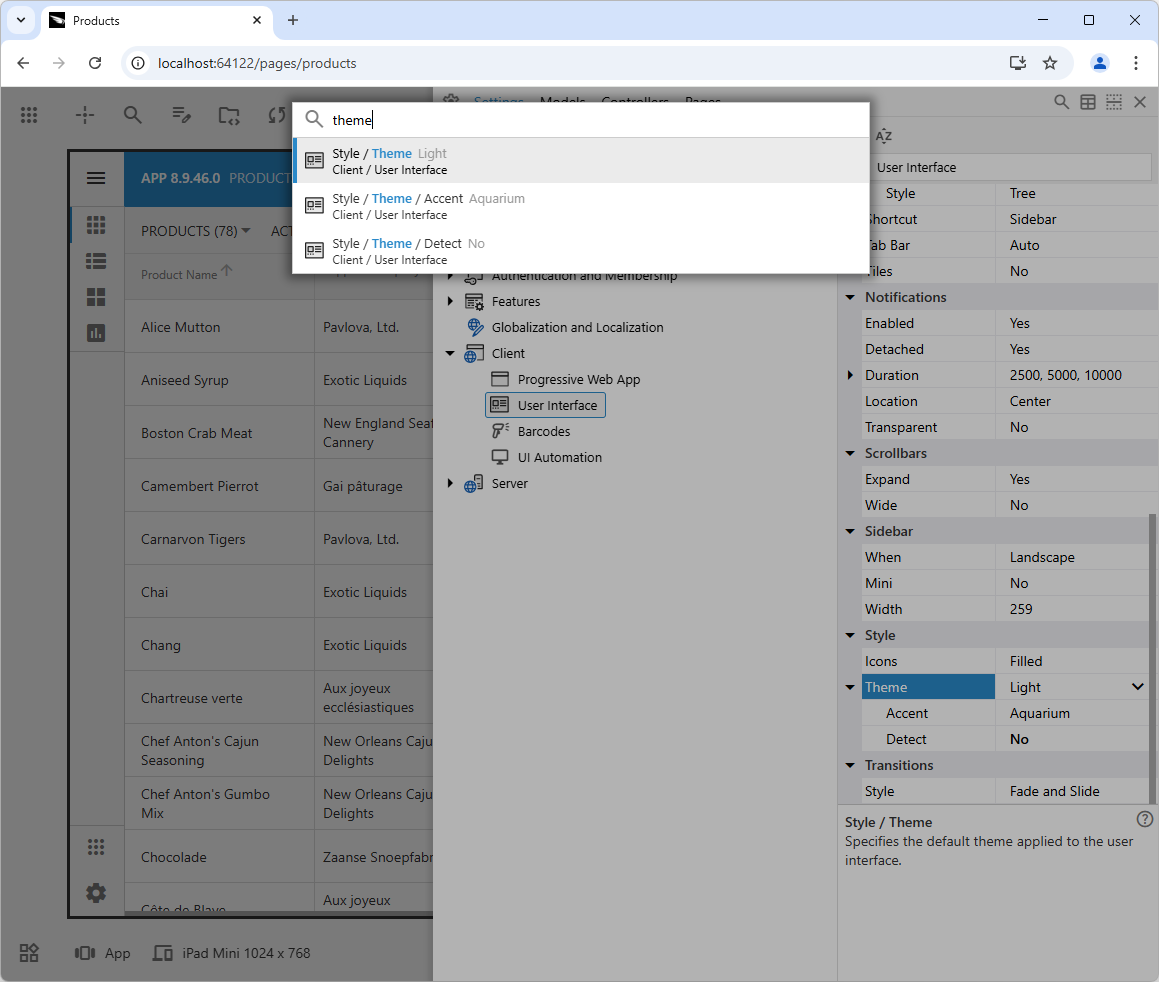
Quickly locate any app setting by entering the property name or value in the search bar to jump directly to the corresponding configuration section and make any necessary changes.
The search will be re-executed automatically the next time the prompt is activated if the user has changed the properties. Activating the search will instantly display the last search results, allowing users to view them one by one in the App Explorer. The history of previous searches will be displayed when the search terms are cleared.
Auto Complete
Business rules written in JavaScript and SQL can be used to enhance applications by responding to both custom and standard actions. Within these rules, developers can reference data controller fields as either properties or standard variables.
JavaScript
When referencing the fields of the current data item in client-side code, use their property names. By typing "this." and using the auto-complete function, you can see and select the available data controller fields. Additionally, pressing Ctrl+Space will display local variables, keywords, and standard JavaScript objects, such as "window" and "Math," that can be used in the browser.
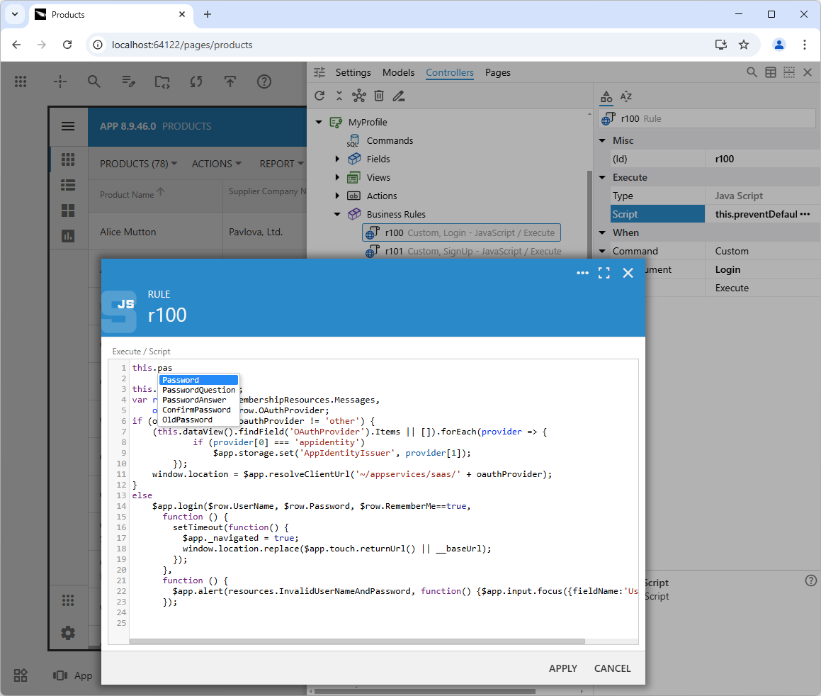
When entering JavaScript business rule code, typing "this." will automatically display a prompt to select the data controller fields. Additionally, using Ctrl+Space provides access to keywords, local variables, and browser objects, along with their respective properties.
SQL
Enter the parameter symbol of your database engine to bring up the fields of the data controller when the business logic. Press Ctrl+Space to see the available keywords. The future releases will also suggest the names of the tables and their columns available in the database associated with the data controller.
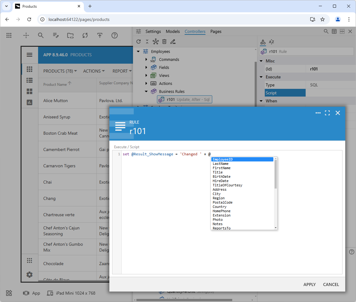
When developers are working with an app connected to a Microsoft SQL Server database and writing an SQL business rule, they can enter "@" to see a list of available data controller fields. The app framework automatically binds the parameter when the rule is executed. Additionally, pressing Ctrl+Space will prompt the names of database tables and their properties.
Upcoming Features
The features listed below are standard components currently being developed and will be included in future product releases.
Edit Mode
When Code On Time app builder is launched on a developer's computer, it utilizes Microsoft IIS Express web server to run the App Studio instance. The default web browser will then open to the App Studio homepage displaying a newsfeed.
In the upcoming release 8.9.47.0, the home page will prioritize a list of projects with the newsfeed taking a secondary role. The developer can then launch their app directly from the home page in either "live" or "edit" mode. In the "live" mode, the app will open in the current browser window with App Studio toolbars displayed. If the app is broken or "edit" mode is selected, then App Explorer will be docked on the left with a top toolbar (similar to live mode, but without the "Inspect" button) displayed. Any property editors (like business rules or Model Builder) will open in tabs in the main part of the page and will stay open..
To see their app, developers can either use the "Exit to App" button or “Run App: button to open the app in a new browser tab.
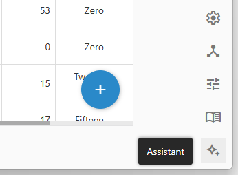
Assistant
The “magic” button in the bottom right corner of the App Studio will activate the Assistant panel.
Purpose
The Assistant panel is designed to streamline the development process in Code On Time by integrating contextual information and guidance directly into the App Studio. Its primary purpose is to enhance developer experience by consolidating relevant details, offering helpful tips, and highlighting recently modified elements. This empowers developers to efficiently understand and manage application configurations without navigating away from their current context.
Key features of the Assistant panel include a list of recently changed configuration elements with timestamps and property details, contextual information tailored to the selected element or task, and a project overview with status updates and potential warnings. Additionally, the panel will proactively identify missing configuration elements, such as database connections, and guide developers through their creation, ensuring a more robust and complete application setup.
Functionality
The change log maintains a detailed record of modifications made within the project, presenting items in a format similar to search results. Each log entry provides a snapshot of a specific change, allowing developers to trace the evolution of their work. By selecting an item from the change log, developers can directly open the corresponding configuration within the App Explorer. This feature streamlines the development process by preserving context and eliminating the need to navigate manually through the project structure. Developers can seamlessly transition between reviewing past work and actively making changes, enhancing productivity and ensuring continuity throughout the development lifecycle.
The assistant will play a key role in streamlining the Code On Time development process, especially for new users. When a developer initiates a new project, it will typically start with a single, basic content page and no established connection to a database. The assistant will be able to identify this initial state and proactively offer guidance to the developer.
Specifically, the assistant will present a task within its panel, suggesting the creation of a database connection. This task will not only provide a clear prompt but also, upon selection, directly open the relevant hierarchy configuration within the App Explorer. This will eliminate the need for the developer to manually navigate through the application to find the correct settings, saving time and reducing the potential for confusion.
Furthermore, the assistant's guidance will extend beyond the initial database connection. If a connection has already been established but the project lacks any defined data models, the assistant will recognize this and offer a new task: creating the first model. Again, this task will provide a clear action item and, upon selection, streamline the process by opening the appropriate configuration area within the App Explorer.
Overall, the assistant's ability to recognize the state of a project and offer contextually relevant suggestions will significantly enhance the developer experience. By proactively guiding developers through essential steps and automating navigation within the application, the assistant will reduce friction, accelerate development, and empower developers to create data-driven applications more efficiently.
The assistant will proactively suggest tasks and highlight recently changed elements, even when its panel is closed.
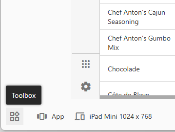
Toolbox
The “Toolbox" button, located in the bottom left corner, activates the Toolbox panel. This panel provides access to Components that facilitate both the creation and transformation of user interface elements within the live UI (displayed in the 'inspection frame') or through the App Explorer. Developers can also activate the Toolbox panel by holding the Ctrl key while performing live inspection.
These Components streamline the process of modifying the application's configuration. For example, when a form view is in focus, the Toolbox will offer Components to create elements such as a virtual field or a custom action button. If a lookup field is inspected, Components to transform the field's behavior or appearance will appear, such as a Component to change the lookup into a radio button list. Additionally, when a form view is active, components may be available to create layout elements, like placing a group of fields into a dedicated category or tab.
To use a Component, developers can either:
- Select it from the Toolbox and then, to indicate where the creation or transformation should occur, either draw or click on the target element in the live UI. This extra click or draw action is necessary when the live inspection frame is not visible. If a UI element is already selected, a single click on the Component will execute its associated action.
- Alternatively, developers can right-click on a node (or a selection of nodes) directly within the App Explorer and choose the 'Toolbox' option from the context menu. This provides the most specific context for selecting an appropriate Component. For example, if several data field nodes are selected in the App Explorer, the Toolbox will present 'Category/Panel,' 'Tab,' and 'Wizard Step' Components. Using these components will add the category to the view and configure properties like 'Tab' or 'Wizard' while also moving the selected data fields into the newly created category.
The selected Component will then create new configuration elements in the application's data controller or modify the properties of existing elements. After the Component's action is complete, the user is transitioned to the App Explorer, where they can further refine the changes and configure related properties. This approach provides a familiar visual development workflow, similar to using a component toolbox in visual IDEs, to accelerate UI customization and make Code On Time's powerful configuration options more accessible.
App View
Use the "App View" button to toggle between the App and API configurations.
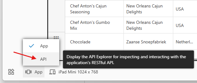
The API View in App Studio provides developers with a comprehensive environment for working with RESTful APIs of Code On Time applications. By switching to the API view, developers view the app pages as documentation with the hypermedia and physical data. They can explore and test these APIs directly within the App Studio. The view intelligently determines the relevant API context based on the current page and presents the API documentation and data in a structured format. Live inspection of the API documentation or data will bring up the relevant configuration section in the App Explorer.
Developers can navigate through the API documentation using hypermedia links, and the browser's back button allows for easy navigation of API history. The API Explorer UI can be further enhanced with features like a consistent layout, clear sections, visual hierarchy, and interactive elements. These enhancements make the API View a powerful tool for understanding and working with RESTful APIs in Code On Time applications, streamlining the development process and promoting a deeper understanding of the API's structure and capabilities.
The API View will unlock the power of the RESTful API for developers willing to use Code On Time to build the powerful backend functionality for their custom state-of-the-art user facing applications.
App Explorer Integration
The App Explorer in the App Studio 2025 consists of the hierarchy of configuration nodes presented as a tree or list and attached Properties Grid. The studio itself is just another app created with Code On Time. The explorer is driven by the metadata and uses the studio’s RESTful API to manipulate data.
Any custom application created with Code On Time includes the client-side libraries of the Tree/ListView and Properties Grid that are part of Touch UI. They also have their own RESful API. The Data Aquarium application framework provides that basis for the server-side code of custom apps. The framework will be extended to dynamically create the metadata compatible with the App Explorer directly from the app’s data controllers. This will become another option for the developers to enhance their own custom apps.
Conclusion
The December 2024 update to the App Studio introduced the all-new Properties Grid and configuration hierarchies. Code On Time release 8.9.46.0 brings enhanced app customization tools and an updated App Studio user interface. Key features include App Explorer, Live Inspection, Global Search, Background Inspection, Peek Through, and Auto Complete.
App Explorer combines a hierarchical view of the app configuration and the Properties Grid in both horizontal and vertical layouts. Live Inspection allows developers to point and click on the UI of the live application and jump to the corresponding configuration element in the App Explorer. The Global Search allows developers to query all configuration hierarchies.
Background Inspection monitors the live app user interface as developers navigate the configuration hierarchies. Peek Through allows developers to get an unobstructed view of the live app with the focus frame on the matching UI element. Auto Complete provides code editors with auto-complete for data controller fields in SQL and JavaScript business rules. These features and the UI are finalized for future releases and will enhance the user experience for both new and expert developers.