Data lists are composed of items that are rendered as cards. Developers specify the contents of a card by configuring the data field tags of a controller grid view.

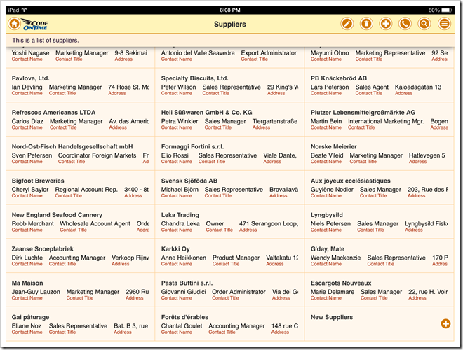
Apps with Touch UI can be displayed on desktop and mobile devices with various screen sizes. For example, the card sample shown above was taken from this screenshot of a supplier list on iPad Air.

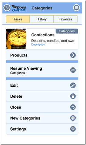
Here is another sample that shows a card of a product category in Task Assistant displayed on iPhone.

Developers can test and fine-tune the responsiveness of a data card presentation while browsing an app in a desktop browser.
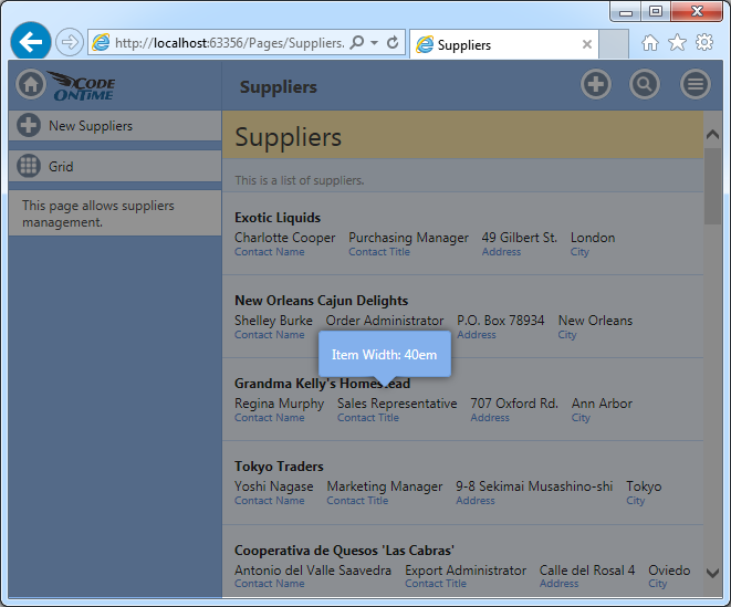
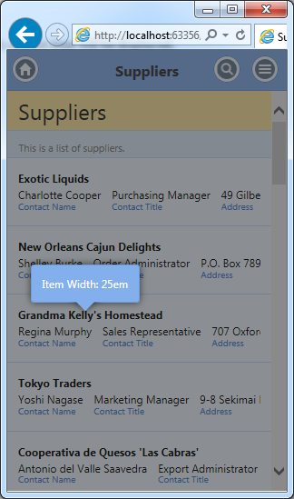
Resize the browser window as needed, press Ctrl+Shift keys on the keyboard and double click any item card in a list. A hint with the logical width of a list item will be displayed.


Take a note of the fields that do not fully fit on screen and apply tag item-descNN, where NN is replaced with the item width that works with your data and labels. The field and its label will be visible only if the width of a list is equal or greater than the numerical suffix.