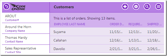
Page headers are displayed at the top of every page to inform the user of which view or control they are currently working with. The picture below displays the page header of “Orders”, visible below the page title.
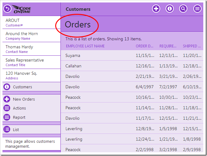
In pages that display data views, the header is hidden on two conditions:
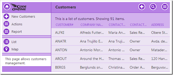
1. When the current view is the entry point to the page.
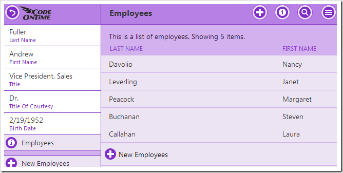
2. When the text of the page header matches the title of the page displayed on the menu bar at the top of the screen. For example, the child view of Employees on the Employees page in a sample Northwind app will not have a page header.
Hiding the Page Header
The header can also be hidden on a per-page basis.
Start the Project Designer. In the Project Explorer window, double-click on the Customers page.
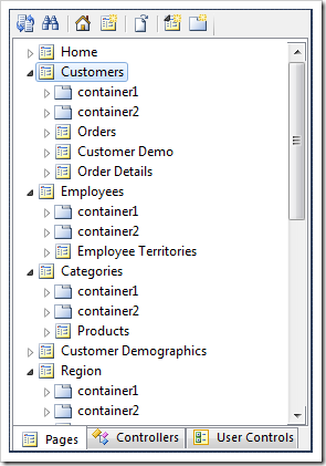
Specify the following:
| Property | Value |
| Custom Style | Tall |
Save the page, and press Browse on the toolbar to generate the app and open the page in your default browser. Select a customer, and tap See All next to the list of orders. Note that the “Orders” page header is not displayed.
Page Headers in Custom User Controls
The page header text for user controls is derived from the data-activator tag. By default, this tag is set to the name of the user control.

The header text can be specified using the data-page-header tag. For example, let’s specify the page header text for a freshly created user control. Open the user control file in Visual Studio and make the following highlighted addition:
...
<!--
    This section provides a sample markup for Touch UI user interface.
-->
<div id="TestUserControl" data-app-role="page" data-activator="Button|TestUserControl" data-page-header="Custom Header">
    <div data-role="content">
        <p>
            Markup of <i>TestUserControl</i> custom user control for Touch UI.
        </p>
    </div>
</div>
...
Save the file and refresh the web page. Note that the page header text has been changed.

The page header can be hidden by specifying “false” for the data-page-header tag. Make the following change:
...
<!--
    This section provides a sample markup for Touch UI user interface.
-->
<div id="TestUserControl" data-app-role="page" data-activator="Button|TestUserControl" data-page-header="false">
    <div data-role="content">
        <p>
            Markup of <i>TestUserControl</i> custom user control for Touch UI.
        </p>
    </div>
</div>
...
Save the file and refresh. The page header will not be present.
