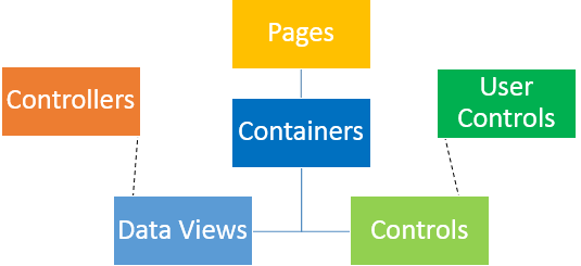
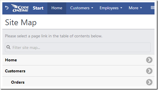
Every app created with Code On Time generator has various pages organized into a hierarchy. Each page may contain multiple containers that are used to organize content.
Placed into these containers are data views and user controls. Data views are used to bind controllers to pages and allow the user to view and interact with the data. Data views may interact with each other in order to display master-detail relationships. Controls represent bindings of user controls, which contain custom HTML and code that can expand the functionality of the application. Pages can also be configured to link to other websites.
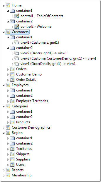
The picture below shows the default organization when a sample Northwind app is created.
When an application is first created, pages are automatically composed for each table included in the project, and a page hierarchy will be determined by any foreign key relationships between these tables. Master and child views will be placed and configured on the pages.
A Home page is created for every application and contains two controls – the table of contents, and a default Welcome message. Any views will be placed under the “Reports” menu option. If ASP.NET Membership is enabled, a Membership page will be added at the end to allow any users with role “Administrators” to manage the users and roles of the app.
Pages can be rearranged easily using drag & drop techniques in the Project Explorer.
The behavior of page elements differs between Desktop and Touch UI.
Inter Page Navigation
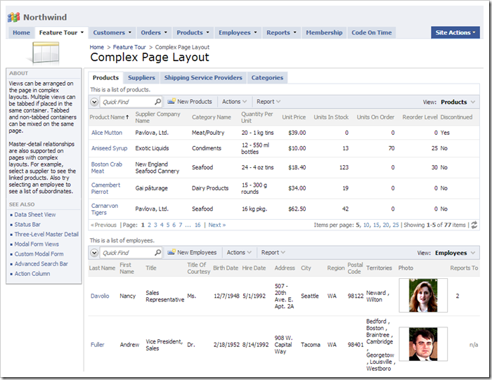
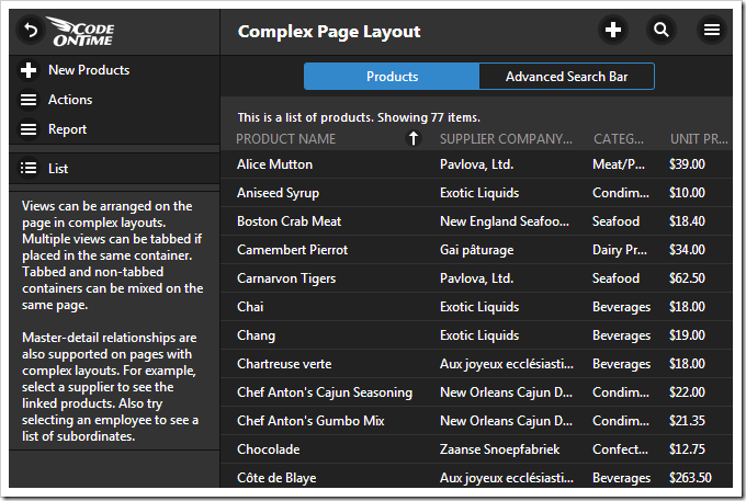
Pages rendered with Desktop user interface will display all controls and data views at the same time. Data views can be grouped inside tabs, triggered by Tasks items on the side bar, and can be conditionally hidden. The Complex Page Layout demo shows multiple data views organized into different tabs and containers. Users can navigate through pages of records using the pager on each data view.
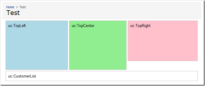
Controls will also be rendered in their own areas on the page.
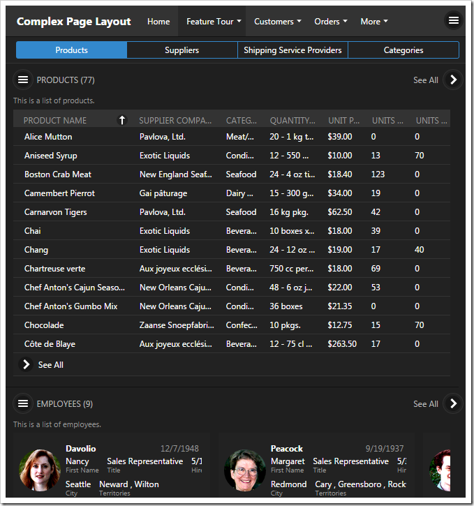
The same page in Touch UI will show the same layout of data views.
Note that each data view shows a small subset of records. The user must click on See All in order to see the entire set of data in full screen. The views on the main page “echo” the contents of the full screen data view.
The full screen presentation offers infinite scrolling and easy access to actions on the menu bar and side bar. If there is only one master data view on the page, this presentation will be activated by default.
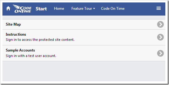
Navigating to a page with a single control will display the contents of the control in full screen. When a page with several controls is rendered, a list of available controls will be displayed.
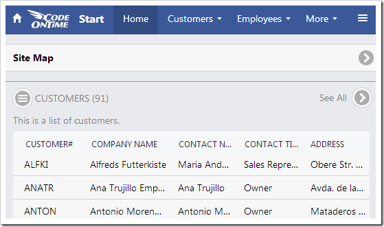
Combining controls and data views on the same page will render the control as a button and display the “echo” data views.
Clicking on a list item will open the user control or data view in full screen.
The user may return to the main screen by tapping on the Back arrow in the top left corner of the screen.
