Touch UI / Charts
Maximize Charts
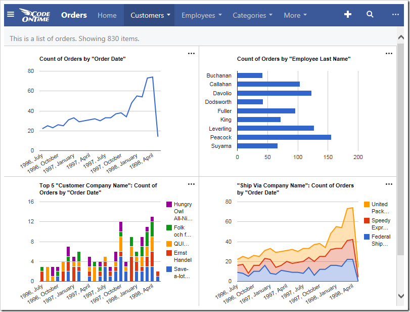
Several sample charts are displayed below. Note that the axis values, legend, title, and any labels are placed outside of the chart. The chart itself floats in the center of the cell in the view.
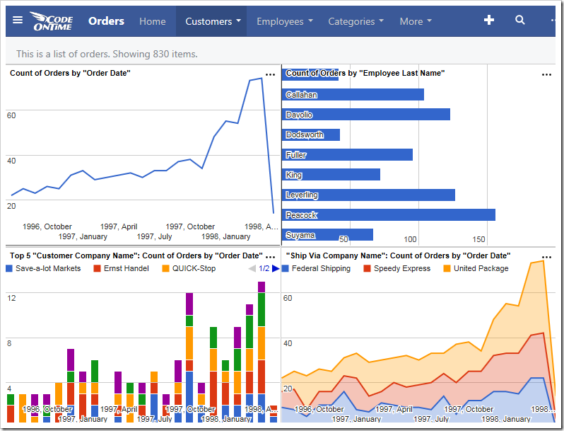
It is possible to expand each chart so that they fill the entire available area. All elements of the chart will be place inside the axes in order to full utilize all available screen size. The legend will be placed at the top of the graph, axis labels are placed inside the axes, and the title is also located inside the graph area.
In order to specify a chart to use this expanded mode, add the keyword “maximize” for every pivot defined in the view.
| Data Field | Tag |
| CustomerID | pivot3-col1-top5-sortdescbyvalue pivot3-maximize |
| EmployeeID | pivot2-row1-bar pivot2-maximize |
| OrderDate | pivot1-row1-date-line pivot3-row1-date-all-columnstacked pivot4-row1-date pivot1-maximize |
| ShipVia | pivot4-col1-areastacked pivot4-maximize |
The charts will now maximize the available space.

