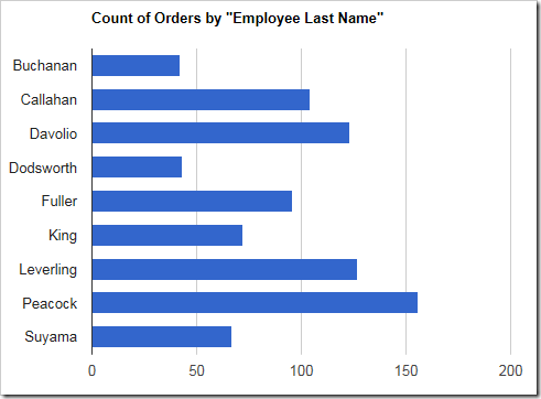
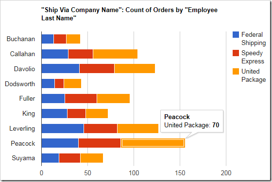
The “bar” chart type renders horizontal bars for each row of data. One use case would be to quickly compare records grouped by lookup values. For example, it can be used to show the number of orders made with each employee on the Orders page of the Northwind sample app. The chart reveals that “Peacock” is the most active employee.
To use “bar” chart type, add the keyword “bar” to any “pivot-” tag, and make sure that it is separated with hyphens (-).
| Data Field | Tag |
| EmployeeID | pivot1-row1-bar |
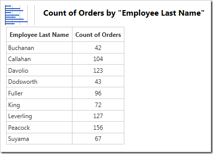
Here is the data for the above graph:
Hovering over or clicking on a single bar will reveal the data behind that bar.
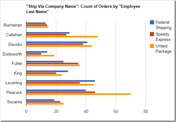
When multiple values are specified for each row, a bar will be rendered for each value in a different color.
| Data Field | Tag |
| EmployeeID | pivot1-row1-bar |
| ShipVia | pivot1-col1 |
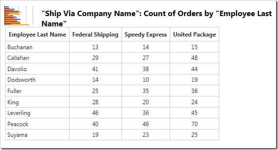
Multiple columns of data can be seen in the table below.
Each row can also be displayed as a single bar, with values stacked on that bar, by using the “barstacked” chart type.
| Data Field | Tag |
| EmployeeID | pivot1-row1-barstacked |
| ShipVia | pivot1-col1 |
