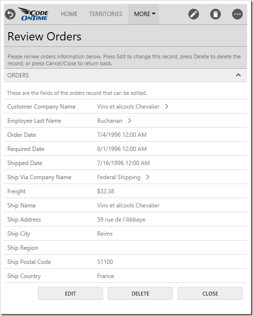
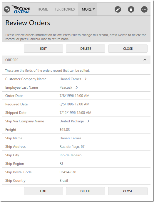
Every form in web applications created with Code On Time display a row of buttons. The typical actions available in the “Form” scope include Edit, Delete, Close/Cancel, Save, and Save and New. In addition, actions that trigger custom calculations are often put in the “Form” scope. The default presentation mode for form actions is called “Auto”.
Auto
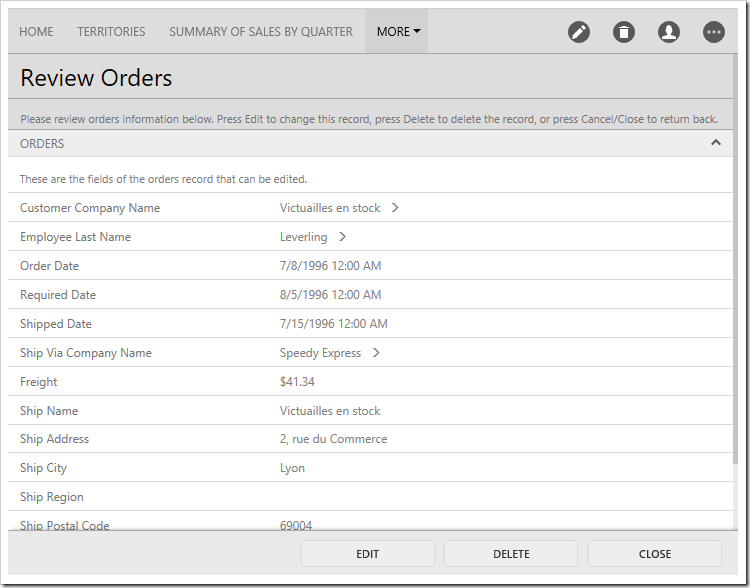
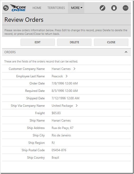
The “Auto” mode will present form buttons in the best location depending on the size of the screen. On medium size screens, the buttons will be aligned to the right side of a fixed bar at the bottom of the screen. This ensures that the buttons are in the same position every time a user opens the form, resulting in a smaller learning curve to the application.
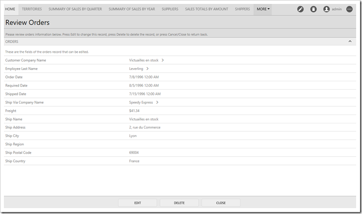
Larger screens will result in the form buttons shifting to the center of the button bar, closer to the field values.
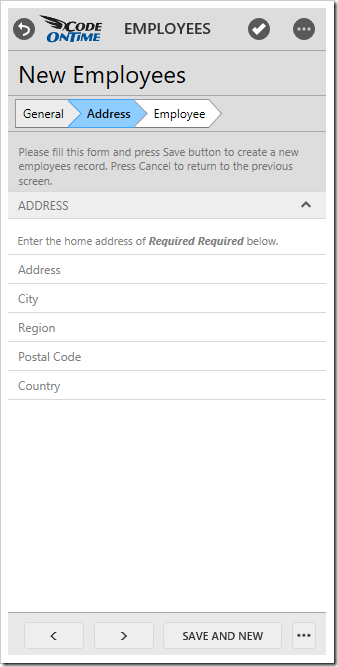
If the screen is too small to display all form buttons, they will be automatically collapsed into a three-dot menu.
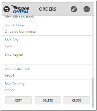
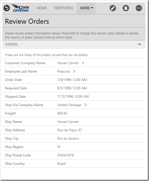
If the screen is both narrow and short, the form buttons will be rendered at the bottom of the form. This will ensure that devices with small screens can maximize the amount of space used for display of field values.
None
It may be desirable to hide the form actions bar from the screen. Let’s remove the form buttons from the Orders screen of the sample Northwind project.
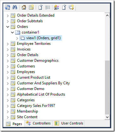
Start the Project Designer. In the Project Explorer, double-click on “Orders / container1 / view1 (Orders, grid1)” node.
Make the following change:
| Property | Value |
| Show Action Buttons | None |
Press OK to save, and press Browse on the toolbar to regenerate the app.
When the app comes up in the default browser, click on a record on Orders page to view the form. Notice that the form action buttons are no longer visible. The actions are still accessible in the top right corner of the screen.
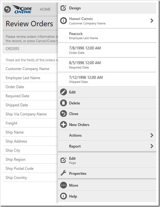
The user can also access all actions by clicking on the three-dot menu in the top right corner to access the action panel.
Top
When Show Action Buttons is set to “Top”, the action buttons will be rendered above the form.
Bottom
When Show Action Buttons is set to “Bottom”, the buttons will be rendered below the form.
Top And Bottom
When Show Action Buttons is set to “Top and Bottom”, the buttons will be rendered both above and below the form. This can be helpful when the form is very long.
