The new exciting feature of Touch UI is the ability to express the width of the responsive grid columns in pixels. The new tag column-width-(tn|xxs|xs|sm|md\lg\xl|xxl)_NNN makes it possible to provide the multiple values for the grid column width that will be applied conditionally in the visual containers of the specific size. We have developed this new mechanism for grid column sizing while working on the Live Designer for applications built with Code On Time.
The Sizing Problem
HTML tables are commonly used to present data in the grid format. The browsers will automatically evaluate the text in the table cells and set the width of each table column for the best fit. This works great for the standalone tables with the known number of rows.
If your grids are designed for infinite scrolling or consistent paging of a large number of rows, then a different mechanism must be put in place. Only the small subset of rows is rendered initially and therefore it is not possible to figure the best column width based on the text in the cells of the leading rows. Touch UI framework takes advantage of the Columns property of the data fields in the Grid views. Column values of the fields in the data controller views are derived from the size of the database table columns. The framework figures the total width of the columns by iterating through the visible data fields in the view. This allows us to determine the relative width of each individual column in the grid. Next the framework calculates the width of the grid column in pixels by multiplying the physical width of the visual container by the relative width of the column. The framework also applies constraints to ensure that the columns are never too narrow and remain usable.
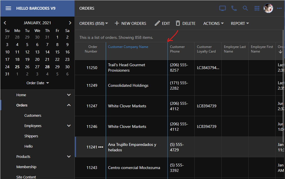
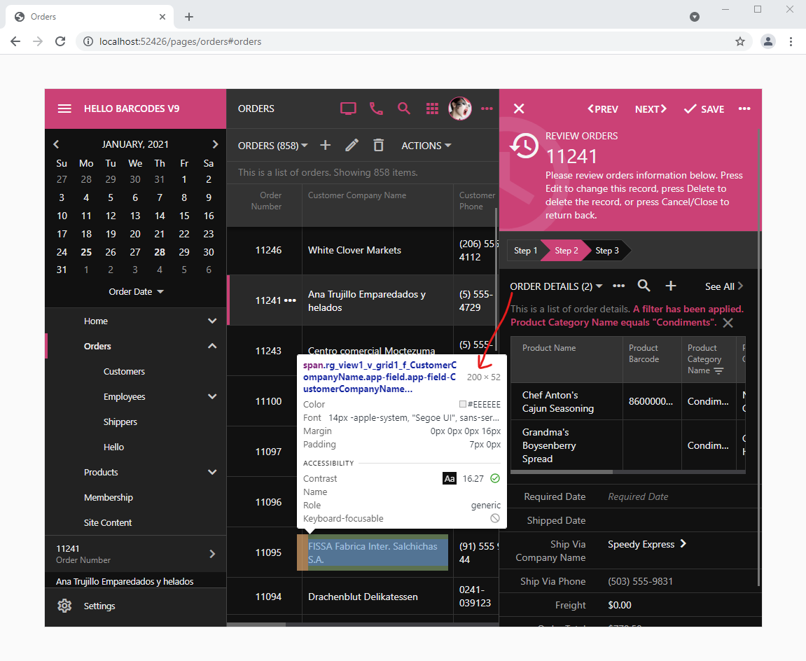
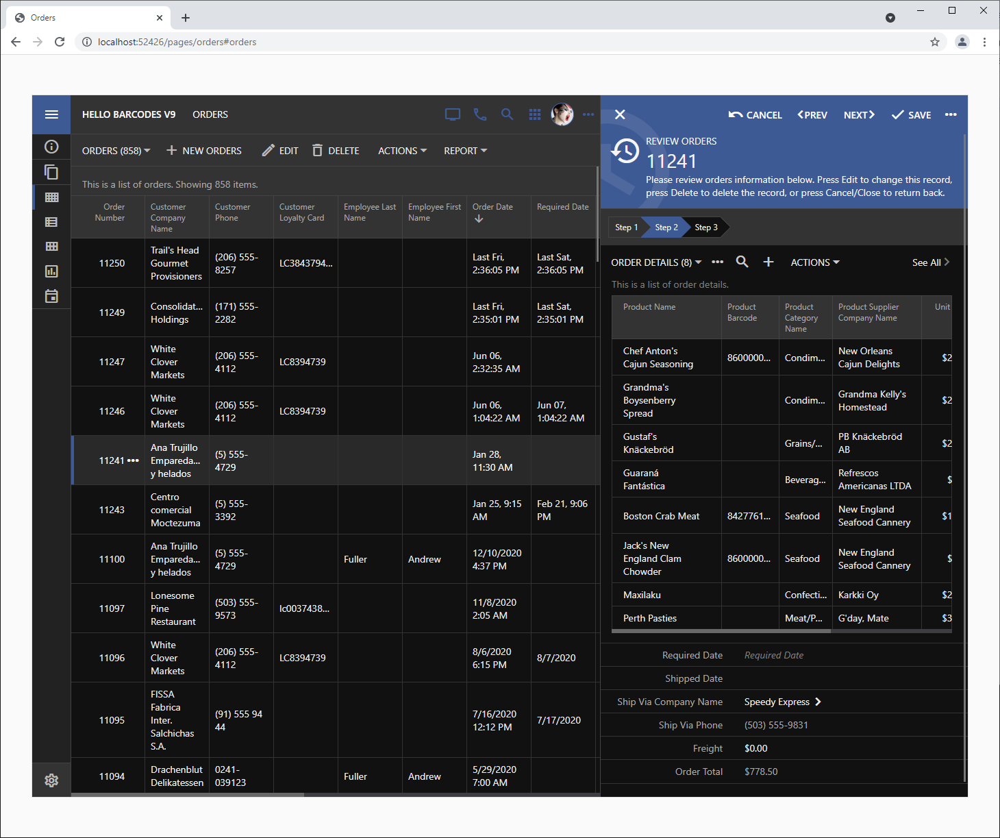
The screenshot demonstrates the grid of orders and the selected order in the reading pane wizard form. The latter shows the grid of the order details.
The framework has calculated the width of individual columns to provide the best fit for the data. Scrolling, filtering, and sorting will not change the column width in both grids to ensure a consistent presentation.
Developers can increase the value of the Columns property of individual data fields to provide them with the larger possible real estate. Unfortunately it makes it difficult to achieve the desired width without much trial and error.
The Sizing Solution
The app in the screenshot above is running in the live preview mode and matches the size of the iPad Pro. The framework has assigned the logical width md (medium) to the master list and xs (extra small) to the reading pane.
The individual logical width abbreviations supported in Touch UI are matched with the physical width of the visual containers as follows:
| tn | 0 - 319 |
| xxs | 320 - 479 |
| xs | 480 - 575 |
| sm | 576 - 767 |
| md | 768 - 991 |
| lg | 992-1199 |
| xl | 1200-1365 |
| xxl | 1366 - . . . |
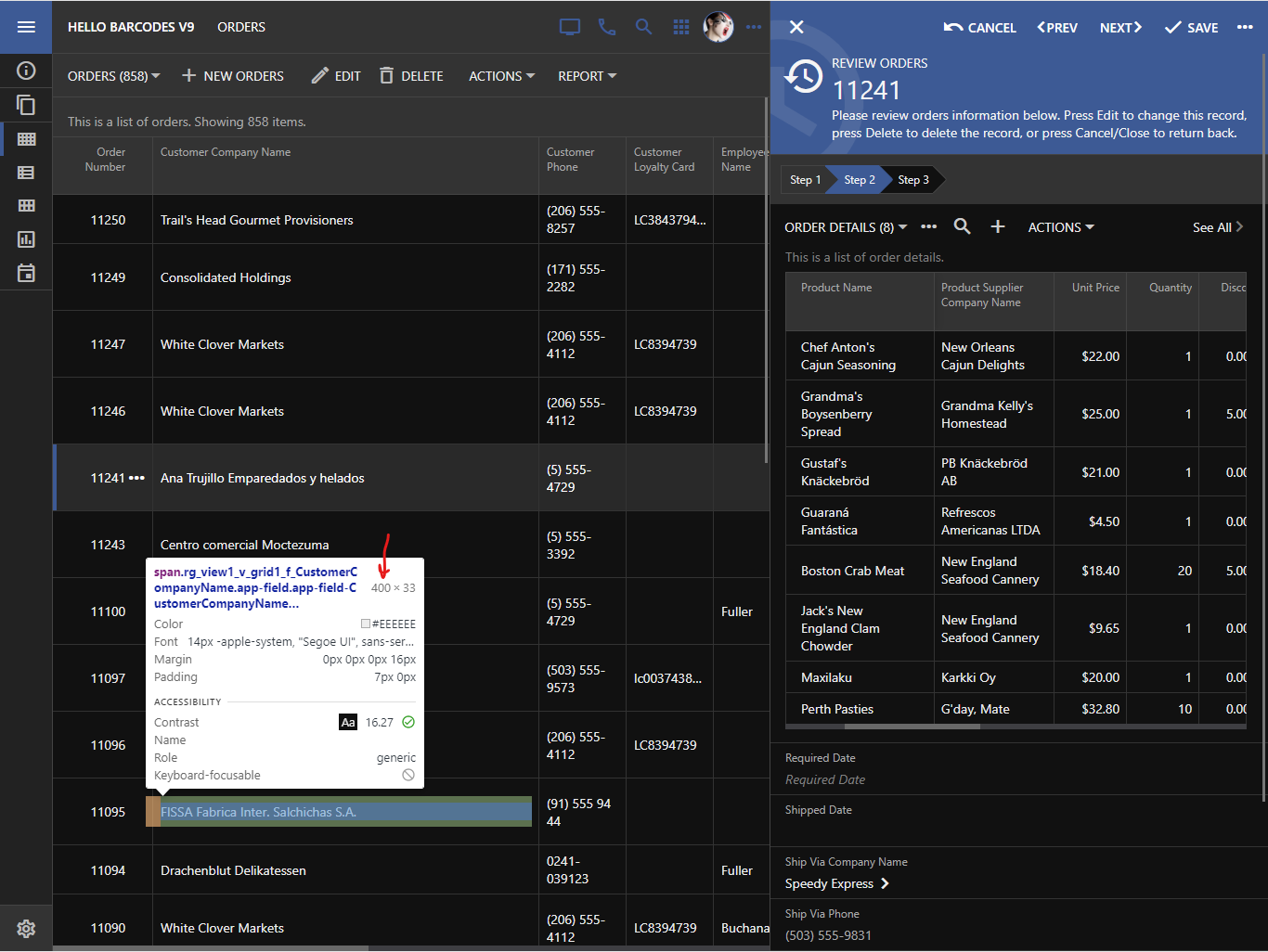
The second column in the master grid of Orders is Customer Company Name. It represents the alias of the CustomerID. Add explicitly the “alias” data field to grid1 and tag it as
column-width-tn-200 column-width-md-400
This will instruct the framework to set the column width to be 200 pixels if the visual container of the grid is at least tn (tiny). The “tiny” range starts from 0 and therefore the first tag will set the width of Customer Company Name to be always equal to 200 pixels. The second tag instructs the framework to set the width of the grid column to 400 pixels in the visual containers that are at least 768 pixels wide.
This is the effect of the tags on the presentation. The customer name is now 400 pixels wide since the visual container size is md.
Tap the hamburger menu in the top left corner to expand the sidebar. The visual container of the master grid will reduce to sm (small) size. This will also reduce the width of the Customer Company Name to 200 pixels.

Visual Designer and Grids