Let’s explore a few customization ideas for the home page and toolbar of your app.
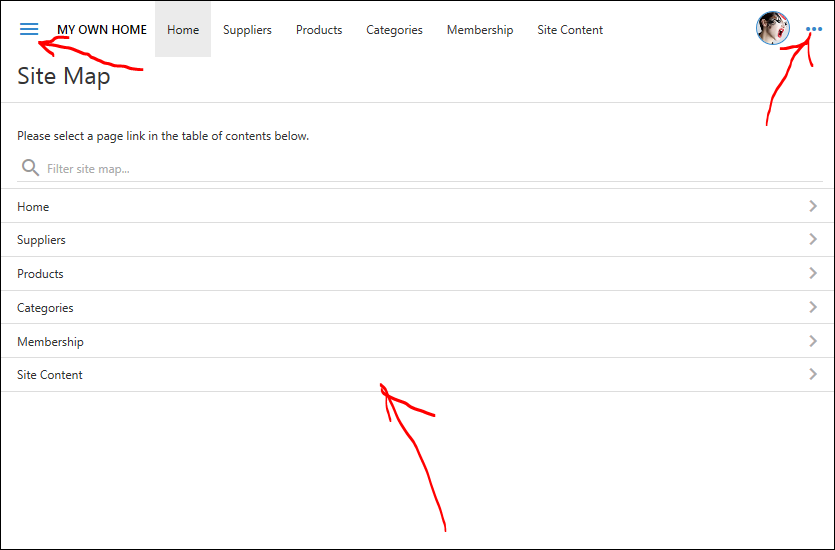
The default home page displays a table of contents. The toolbar has “hamburger” button (“bars” icon) of the left side and content menu button (“more” icon) on the right sidebar. The illustration is presented in Light theme with Modern accent.
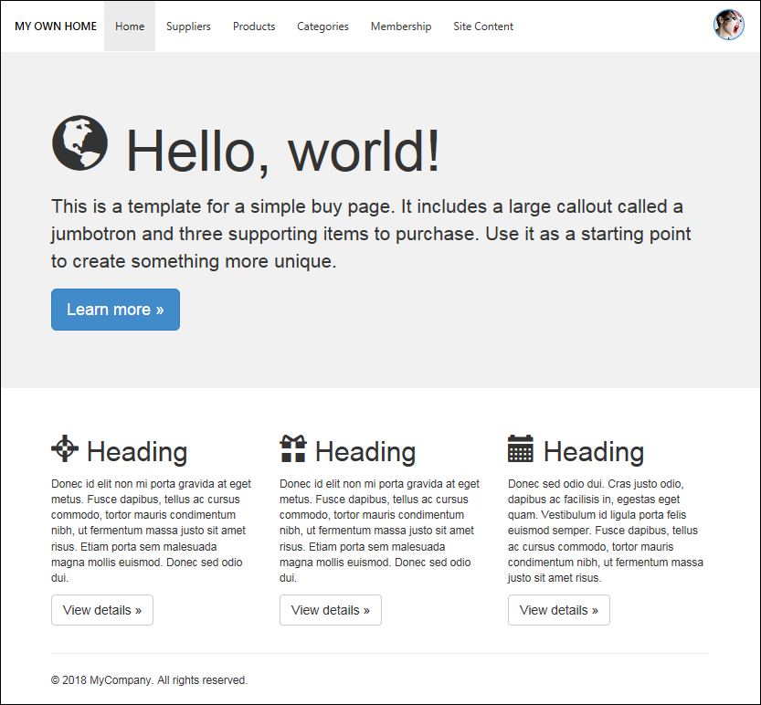
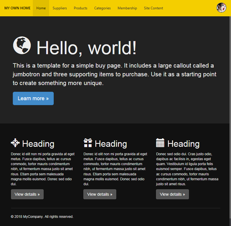
A customized home of an app based on Touch UI may display marketing and informative content to the end users instead of a default table of contents. Let’s remove the table of contents from the home page and replace it with a marketing message for the end users of the app.
Have you noticed that the new design does not have the Menu and More buttons on the toolbar?
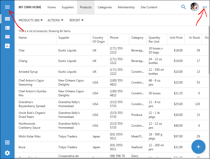
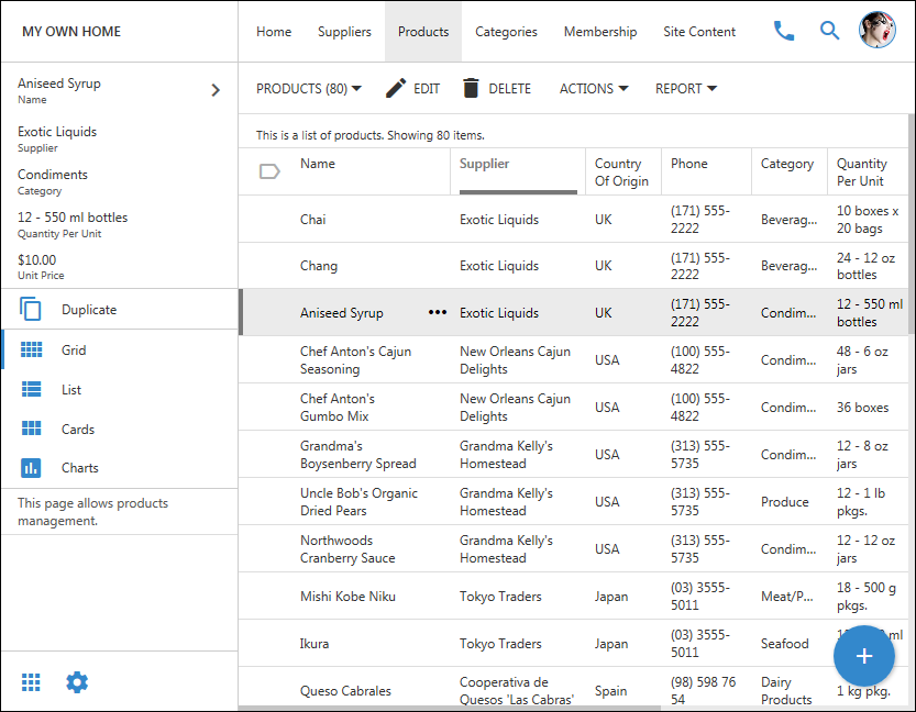
By default the data pages of the app do display both buttons just like the default home page with the table contents.
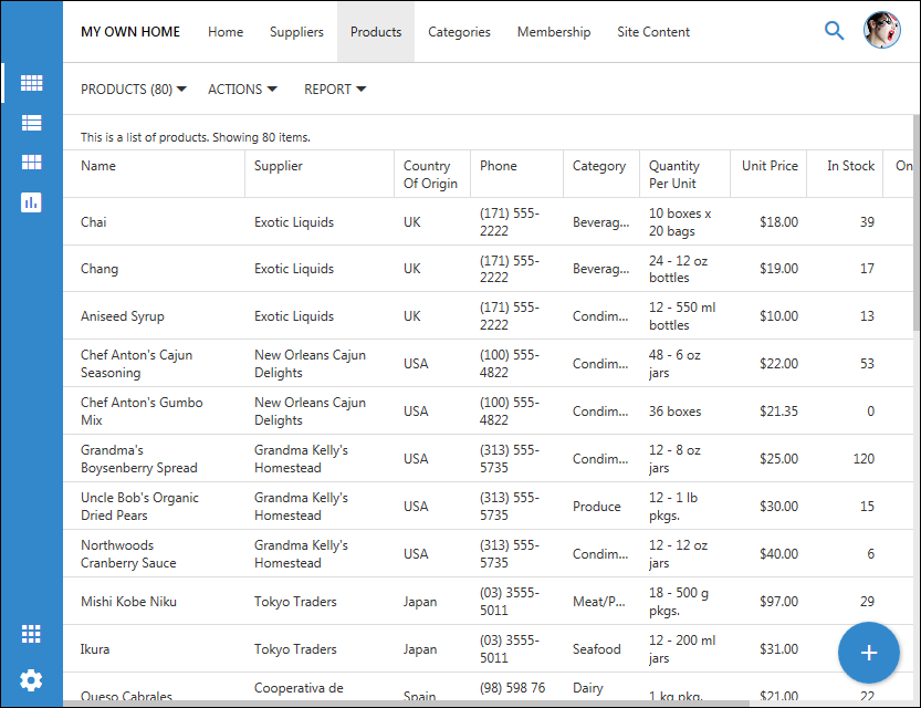
Let’s hide the Menu and More buttons on the toolbar on the data pages as well.
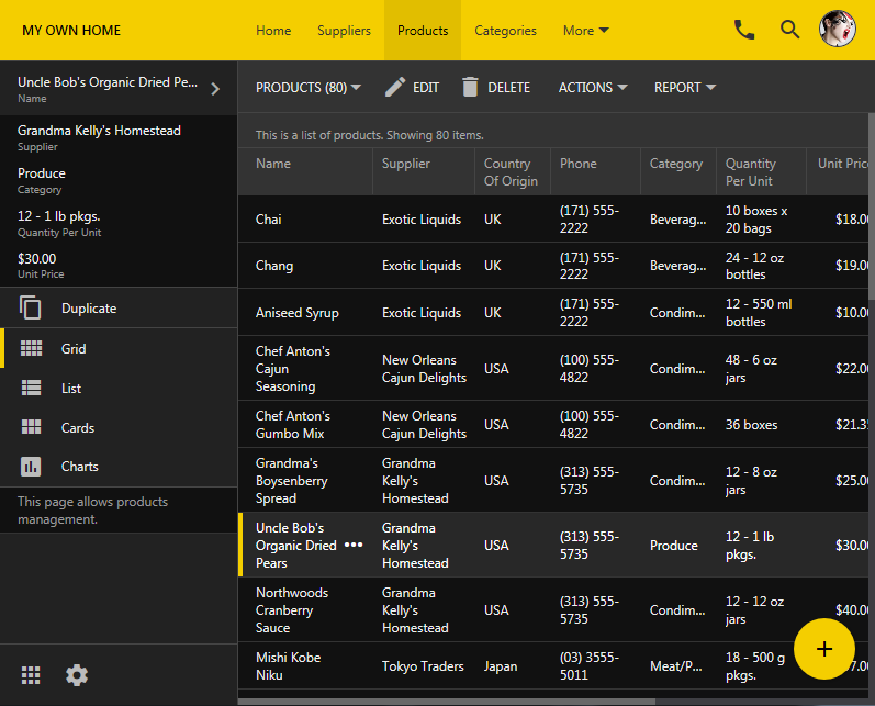
This is how the data pages will look when the left sidebar is expanded.
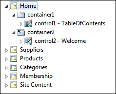
Select the project name on the start page of the app generator and locate “Home” page in the Project Explorer on the right hand side of the Project Designer.
Right-click and delete both containers on the page. This will remove the table of contents displayed to the authenticated users and the welcome message displayed to anonymous users.
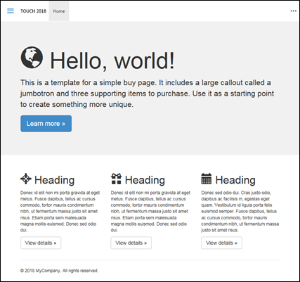
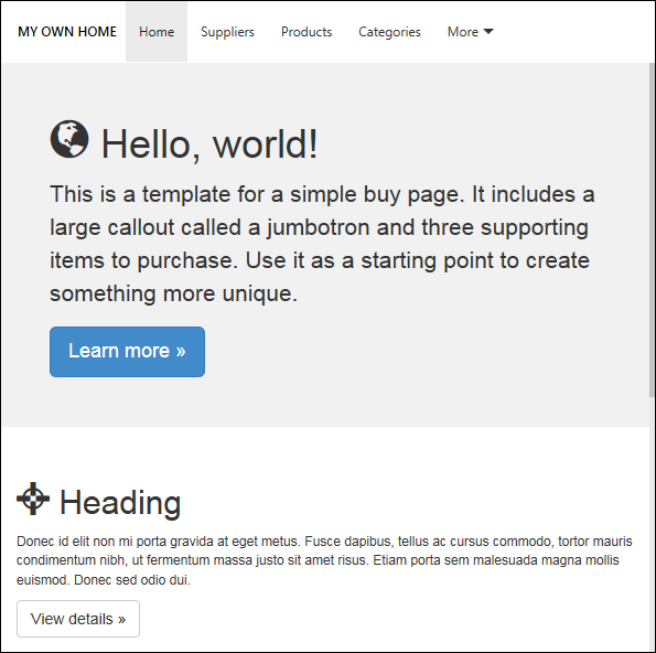
Double-click the home page, select Jumbotron as the Template, save changes, and generate the app. Inspect the home page. It will look similar to the one in the picture. Try other templates to find the best fit for your app.
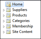
Lock the page from being overwritten during the code generation before making any changes to the content of the template. Double-click the home page in the Project Explorer and specify First Time Only in the Generate property. Save the changes. The home page icon will display with the “lock” indicating that any changes to the app will be preserved if the page exists already.
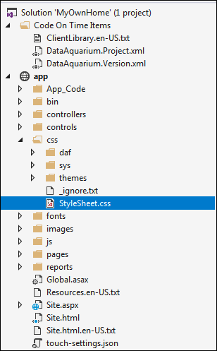
Click Develop on the toolbar of the Project Designer and add a new stylesheet with the name of choosing under ~/app/css/ folder.
Enter the following CSS rules in the file app/css/StyleSheet.css.
/* 1. Hide "hamburger" button when the toolbar does not have the "Back' button  */

.app-bar-toolbar:not(.app-has-back) #app-btn-menu {
    visibility: hidden;
}

/* 2. Hide the context button with "more" icon*/

.app-bar-toolbar #app-btn-context {
    visibility: hidden;
}

/* 3. Align the logo area of the page with the content when there is no sidebar on the left side */

body:not(.app-has-sidebar-left) .app-bar-toolbar .app-logo {
    left: 16px;
}

/* 4. Shift the logo text more to the left in the expanded sidebar */

body.app-has-sidebar-left:not(.app-has-minisidebar-left) .app-bar-toolbar .app-logo {
    left: 20px;
}

/* 5. Move the "icon" buttons of the toolbar to the right */

.app-bar-toolbar .app-btn-cluster-right .app-btn {
    margin-right: -28px;
}
The comments provided next to the CSS rules explain their effect on the User Interface of the app.
Rules (1) and (2) are hiding Menu and More buttons on the toolbar. Rule (3) shifts the text in the Logo area to the left when the sidebar is not visible.
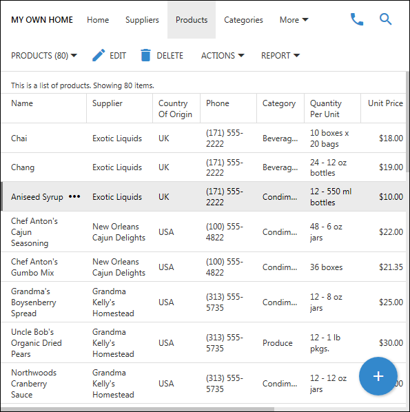
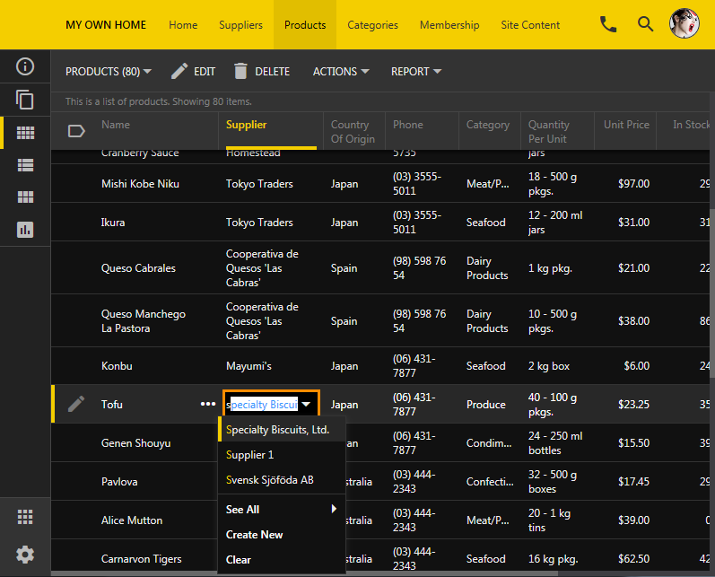
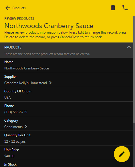
The same rules also apply to data pages. A data page of an app based on Touch UI with customized toolbar on a narrow screen is shown next.
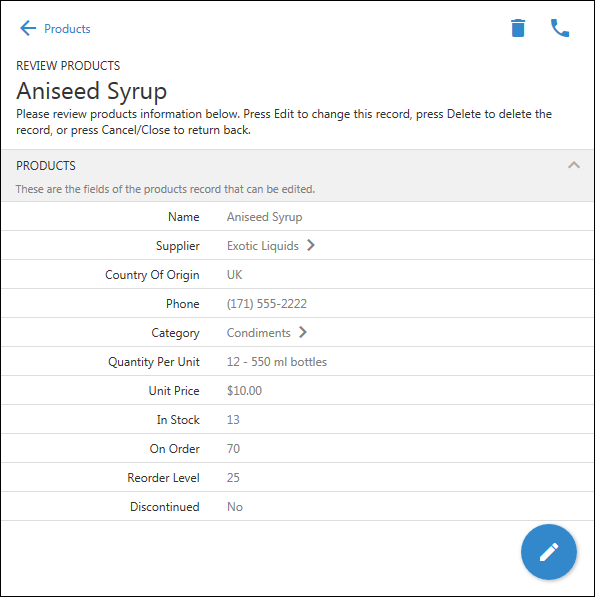
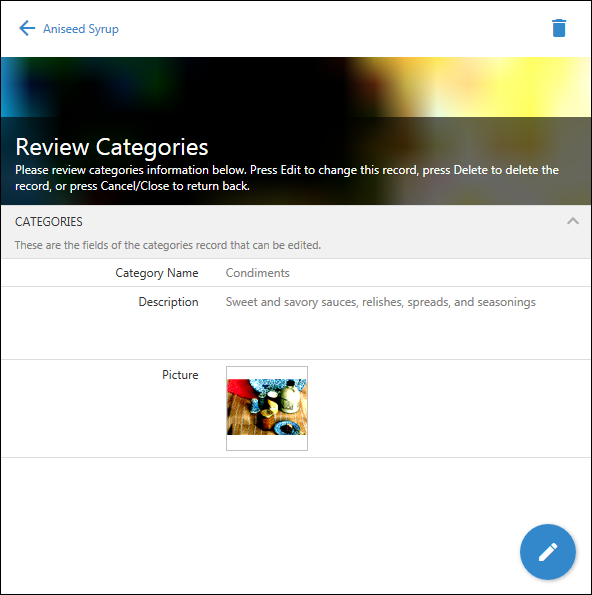
If the screen of the device is narrow then modal pages will be automatically replaced with fullscreen pages. In that case rule (1) does not apply and the Back is visible next to the name of the previous view.
In this screenshot the user continues to drill into data and views the Category information of a product. Button Back remains visible and button More is not displayed. Rule (4) shifts context actions to the right of the toolbar.
Here is how the same changes will look in Dark theme with Construction accent.
This is the home page without Menu and More buttons on the toolbar.
This is the data page with the expanded sidebar.
This is the data page with the collapsed sidebar in inline editing mode.
This is the same app on a small device without More button in the toolbar. A fullscreen page of an app created with Code On Time application generator presented on a narrow screen.
Touch UI is entirely CSS-driven and allows customization of various aspects of user interface.
