It’s been four months since the last software update. It does feel like an eternity, doesn’t it!
Originally we intended to release an incremental set of changes in March of 2016. A major rewrite of Touch UI form layout engine was also under way at that time. One thing led to another and the team has decided to postpone the release by a couple of weeks to complete the new layout engine. Two weeks have stretched into a month and we have announced that the release will go out in the middle of May, which was too optimistic. Finally the development of the new code has been completed. We are validating the new capabilities and fine tuning the software.
Code On Time release 8.5.8.0 will become available on June 8, 2016.
The release incorporates our experience gained from the development of a few real-world projects. In the coming days we will post a collection of the highlights describing the product changes. Keep reading to see what’s new!
Layout Engine and Universal Input
The new layout engine has been introduced to enable custom form development with precise positioning of user interface elements in responsive fashion. We have developed a layering technique of HTML content that makes possible complex layouts without sacrificing performance.
The major runtime component of the layout engine is called Universal Input. New version of Touch UI does not allocate multiple input controls when the form is rendered in the browser. An on-demand input control is created instead when a user interacts with the page content in edit mode. The input control takes the space allocated in the form layout for the data item. This makes possible positioning the fields with high precision. It is also creating an illusion of live inline editing of page content. Universal Input introduces keyboard-driven navigation for rapid data entry not found anywhere else.
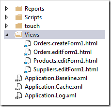
Custom form development now becomes very similar to report development. You are developing a blueprint for data presentation and the data is “magically” editable as needed. Custom form layouts are stored in the ~/Views folder of the project.
The follow up release 8.6.0.0 will introduce the Form Designer, the feature borrowed from the upcoming http://cloudontime.com.
If a custom form layout is not available then an automatic layout is created at runtime. The automatic layouts are similar to the most recent releases of Touch UI.
New Lookup Style
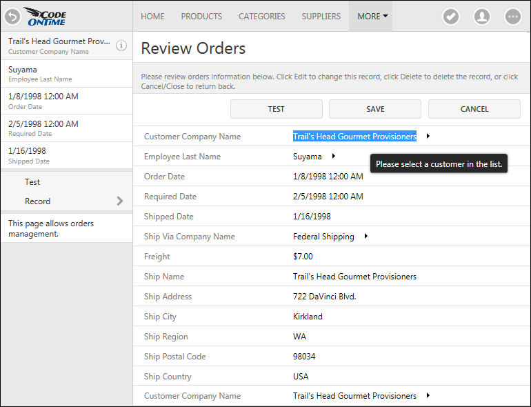
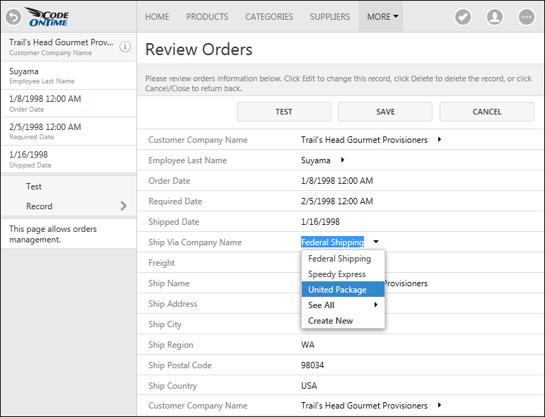
The screenshot shows an example of an Order record in edit mode. Notice that the text value of the customer company name is selected automatically. A tooltip is displayed when user hovers over the input field. The same field is also displayed at the bottom of this layout. It is now possible to place a data field on custom form any number of times with optional read-only flag when needed.
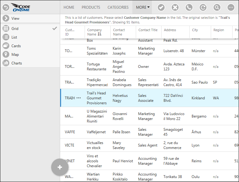
The lookup data fields based on foreign keys are indicated by drop arrows pointing to the right. A user can tap on the arrow to make a selection or use keyboard Right key to activate the row selection from the full screen view of customers. The lookup data view is also activated if user presses Ctrl+Enter.
Up and Down keys will change the selection in the Grid, List, or Cards view of lookup records. Press Enter key or a tap on an item to select the lookup value.
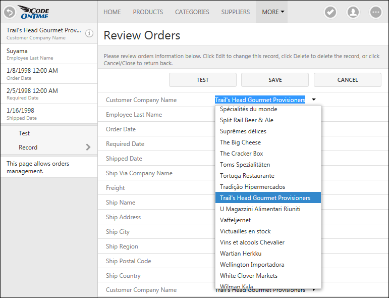
Pressing Ctrl+Space or Ctrl+Down will activate a simplified selection mode of a lookup value.
User can choose a different value with Up/Down keys, manually activate the full screen selection mode of a lookup value, or create a new lookup item if enabled.
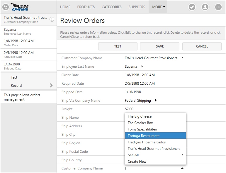
Typing a text in the input field will start auto-complete mode of lookup value search in the second instance of “customer company name” data field at the bottom of the layout in the next screenshot.
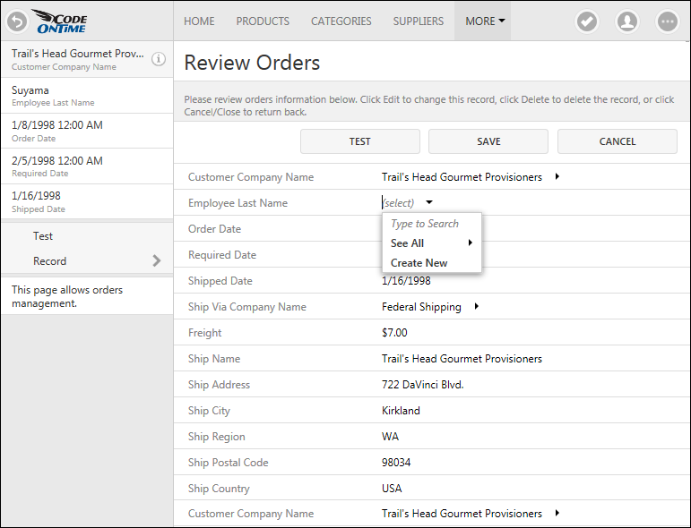
User will simply erase the lookup text to clear the value.
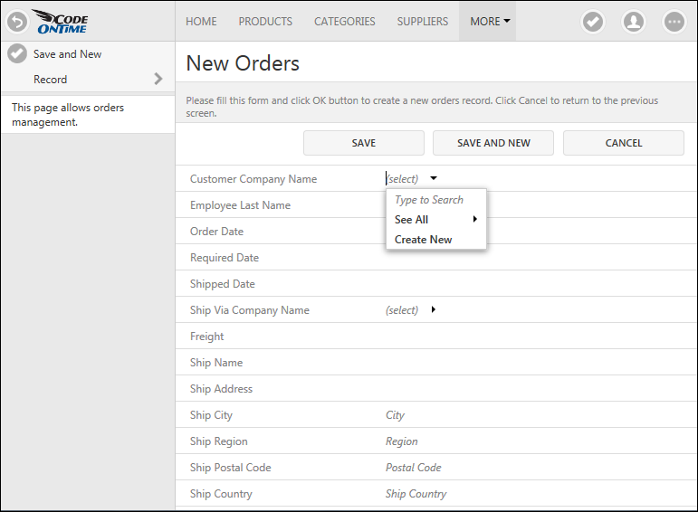
This is the same form layout displaying a record in the new mode in the next screenshot.
Notice that the forms in the new mode now display Save, Save And New, and Cancel buttons. Some of the shipping fields display custom placeholders with input instructions. Clicking on the field label or in the empty space will activate the input control.
Desktop UI users will recognize that the new lookup style combines the direct selection of lookup values from the multi-column view of records with the ability to type ahead in Auto Complete style.
The dedicated auto-complete mode is now also available for lookup fields in Touch UI. If this style of value selection is enabled then the arrow next to the field value will point down and See All option will not be available in the popup list of values.
The same presentation will be displayed for Drop Down List view style in forms. Inline editing in grid uses Auto Complete style input for Radio Button List and List Box styles of lookup selection.
