The long awaited release 8.5.8.0 is here! Originally intended to be released in March of 2016, a shift in strategy has resulted in this release coming out in June. We greatly appreciate everyone’s patience, and hope that we find the result to be rewarding for everyone.
Form Rendering Engine
The biggest change in this release is an overhaul of the Form Rendering Engine. One of our biggest complaints for Touch UI was the lack of customizability of the form. The original implementation of forms provided for limited capability in ordering data fields. Categories were used to group data fields into new rows, columns, and tabs.
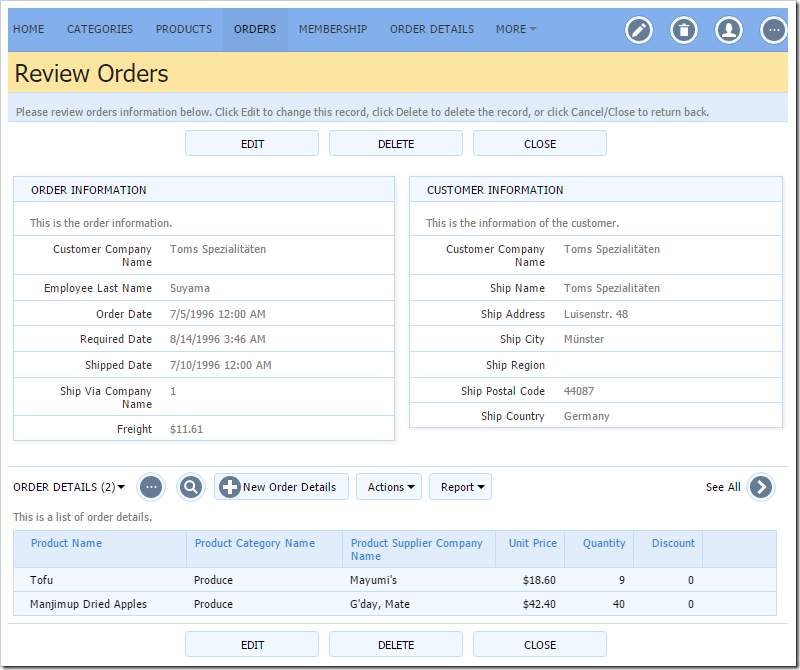
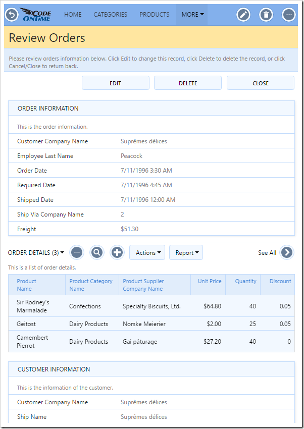
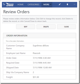
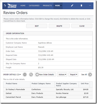
In response to these comments,we have added the ability to define HTML templates that allow precise positioning of data fields and custom content into the form. A simple example can be seen below.
These HTML templates will be placed under the ~/Views folder of your project. When loading a view, the application framework will attempt to find the file “[Controller Name].[View ID].html”. If not found, it will generate a default template.
A snippet from the template can be seen below:
<div data-layout="form">
    <div data-container="column" style="width:50%">
        <div data-container="collapsible" data-header-text="Order Information">
            <div data-container="row">
                <div data-control="description">This is the order information.</div>
            </div>
            <div data-container="row">
                <span data-control="label" data-field="CustomerID">CustomerID</span>
                <span data-control="field" data-field="CustomerID">[CustomerID]</span>
            </div>
            <div data-container="row">
                <span data-control="label" data-field="EmployeeID">EmployeeID</span>
                <span data-control="field" data-field="EmployeeID">[EmployeeID]</span>
            </div>...
The entire template must be wrapped in a data-layout element, and various different data-container elements are available for easy positioning of elements. Rows can be used to automatically position fields. It is always possible to use your own elements and position items manually. More documentation on this feature will be coming soon.
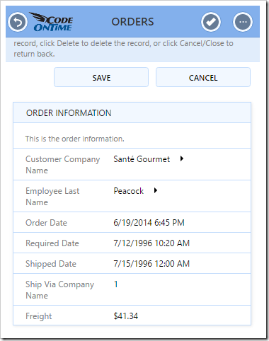
These layouts work perfectly well on mobile devices, too.
In order to make the process of developing form templates easy, a visual Form Designer will be included in future releases.
The engine utilizes our new Universal Input API in order to react to user clicks and key presses. When the user clicks on a label or field, the API will find and build the relevant input control in order to handle that field. When the user leaves the field, all values that show that field value will be updated. The API handles Tab, Shift+Tab, Up, Down, Left, Right, Enter, Shift+Enter keys in order to move between fields.
Lookup 2.0
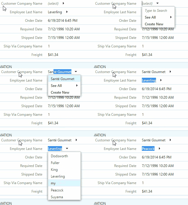
With the new Form Rendering Engine, we decided to overhaul the lookup input control to allow your users to get their work done easier and faster. The new lookup allows the user to type in their search query, and a suggestion list will automatically be loaded. Use arrow keys to navigate up and down in the list. Press Enter on your keyboard to select an option.
The user can click on the arrow to the right of the field to navigate to the lookup view.
The user can also press Ctrl+Space to activate the list. From there, the user can create a new lookup record, or jump to the lookup view by pressing “See All”. “Ctrl+Enter” will also activate the lookup view.
Client-side data caching and filtering is employed in order to ensure that performance is top-notch.
Calendar Input
Dates have always been a difficult data type to work with. Every browser implements native input differently, some working better than others. Rather than compromising in order to utilize the native input of every browser, a new Calendar Input has been developed. This input control is an extension of the calendar sidebar filter component, which also includes the upgrades.
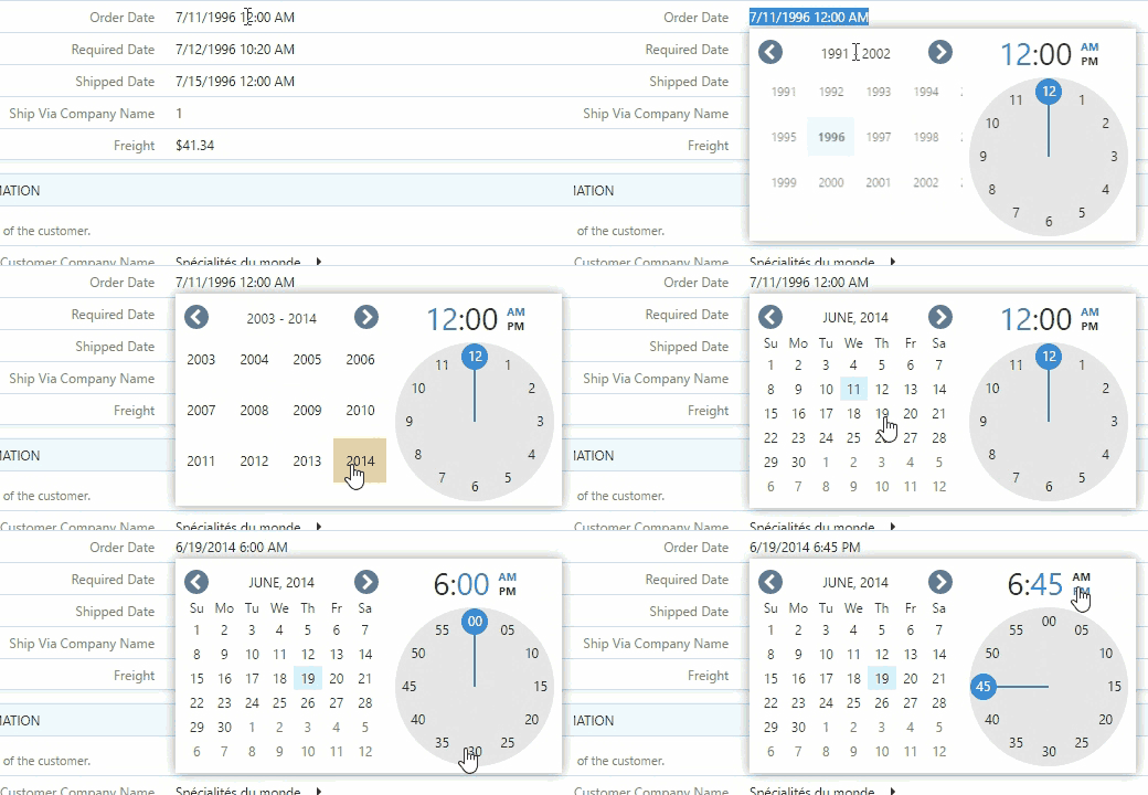
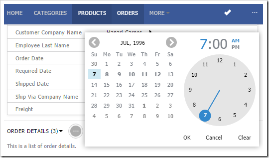
The input will be activated when the user focuses on the field. Selecting a day in the month will set that date. The user can drag or use the arrow buttons to move between different months. Clicking on the header will allow the user to select the month or year.
If the data field also renders time, a clock will be rendered. The user can click on an area in the clock to set the time. Clicking on the hour or minute part of the header will allow changing that part of the time. Clicking on AM/PM will toggle the time of day.
The user will continue to be able to manually edit the value in the input control.
If the input is activated on a very small screen or mobile device, the Calendar Input will be displayed in the center of the screen. The user must click “OK” to save the new value, “Cancel” to close the popup, or “Clear” to reset the value.
Notice that days that contain data in the month are bold. Hovering over the day will reveal a count of records on that day. The client library makes asynchronous requests to pull the data and caches it on the client. If performance is a concern, this feature can be disabled by tagging the data field “calendar-input-data-none”.
Data View Fields
In the past, Code OnTime users needed to configure pages with multiple data views in order to display lists of data related to the master record. This process led to a disconnect between the data and presentation layers of the application.
Release 8.5.8.0 changes the paradigm. A new field type has been introduced, “DataView”. This will allow users to embed lists of records directly into the forms of master records. This change brings controllers more inline with how users would intuitively understand business objects.
Simply define a field of type “DataView”, point to the correct controller, specify the filter field, and create a data field to bind it to the form. All pages that refer to that form will now reveal relevant child records.
The traditional method of defining child data views still works. This can be used for child data views that should only be displayed on certain pages (or define another view that excludes the data view field).
Future releases of the app generator will allow users to perform inline editing of child records at the same time that the master record is being modified.
Grid Upgrades
This brings us to the new and improved grid. In previous releases, it was difficult to set the size of grid columns to match up with the intended look and feel. Release 8.5.8.0 has made the grid sizing process more transparent.
The grid will now use the exact size of each data field in columns when allocating space. If there are no columns defined, then the columns will be set to 2/3s of the length of the field, or various preconfigured lengths depending on the type of the field.
In order to make the client library more intelligent and require less involvement of the user, a new feature has been added to the grid – “Fit To Width”. This will automatically shrink the grid columns to fit the screen, down to a certain limit. The space allocated to each column is equal to the proportion of “columns” that field was assigned. This feature is automatically enabled for every grid. If the behavior is undesired, the data view can be tagged “grid-fit-none” to disable the functionality.
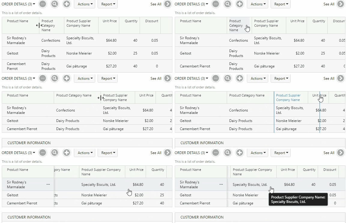
The width of the grid may surpass the width of the page – the user will then be able to drag the grid left and right to bring different columns into view. Touch input is now supported for dragging.
If a column is too small or big to see the data, the user can click and drag the divider between columns in order to resize.
Future releases will offer the ability to reorder the columns on the client.
“Tiny” Density
Touch UI applications offer several different display densities in order to fit the needs of every user. The smallest size, Condensed, was still larger than Desktop UI. Therefore, we are introducing “Tiny” display density, which uses the same font and font size of the desktop.
The picture below compares “Comfortable” and “Tiny” display densities.
Business Object Model and Data Access Objects
Code business rules in previous releases of Code OnTime app generator would list each field in the parameters of the method. Controllers with over a hundred fields would result in sprawling and ungainly method signatures. To update a data field for the client, it was necessary to call the UpdateFieldValue() method. See an example of legacy code below.
using System;
using System.Data;
using MyCompany.Data;

namespace MyCompany.Rules
{
    public partial class OrderDetailsBusinessRules : MyCompany.Data.BusinessRules
    {
        [Rule("r100")]
        public void r100Implementation(int? orderID,
            string orderCustomerID,
            string orderCustomerCompanyName,
            string orderEmployeeLastName,
            string orderShipViaCompanyName,
            FieldValue productID,
            string productProductName,
            string productCategoryCategoryName,
            string productSupplierCompanyName,
            FieldValue unitPrice,
            short? quantity,
            float? discount)
        {
            UpdateFieldValue("Quantity", 1);
        }
    }
}
Release 8.5.8.0 will now generate data model objects for each controller that has a code business rule, and will pass this object as a parameter to the method. The setters for each property of the data model object will update the corresponding field on the client side.
using System.Data;
using MyCompany.Data;
using MyCompany.Models;

namespace MyCompany.Rules
{
    public partial class OrderDetailsBusinessRules : MyCompany.Data.BusinessRules
    {
        [Rule("r100")]
        public void r100Implementation(OrderDetailsModel instance)
        {
            instance.Quantity = 1;
        }
    }
}
The new business rule format is vastly easier to read and understand, even for non-professional C# or Visual Basic developers.
Legacy business rules will continue to function as they did before.
Release 8.5.8.0 no longer offers a way to enable data access objects globally. The developer will need to enable data access objects on each controller by enabling the “Generate Data Access Objects” checkbox. These objects will extend the business object models. Models and data access objects will now be stored under ~/App_Code/Models folder.
Miscellaneous
These are just some of the new features in release 8.5.8.0. A more comprehensive list can be seen below:
- Fields now have the option to be set as “Virtual”. These fields will never be included in Insert or Update queries, but are still editable by the user and can be read and manipulated in business rules. Developers no longer need to mark fields as “not modified” in rules in order to use custom fields.
- Controllers can now be generated with “Save” and “Save and New” in create forms. By default, new applications will have this enabled by default. It can be toggled with the “Use ‘Save’ and ‘Save and New’ in forms” checkbox in the Features page of the Project Wizard.
- Vast performance enhancements in page loading, button clicking, form opening, grid rendering and dragging, calendar rendering and dragging. HTTP requests are now smaller and data is cached when possible.
- Re-selecting a record in the form after creating a record will no longer go back to the grid before loading the edit form. This results in significantly faster workflow when inserting multiple records.
- Support for Report Viewer 2015.
- Touch gesture support for Drag & Drop API – tested with Surface Pro 4, iPhone 6 Plus, iPad Pro, Nexus 5x, S7 Edge. This API is used in calendar, grid, calendar input, and panels.
- Model Builder Tooltip API has been ported to Touch UI.
- “Borrowed” fields defined in data models will be copied when the lookup value is changed. These fields will now be included as read-only in the create form.
- Changing namespace of application in Web App Factory will move data model files to correct location.
- A grey overlay will cover the screen if the user attempts to “double” click an action while another action is executing.
- Custom scrollbar ensures a uniform user experience across browsers and themes.
- View templates can exclusively contain the file name of another template. The application framework will load the file with that file name.
- The text “Loading” will be displayed when the page is loading.
- Blob Adapters no longer require the user to be logged in when there is no membership enabled.
- Data Text Field and Data Value Field are initialized correctly if a model exists for the lookup controller.
- Virtual lookup fields are now correctly created when defined in the data model.
- Removed installer dependency to .NET 3.5.
- The web.config file will not be overwritten unless necessary to avoid the “AppDomain Unloaded” message in Visual Studio.
- Many other minor bug fixes.
We were not able to finalize some of the features that we desired to include in this release, due to time constraints. Expect to see these features in future releases:
- Modal forms in Touch UI.
- Grid inline editing (Data Sheet mode).
- Use of HTML templates to define Grid/List/Card layouts.
- Swipe left/right action group. Actions placed in this action group will be revealed when user performs the relevant gesture in the grid.
- Promoted action group. Actions placed in this action group will be revealed when user clicks on the floating promo button at the bottom of the screen.
- Sidebar will be rendered in the left menu panel when the screen is small or sidebar is disabled.
- Revealing mini calendar under Calendar mode selector when sidebar is not visible.
- Reordering of grid columns via drag & drop. The order will be saved in the browser cache.
- Support for Azure 2.9.
- “Bucket” lookup will allow selecting multiple items from the lookup view.
- Rich Text Editor in Touch UI.
- Visual Form Designer.
- Multi-day events in Calendar.
