The upcoming update 8.0.9.0 will introduce numerous enhancements to the Touch UI in the apps created with Code On Time.
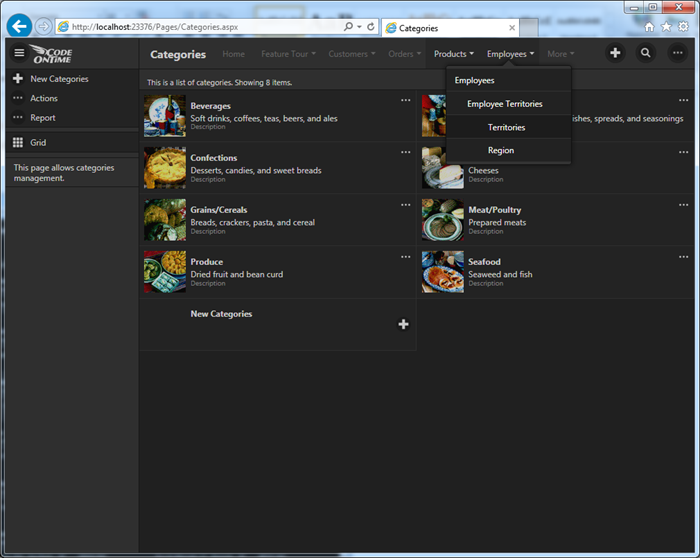
Application navigation menu is now displayed on the toolbar if a space is available. Multi-level navigation options are displayed on a single panel to simplify selection.
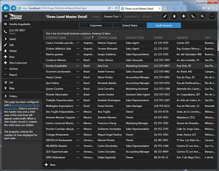
We have removed “Home” button and replaced it with standard “bars” commonly found in modern apps. The button is now called “Menu”. The button is visible in the top left corner in the screen shot above.
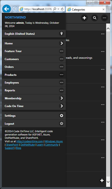
Button “Menu” will display navigation menu options on a typical smartphone.
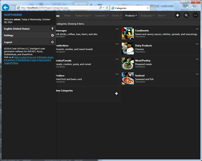
Button “Menu” will display only the basic menu options such as language selector, settings, and login/logout options on devices with larger screen .
The context menu button is now called “More”. It is displayed on right-most side of the toolbar when actions are available. You can see the button in the screen shot above next to the search icon on the toolbar.
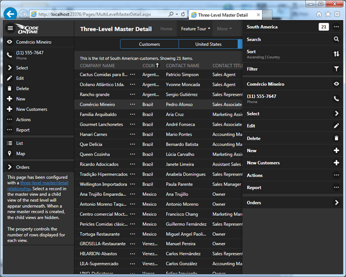
“More” button on the right side of the toolbar provides access to all actions that can be applied to the data view focused on the page. Actions with “Grid”, “Action Column”, “Action Bar”, and “Form” scopes are rolled into a single set. The slide-out panel is displayed on the right side of the screen when “More” button is pressed.
Developers can include custom actions in both “Menu” and “More” panels.
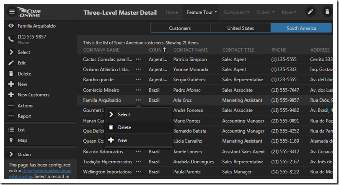
Rows of a grid will also display “More” button right after the first column. The next screen shot displays “More” button next to Company Name field value.
This button will open a context menu of the selected row. Actions with scopes “Grid” and “Action Column” are included the context menu.
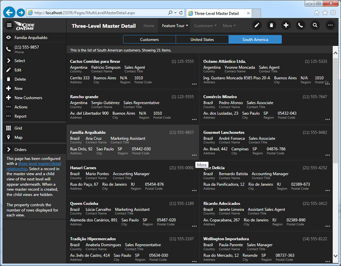
“More” button is also displayed in the data cards of a list. It is displayed either in the top right corner or in the bottom right corner of a data card.
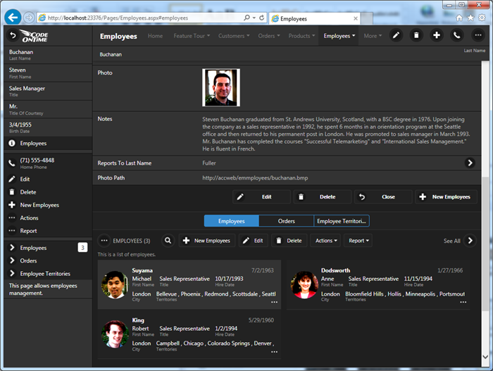
Summary master views and child views display action bar options. The child view with the list of Employees displays “New Employee”, “Edit”, “Delete”, “Actions”, and “Report” options. The buttons with text labels are automatically reduced to icons or hidden on narrow devices. The entire set of available actions is always accessible via “More” button displayed to the left of the view name.
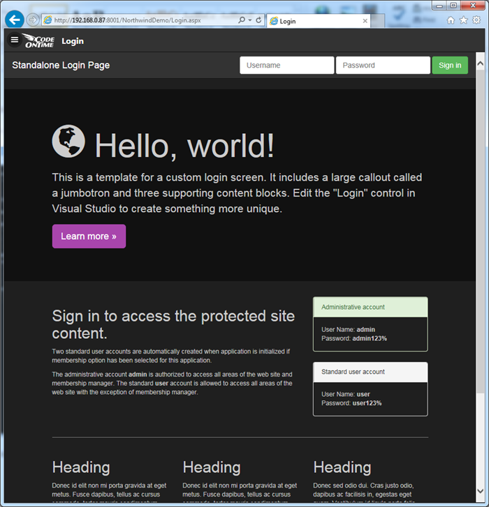
Application framework now seamlessly integrates Bootstrap, the popular framework that makes it easy to define responsive content. Here is an example of a dedicated login page based on Bootstrap. Learn about the framework at http://getbootstrap.com.
