Wednesday, May 1, 2013
Tools for Excel: Data Fields
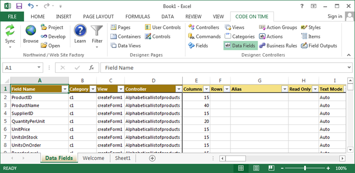
This is a typical view of data fields in a project.
Consult the following table when entering property values:
| Property | Description |
| Aggregate | Specify an Aggregate that will be displayed at the bottom of grid views. |
| Alias | The Alias is the field value that will be displayed to the user. The header text will be inherited from the alias field label. |
| Auto Complete Prefix Length | Specify an Auto Complete Minimum Prefix Length greater than 1 to enable auto-complete on the data field. |
| Category | The category that this data field belongs to. |
| Chart | If the view is a chart, specify a Chart property that the data field will function as. |
| Code Filter | Specify an operator for the Code Filter to determine how records will be restricted from being displayed. |
| Controller | The controller that this data field belongs to. |
| Columns | Columns determines the width of the data field. If the field is a radio button list or check box list, this will determine the number of columns. |
| Data Format String | Specify a Data Format String to format the field value before it is presented to the user. |
| Field Name | The name of the field that is instantiated. |
| Footer Text | Displayed under the field in the form. |
| Filter Expression | Write a Filter Expression in the programming language of your project. Code Filter must be specified. |
| Format On Client | If Format On Client is disabled, the server will format the field using the specified data format string. |
| Header Text | Replaces the name of the field in the form. |
| Hidden | Enable to hide the field from the user interface. |
| Hyperlink Format String | The Hyperlink Format String allows formatting the field as a link. Specify an absolute or relative (starting with ~) URL that may include field names enclosed in curly brackets. You can place _blank or any other standard window name followed by colon symbol in front of the URL. |
| Read Only | If Read Only is enabled, the data field will not be editable in the user interface. |
| Read Only When | Read-Only When is a JavaScript expression that will enable editing on the data field when it evaluates to true. |
| Rows | Rows determines the height of the data field or list box. |
| Search Mode | The Search Mode property will control the behavior of the data field in the advanced search bar. |
| Search Options | Search Options represent the options available for searching the field in the advanced search bar. You can limit or reorder the search options. Search options must be compatible with the data type of the field. Separate options with "," or list one option per line. Examples: $contains, =, $between, >, $future. |
| Tag | Use the Tag property to define enhanced business purpose of the data field. |
| Text Mode | Text Mode will determine how the text box is rendered. Password will render the field value as asterisks. Rich Text will enable rich text editing on the field value. Note allows easy editing of long field values. Static will display the field as read-only, but still send the field value to the server. |
| Tool Tip | Tool Tip is displayed when user mouses over the input box or text. |
| View | The view that this data field belongs to. |
| Visible When | Visible When is a JavaScript expression that will display the data field when it evaluates to true. |
