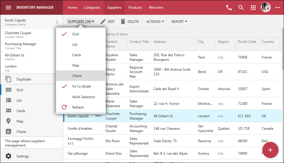
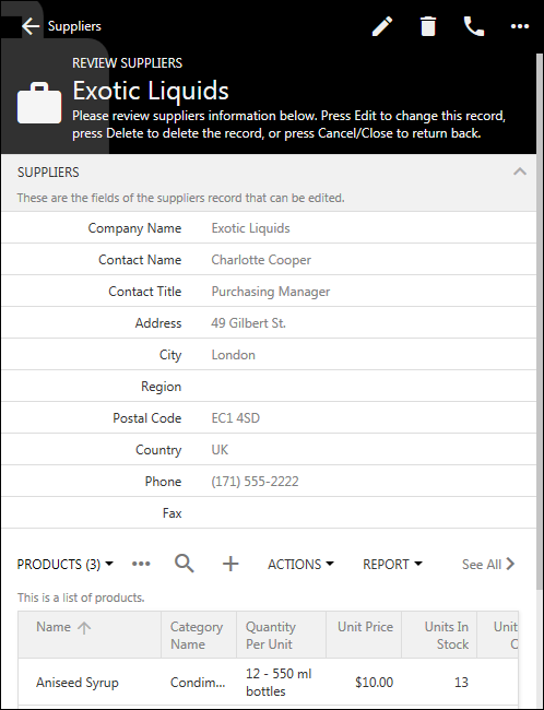
A new theme engine in Touch UI is included with the release 8.5.12.0. The brand new themes provide a modern look-and-feel for your line-of-business universal apps. Designed to work with both Desktop and Mobile devices, Touch UI offers a universal solution to application developers. Your end users can point with a mouse or a stylus and click or touch the responsive user interface elements.
The user inteface is customized with themes and accents. A theme provides the main color scheme. An accent provides additional color adjustments. The themes are CSS-based. The new release will ship with a single Light theme. Additonal core schemes are expected to become available in the future. Accents are JSON files describing particular colors and other properties that will customize the theme. Release 8.5.12.0. ships with 35 accents. Developers can make a copy of any existing *.json accent under ~/touch folder and replace the colors with those that are matching the application requirements. Developers can standardize on a particular theme and accent for their app by deleting the standard themes and accents that are not needed. The upcoming CoT v9 will also include an interactive theme builder that will allow producing custom accents within the live app.
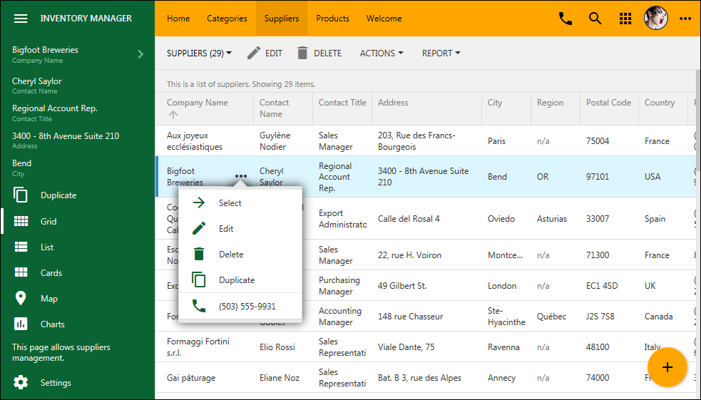
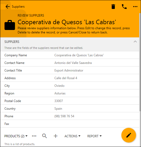
The screenshots of the new Light theme with Citrus accent are below.
This is the new Azure accent for the Light theme:
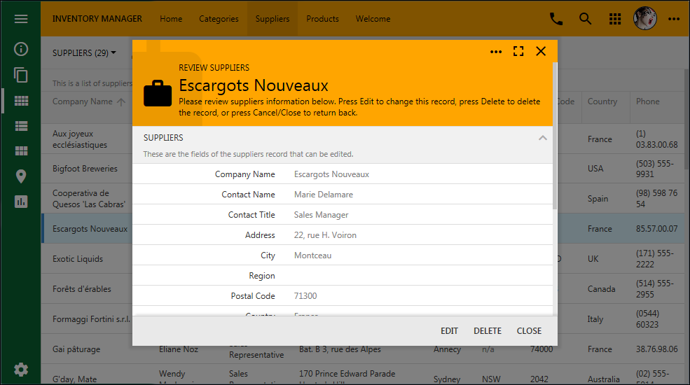
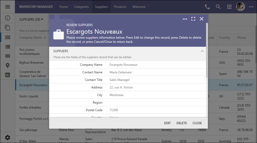
The new Grapello accent in Light theme in the screenshot showing a modal form:
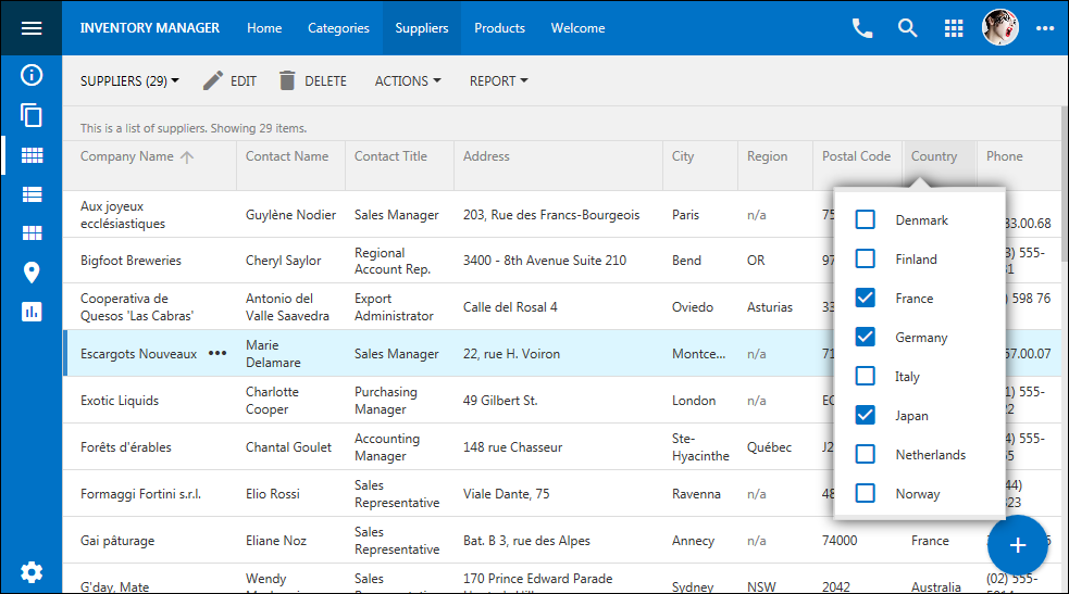
The new Plastic accent demonstrates interactive filtering in Light theme:
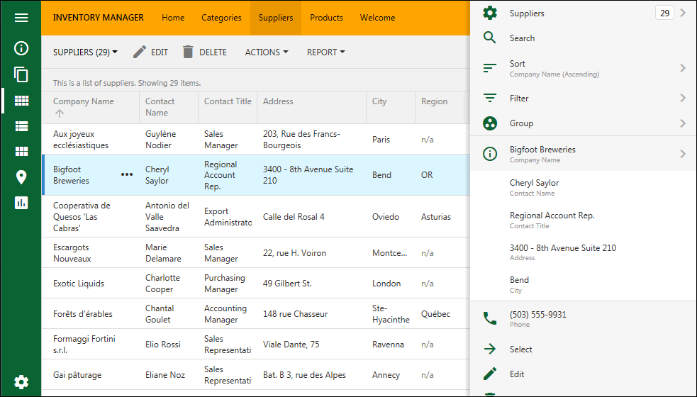
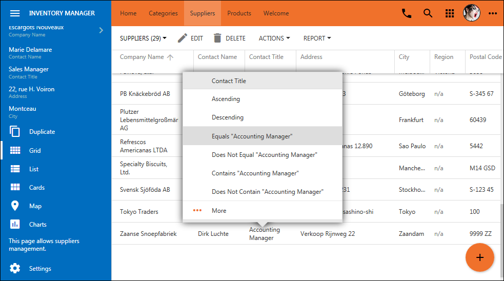
The new Berry accent demonstrates the view selector in Light theme:
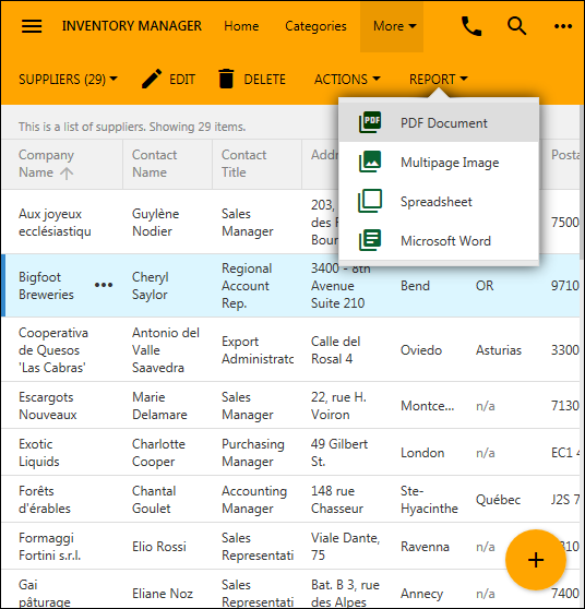
This is the Light theme with Dark Knight accent on a small screen:
The user interface theme is constructed at runtime by applying properties defined in the JSON configuration of the accent to the chosen color scheme of the theme.
This is the actual configuration file for the Citrus theme. You can create a new accent by making a copy of an existing one and replacing it’s colors.
JSON:
{
"name": "Citrus",
"color": "#FFA500",
"header": {
"background": "orange",
"backgroundTransparent": "transparent",
"border": "#FFA500",
"paddingTop": 0,
"icon": {
"default": "#000",
"hover": null,
"selected": null,
"backgroundOpacity": null
},
"text": {
"default": "#000",
"hover": null,
"logo": null,
"hoverBackground": "rgba(0,0,0,0.05)",
"selectedBackground": "rgba(0,0,0,0.08)"
},
"split": {
"background": null,
"icon": { "default": null }
}
},
"panel": {
"icon": {
"default": "#0a6332",
"hover": "#003D00",
"selected": null
}
},
"buttons": {
"promo": {
"background": "#FFA500",
"icon": {
"default": "#000"
},
"menu": {
"icon": {
"default": null,
"hover": null
}
}
}
},
"sidebar": {
"full": {
"background": "#0a6332",
"border": "#0a6332",
"selectedColor": "#fff",
"text": {
"default": "#eee",
"hover": "#fff",
"active": null,
"static": "#80ba99"
},
"icon": {
"default": "#fff",
"hover": "#FFA500",
"active": null
},
"toolbar": {
"background": "#0a6332",
"border": "#0a6332",
"selectedColor": "#fff",
"icon": {
"default": "#fff",
"hover": "#FFA500",
"active": null
}
}
},
"mini": {
"background": "#0a6332",
"border": "#0a6332",
"selectedColor": "#fff",
"icon": {
"default": "#fff",
"hover": "#FFA500",
"active": null
},
"toolbar": {
"background": "#0a6332",
"border": "#0a6332",
"selectedColor": "#fff",
"icon": {
"default": "#fff",
"hover": "#FFA500",
"active": null
}
}
}
}
}
The user interface elements and behavior are customized via the new ~/touch-settings.json configuration file in apps created with Code on Time 8.5.12.0.
JSON:
{
"defaultUI": "TouchUI",
"appName": "Inventory Manager",
"map": {
"apiKey": null
},
"charts": {
"maxPivotRowCount": 100
},
"ui": {
"theme": {
"name": "Light",
"accent": "Aquarium",
"preview": null
},
"displayDensity": {
"mobile": "Auto",
"desktop": "Condensed"
},
"list": {
"labels": {
"display": "DisplayedBelow"
},
"initialMode": "SeeAll"
},
"menu": {
"location": "toolbar",
"tiles": null
},
"actions": {
"promote": true
},
"transitions": {
"style": "slide"
},
"sidebar": {
"when": "Landscape",
"mini": true,
"apps": true,
"toolbar": true,
"icons": true
},
"toolbar": {
"apps": true
},
"apps": {
"location": "toolbar"
},
"showSystemButtons": null,
"smartDates": true
},
"settings": {
"enabled": true,
"options": {
"displayDensity": true,
"theme": true,
"transitions": true,
"sidebar": true,
"labelsInList": true,
"showSystemButtons": true,
"promoteActions": true,
"smartDates": true,
"initialListMode": true
}
},
"membership": {
"enabled": null,
"profile": "view switch login logout",
"help": true,
"accountManager": {
"enabled": true
}
},
"help": true
}
